
Your most common slides are often your most time-consuming. In building Beautiful.AI, we’ve pored over hundreds (maybe thousands?) of presentations looking for insights into how people build their slides.
One of the most striking things we’ve noticed is that some of the most common slide types you see in presentations are also among the hardest to make. In fact, some of them can take even professional designers hours to create.
Most of us just take this time suck for granted. After all, presentation software like PowerPoint and Keynote usually starts us off with a blank canvas, so it’s kind of a miracle that we can create anything at all. But we think it's downright silly that slide types so many of us use so often should require so much effort to create.
We believe that your time shouldn’t be spent re-aligning icons, cropping photos, playing around with font sizes, or reinventing the wheel. It should be spent crafting and delivering great presentations. So we think there has to be a better way to build these kinds of slides.
Below are just a few examples of the slides that we all struggle with and how we've tried to remedy them with Beautiful.AI.
1. THE TIMELINE
It's estimated that there are 30 million presentations created every single day. If that's true, then we'd be willing to bet that 29 million of them feature timelines. This incredibly versatile graphic is used for everything from progress reports to project plans. And yet, they are easily one of the most frustrating slides to build.
You may be able to find a slick-looking template slide or dig back into your slide library to find old examples that you can edit, but good luck if you want to change the order of milestones on your timeline or add new ones. This almost always requires moving all of the other items around, selecting-all and dragging groups of shapes around, and other time-consuming tasks.
Meanwhile, you're thinking to yourself: "Why can't I just drag this milestone where I want and have the others make room for it?" That's a great question, and it's precisely the one we asked ourselves—and answered—when we created this template for Beautiful.AI.
2. THE VERTICAL ICON LIST
In most PowerPoint and Keynote templates, "Title and Bullets" is the default layout. It’s sitting right there when we click “New Slide,” so most of us just go with the flow and start filling up the slide with text. Only when we’ve finished jotting down our ideas do we start thinking about how to “dress up” the slide—either with an image or a set of icons that make it easier for our audience to quickly grasp what we’re trying to say.
And that’s when things get tricky. First off, where are you supposed to find the icons? How do you make sure they’re all in the same visual style? What if you want to change their colors? How many of them can (or should) you squeeze in a row? And if you put them in the wrong order, how long will it take to rearrange them?
For a slide type that’s this pervasive (and this powerful), it’s kind of amazing that it’s so hard to design. But it shouldn’t be—if you can summarize your messages, then the rest should take care of itself. You should be able to find the right icons in seconds, order and re-order your points instantly, and never have to worry about how your slide is laid out. (For what it's worth, our Team Slide template works exactly the same way.)
3. THE BIG MESSAGE
In just about every presentation, there comes a time when you need to snap your audience back to attention and remind them of just how important your message is. You may want to punctuate the problem you’re all facing, the mission that guides you, or the call to action that will help you solve it together. And when that time comes, there’s no better way to grab your audience by the collar than with a big 'ol message slide.
We’ve all seen these beautiful slides and wondered: “How did they do that?” First off, they had to pick the right font. (Should it be the same one I’m using everywhere else? Should it be ALL CAPS? And just how "big-ass" should it be?) They had to hunt for the right image to pair it with. And then they had to figure out if the message looks best above the image, next to it, or on top of it. All in all, it probably took 30 minutes to turn a simple message into a simple slide.
This seems crazy. The images (and those cool Instagram-like filters) should be at your fingertips. You should be able to experiment with layouts and text placements without having to build a new slide. And you should never, ever have to worry about font size. (Ever.)
4. THE PHOTO GRID
To be fair to PowerPoint and Keynote, Title + Bullets isn’t the only default slide types available. You can also arrange your text into three columns, pair an image with bullets, or even place two images side-by-side. But what if you want to add three images? Or four? Or seven?
The photo grid is a classic slide type, but it has to be built from scratch every single time. You’ve got to pull the photos in from your library, lay them out on the canvas, and put the puzzle pieces together so that square photos play nice with rectangle photos and big photos play nice with little ones. And when you’ve finally got them all in place, you better like the way it looks, because even swapping a few images can create at least 15 minutes of new work.
Again, your goal isn’t to place all of the images in precisely the right place. You just want to get them all in a grid and make sure it looks nice. And this part of the process is more math than it is art—math that software can do better than a human. So shouldn’t you be able to just drop in your photos and let the software show you all the ways it can (and even should) look? And when you want to add a new image, shouldn't the software make room for you?
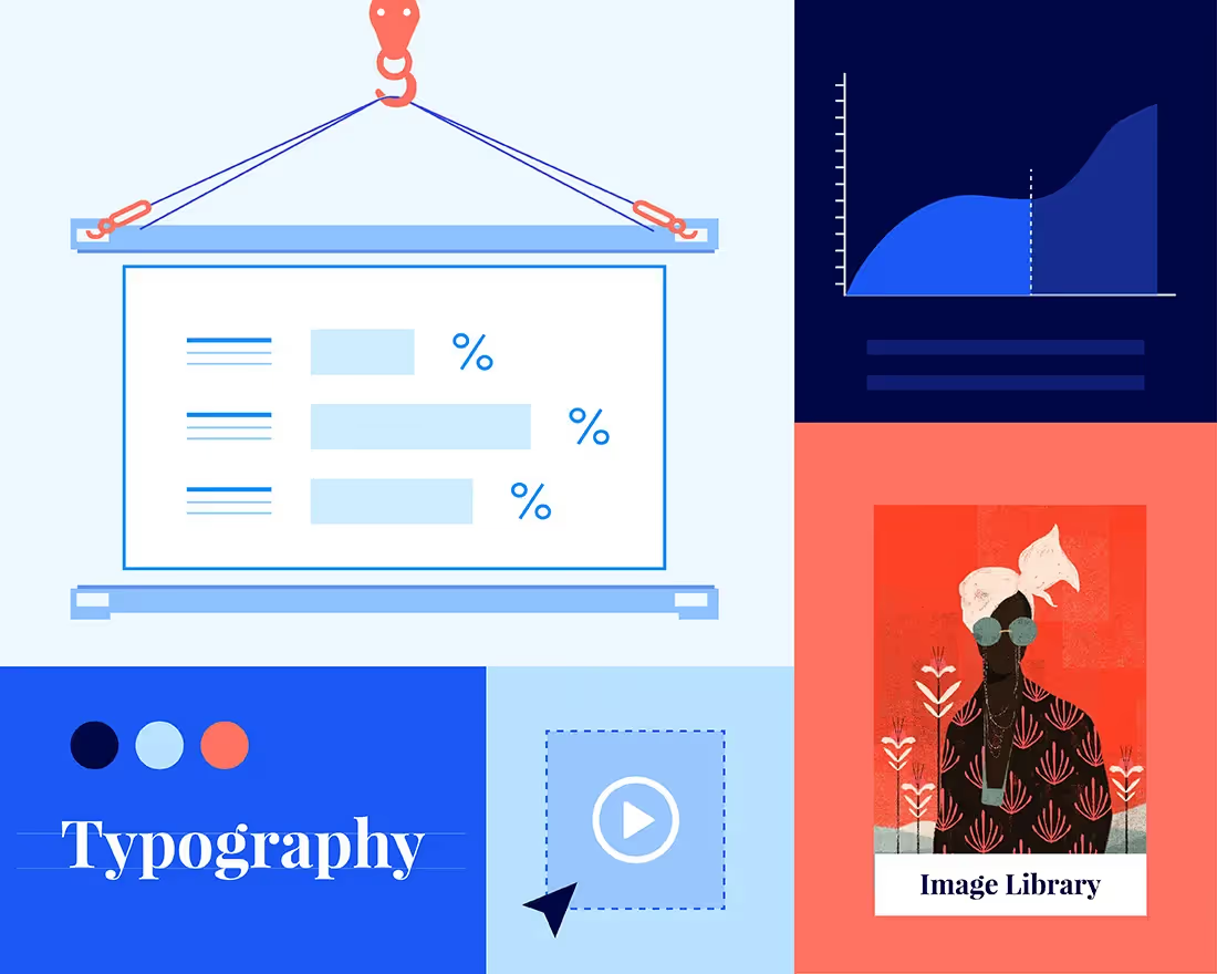
5. THE CHART
One of the biggest problems with today’s presentation software is that it’s so focused on what you want to do that it doesn’t stop to consider why you’d want to do it.
This sounds a bit Yoda-esque, so we’ll give an example: Let’s say you’ve built a chart that shows your monthly revenue to date along with projections for the next three months. You might want to indicate that those three months are in the future, so you want that part of the line to look different from the months before. With PowerPoint, the only way to do this is to create a second chart that starts at today and goes into the future, and then line up that second chart perfectly with the first one so it feels like they’re one in the same. (If this sounds complicated, that’s because it is.) And what if you want to highlight the first and last data points to emphasize overall growth? How would you even do that?
Formatting charts like this should not be your job. You should be able to tell the software the why (e.g. “I want to emphasize this range” or “I want to show that things changed after this point”) and let it figure out the what for you. That’s how you would communicate with a presentation designer, so it should also be how you communicate with your presentation design software.
———
Beautiful.AI features more than 50 interactive smart templates that are as dynamic as the ones you see above. If you're interested in learning more about what our tool has to offer, check out the presentation below or sign up for your free account today.