

Note: Our guest author for this article is experience consultant and founder of LOVE GOOD COLOR, Laura Guido-Clark. Over her career, Guido-Clark has helped some major companies like Herman Miller, Samsung, and Toyota (just to name a few!) understand how to use color theory and emotion to develop a connection to spaces, transform products, and make an emotional impact in presentations. Learn more about the importance of color at LOVE GOOD COLOR and the impact of her nonprofit, Project Color Corps.
My obsession with color began at the age of ten while watching The Wizard of Oz. When Dorothy stepped into a technicolor world I went with her, realizing that the impact of color was deeply emotional and that color can tell a story. While my love for color never waned, I had another love, science. By college, I had a double major in pre-med and interior design. I have always felt the two were similar, they both require observation, experimentation, and, above all, empathy.
While I work with many mediums, color is by far the most transformative. If you’ve thought of color as something that lies on the surface, think again. The use of color has depth, it is empathic and intuitive. I believe that we know when we use color well... and we know when we don’t.
My “aha” moment came from the experience of not using it quite right. My husband and I decided to paint our young son’s room orange. Not just any orange: a really intense orange. The kind of vibrant orange that radiates energy and makes you feel excited just to be alive. In color psychology, orange is noted as optimistic and joyful, two traits anyone would want their child to have. However, what we failed to realize is that orange, like any color, has nuance. We soon realized this specific color of orange wasn’t the optimal shade for our son’s room, it was way too joyful and it affected his behavior. Yet, it wasn’t orange’s fault and it wasn’t my son’s fault; it was a color misunderstanding.
I realized something was missing, a way to emotionally connect to color. That is why I created LOVE GOOD COLOR— a new color system that helps you choose the best colors for impact, teaching you a new language of color.
The best environments, presentations, and products understand color has an impact. Color’s use (or lack thereof!) provokes an emotive response. If you’re saying one thing in a presentation and your color combination is saying something different, your audience will feel conflicted. Your color palette speaks before you do.
Research shows that color transcends our visual sense; it’s a physical wavelength absorbed through the skin. Studies prove that shifting the color in a room can lead to behavioral changes and even affect blood pressure and heart rate in both sighted as well as blind students.
Neurobiologist Mark Changizi states in his work that the evolutionary reason we see in color is to read human emotions. Color affects both the head and heart yet we often leave color palettes as the last step in our design process. This means a key component to a powerful presentation is frequently left out.
Color can actually change human behavior. The psychology of color and physiological effects of color are staggering. Color influences our minds, our moods, and our behaviors. Shifting the shade shifts the meaning. It can set off a response that makes people react, influences their decision-making, or even take an action. The right color can be the perfect CTA and contribute to conversion rate. As you can see below, when you change the color, you change the story.
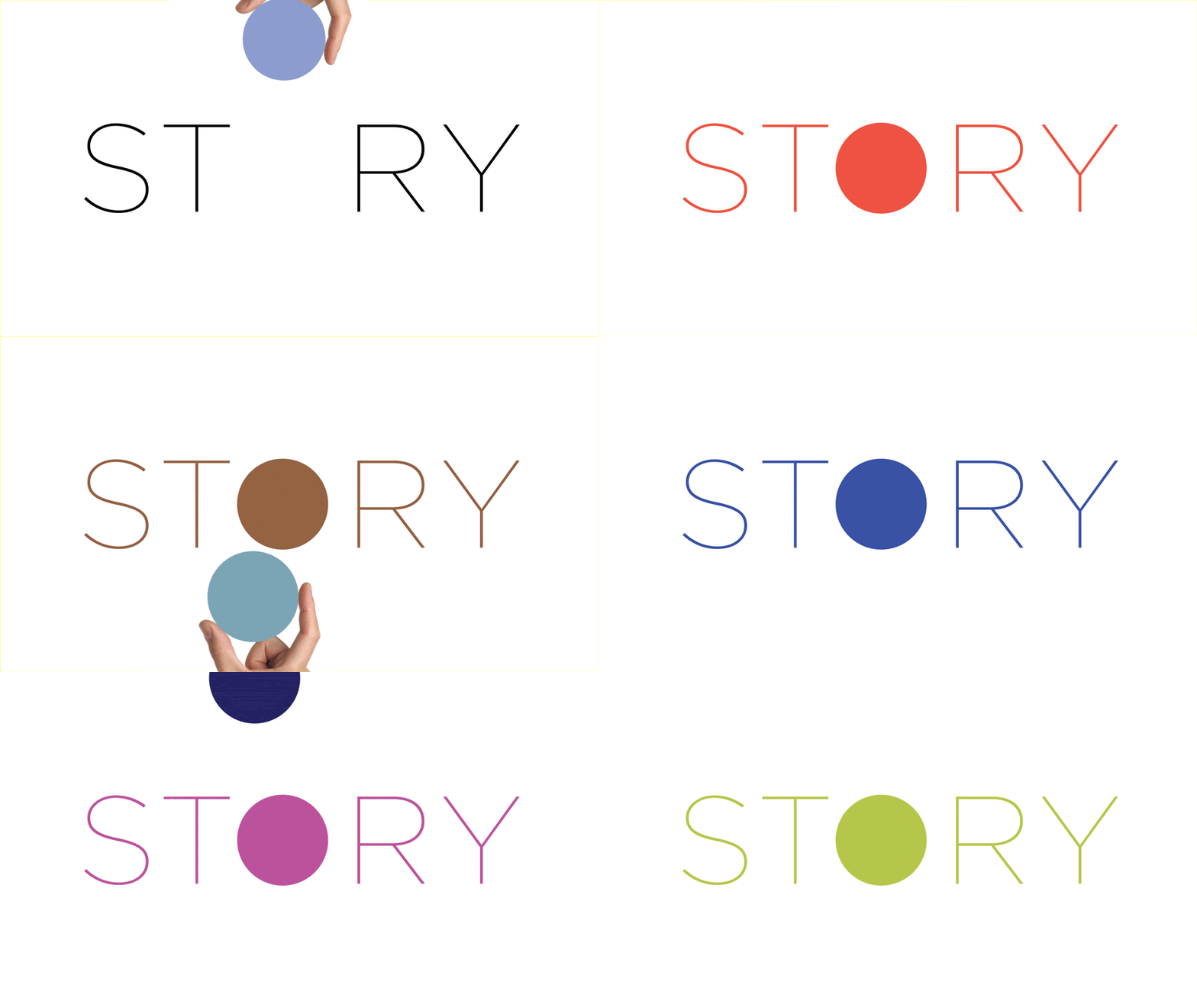
When preparing your presentation, note that research shows that people can recall color schemes better than they can even recall objects. Color influences— and greatly affects— the perception of your presentation and the power of its message. Using color for impact is one of the most powerful mediums you have. To make a presentation memorable and meaningful integrate and use color to reinforce your message.
Let’s take a look at these examples Love Good Color put together with the help of Beautiful.ai’s templates showing 3 different color treatments and how they have varying emotive impact.
Here we used a beautiful.ai template to make 3 different “our team” pages.
Each of the pages tells its own story through the color's influence. The essence of the team and company's brand personality can be reinforced through intentional color selection:
Creative, fun
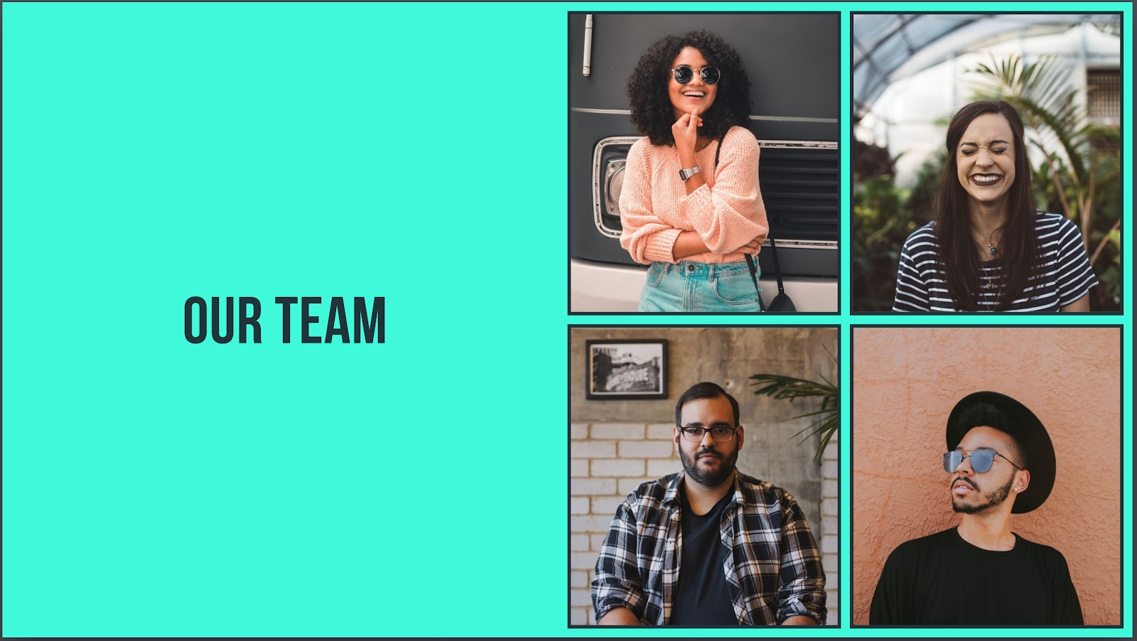
Empathic, engaged

Thoughtful, industrious

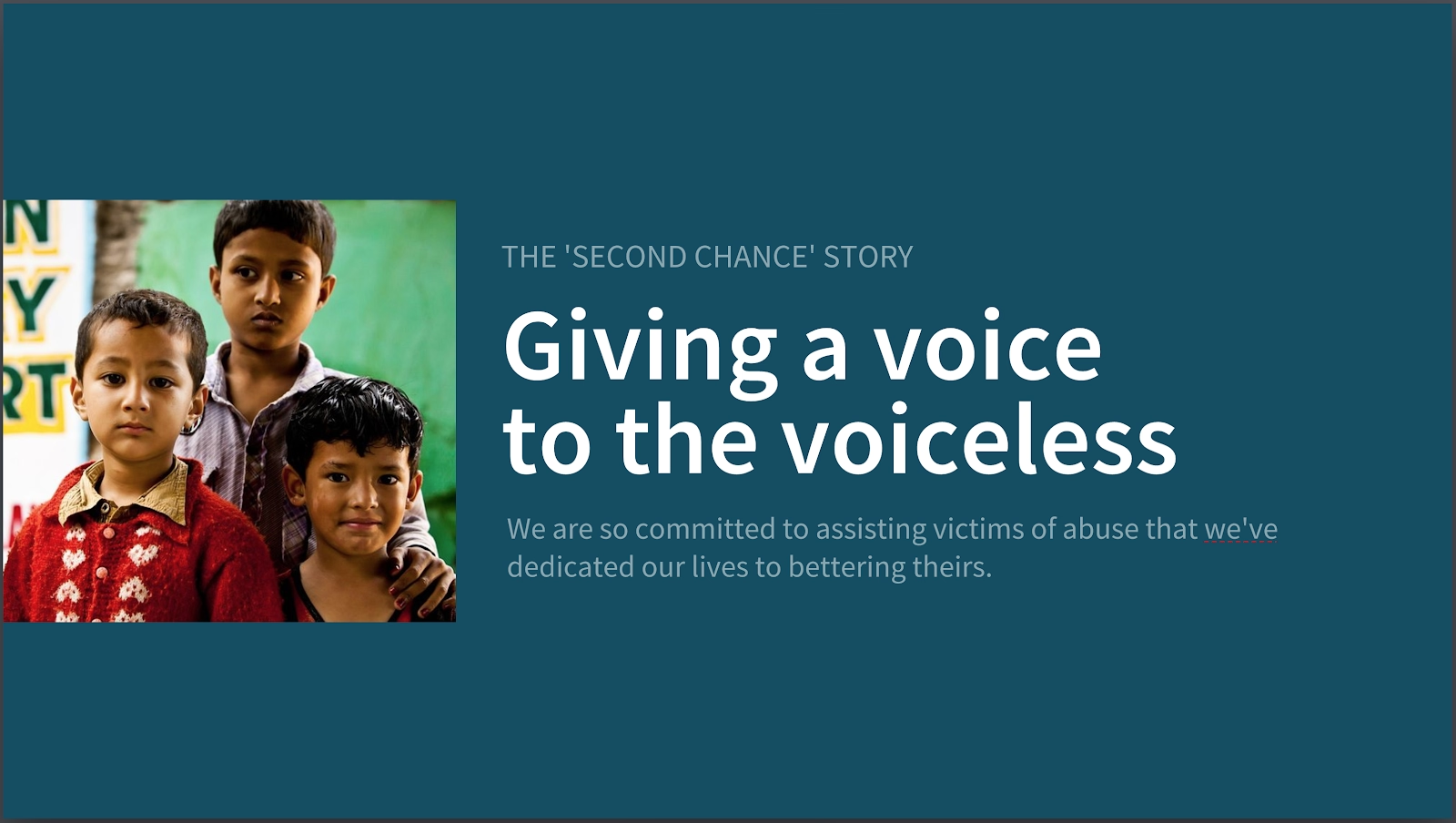
Next we used a beautiful.ai template to make a Nonprofit's “Mission Statement” page:
Again, each page tells its own story through color. With each color change we have highlighted a different characteristic of what the Nonprofit embodies.
Empowerment, strength

Hopeful, uplifting
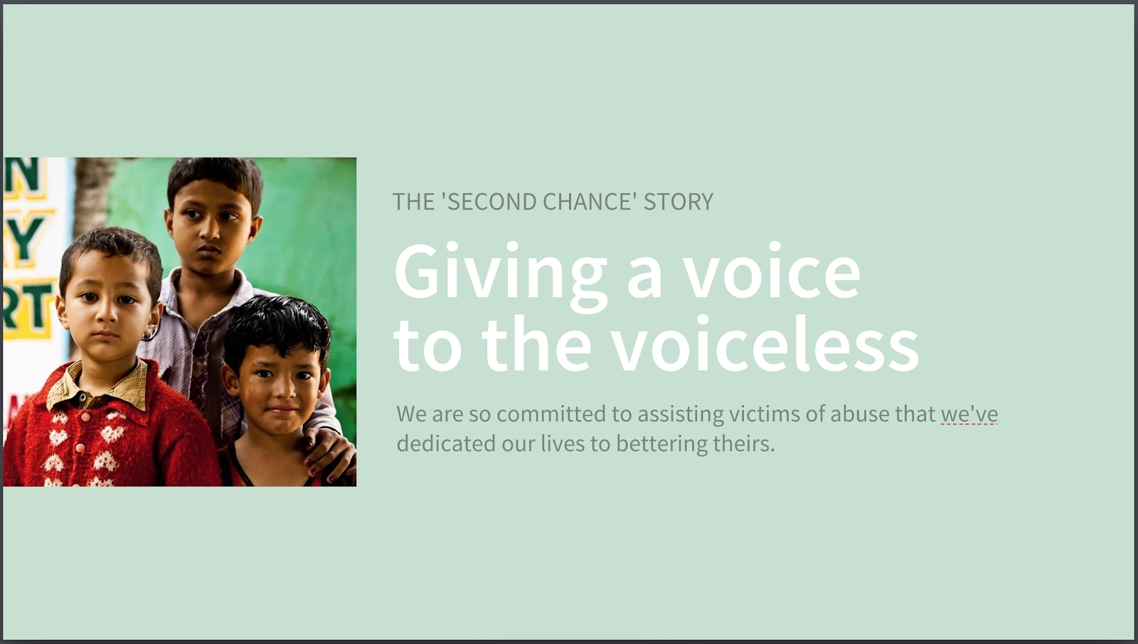
Commitment, determination
The bottom line (literally) is that your color choices matter.
Read more customer success stories and case studies here.
Learn more about our LOVE GOOD COLOR workshops and tools and follow us on Instagram so you never miss a color story: LOVE GOOD COLOR @lovegoodcolor




.gif)