

It goes without saying that we always have our finger on the pulse of presentations— the good, the bad, and the ugly. In order to contribute to the industry, we like to be in the know of what’s new, what’s trending, and what’s missing when it comes to both creating a deck and presenting it. The beauty of technology is that things are always evolving and changing, and as such presentations and public speaking are always improving.
So, as the year (and decade) comes to a close, we’re looking back at the highs and lows in the world of presentations. A year in review of sorts, in case you missed any noteworthy presentations or cringe-worthy decks in the past 12 months.
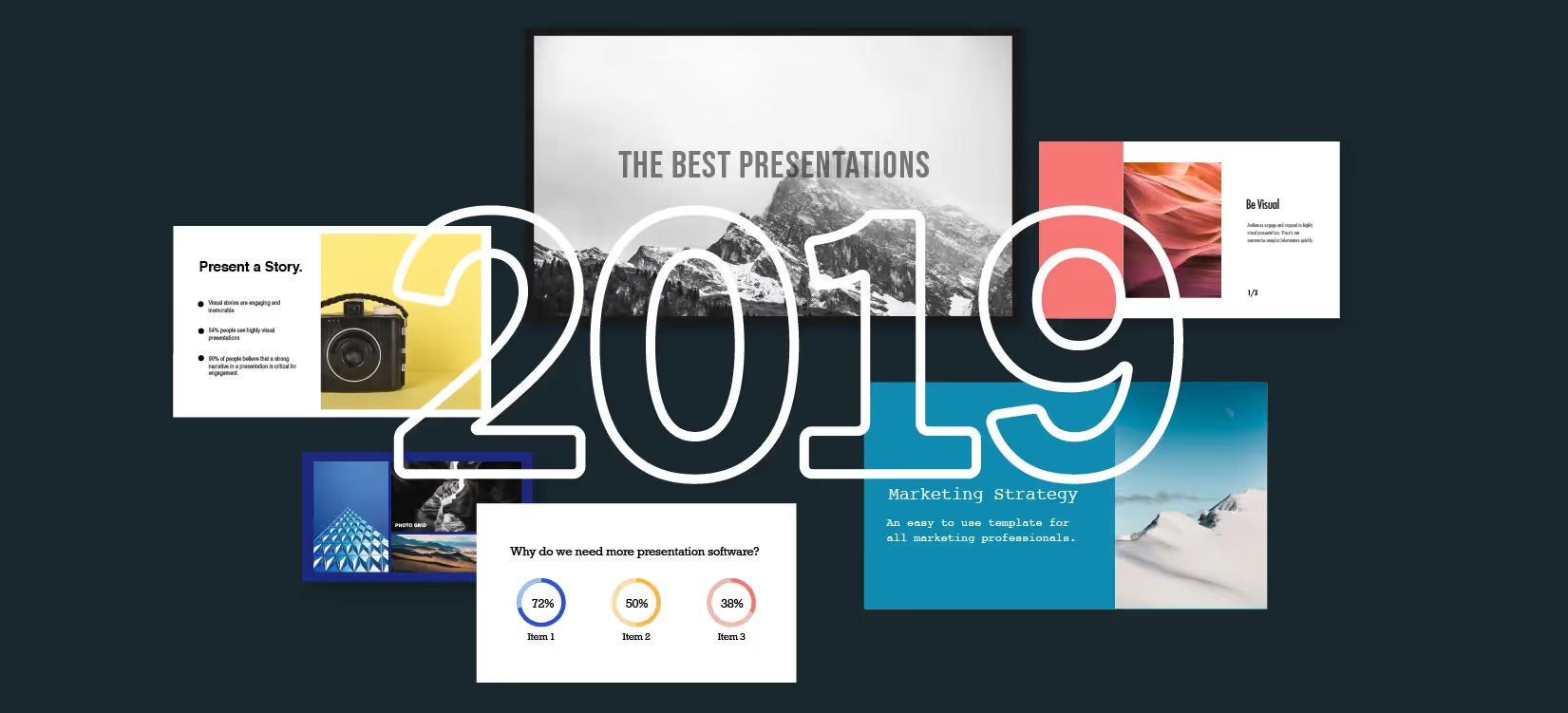
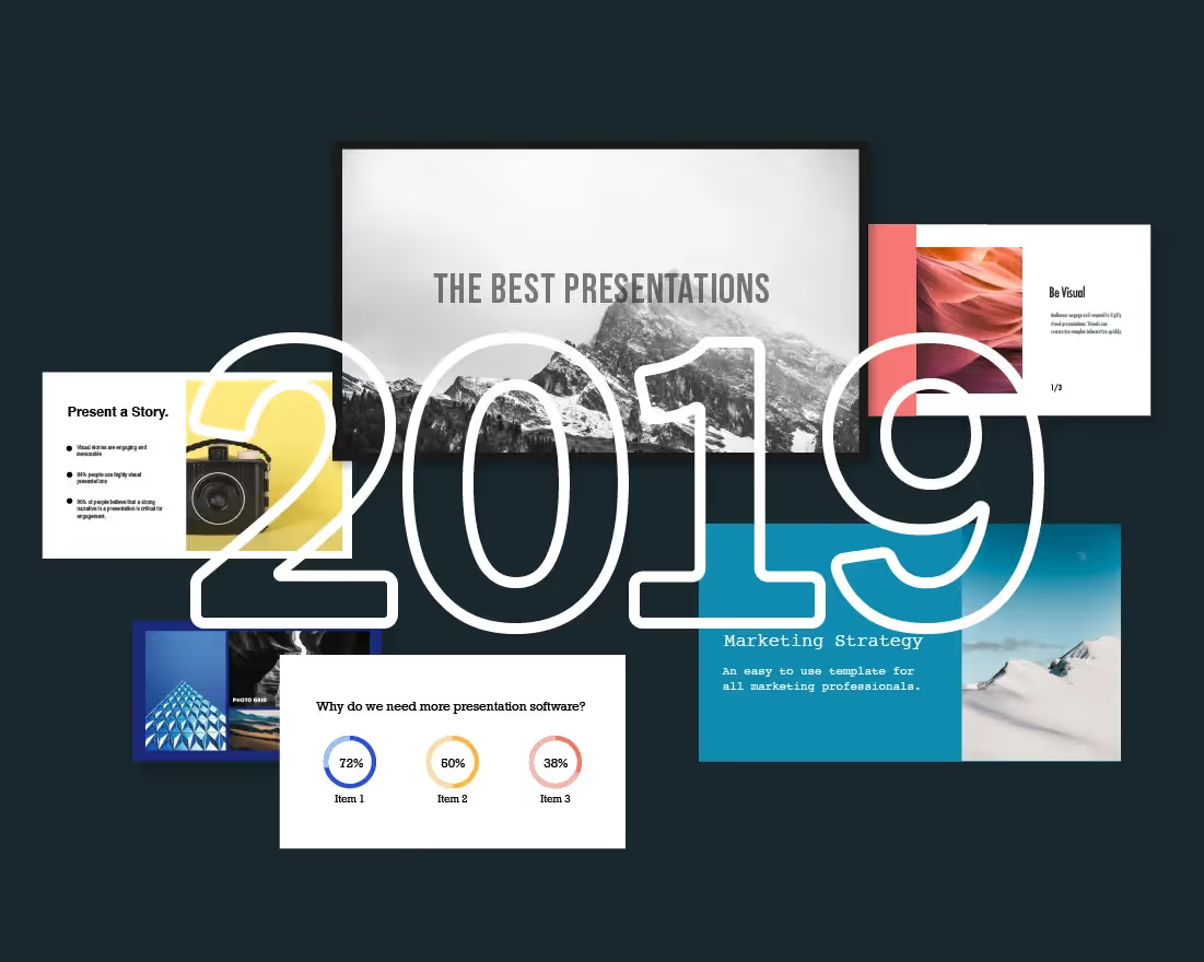
Without further ado, here is a round-up of the best and worst of presentations in 2019.
2019 Had Some Really Great Presentations
1. Srinivas Rao and The Unmistakable Creative — This year, Srinivas Rao, the popular author, host of the podcast, The Unmistakable Creative, and constant (and accomplished) keynote speaker shared his presentation hack with us. You guessed it: Beautiful.ai’s Smart Slides. In fact, he created his own Unmistakable Creative media kit in Beautiful.ai. Srinivas says, “Everyone said the media kit was breathtaking. Beautiful.ai is leaps and bounds better than the other products. I’ve even done online courses and slides in Beautiful.ai. It’s instinctive, it’s fast, and it’s nearly impossible to make a presentation hideous.” We do have to admit, his presentation style (and deck) is pretty impressive, earning a spot on our best of 2019 list.
2. Siqi Chen on Presentations — Siqi Chen, investor and CEO of Sandbox VR, knows presentations. He’s likely given and received his fair share of Pitch Decks. And while Pitch Decks are great (and wildly important for entrepreneurs), our favorite presentation from Siqi Chen is his presentation on presentations. Yep, you read that right. This year he created a 58-slide presentation sharing everything he knows about crushing presentations. It was great. He talks about the importance of storytelling, and how to provoke action from a presentation. It’s helpful to presenters of all levels, and visually appealing, which counts as a win in our book.
3. Meghan Markle in Cape Town, South Africa — It’s no secret that Meghan Markle, Duchess of Sussex, steals hearts worldwide every time she takes the podium. In fact, her speeches always seem to go viral from unwavering fans. But what makes her speeches so royally good? Sure, what you have to say matters, but how you say it (and how well you connect with your audience) matters more. Meghan Markle isn’t afraid to get personal, she embraces local cultures and languages, and always makes eye contact with a smile on her face. Earlier this year she gave a heartfelt speech at a charity event in Cape Town, South Africa where she said. “I’m here as a member of the royal family, and as a wife, a mother, a woman of color. As your sister.” The crowd (and internet) melted.
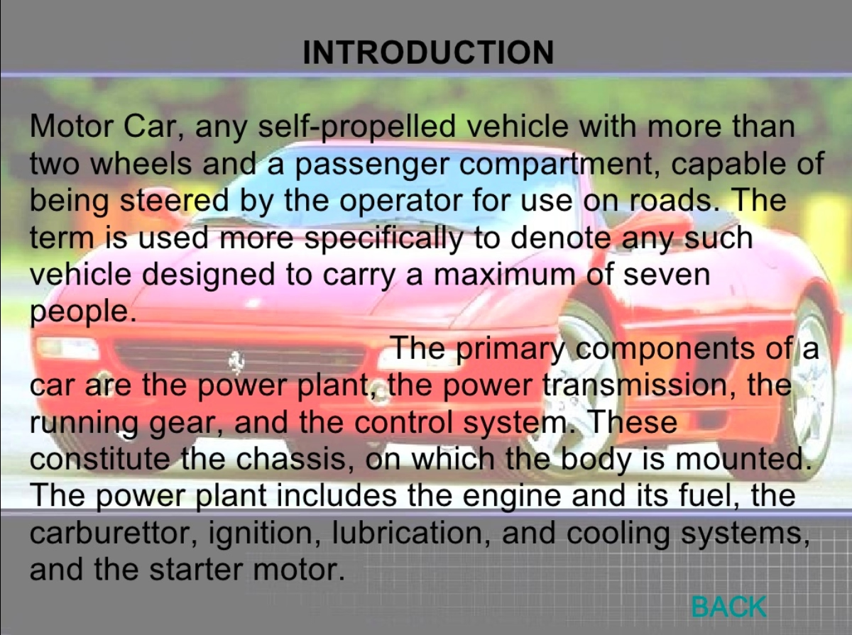
And, Some Really Bad Ones, Too
1. Car and Technology — Okay, we have to admit, this presentation deck technically isn’t from 2019, but we discovered it in 2019, so that counts right? It’s the perfect example of what not to do, so we had to include it. This entire presentation screams “fail” from the lengthy paragraphs to the questionable image placements. Luckily, it’s virtually impossible to create a presentation this ugly in Beautiful.ai.
2. Kshivets O. Lung Cancer Surgery — Again, not a 2019 design, but cringe-worthy nonetheless. We’ll give these slides the benefit of the doubt considering they were created nearly 10 years ago, but all of the graphs and charts are a disaster. Your audience should be able to digest your data without getting a migraine, so overly-complicated charts are a no for us. And this presentation is nothing but complicated.

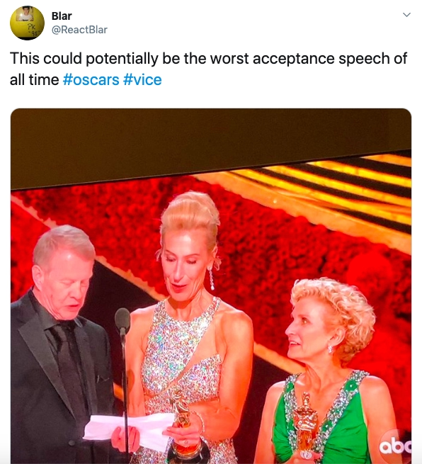
3. The Oscars Acceptance Speech — True, not a traditional presentation, but this acceptance speech has been pegged as one of the worst of all time. Why? When Greg Cannom, Kate Biscoe, and Patricia Dehaney-Le May accepted their award for the film Vice they took turns reading their speech off of a notecard. This sounds awkward, right? It gets worse. At one point, they got confused where one left off and where the other was supposed to pick up and as a result the speech got all jumbled. The key takeaways from this? Don’t read straight off of a card (or presentation slide), and don’t pass the microphone every other word.
All that to say, a lot has changed since 1987, including presentation software and stale public speaking styles. PowerPoint is so 2000 late. What looked good then certainly doesn’t look good now, and it shows. Kate McKinnon said it best on Saturday Night Live— in our favorite skit of the year— when she poked fun at PowerPoint’s pain points.
Cheers to another year of presentations, we’re excited to see what 2020 will bring.


.avif)
