
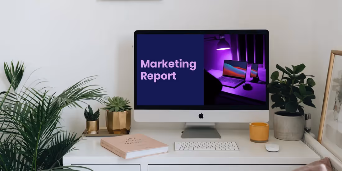

Virtual storytelling is a practice that is present in nearly every business. From coordinators to C-suite executives, presentations are a crucial part of most professional’s workflows. It's a skill that is often overlooked, but widely appreciated in the workplace. There are countless team meetings, employee onboardings, and campaign or budget proposals that warrant presentations. But just because a presentation is designed for internal use doesn’t make it any less important.
Many companies will have brand standards in place for both external and internal communications, which extends to presentations. This encompasses everything from fonts and colors to the story you're telling. As leaders, it’s an executives responsibility to put those standards and expectations in place for their team.
We caught up with five chief marketing officers (CMOs) to pick their brains on top tips for their team’s internal presentations.
Let’s meet the experts: Colby Zintl, CMO, Common Sense Media; Daniel Goldberg, CMO, Loka; Paul Baumgarthuber, CMO, LaserAway; Sally Frykman, CMO, Velodyne Lidar, Inc; Eric Quanstrom, CMO, CIENCE Technologies.
With their extensive backgrounds in marketing, branding, and communications, each chief marketing officer brought different insights and pieces of advice that you can apply to your next presentation. Here’s what they said.
Find a strong story
Storytelling is the backbone of presentations. Many times, avid presenters will recommend you start with your story before you even open up a presentation slide. Not only does this help you develop a strong narrative with the most meaningful information, it helps you avoid overly-cluttered slides.
Daniel Goldberg says, “When our team is creating a presentation, I recommend they start with a brain dump then find the storyline. You need to get all the info out in front of you to see the richest, and most unexpected, connections. That's how you beautiful-mind it. Then make sure you can explain each of your main points to a 5th grader. What metaphors will you use? What anecdotes will you add to make the idea relatable and real?! Stories stick in your mind long after numbers fade. Go back through the presentation as many times as you need to make your points as visual and impactful as possible.”
Colby Zintl adds to the importance of your story landing with your audience, “If someone picked up this presentation randomly, off the printer, and read it, would it make sense? Make sure your presentation can also work as a "leave behind" - as easy to understand when presented, as it is 2 weeks later.”
Nailing the story internally is important, too. Eric Quanstrom says, “My top areas of focus for internal presentations align with two of our core values here at CIENCE -- Namely Transparency and Data-Driven Decision Making. We prioritize both in our all-hands meetings from management to our 1K+ employees so that they can understand the context + reasons (especially data) around decisions that are made.”
Maintain visual consistency
Regardless of whether your presentation is client-facing, or internal, consistency and brand standards should be at the forefront of your design. That visual consistency is what helps each deck maintain its professionalism.
“It is important that every element from fonts to photos, remains on-brand and to standards,” Paul Baumgarthuber emphasizes. Not only does this keep internal communications on track, it raises the standard for external decks.
“Inconsistency is a presentation killer, whether that's inconsistency among different presentations (from the same org) or worse, inconsistency within a single presentation.” Zintl says, “Create a brand style guide, with approved colors, images, font, and presentation style, and automatically your presentation goes from amateur to polished.”
Sally Frykman’s team has to ensure that everything remains consistent worldwide. “As a global company, it is critical that the branding for Velodyne’s internal and external presentations match across each region. When I first arrived at Velodyne, this was not the case! It took a lot of time and energy to develop a deck and educate our employees on how to use it. Fortunately, it was well worth it. Everyone is now on board and using the same presentation, which is key for branding and professionalism,” she explains about their process.
Templatize for efficiency
In any business, time is money. And by automating repetitive tasks you can give time back to your employees to focus on other projects. Beautiful.ai’s Smart Slides help take on the burden of deck creation to automate more mundane design tasks like aligning text boxes and resizing images. It’s something that has saved many organizations and teams up to 50% of their time. Even more, templatizing team slides can help simplify internal presentations by giving non-designers a solid starting point.
Baumgarthuber’s top tip for presentations? “Templates templates templates - but make it stylish. Memorize Pantones, hex values, and save character styles,” he says. Creating branded presentation themes allows your team to set it and forget it when it comes to fonts, logos, and colors so that they don’t have to manually tinker with them on each new slide.
“In order to keep everyone on brand, we created a template that follows our brand standards and contains an easy-to-use library of elements. We have resources available such as corporate slides, pre-made slides for content population, approved images, video, icons and logo variations. We update our presentations regularly to reflect changes, product launches or company announcements. My team has done company-wide trainings on presentations and are a great resource for employees who need support,” Frykman says.
Goldberg adds that it's important that their team has simple, rinse and repeat brand standards in place so that they don't ask a lot from them design-wise. A presentation software— like Beautiful.ai— gives teams the guardrails they need to stay visually consistent from client pitches to all-hands meetings.
Make it easily digestible
You can have a killer story, but if it’s not easy to digest by your audience you will lose them. To avoid this, your slides should be meaningful and clean. A good rule of thumb when designing your slide is less is more. Can your audience easily distinguish what the main point of each slide is? If not, you need to rethink how you’re structuring your story.
Frykman says, “Presentations are successful when they are easily digested by audiences. This means that presentations should look clean, concise and be aesthetically pleasing. There are a few easy ways to make sure that happens.” Her tips for clean, professional slides are; 1) use copy sparingly to convey main points (speak to the slide instead), 2) use images that are in focus and engaging, and ensure that the slide is not too busy, 3) use the company template and do not go rogue.
She adds that a great way to check if your presentation is effective is to review it with a colleague. “I have fantastic members of my team who are highly skilled in design, digital media and communications. I encourage everyone at Velodyne to come to my team for support with their presentation development.”


.avif)
.avif)
