
We’ve all been there: staring mindlessly at a presentation that we need to get through for school or work. Oftentimes, if there’s an overwhelming amount of text, people will lose interest and resort to skimming instead of actually reading the information in front of them. In fact, studies show that people between the ages of 15 and 44 spend less than 10 minutes a day reading. With that in mind, we can’t expect people to spend 20 minutes reading through your overcrowded slides.
People often claim that you forget as fast as you read. It’s no wonder why avid presenters aim to keep their slides clean and concise to encourage better engagement and retention. One style of writing that helps people say more with less are bullet points.
Bullet points are sentences or paragraphs broken down into short little chunks of scannable content. They’re like Sparknotes for an overarching idea or thought. Many people will use them to relay key information to teams or partners more effectively. However, that’s not to say bullet points are the answer to your presentation problems. There is a right and wrong way to do bullet points.
Here are six things to keep in mind when writing bullet points to ensure your team is following along and reading what you’re presenting to them.
Dodge the unnecessary bullet(s)
Normally we’d tell you to avoid text-heavy slides at all costs, but we recognize that some presentations warrant bullet points. The important thing to note is that less is more, and just because you’re using bullets doesn’t mean you need to use 10 on one slide. Keep your bullet points to a minimum so that your team can focus on what they’re seeing on each slide without feeling overwhelmed.
Make them into mini headlines
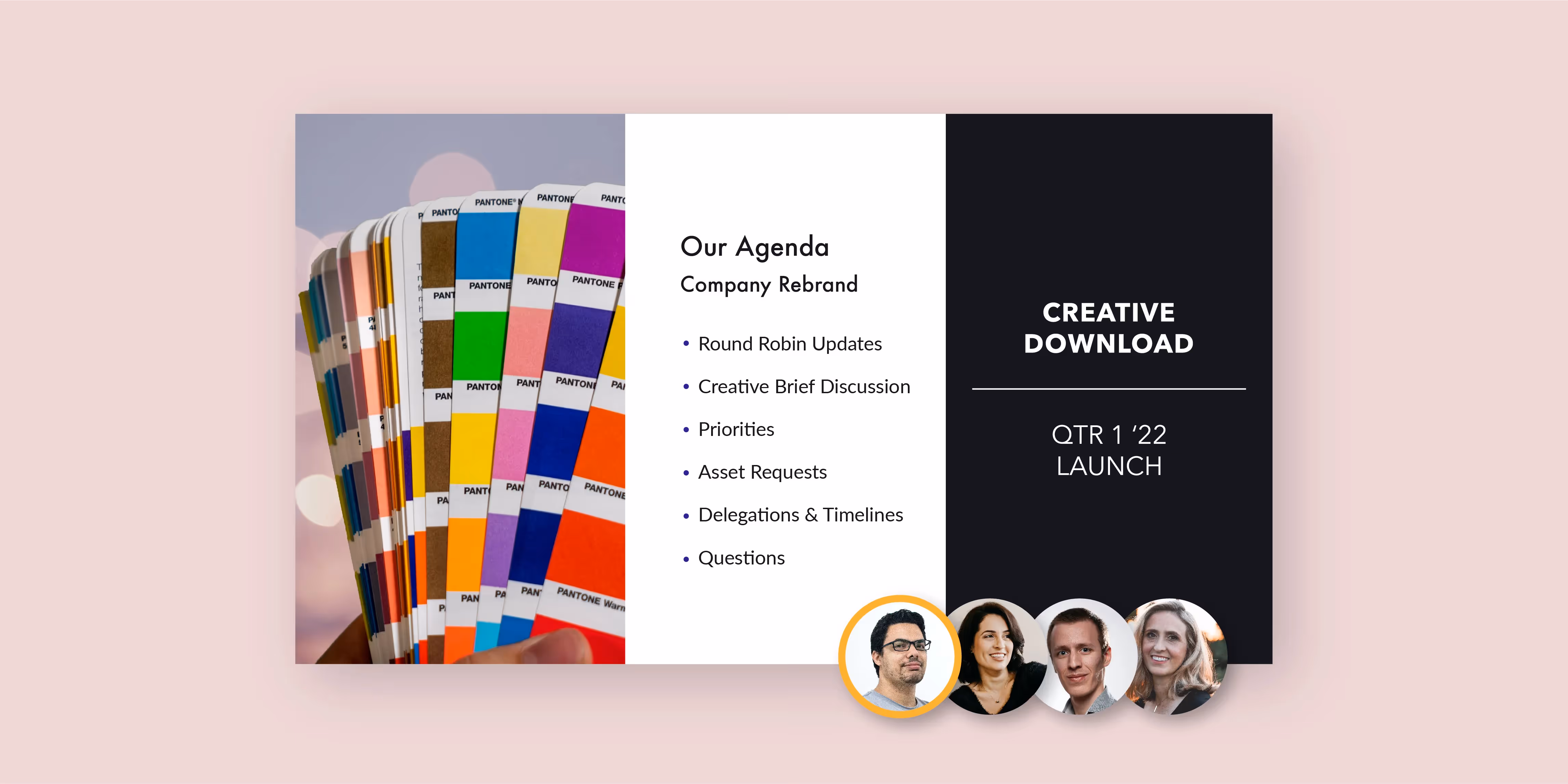
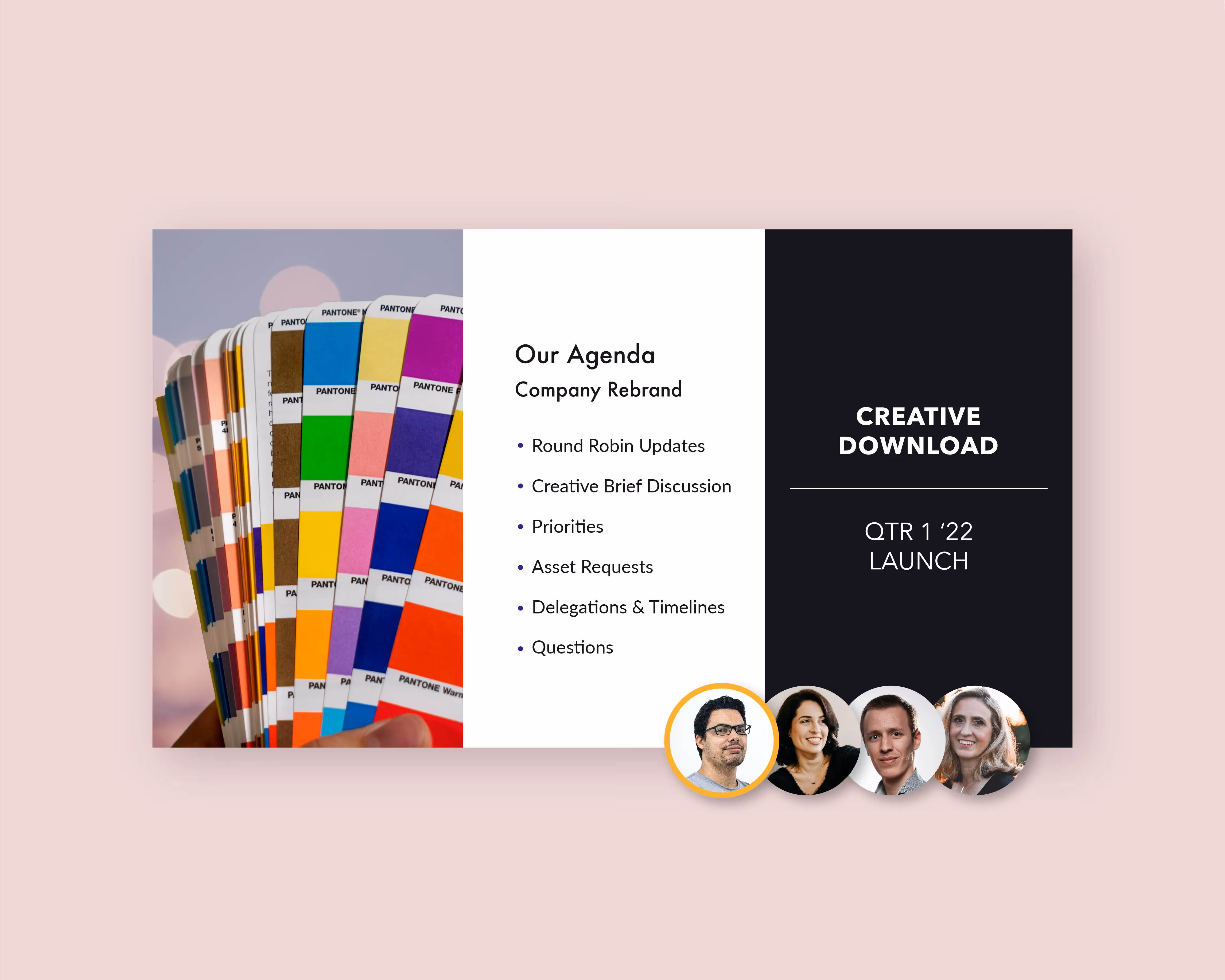
Think of your bullet points as miniature headlines, as opposed to full sentences. The bulleted points should be the main takeaways, while you verbally call out any additional annotations or supporting facts as you run through your presentation. The goal of bullet points is to have your audience pick up on the key takeaways almost immediately. If your team is confused by the objective of the slide, you’re doing it wrong.
The order of your bullets can tell a story in itself
The flow of your bullet points alone should tell a story. Whether they’re in chronological order or each bullet supports the one preceding it, the order in which you arrange them matters. Be intentional with how you format your bullet points, and make sure it supports your overarching message so that your team can follow along seamlessly.
Bring them to life with animations
Even with the most interesting content, you’ll still lose a handful of team members to boredom or disinterest. Our suggestion to rein them back in? Animations. By adding even the most subtle animations on your slides it brings your content to life, catching their eye, and reengaging them with your presentation.
In Beautiful.ai you can pick the speed and transition style of how your bullet points build on the screen as you advance. This helps your team focus on each individual bullet until you’re ready to move on to the next one.
Add supporting visuals
When people are bogged down with information, supporting visuals can help break up the blocks of text to make things more digestible. You might add a beautiful image or graphic on the right side of your bullet points to help make it more visually appealing. Similarly, you can select a slide template like Icons with Text and use a supporting visual to mark the start of each bullet instead of a simple dot. Even just the smallest visual will help your team retain what was on the slide better than if it were just plain text.
Keep things symmetrical
While this isn’t going to make (or break) your slide, you should keep symmetry in mind when creating your bullet points. If one bullet is 10 words, and the next is 30, you’re going to have a jumbled mess. As a good rule of thumb, you should try to keep each bullet point to the same length so that it’s a cleaner design and easier to follow along.
By using our Beautiful.ai Bullet Smart Slide template, you can keep your design in check without bugging your marketing team. Our design AI will tell you when you've added too much text so that your slide always looks professional and proportionate.


.avif)