Whatever happened to the floppy disc? Could Dropbox have had any role in its demise?
Can you believe it’s been 13 years since Dropbox made its debut as a startup at the 2007 Y Combinator Demo Day? The cloud storage company has become such a key part of daily lives— and it’s inspired so many similar companies and products— that it’s almost as if Dropbox has been around as long as the internet. Okay, we’ll admit, that’s a bit of a stretch— but their launch was significant in the tech industry.
With Dropbox, users were finally able to sync files from their desktop programs to the web, back up their files without a disc or flash drive, gain access to those files from anywhere with an internet connection, and easily share files between users without resorting to a lengthy email chain full of attachments. All of which was revolutionary for 2007 technology.
The 2007 Dropbox pitch earned the company $1.2 million in seed funding. Since then, Dropbox’s meteoric rise to the top of the tech world was made possible by even more investments until 2018 when Dropbox became the first Y Combinator company to go public. Still, like many other young tech companies, it all started with a pitch deck.
How did Dropbox convince investors to ante up that all-important seed money in 2007? Obviously, the then-startup did something right, but could it have retained an even greater investment with a professionally designed pitch deck?
What did Dropbox get right with its pitch deck, and what could it have done better? Would it have impressed even more investors if its design relied on some of the best practices recommended by professional designers? Would Dropbox have risen quicker if its pitch deck was “beautiful?”
Take a look at our Dropbox pitch deck redesign and let us know what you think.
First, let’s break down the basics. We started out our redesign by choosing a universal theme for all slides, which saved us time because we didn’t have to create each slide from a blank canvas. We chose a custom color palette utilizing colors featured in Dropbox’s logo, as well as complementary colors for contrast. We also tailored the theme with consistent background colors and styles for each slide. We even set a cohesive font profile for our presentation, choosing the same font in different sizes for our headers, titles and body text.
The cherry on top? We were able to search for the Dropbox logo using Beautiful.ai’s logo search tool, and we applied the logo to automatically appear as a footer in the bottom right corner of each slide we created.
Now let’s dive in.
Download the free, customizable Dropbox pitch deck here
Slide 1: Title Page
Every pitch deck begins with a title page. While the original Dropbox presentation featured a title page with the company’s logo and web address, we spiced our version up with an animation.
.webp)
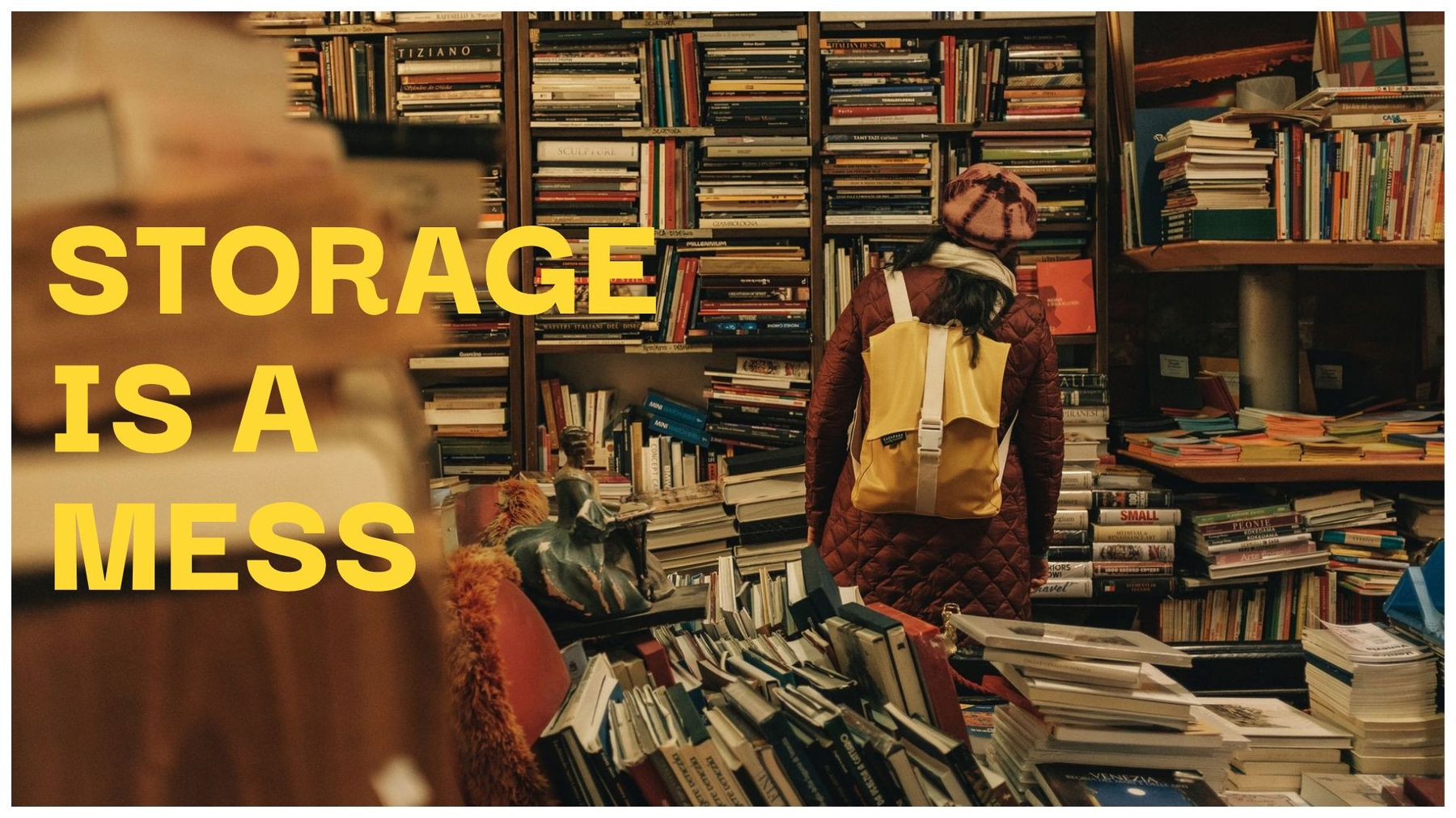
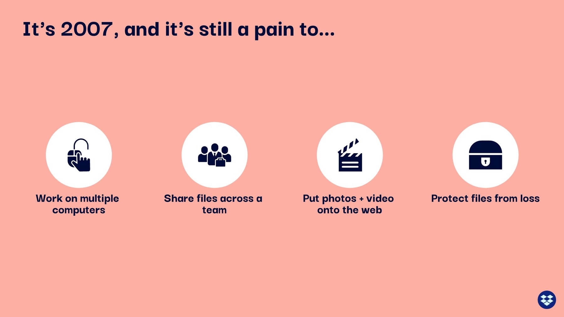
Slide 2-3: The Problem
The second Dropbox slide introduced the problem the product would solve: Storage is a mess. While there was nothing wrong with the original, per se, we livened it up by expanding the “mess” image to the full slide and placing the slide’s title over the top of it.
Dropbox further explained the problem on a second slide, and we followed suit in our redesign. Why was storage such a mess in 2007? Dropbox gave four reasons, and while we didn’t feel any reason to change them, (we think) we’ve presented them in a better fashion. Instead of just another boring bulleted list, we listed each of the reasons with a corresponding icon.
Slide 4: 2007-Era Solutions
So, what were people doing to address storage issues in 2007? The answer is featured in the next slide. Again, we replaced Dropbox’s original— and boring— bulleted list with a series of icons that describe each option.
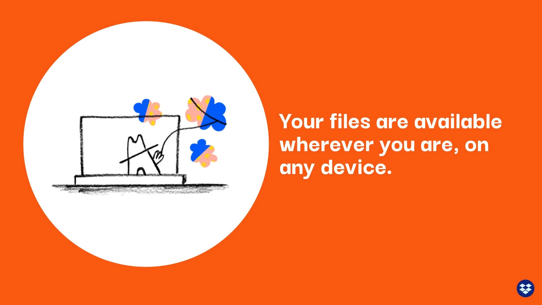
Slide 5-6: The Solution
The original Dropbox pitch deck featured a slide describing storage opportunities “in a perfect world.” We livened up the presentation by splitting this into two slides. We created one with the heading atop a full bleed image from Beautiful.ai’s easily-searchable library of free stock images.
Then, we used a carousel design to replace another infamous bulleted list. With the carousel, each list item appears after another on the same slide, so we only had to apply the image and color scheme once, and each bullet point receives its own emphasis.

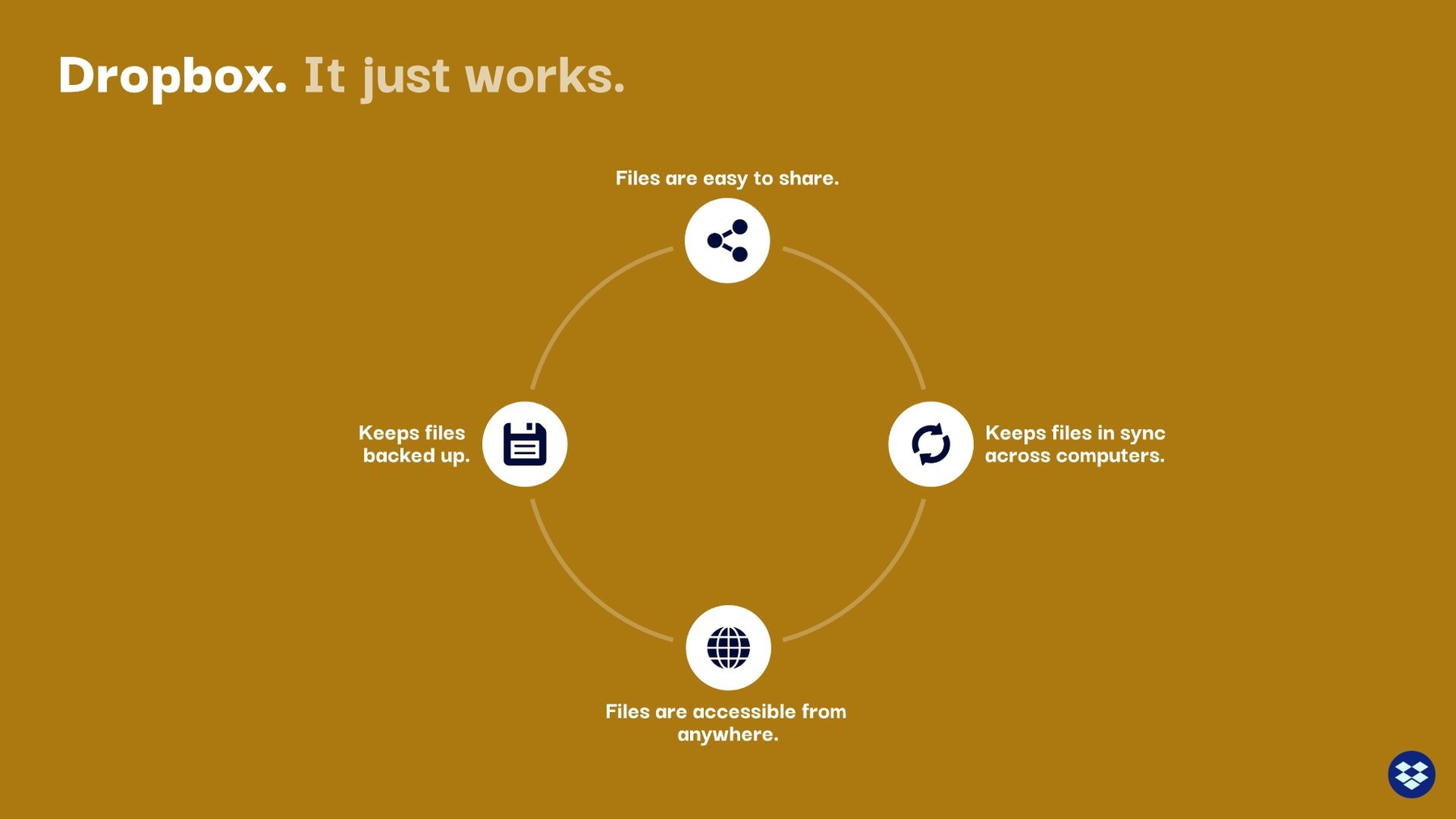
Slide 7: Dropbox Works
How does Dropbox work? The answers made up the content of the next slide in the original Dropbox pitch deck. While the team at Dropbox created yet another bulleted list (yawn), we were able to use Beautiful.ai to create a cycle diagram to show the process. Each of the bulleted items from the original slide were transferred to the diagram, along with corresponding icons.
Slide 8: Dropbox Video
The original Dropbox pitch deck was unique in that it featured a product demonstration video among the slides— an excellent strategy to reach additional investors. But while the Dropbox team posted it as a demo, in which audience members can view the video on their personal computers, we embedded an actual video into our slide deck, so entire audiences can view it at the same time.
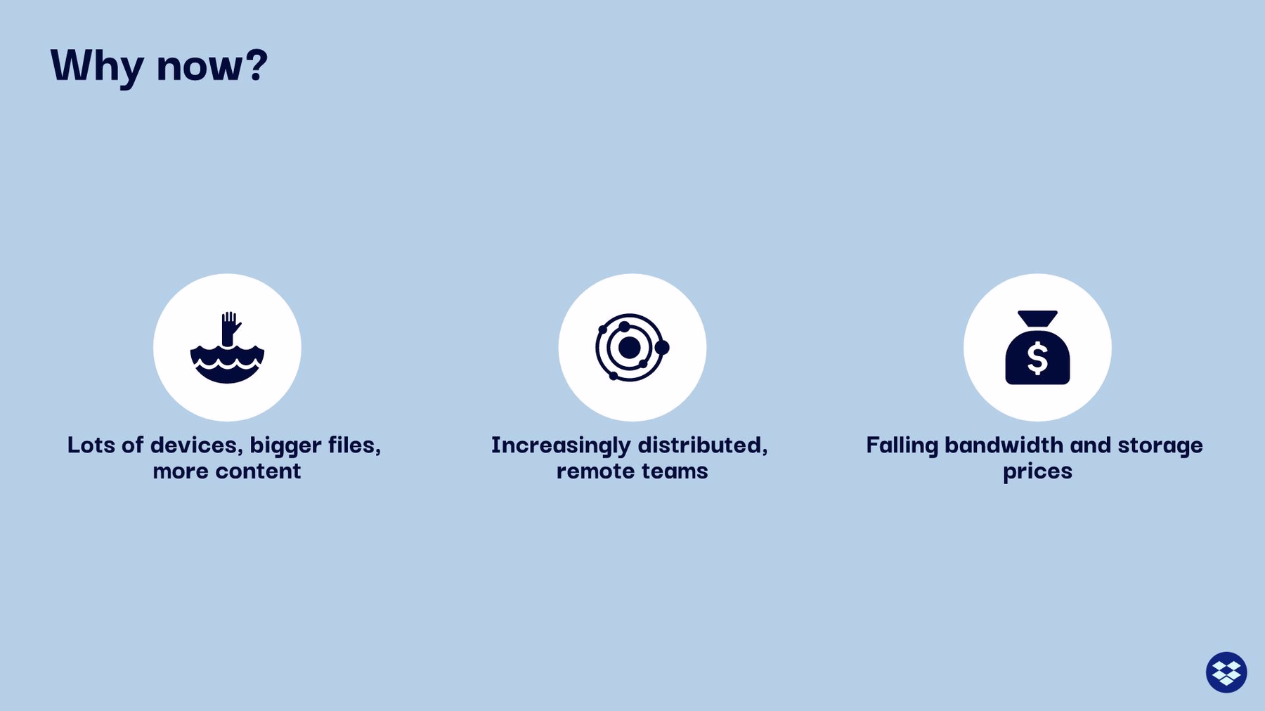
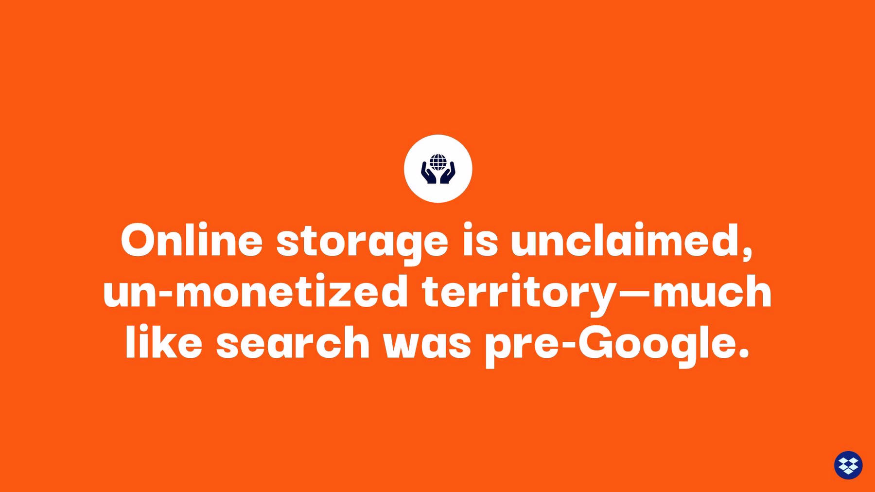
Slide 9-10: Why Now?
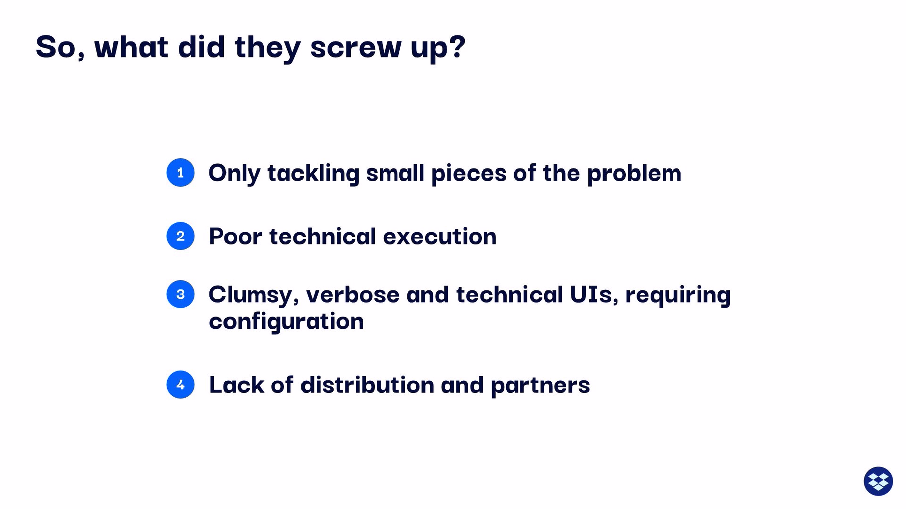
Timing is important in the release of any successful product. The Dropbox team believed they were launching their company at a pivotal time and explained why in the next slide. Unfortunately, they relied on the same boring bulleted list they used for the previous slides. It makes you wonder how many investors were asleep at this point of the presentation.
To liven up our redesign, we created two slides from the original single list. The first transforms the first three bullet points into another icon list. The last bullet point was so important, we felt it needed its very own slide for extra emphasis.
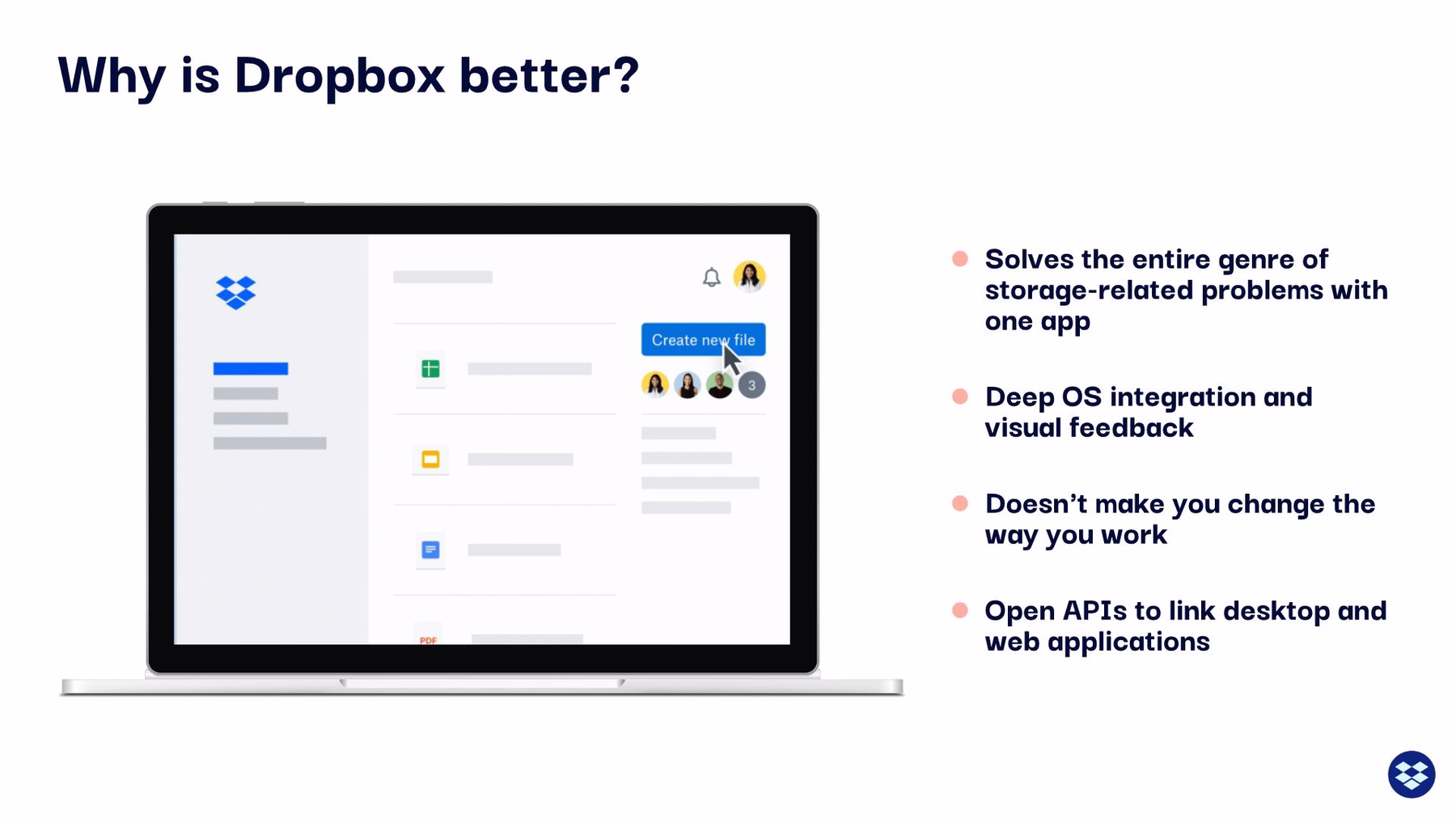
Slide 11: Why is Dropbox Better?
Any effective pitch deck will tell potential investors why the product is better than its competition. And— surprise, surprise— Dropbox delivered its explanation in yet another bulleted list. We also listed these reasons as a bulleted list, but our list is to the side of an animated image that is sure to refocus audiences on the subject at hand.
Slide 12: Product Comparison
The original Dropbox pitch deck effectively displayed how Dropbox compared to other products on the 2007 market by creating a basic chart. We easily recreated the chart using Beautiful.ai’s desktop screenshot slide with an accompanying list. The animated screengrab highlights Dropbox’s product, while the bullets explain why it’s a better option than the competition.

Slide 13-14: Competitor Errors
Of course, it’s not enough to simply input a side-by-side comparison of competitor product offerings. The Dropbox team also wanted investors to know what the competition lacked. You guessed it: bullet points. We recreated the slide with our table template, a more beautiful and cleaner alternative to a lengthy list.
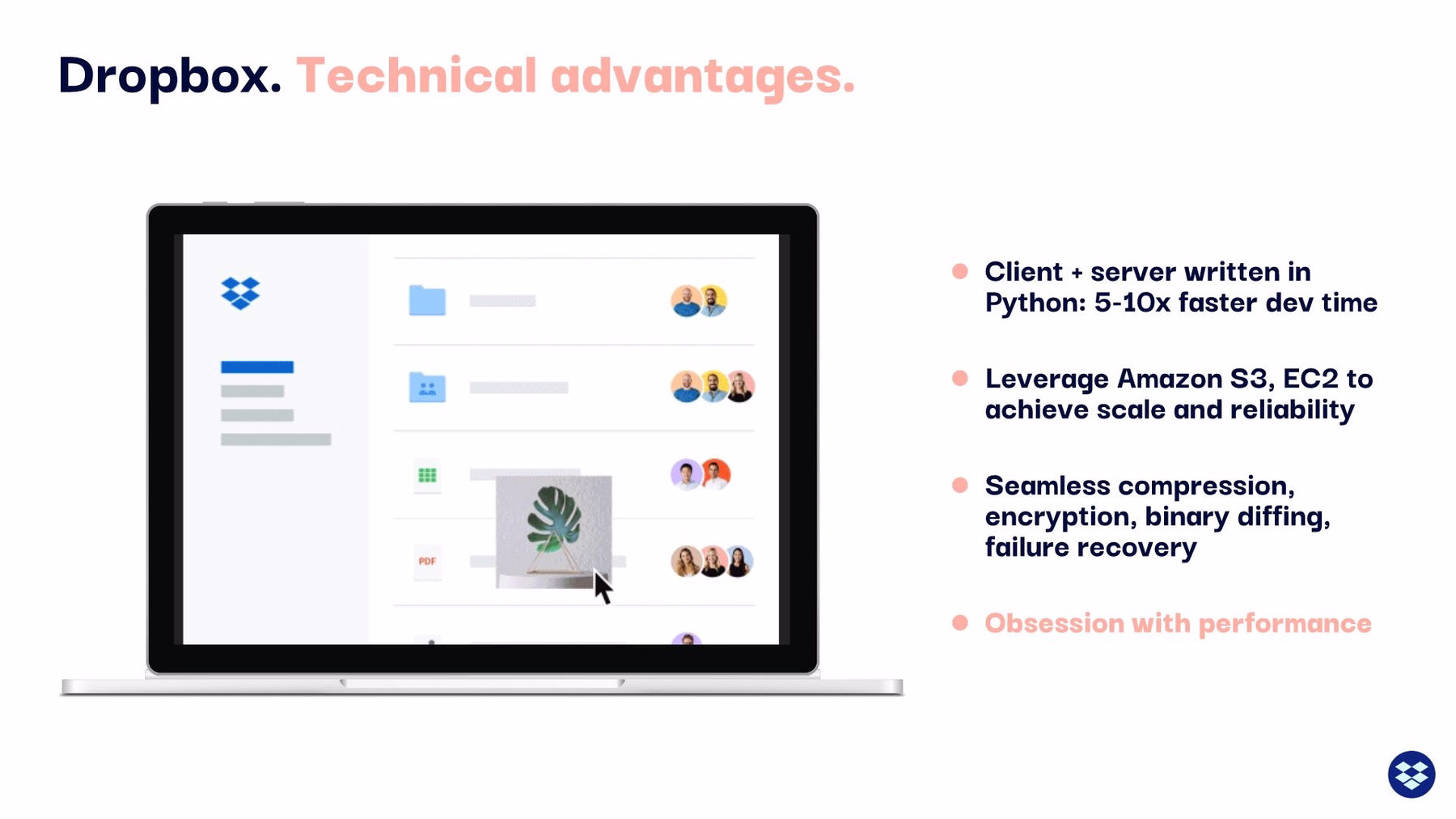
Slide 15: Technical Advantages
Technical advantages? There’s a bulleted list for that (cringe). We made our slide a lot more engaging by placing a colorful bulleted list aside an eye-catching animated image.
Slide 16: The Dropbox Team
Any effective pitch deck is going to introduce potential investors to the startup’s principal stakeholders. The original Dropbox pitch deck displayed a photo of the company’s CEO and CTO, along with a brief explanation of each of their backgrounds. We transformed this slide in our redesign, by placing more professional images of each executive atop a bold background color. Beautiful.ai’s team members slide template is the real MVP here.
.webp)
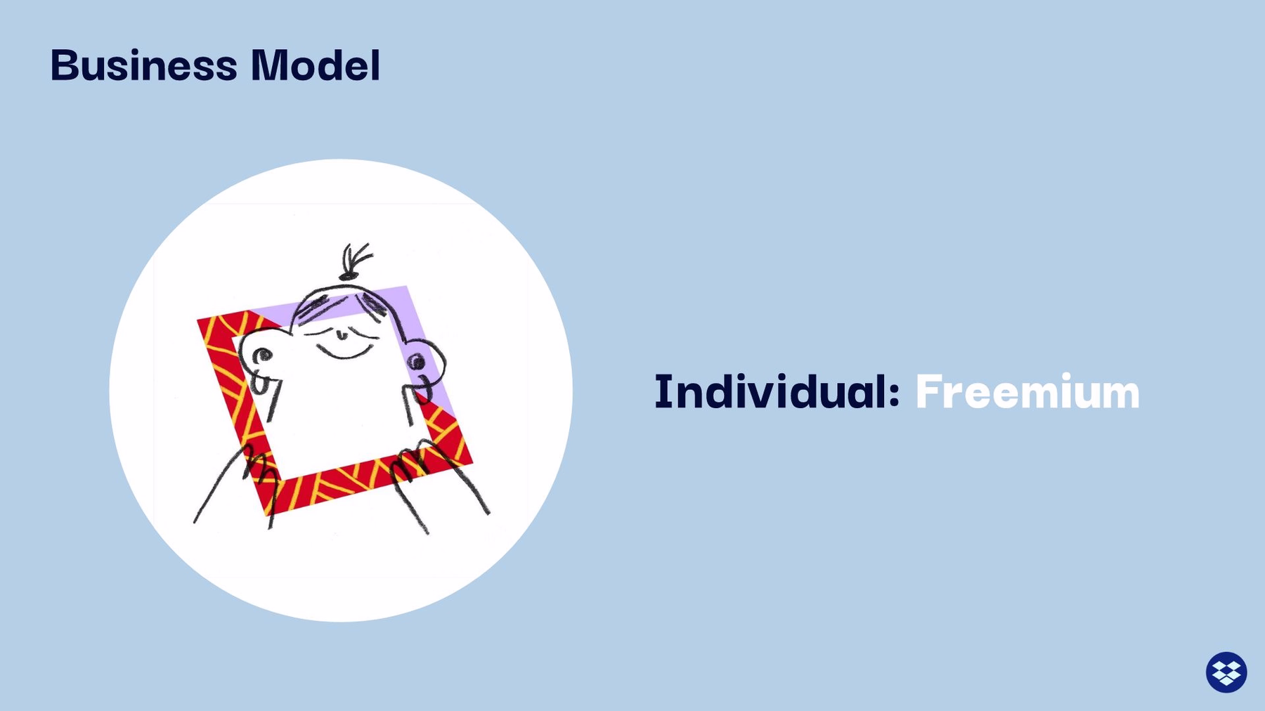
Slide 17: Business Model
An effective pitch deck also should explain the startup’s business model. How will it turn a profit? As expected, the Dropbox team accomplished this with the same bulleted list it used for so many other slides in the presentation.
We chose to redesign this slide with a carousel format, so that each item could be emphasized individually. We also chose separate corresponding images to correlate with each point in the carousel. Because we chose the carousel slide format, we were also able to incorporate the next slide in the original Dropbox pitch deck, as well, since it was the same topic as the previous slide.
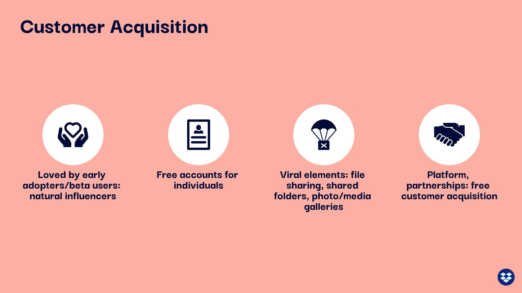
Slide 18: Customer Acquisition
Another vital piece of information in an effective pitch deck is an explanation of how the company will acquire customers. We traded their bullet points for a Beautiful.ai icon list with icons from our free icon library. It’s more a modern and effective design, in our opinion.
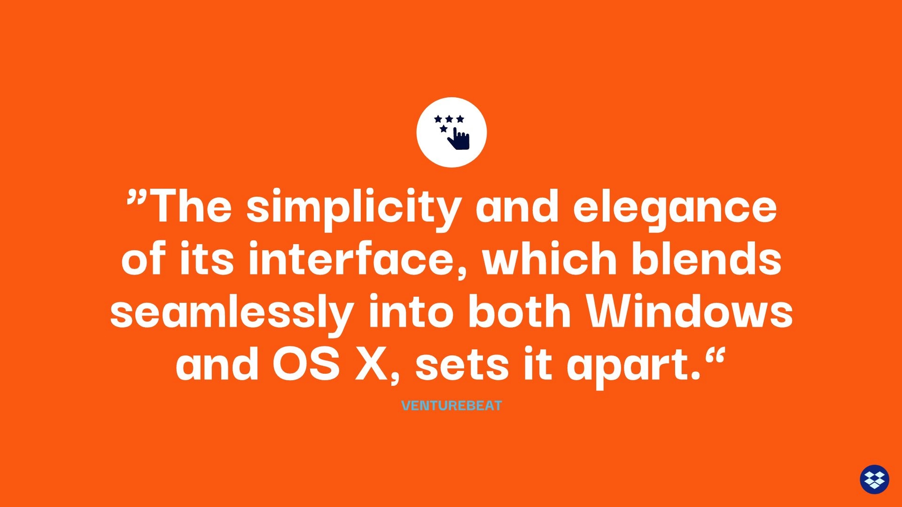
Slide 19: Dropbox Review
The next slide in Dropbox’s original pitch deck features a quote from Venture Beat. The problem is that it was displayed as simple text on a plain white background. Do you think potential investors were drawn to that slide? In our redesign we featured the same content, but we placed it over a bold background color, along with a corresponding icon.
Slide 20: Closing Logo
A closing slide can make or break a pitch deck. It allows for any additional comments or questions before the presentation officially ends. The original Dropbox pitch deck merely placed its logo atop the same boring white background used for all the previous slides in the presentation. We replaced it with an animated logo that continues to grab potential investors’ attention to the very end.

So, how do you think we did? Is our redesign of the original Dropbox pitch deck more likely to convince investors? Was it more “beautiful?”


.gif)