

Sorry, but there’s no nice way to say this: Bullet Slides are a cop-out.
In most PowerPoint and Keynote templates, the “Title and Bullets” layout is the path of least resistance. It shows up every time we click “New Slide,” so most of us just go with the flow and start loading up our slides with text. And while there may be cases where it makes sense to present a blank slide with five bullets (maybe you’re giving a presentation on the history of bullet points?), 95% of the time there is a much clearer, more compelling way to communicate your idea.
But you already know that. The real reason why we turn to the bullet slide is because we simply don’t have the time or resources to do anything else. It’s hard enough finding time to work on our presentations; the idea that we’re going to interrupt our flow to brainstorm, sketch, and design a better visual for every single one of our slides is wishful thinking, at best.
So abandoning the bullet slide is much easier said than done. You not only have to figure out what should replace it, but also how to design it. But it can be done.
For starters, you need to ask yourself why you settled for a bullet slide in the first place.
YOU: “I was making a list.”
OK, sure. But a list of what?
YOU: “Ideas” or “People” or “Things” or "Steps" or “Parts of a Whole”.
Ah, now we’re getting somewhere. Depending on how you answer this question, you begin to open yourself up to a bunch of new ways to present your information visually. And these visuals are not just slide dressing—they transform your presentation from a monotonous document into an experience that actually helps your audience internalize your message.
Here are just a few examples of what we mean. (BTW, all of these slides were converted from bullet slides in less than a minute using Beautiful.ai.)
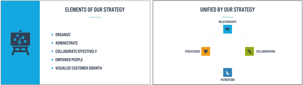
A "This and That" list falls into one of two categories. If everything on your list is equally important, then you may want to position your ideas next to one another—accompanied by icons or images—so that your audience can quickly scan the slide and take in the big ideas. But if the items in your list vary in importance, consider making that clear with a "list" that communicates the relationship between them—for example, you might use a Venn Diagram to illustrate to how items overlap and intersect.
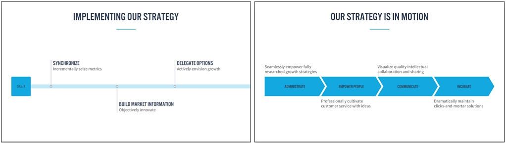
A "This, Then That" list is, by definition, a process. It has both a flow and a direction to it. So rather than laying out your ideas top-down, why not present them left-to-right so your audience can follow along? This unlocks a new set of visuals you can consider, from diagrams to timelines.
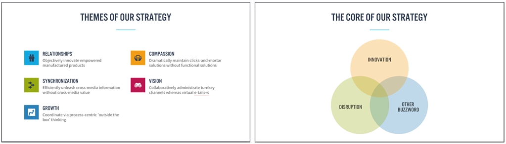
A "This About That" list includes items that all reference one central idea. For example, you might be listing the major cities within a country or the elements of a strategy. If you’re building a slide like this, consider introducing a visual—either a photo or an icon—that communicates the core idea and sets the context for your list. (And, if you'd like, you can even keep your bullets!)
Of course, knowing that there’s a more effective visual is only a quarter of the battle. With traditional presentation tools like PowerPoint and Keynote, you then have to build it. And while you may be able to shortcut the design with SmartArt or template libraries, chances are you’ll have to do a fair bit of design yourself. This means you’ll have to make decisions like:
- Where should I look for icons or photos?
- How many images or icons or chevrons can I fit in a row?
- How big should the body text be?
- When should I go from vertical icons to horizontal icons?
- Can I add a milestone to my timeline without having to redesign the whole thing?
In other words, all the work you did to clarify your message just created more work for you.
This is silly. You shouldn’t be punished for moving away from bullet slides; you should be rewarded. If you want to find an alternative, all you should have to do is ask.
More specifically, you should be able to see how your content looks in other templates with the click of a button. And once you choose one, you should be able to find the right icons in seconds, order and re-order your points instantly, and never have to worry about how your slide looks. (Oh, and if you want to go back to bullet points, that should be a click away, too.)
This is precisely why Beautiful.ai exists. We’ve spent most of our careers working on presentations—as designers, writers, and developers—and we’ve seen how the old software limits people by asking them to spend a disproportionate amount of time figuring out how to design slides rather than what they're trying to say and why it matters to their audience. If we can lessen that burden—while exposing you to new ideas in the process—then we think that we can help you be more efficient, more effective, and better at what you do.
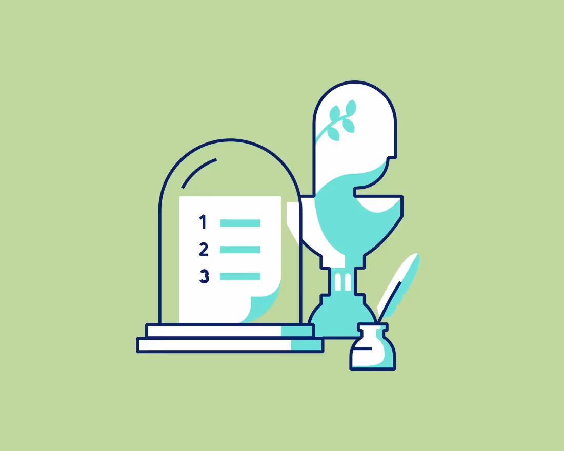
So let’s start by raising a glass to the Bullet Slide. You’ve served us well; now go enjoy retirement!


.gif)


.gif)
