


When you think of a presentation, what comes to mind? It’s probably either 1) the burden of creating a deck from scratch, 2) the content you’ll include, or 3) your fear of public speaking. While all three are valid concerns, presentation layout design is important to consider, too. Presentation layout is oftentimes overlooked, but it’s an important element of the presentation design process.
In this blog we’re talking about all things presentation layout; what it is, why it’s important, and quick tips to nail your layout design.
What does presentation layout mean?
Your presentation layout is essentially the anatomy of your presentation, and the format of each slide within the deck. It’s the way you’re structuring your story for your audience. Presentation layout emcompasses everything from image size and text placement, to chart selection and the order of slides.
When you don’t know where to take your presentation, templates are a great starting point to help with layouts. That said, you don’t have to let the templates limit your creativity. There are many different ways to customize each layout beyond the default settings. You can simply use them as a jumping off point to help organize your thoughts and create beautiful slides.
Why is presentation layout important?
We’ve talked about visual storytelling and it’s importance time and time again. Visual storytelling is the narrative told through the use of visual assets such as images, illustrations, graphics or charts, and video. Visual storytelling helps paint a better picture of your story, and really drive your point home. It’s important to your story because it’s how your audience will receive your content, and it affects how they will retain the information.
Presentation layout is the backbone of visual storytelling in your deck.
The majority of us are visual learners, so having information presented in a way that makes sense by way of infographics, charts, or images is significantly easier to comprehend than a cluttered block of text. It’s simple, really. If your layout is jumbled and messy, it’s going to be a lot harder to digest on the receiving end. Likewise, if you stick to clean, professional presentation layouts your audience will have an easier time following along.
It’s important to note that a bad layout can also result in a Frankendeck (and nobody has time for that), so nailing your presentation layout is critical to the overall success of your deck.
Layout tips
These simple tips can help you improve your presentation layout with little-to-no extra work.
Think outside the box
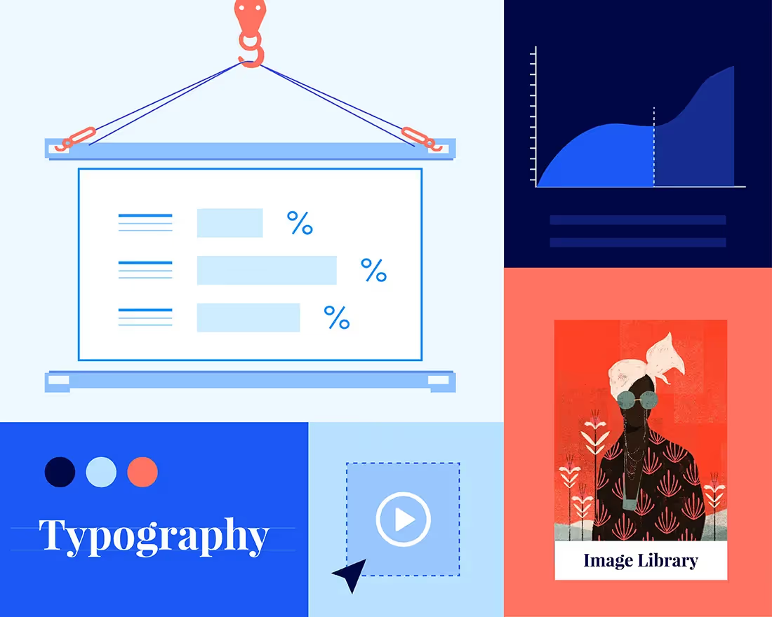
With Beautiful.ai’s inspiration gallery, the design informs the idea which helps you craft your story in a more thoughtful way. Our Smart Slides have guardrails to help prevent non-designers from making a mess of their slides. While those limitations might push some people outside of their comfort zone, we put those restrictions in place for a reason. It encourages more avid designers to be more creative and think outside the box. Our inspiration gallery might help users think of a certain chart or infographic in a new way, and as a result that might help them structure their story in a way that flows better for their audience. Try something new and see where it takes you!
Toggle between different formats
Our Smart Slide templates aren’t one-size-fits-all, and there are actually many different variations for each template. Fidgeting with the menus in our slides is low stakes because you can easily change anything back with the click of a button if you don’t like it. If you want to get creative, toggling between different formats is a good place to experiment without having to re-do any of your work. You can quickly try out a few variations to see what you like, and what fits your content best.
By selecting the “layout” dropdown, or clicking the tool wheel, you can unlock things like:
- Different bar styles, chart or graph layouts
- Labeling options (i.e. icons, fonts, numbers, percentages, etc.)
- A fit or fill option for your image ratio
- The ability to change the layout, or style, altogether
- And much more!
Less is more
While playing around with different layouts can be fun, and unlock your creativity, it comes with responsibility. It’s important to remember that less is more in the world of presentations, and things can get messy fast. When you’re laying out your presentation, lean into clean, modern design to keep things digestible, visually appealing and professional.
If you have an inevitably text-heavy slide, break it up by following with an image or infographic afterwards. Part of nailing your presentation layout includes knowing which slides to use, and when to use them. Does it have to be two bulleted slides, or can you say the same thing in one slide with an image and text, or with a simple chart? Do you have to use two chart slides back-to-back, or can you mix it up? These are all things to consider in the presentation layout. keyw


.avif)
