
.gif)
.gif)

The background of your presentation plays a crucial role in how your audience perceives your message. While it might not be something you notice, it will have one of two effects on your audience; 1) a distracting, unprofessional background might take away from the content of your presentation, or 2) an engaging and eye-catching design can help drive your message home. We’d be willing to bet that anyone creating a deck is hoping for the latter— an engaged audience who retains the information being presented to them.
In this blog post, we're diving into the importance of having the right background for your presentation and suggest some simple and effective design tips in Beautiful.ai that can take your slides to the next level.
Why do backgrounds matter in presentation design?
The background of your presentation is the canvas upon which you display your message. It sets the tone, creates a mood, and establishes context for your audience. A good background should complement your overarching message and make it easier to understand and remember. For example, if you're giving a presentation about a new product, a background that features the product's logo or colors can help create a brand identity. On the other hand, if you're presenting serious data, a plain and simple background that doesn't compete with the complex metrics can make it more digestible and easier to interpret. Choosing the right background in presentation design can be the difference between a presentation that lands well with your audience, and one that falls short.
Simple backgrounds that make a big impact
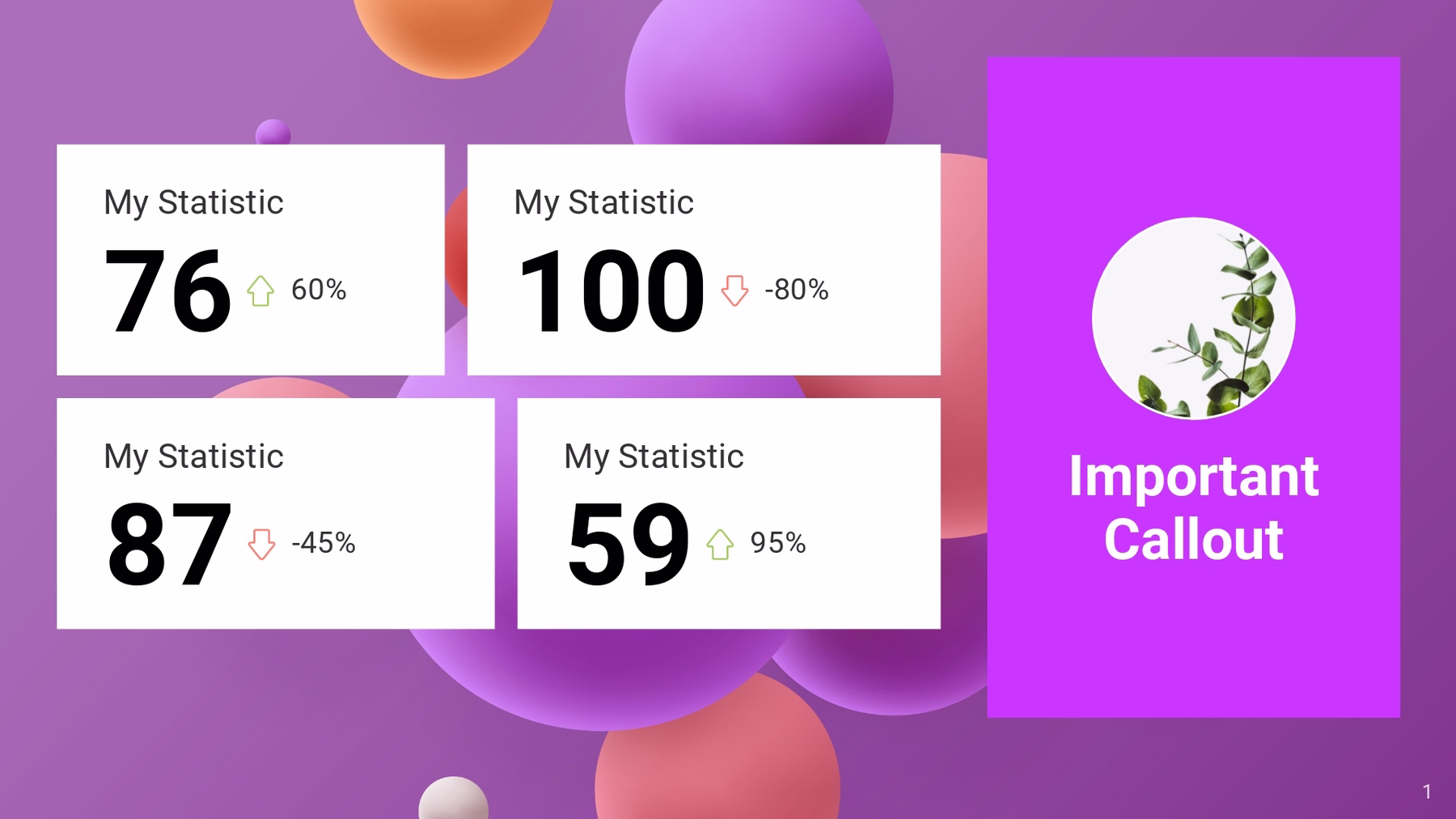
When it comes to choosing the right background for your presentation, less is more. Here are some simple, yet effective, backgrounds that will level up your content.
Solid color
A solid color background is a safe choice that will still make your presentation stand out. You can opt for a bright or contrasting color that complements your content or matches your branding guidelines. Don’t be afraid to mix-and-match. One slide might be white, while the next one warrants a bolder, darker color to emphasize the information on the screen.
Gradient colors
A gradient color background can add depth and dimension to your slides without overwhelming the content. You can choose from a wide range of gradients, such as shades of a single color, warm or cool color palettes, or even a custom color scheme that matches your brand’s theme. A gradient background looks put together and professional, without looking like you tried too hard.
Textured Backgrounds
A subtle or textured background, such as watercolor, geometric shapes, or patterns, can give your presentation an elevated touch. Choose a texture that matches the tone and context of your presentation.

Background images
Using a relevant image as a background can make your presentation more engaging and visually appealing. However, things can quickly take a turn to cluttered and distracting if you don’t choose the right photo. To ensure that the background image doesn’t overpower the content of your slide, you might choose one with one with ample negative space or lower the opacity for better legibility.

Best practices for choosing a background for your presentation
Now that you have some simple background ideas, here are some best practices for selecting the right background.
Keep it simple
The simpler, the better. Avoid busy or flashy backgrounds that could distract from your content.
Pay attention to contrast
It’s crucial to the success of your presentation that all text and graphics are legible against your background. Use contrasting colors or fonts to increase readability.
Choose a relevant background
Select a background that complements your content or message, and keep your company’s branding in mind.
Test it out
Before it’s time to get in front of a live audience, test out your background on different screens and sizes to ensure it looks good. There’s nothing worse than a pixelated background image, or a color that doesn’t translate well when being presented.
Adding a simple background in Beautiful.ai
Adding a background image or effect to your presentation is easy in Beautiful.ai. In your theme editor, select “more options” which will take you to more advanced controls. Under “colors” scroll down to the bottom where it says “background colors”, “background effects”, and gives you the option to upload background images— this is where you can play around with different design styles.
By doing this directly in your theme editor, it allows you to apply the changes to your entire deck so you can set it and forget it. This helps you maintain consistency across each slide so that your background design is cohesive and on brand, always.


.webp)


.avif)
