“The details are not the details. They make the design.” ~ famed designer and architect Charles Eames
The late Charles Eames, renowned 20th-century master of design and architecture, had a point when he said the details make the design. After all, a visual presentation is a sum of its parts. If designed strategically, however, an effective and cohesive design is transformed into more than a sum of its parts— it becomes a valuable entity all its own. Still, it all starts with the basic design elements and presentation rules.
Want to design an effective visual presentation that communicates your message and achieves your objectives? Be sure to remember the following seven basic rules for creating a presentation:
1. Speak to your audience
"Designing a presentation without an audience in mind is like writing a love letter and addressing it 'to whom it may concern." ~ Ken Haemer, former AT&T presentation research manager
Effective presentations aren’t one size fits all. To reach an audience, a presentation design should be catered to that audience. You wouldn’t reach a room of business executives in the same way you would communicate with a room of fourth-graders.
The audience should be considered in every design choice. What sort of humor would the audience respond to? What types of images would best catch its collective interest? What basic knowledge of the topic does the audience already know? Each of these considerations should impact how the message is communicated and how the presentation is designed.
2. Remember the 10/20/30 rule
“Think of your slides as billboards. When people drive, they only briefly take their eyes off their main focus, which is the road, to process a billboard of information. Similarly, your audience should focus intently on what you’re saying, looking only briefly at your slides when you display them.” ~ Nancy Duarte, author and CEO of Duarte, Inc.
It isn’t always easy for amateur designers to know the difference between principles of good design and what amounts to a hot mess. One of the more basic PowerPoint presentation rules is the 10/20/30 rule.
What is the 10/20/30 rule? It’s threefold yet simple:
- Use no more than 10 slides in your presentation.
- Present for no longer than 20 minutes.
- Use fonts no smaller than 30 points in your design.
While experienced presentation designers might veer away from this rule for certain slide decks, a beginning designer can follow the 10/20/30 rule to keep their audience interested, provide an appropriate amount of information and ensure their message clearly can be understood.
3. Customize your theme or branded style
“Design is the silent ambassador of your brand.” ~ Paul Rand, art director and corporate logo designer
Consistency and unity are vital aspects of an effective presentation. Every slide should look like it’s part of a package with specific typography and color palettes.
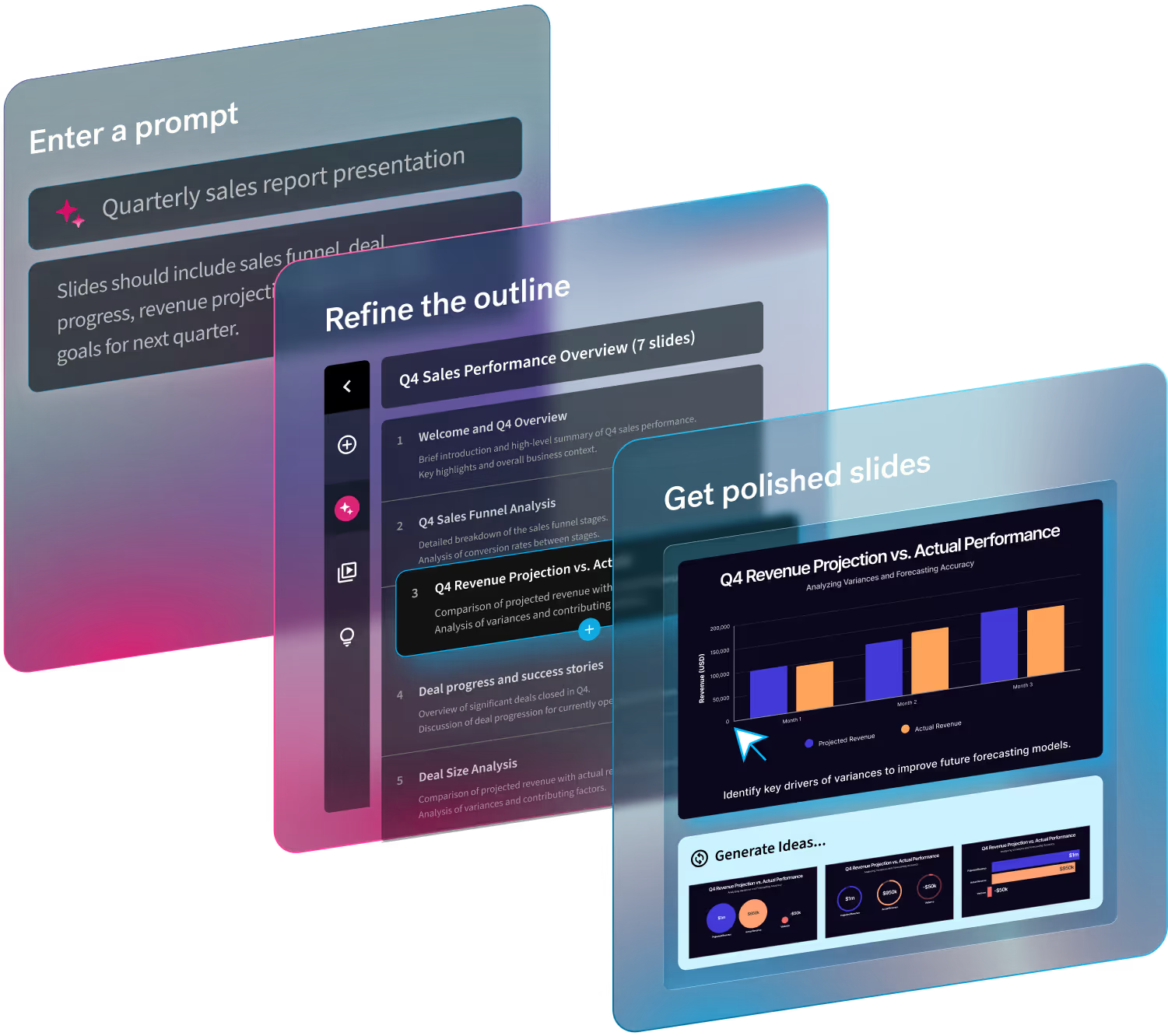
Presentation designers might spend hours customizing the details on each PowerPoint slide, or they can use a PowerPoint alternative presentation software like Beautiful.ai and create a custom theme that not only unifies the slides into a cohesive design, but also reflects a brand’s style guide.
4. Include high-quality assets
“There are three responses to a piece of design – yes, no, and WOW! Wow is the one to aim for.” ~ Milton Glaser, famed graphic designer
If a presentation design is a sum of its parts, then those parts must be of a premium caliber. High-quality presentations are made up of high-quality elements, including vivid photos, eye-catching videos and engaging infographics.
Beautiful.ai users can choose from a library of thousands of free stock photos, icons and logos. The cloud-based PowerPoint alternative presentation design software also makes it simple for users to add high-quality music and other audio tracks, as well as a variety of animations to bring presentations to life.
5. Illustrate your data
“I found I could say things with colors and shapes that I couldn’t say any other way,” ~ artist Georgia O’Keefe
Numbers rarely lie, but they also don’t always make a lot of sense to audiences. Nobody wants to sit through a presentation where they are inundated with so much data that they are either left confused or asleep.
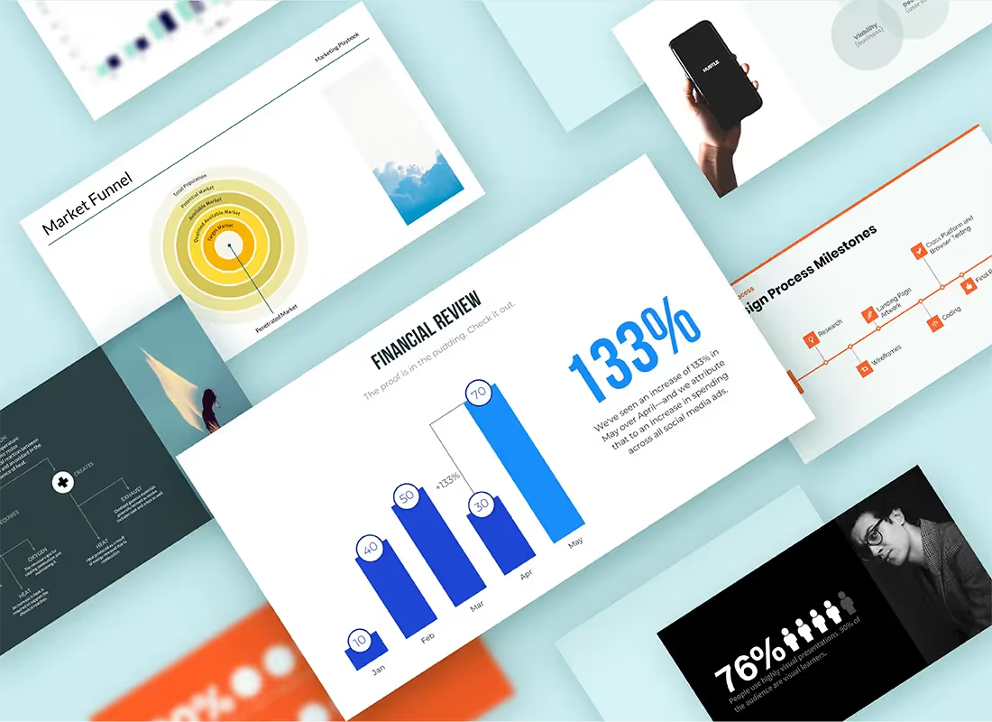
But when data is illustrated, its story begins to emerge. Considering 65% of people are visual learners, data visualizations like infographics are a vital element of an effective presentation.
Beautiful.ai users can create a plethora of various graphs, charts and infographics to illustrate any type of data. Just choose the best type of infographic among the smart slide templates, enter the numbers and watch as artificial intelligence designs colorful and informative data visualizations, including bar graphs, scattergraphs, pie charts and so many more, right before your eyes.
6. Tell a story
“If history were taught in the form of stories, it would never be forgotten.” ~ author Rudyard Kipling
Humans respond to emotion, and one of the best ways to convey emotion is through storytelling. Empathetic characters, personified data and relatable experiences all help convey emotional tones and messages. In fact, research has shown that multiple areas of the brain display heightened connectivity after the subject listens to a story.
Designing a presentation that tells a story, therefore, captures audience attention, holds its interest and conveys more powerful messages. Be sure to consider the narrative of your presentation when choosing how to illustrate your ideas.
Remember, every good tale has a distinct beginning before following a story arc that leads to a powerful conclusion. Likewise, presentations are the perfect media to utilize elements of visual storytelling, which has long been used as an effective tool in the realms of both marketing and education, thanks to the additional engagement it fosters.
7. Less is more
“Simplicity, carried to an extreme, becomes elegance.” ~ Jon Franklin, author and two-time Pulitzer Prize winner
It’s easy to overdo it when adding elements to a presentation. After all, most presenters have a lot more information to convey than they can squeeze into a reasonable number of slides.
It’s only natural to want to add as much as can fit onto a slide, but the most effective slide decks usually are the simplest presentations. Your audience isn’t there to read a novel, and adding too many details not only makes the information less digestible and less memorable, but the design also will appear cluttered, busy and unprofessional.
Simplicity is key in presentation design. Stick with two primary colors when customizing your theme, and add shades of these if additional hues are needed. Likewise, stick with a primary font and adjust its size and weight as needed to create a cohesive design. Use photos and data visualizations, but stick with no more than one or two per slide.
As much as possible, let the visual elements of the presentation take the place of extra text. Remember, some empty space is your friend.
Of course, Beautiful.ai users don’t have to memorize these PowerPoint presentation rules. The PowerPoint-alternative software employs AI to apply the same principles of great design used by the pros, modifying the presentation design each time new content is added. They can also choose to customize multiple presentation templates, perfectly curated by professional designers to fit a variety of topics.

.gif)
.gif)


.gif)


