
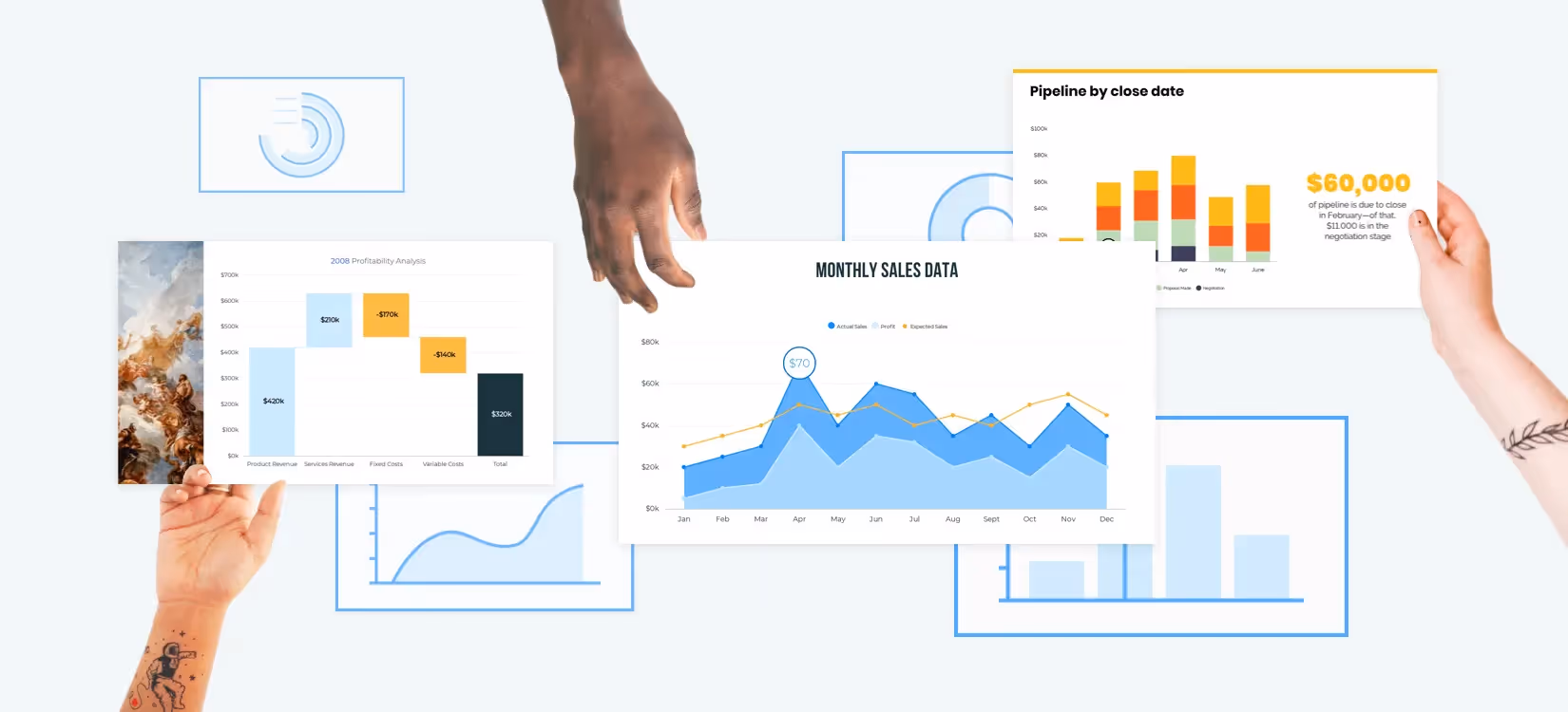


Data is critical in this day and age if you want to guide decisions within your business or for your clients. You may need data to track the effectiveness of certain efforts, or to convince stakeholders that a new project is necessary. And while you know that you need data for insights and action, knowing which data to extract and how to share it with your audience is another story.
The last thing you want to do, after selecting your data sets, is to stress over which bar or chart to use to bring that data to life. Here, we’ll help you choose the right graph or chart for your data, all of which are available to you on Beautiful.ai. We’ll also share tips for using each option to their fullest.
The Top 7 Graphs and Charts to Visualize Your Data
Bar graph
A bar graph, also called a column chart or bar chart, compares values over time. It can also point out relationships or patterns between groups of data. The bars or columns in your graph can be arranged vertically or horizontally.
Tips for Using a Bar Graph
- Show long-term changes with a bar graph. Short-term changes or slight changes in data may not be as obvious with this graph.
- Use a vertical bar graph when displaying data over time.
Line Chart
Also called a line graph, a line chart displays a relationship between two values over time. Data points are plotted on a graph and connected by lines. The horizontal x-axis usually uses time as a measurement, while the vertical y-axis can be a value such as number of conversions, dollar amount of sales, number of followers, and so on.
Tips for Using a Line Chart
- Choose the best unit of measurement to display trends in your data: months, weeks, days, or even hours.
- Create a key or legend that identifies the lines on your line chart.
Waterfall Chart
When you need to analyze an initial value over time, use our waterfall chart template. This type of chart plots the positive and negative changes made to an initial value, and ends with a resulting value. A waterfall chart is great for showing how factors like unexpected costs, budget changes, sales, or shifting inventory can affect one value.
Tips for Using a Waterfall Chart
- Use different colors to make various values in your chart stand out.
- Label key information clearly. Use a big, bold typeface so that your chart is easy to read.
Area Chart
Like a line graph, an area chart compares values and relationships between data over time. After data points are plotted on a graph and connected by lines, the area between the x-axis and the line is shaded in with a color. Area charts display simple comparisons well, and can show how parts of data relate to the whole.
Tips for Using an Area Chart
- Pick the best y-axis value amounts to display your data clearly. If there’s no clear trend, try making your y-axis values larger.
- Use a stacked area chart to break down and compare pieces of data to the whole set. To display separate data sets on one graph, use an overlapping area chart.
Funnel Chart
A funnel chart has a number of uses in presentations. This chart is shaped like a funnel, with the largest section at the top and progressively narrower sections of data that follow. Use a funnel chart to identify steps in a process, illustrate the sales of a product or service, or show data that decreases over time.
Tips for Using a Funnel Chart
- Choose a funnel chart when tracking sales conversions, explaining the recruitment process, or identifying steps in a marketing campaign
- Break your funnel chart into as many sections or steps as needed for clarity.
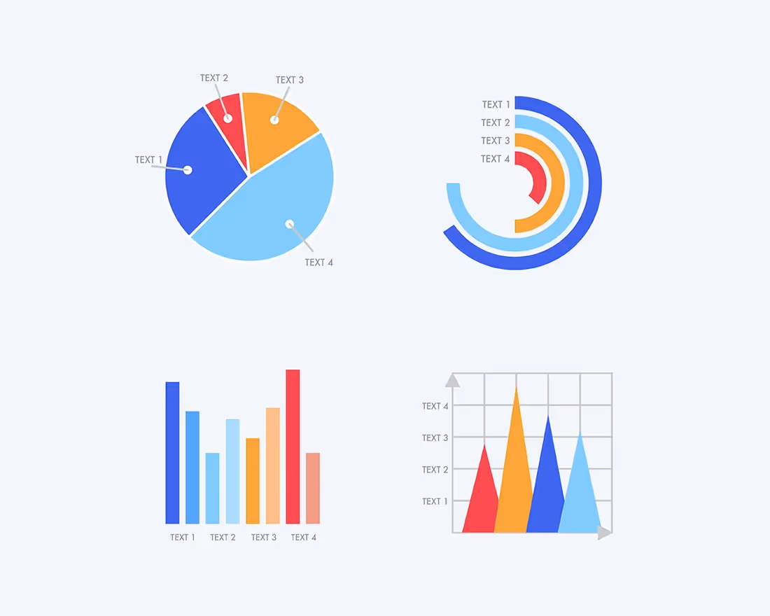
Pie Chart
A pie chart is a circular chart that shows how parts of data relate to the total, as well as each other. Each “pie slice” of data easily tells the reader how much of one data element exists compared to the rest.
Tips for Using a Pie Chart
- Use a pie chart when you have six or fewer categories. The more categories you have, the more difficult it is to distinguish between the pie slices visually.
- Compare data like demographics, budget, market analysis, and more with a pie chart.
Scatter Graph
Also called an XY plot or a scatter chart, a scatter graph displays values by plotting dots on a grid. A scatter graph can show a positive or negative relationship across a set of data points. Scatter graphs are excellent tools for predicting trends, displaying progress over time, or spotting patterns in customer behavior.
Tips for Using a Scatter Graph
- Add a trend line, also called a line of best fit, to your graph to make clear relationships between data points more visible. If there’s no clear relationship, leave the line out.
- Display patterns and large data sets with a scatter graph. However, it’s not the best choice for showing increases or decreases from one data point to another.
Match Your Data to the Right Chart or Graph
Are you still unsure which type of graph or chart to use for the data set you’re trying to present? To pick a suitable format for your data, ask yourself the questions below. While we broke down the top seven graphs and charts to use, we’ve also included even more charts or graphs to choose from, all of which are available on Beautiful.ai.
Do I want to compare individual data sets against the whole?
If so, use:
- Pie charts
- Stacked area charts
- Waterfall charts
- Pictograph
- Thermometer
Do I want to show steps in a process?
If so, use:
- Funnel charts
- Flowcharts
- Timelines
- Gantt charts
Do I need to identify patterns or trends over time?
If so, use:
- Scatter graphs
- Line charts
- Bar graphs
- XY plots
Do I need to do all of the above?
If you need to compare certain data sets against each other, track data over time, or show steps, you need multiple charts and graphs. You can add any of these with one simple click to our Beautiful.ai presentation decks, making it faster and easier than ever to tell your data’s story visually.
Present Your Data Easily… with Beautiful.ai
Once you understand your reasons for needing a graph or chart, you’ll be able to choose the best one for your next presentation. When you’re ready to start formatting your data and building your presentation, let Beautiful.ai help. You can create beautiful, engaging presentations with any type of bar or graph in mere minutes — no heavy design work or experience required. Get started with Beautiful.ai today!


.avif)
.webp)
