In today’s data-saturated world, numbers alone aren’t enough. From quarterly reports to campaign recaps and board presentations, the ability to make data meaningful through compelling visuals is no longer a “nice to have”. Yet, the road from raw data to impactful storytelling is often bumpy, especially for teams without a background in design.
How do you make complex data more digestible and obvious for audiences that aren’t number savvy?
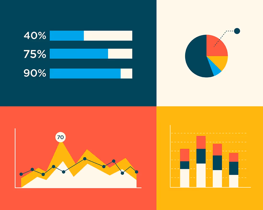
Insert: data visualization AI.
Smart, automated tools, like Beautiful.ai, are reimagining how professionals transform complex data into clear, effective, and engaging visuals. By blending automation with design-forward features, AI data visualization tools eliminate common roadblocks and make it easier for anyone to tell a story with their numbers.
Why traditional data visualization falls short
Historically speaking, creating clear and actionable data visualizations has been a manual, and frustrating, process. Traditional presentations and charting tools demand hours of tweaking, formatting, and trial-and-error. Even when the data is solid, it’s easy to end up with cluttered, hard-to-read visuals that leave the audience overwhelmed and confused.
One common issue is choosing the wrong chart type for the message. Is it better to use a line graph or a bar chart? Should this be a pie chart or a target? When you aren’t sure how to visualize your data, the message can get lost in cluttered slides.
Nailing the design is the Achilles heel of traditional data visualization: it relies too heavily on human effort and intuition, without offering guidance.
The power of AI in visual storytelling
With the onset of smart tools, AI data visualization can help teams turn meaningful data into actionable insights that guide the business forward.
AI-powered decks to get you started
If you don't know where to start, start with AI. Simply add a prompt that details the type of chart or data visualization you're looking for and you'll have a working draft in seconds to iterate on. The AI is a collaborative partner that gives you the blueprint you need to visualize your metrics in new ways.
Smart templates that think for you
Beautiful.ai’s solution to these problems starts with Smart Slides. The AI-powered templates understand design principles so you don’t have to. These layouts automatically adjust to your content, maintaining proper alignment, visual hierarchy, and spacing without any manual dragging or resizing.
Whether you’re adding charts, graphs, or diagrams, the Smart Slide framework keeps everything clean and polished. It’s like having a professional designer co-pilot your deck creation process. This makes data visualization incredibly easy to navigate for someone who has minimal design experience.
Real-time edits without the mess
Anyone who’s updated data in a traditional presentation tool knows the pain of broken layouts and misaligned graphics. With AI, your visuals automatically adapt when you update numbers, keeping the design intact. This ensures your presentation remains consistent in style, structure, and color—even when the data changes minutes before a meeting.
Better storytelling with less effort
By handling the heavy lifting of design, AI data visualization tools let users devote more energy to storytelling. Whether you’re an analyst, a marketer, or an executive, you can craft a narrative that flows smoothly from insight to insight. This is particularly powerful for non-designers who need to produce visually compelling content without spending hours learning design software.
Summarize your insights more seamlessly
Use the AI rewrite feature to help you position the key takeaways and relationships between data sets for different audiences. You can ask the AI to simplify your insights, or change the tone, to make it easier to digest and comprehend.
Tips for using AI for data visualization in Beautiful.ai
To make the most of Beautiful.ai’s data visualization AI features:
- Start with a Smart Slide: Let the system guide your layout choices from the beginning.
- Import data for fast updates: Import or link to preexisting data for more accurate charts, faster.
- Use animations strategically: Draw attention to key data points without overwhelming the audience.
- Emphasize one key takeaway per slide: Avoid clutter and boost clarity.
- Keep it simple: Trust the AI to manage design complexity so you can focus on what the data means.


.gif)