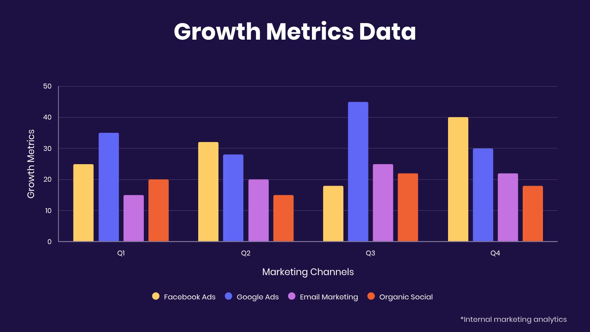
Bar Graph
Overview
Need to add a little visual interest to your business presentation? A bar graph slide can display your data easily and effectively. Whether you use a vertical bar graph or horizontal bar graph, our bar graph template slides give you options to help simplify and present complex data, ensuring you get your point across.
Customize our bar graph template slides to:
- Compare data over time
- Show relationships between two different groups
- Point out patterns or trends in data
Pro Tips for Bar Graph Template Slide

Discover AI capabilities for bar graph
Refine copy on a bar graph slide
Summarize complex data sets
Find trends and relationships in the data
Create a supporting image
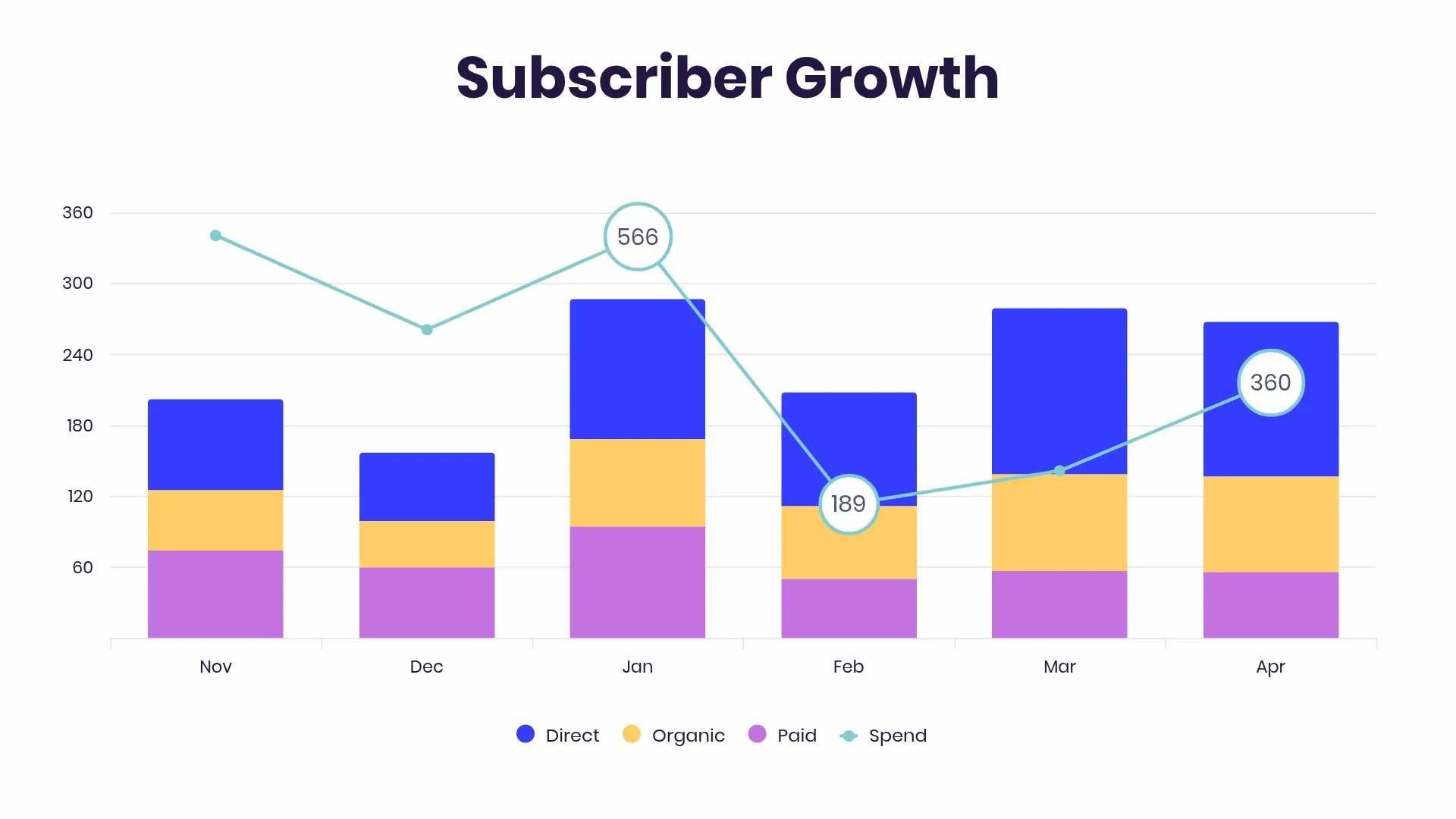
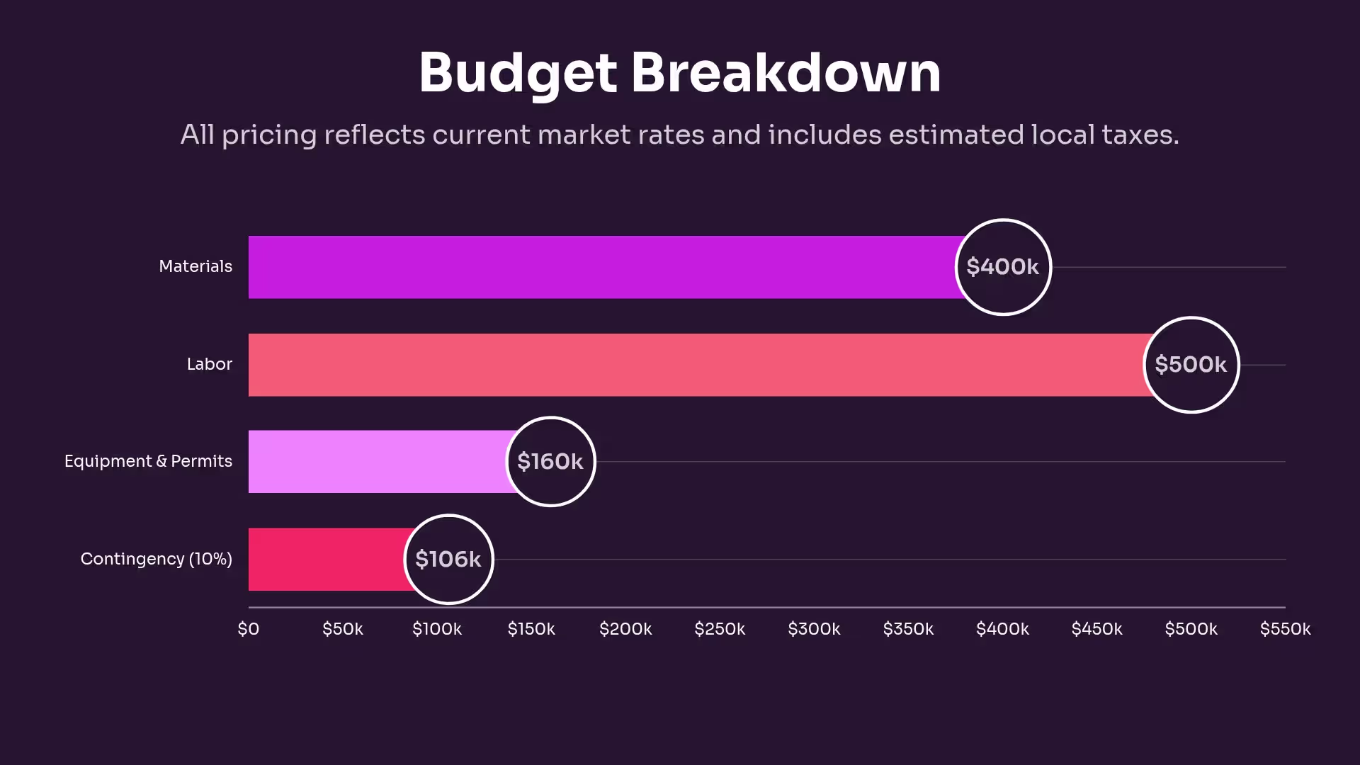
Browse more templates
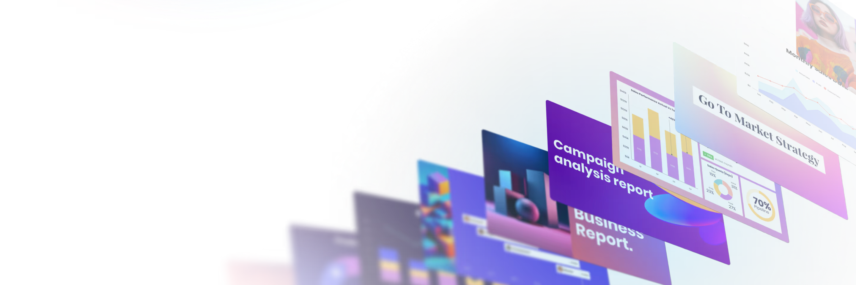
AI-powered Smart Slides that do the design for you
Build your next presentation using Smart Slides—the intelligent building blocks behind every Beautiful.ai presentation. Each Smart Slide is customizable, editable with AI, and automatically adapts layout and spacing as your content changes.
Smart Slides are your built-in designer
Smart Slides auto-align, resize, and animate your content as you edit, so you focus on the message, not formatting.
Start your way, refine with Smart Slides Short heading here
Begin with AI, a deck template, or one slide at a time. No matter how you start, all our presentations are powered by Smart Slides.
Add a designer slide layout
Choose from over 300 Smart Slide layouts for any purpose: data, comparisons, quotes, timelines, image grids, and more.
Edit at superspeed
Add your content and the Smart Slide design logic auto-adjusts spacing, text, and visuals as you edit. Say goodbye to nudging text boxes.
Present & impress
Wow your audience with built-in slide animations, and data visualizations that make your story come alive.

“Beautiful.ai helps us quickly create clear and compelling presentations to share our strategy and results. It has been easy to integrate our branding and to pull from the library of materials created by others — building a cohesive and collaborative suite that helps us advance our mission."

"Beautiful.ai increased our efficiency. I mean, 50% sounds crazy, but it's pretty accurate when you consider all of the manual stuff that we used to have to do that Beautiful.ai now does for us."

"What you guys have created is a foolproof way to ensure quality presentations. It's almost just like they have a graphic designer over their shoulder while they're creating their decks."

“For any business owner or entrepreneur where time is of the essence you lose the ability to put those nice touches on presentations, Beautiful.ai does it for you, especially if you aren't creatively gifted!”
Ready-to-use presentation templates for creating full, polished decks.


Pitch Decks


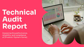
Reports & Reviews


Plans & Strategies
Try it free for 14 days
Start building Beautiful presentations.

