


It’s a question that gets asked all-too-often when you’re trying to find the best way to present information: What’s the difference between a pie chart and a donut chart? After all, they look really similar, and they have the same function... right?
Enter: a “battle” of these two top charts. Here at Beautiful.ai, we are comparing the differences between pie charts and donut charts to reveal which one is better for you and your needs.
Round 1: Pie Charts
What is a pie chart and how do you use it?
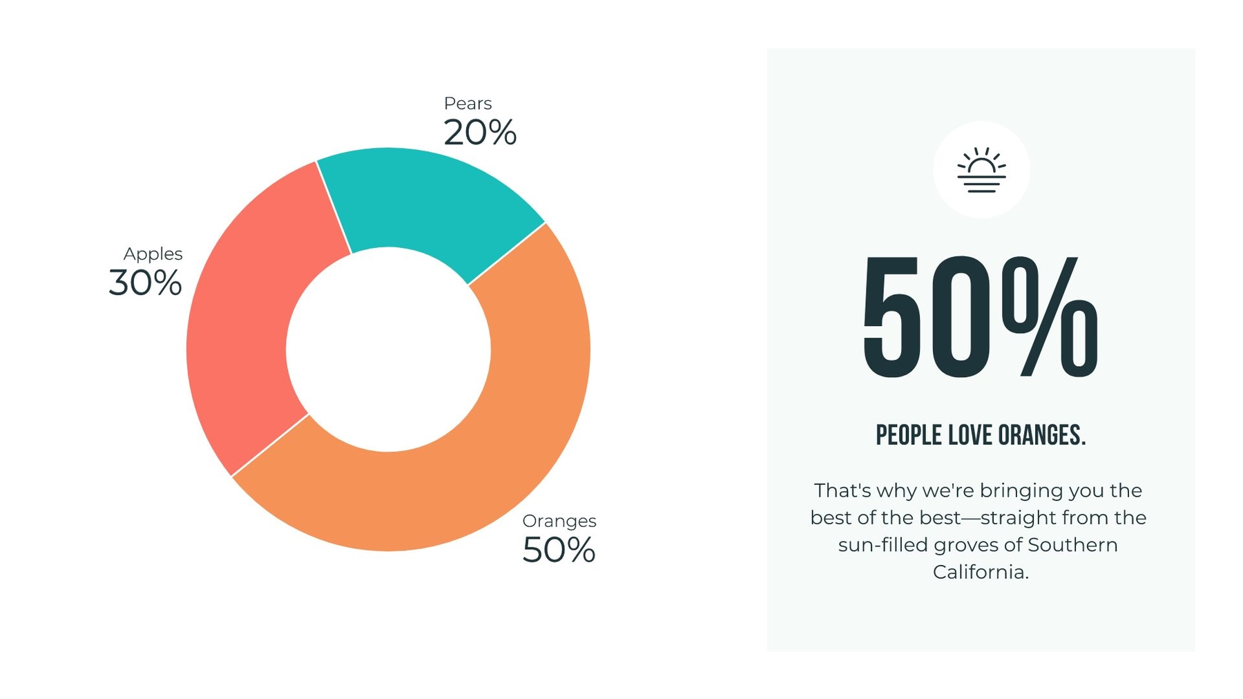
A pie chart is a circular graph (hence the name ‘pie’) that’s used to show or compare different segments — or ‘slices’ — of data. Each slice represents a proportion that relates to the whole. When added up, each slice should equal the total.
When should you use a pie chart?
Pie charts are best used for showcasing part-to-whole relationships. In other words, if you have different parts or percentages of a whole, using a pie chart is likely the way to go. Just make sure the total sum equals 100%, or the chart won’t make a lot of sense or convey the message you want it to.
What type of content works best for a pie chart?
Essentially, any type of content or data that can be broken down into comparative categories is suitable to use. Revenue, demographics, market shares, survey results — these are just a few examples of the type of content to use in a pie chart. However, you don’t want to display more than six categories of data or the pie chart can be difficult to read and compare the relative size of slices.
Round 2: Donut Charts
What is a donut chart and how do you use it?
A donut chart is almost identical to a pie chart, but the center is cut out (hence the name ‘donut’). Donut charts are also used to show proportions of categories that make up the whole, but the center can also be used to display data.
When should you use a donut chart?
Like pie charts, donut charts can be used to display different data points that total 100%. These are also best used to compare a handful of categories at-a-glance and how they relate to the whole.
What type of content works best?
The same type of content you’d use for a pie chart can also work for a donut chart. However, with donut charts, you have room for fewer categories than pie charts — anywhere from 2 to 5. That’s because you want your audience to be able to quickly tell the difference between arc lengths, which can help tell a more compelling story and get your point across more efficiently.
Round 3: Should you use a pie chart or a donut chart for your next presentation?
When deciding between a pie chart or a donut chart for your presentation, make sure the data you’re using is for comparison analysis only. Pie and donut charts are usually limited to just that — comparing the differences between categories. The easiest way to decide which one to use?
The number of categories you’re comparing. If you have more than 4 or 5 categories, go with a pie chart. If you have between 2 and 4 categories, go with a donut chart. Another way to choose? If you have an extra data point to convey (e.g. all of your categories equal an increase in total revenue), use a donut chart so you can take advantage of the space in the middle.
Pro tip: Since English speakers read from left to right, audiences will likely read your charts clockwise. To make them easier to digest, organize your category comparisons from smallest to largest.
The real winner: Pie chart and donut chart templates from Beautiful.ai templates
Whichever way you want to slice your data, make it really stand out with our pie chart templates and donut chart templates. If you still can’t decide — no problem! With Beautiful.ai templates, you can quickly switch between chart styles to see which one works best for you. And in a matter of minutes, you’ll have a gorgeous new chart to show off!
Download our pie chart template or donut chart template to get started!


.gif)
