


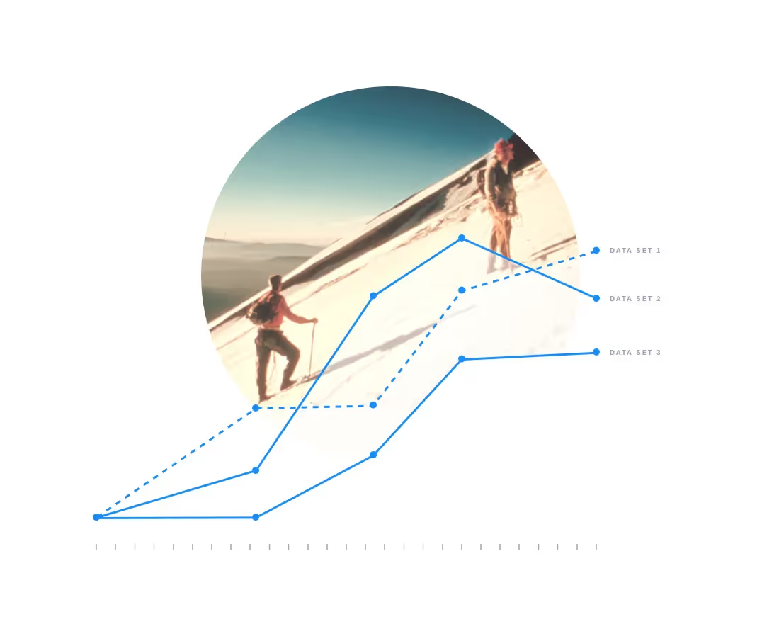
If you’re used to giving presentations, you’re no stranger to data visualization–charts, graphs, and diagrams, oh my! Data visualization is at the forefront of most business decks because it helps more efficiently illustrate different metrics and statistics. This means your audience is paying attention to and retaining your presentation information (instead of dozing off). In fact, 47% of designers create presentations to simplify complex information through visual context. Enter the world of data visualization.
Using a graph to present your data sounds great in theory, but many presenters struggle to find the right graph or chart. Using the wrong graph can be worse than using none at all, making your data hard to understand and your efforts wasted.
The basics of data visualization
Data visualization is important for many reasons. It can help remove noise from data and highlight important details. It’s also an interactive and visually appealing way to grab and hold an audience’s attention. The human brain is better at understanding visual information and identifying patterns and trends, and when aligned with business strategy, the right graphs or charts can provide a complete view and insights.
The first step in data visualization is understanding different charts, knowing which one is best for your data. The second step? Making it beautiful.
In this blog, we cover everything you need to know about one of the most versatile and popular diagrams—the Venn diagram— and how to make it beautiful with little-to-no design experience.
What is a Venn diagram
The Venn diagram has been around for ages. Swiss mathematician, Leonard Euler, is the mastermind behind the original Venn. Euler used the overlapping circles to depict the four categorical propositions of syllogism: The Universal Affirmative, The Universal Negative, The Particular Affirmative, and The Particular Negative. This model was used by mathematicians, scientists, and philosophers to help make sense of their findings.
Fast forward to the modern-day Venn diagram. Reinvented by mathematician John Venn in 1880, the diagram gained popularity and was officially named the Venn diagram by American philosopher Clarence Irvin in 1918.
Today, the Venn diagram is one of the most commonly used diagrams. Venn diagrams were created to effectively depict relationships between different groups of information. In their simplest form, they’re overlapping circles or other shapes to illustrate the logical relationships between two or more sets of items. And they’re wildly popular for all kinds of presentations.
Venn diagram use cases
Venn diagrams are commonly used in business presentations to share statistics and map out probability. You might use a Venn to identify qualities in your ideal employee candidate, different target audience demographics, and the relationship between two concepts like art and science, brand evaluation, or product-market fit. The Venn is extremely useful and versatile, but knowing how and when to use it is still important. Here are some of the most common use cases:
1. Comparative Analysis
Venn diagrams are perfect for comparing and contrasting different groups. Whether you’re evaluating market segments, product features, or customer demographics, a Venn diagram can highlight similarities and differences in a clear, visual way.
Example: Comparing features between two competing software products to highlight common functionalities and unique selling points.
2. Identifying Overlaps
Use Venn diagrams to identify overlapping areas where multiple sets of data intersect. This is particularly useful in research, project management, and strategic planning.
Example: Identifying shared interests among different customer segments to tailor marketing strategies that appeal to all groups.
3. Set Relationships
When dealing with data sets, Venn diagrams can illustrate the relationships between different sets, showing how they interact or are related to one another.
Example: Demonstrating the relationship between different departments in an organization, such as marketing, sales, and product development, and their shared responsibilities.
4. Problem Solving
Venn diagrams help in problem-solving by breaking down complex issues into more manageable parts, making it easier to visualize the logical relationships between different factors.
Example: Analyzing root causes of a problem by visually mapping out potential factors and their intersections to identify common sources of issues.
5. Data Analysis
Venn diagrams are useful tools for data scientists and analysts to visualize data intersections, especially when working with large datasets. They can simplify complex data relationships into an easily digestible format.
Example: Visualizing the overlap between users of different social media platforms to understand multi-platform engagement.
6. Marketing Strategies
Venn diagrams can be used in marketing to segment audiences and develop targeted campaigns. Marketers can create more effective strategies by understanding the overlaps and unique characteristics of different market segments.
Example: Segmenting a customer base by age and purchasing behavior to tailor specific promotions to each group.
7. Decision Making
When making decisions that involve multiple factors, Venn diagrams can clarify the pros and cons of different choices by visually mapping out their impacts and intersections.
Example: Weighing the benefits and drawbacks of various business strategies to find the optimal approach.
8. Event Planning
Event planners use Venn diagrams to organize and visualize different aspects of an event, ensuring that all elements are considered and overlap is managed efficiently.
Example: Coordinating a conference's logistics, marketing, and budgeting aspects to ensure all areas are covered and potential conflicts are identified.
How to make a Venn diagram beautiful
To make your Venn diagram visually appealing, start with a clean design. Beautiful.ai offers an intuitive platform to create stunning diagrams effortlessly. With its AI-driven features, you can quickly generate and customize Venn diagrams that are informative and visually captivating.
But first, what’s your key takeaway?
Before you get started, ask yourself what you’re trying to showcase. Your Venn diagram should clearly illustrate commonalities or differences between two sets of data, customer personas, survey results, competitive analysis, etc. Decide what your key takeaways are before you start plugging in your content.
Choose your colors wisely.
Venn diagrams are simple in nature, but you can still add branded elements like brand colors. While your colors should match the overall theme of your presentation, you can select different colors to represent each set of items. Play around with lighter-colored circles and darker backgrounds, or vice versa.
Make sure your text is legible.
Experiment with different colors, but make sure your font has a nice contrast so that it’s legible within the circles. Stick to a basic font so that your audience can immediately identify what each circle in the Venn diagram represents without having to squint or strain their eyes.
Use icons or images where you can.
A Venn is significantly easier on the eyes than if you were to list the same information out in plain text. That said, people are visual learners, and a bunch of overlapping circles on the slide might not be enough. Use relevant images or icons on the slide where appropriate to take it to the next level.
Consider using more than one.
While less is more on each slide, don’t be afraid to use more than one Venn diagram to drive your point home if you have multiple variants or items to break down. A series of Venns can be compelling to tell your story more effectively.
Try a Venn diagram template
If you still don’t know where to start, there’s a template for that. Our biggest tip for creating a beautiful slide is to use a Venn diagram maker. The right Venn diagram template can help give you a starting point so that you don’t have to start from scratch. Simply pick the template, choose your theme, add your content, and watch the diagram adapt with design best practices borrowed from the professionals. If even a blank template feels too daunting, we have an entire inspiration gallery filled with pre-built slide templates— including Venn diagrams— to help inspire your story.


.avif)
