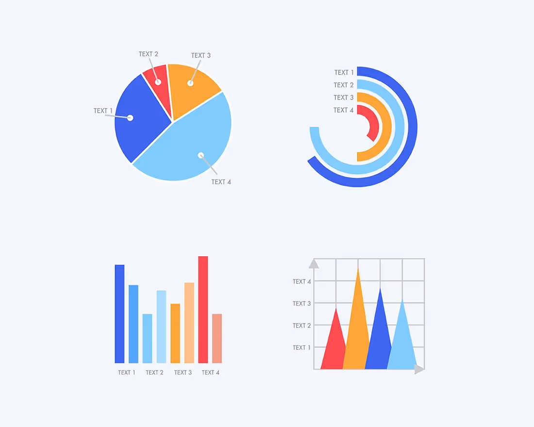


When you’re creating a presentation with Beautiful.ai, you have plenty of slide templates and graphics to choose from. We have a chart for every purpose: plotting and explaining data, displaying timelines, breaking down complex ideas, and so much more.
Line charts and area charts are some of our most widely-used templates for presentations. But what’s the difference between the two? How do you know which one to choose for your next presentation?
We present: a data visualization duel. Here, we pit these two different charts against each other to see which is better for certain purposes, and show you how to use them to the fullest.
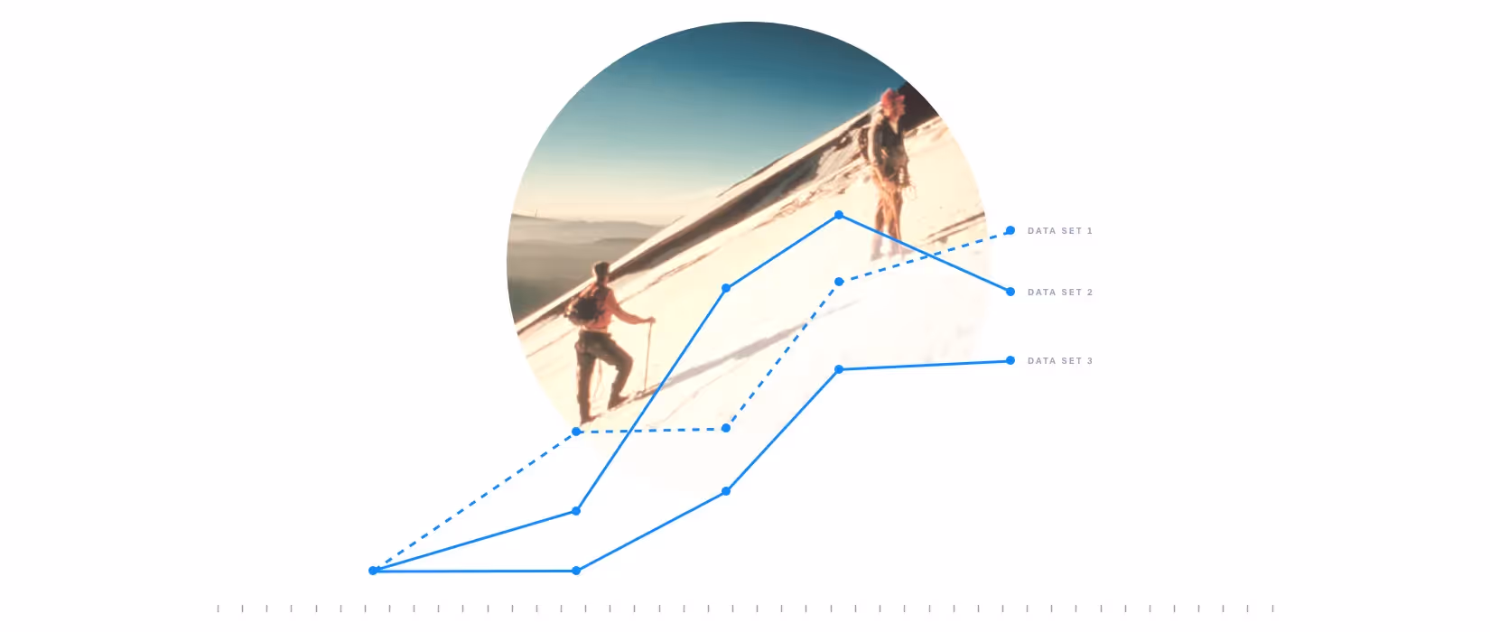
The Line Chart
What is a line chart?
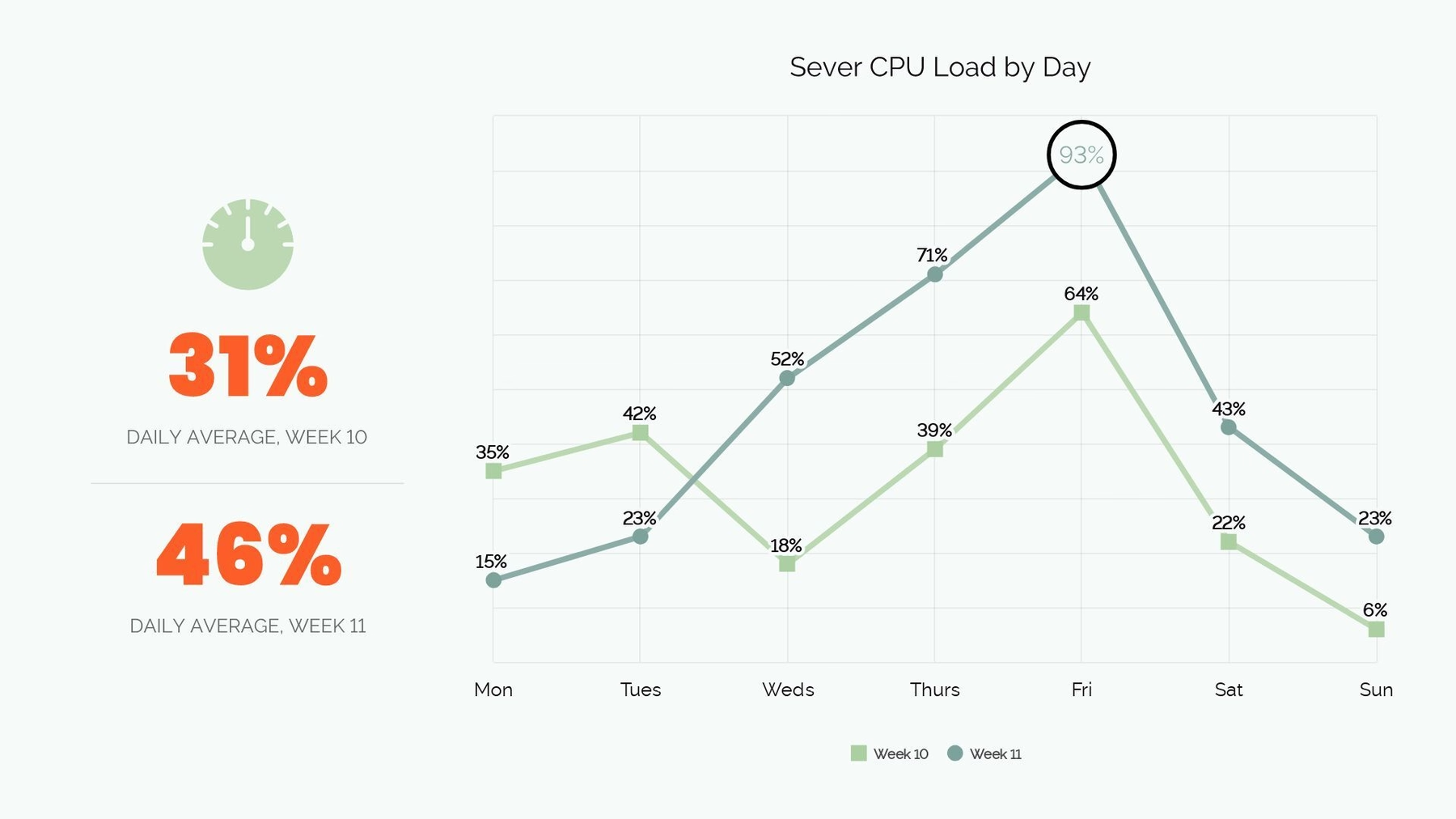
A line chart, in a nutshell, displays trends over time. Also called a line graph, a line chart displays information using data points (called “markers”) on an XY grid. These data points are then connected by straight lines to visually show a trend.
When should you use it?
Line charts are great for measuring the amount of something over time. They’re also versatile tools, and can be used across industries or company departments.
Some examples of line chart presentations include:
- A marketing team’s projected customer base growth for the next year
- The finance department’s report of company cash on hand over time
- Statistics for experiments performed by a team of research scientists
- How many sales occurred in the past few months
More than one line can be plotted on a line chart, too. In the example of projected customer base growth, you might plot projected growth for the upcoming year. When that year is completed, you can use that existing line chart to plot how the team actually performed. You’d get a side-by-side comparison of projected growth and actual growth.
What type of content works best in a line chart?
Use a line chart template to track the values or amounts of things over a period of time. Line charts display short-term data better than something like a bar graph, which is better suited for long-term changes. Because line charts are naturally read from left to right, they’re also usually a great choice when tracking values over time.
When using a line chart template in your presentation, make sure you choose the proper unit of measurements, add a key or legend, and label your chart accordingly.
The Area Chart
What is an area chart?
An area chart, also called an area graph, is similar to a line graph in that it displays changes in data over time. Data points are marked on an XY grid, then connected to form a line. From there, the area between the plotted line and the x-axis is shaded in with colors or textures.
When should you use it?
It may be easier for your audience to see and understand the data with a colorful area chart template instead of a line chart, especially if the differences between your data values are large enough to be displayed visually.
You might use an area chart presentation if you need to:
- Display large differences between your data points
- Show multiple values over time
- Plot data over a longer period of time
- Explain how multiple data points relate to the total value
What type of content works best in an area chart?
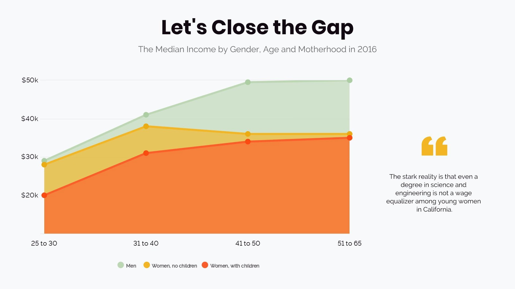
Area charts are versatile because you can compare multiple data sets. An area graph that compares different data sets is called an overlapping area chart. For example, if you want to see how many women’s clothing items and men’s clothing items your apparel company sold last quarter, you’d plot data points for each category and fill in those areas with a different color. You can see at a glance which apparel line performed better in quarterly sales.
An area graph that breaks down a total data set into smaller related sets is called a stacked area chart. If your hypothetical apparel company wanted to see which types of women’s clothing items performed best over the last quarter, you’d plot each product on your graph and fill them in with different colors. That way, you can compare each product to your overall quarterly sales for women’s clothing.
Who’s the winner?
We’ll call it a draw: both the line chart and the area chart have similar strengths. They can transform boring data into professional and easy to read charts in your presentation. Line charts display short-term data and precise data points well, while area charts are great for displaying long-term data and multiple data sets.
With Beautiful.ai, you can easily add and customize a line chart template or an area chart template in your next presentation. Need a different type of chart or diagram? Beautiful.ai has you covered, too. We have an extensive library of free slide templates with endless design options and customization abilities.