


Creating a presentation from scratch can be intimidating. Sure, you’re an expert on the topic you’re presenting, but knowing which charts and graphs to plug that information in to can be overwhelming. You’re not alone. Even with pre-designed presentation templates at your fingertips, it’s important to know which ones are appropriate to use for your specific piece of content. You may be inclined to use the most obvious chart for your slide, but that could limit the creativity of your presentation.
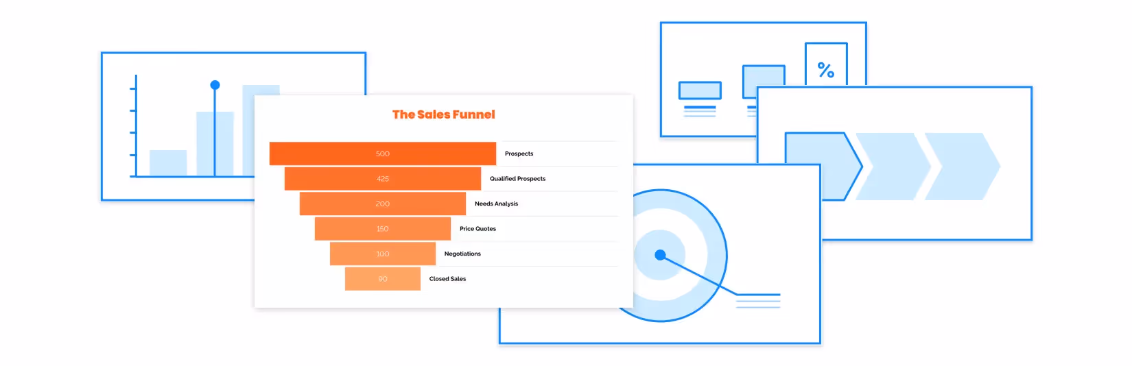
Here’s an example: a sales funnel. If you’re planning to include a sales funnel in your presentation, you’ll likely gravitate towards our funnel diagram template. We don’t blame you. The template itself has the word “funnel” in the name, so it makes sense. That said, we’re here to help you think outside the box. Don’t get us wrong, we think our funnel diagram is great, but we also have a handful of other templates that can show your company’s sales funnel in a new way.
You bring your content, and we’ll do the rest. There are countless combinations for sales funnels, especially with our new Elements feature, so you can have more creative license to tell your story. Below are five different charts that you can use to present your next sales funnel.
Funnel
We’ll start with the obvious: a funnel diagram. Our funnel diagram is a classic way to showcase your sales funnel, and probably what most sales teams would use. Depending on your content, try changing up the format from a funnel to a pyramid, volcano or staircase diagram. You can also use our Elements feature to add call-outs, images or icons.

Target
Use our target diagram to show your sales funnel in a more engaging way. The outer ring of the target would represent the top of the funnel, while the center would be the bottom of the funnel. Using a target diagram allows your audience to quickly understand the “target” goal. Use a text box to add a brief description of each ring on the side bar.

Compare column
Make a quick statement with our compare column template. The furthest column on the left will act as the top of the funnel, moving towards the bottom of the funnel on the right. Using a compare column slide allows you to show your sales pipeline in a bite-size chart, so that the content is easy to digest by your audience. Use big numbers within the columns to represent your data.

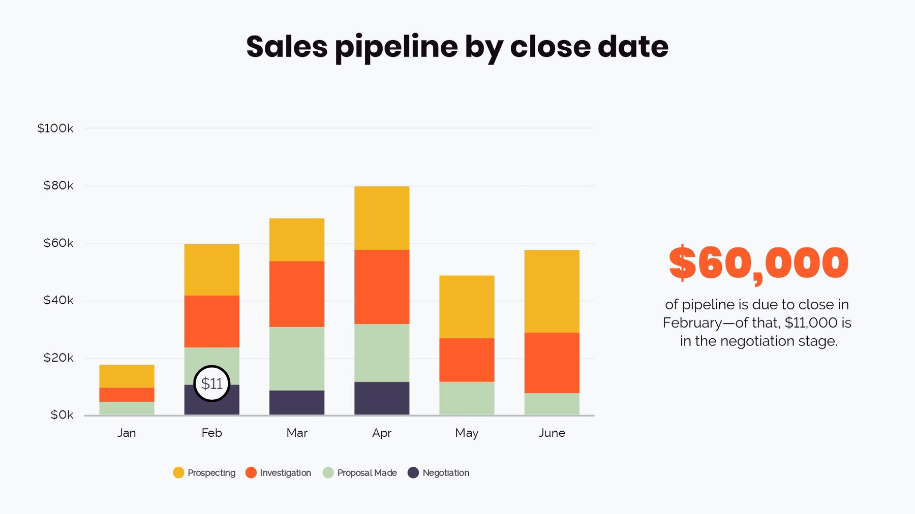
Bar graph
We used our column chart (or bar graph) to show a sales pipeline broken down by month. Each column shows an individual funnel for the month, and how it contributes to the overall financial pipeline. We color-coded each column to represent the sales funnel process as it relates to the monthly goal. Using this chart allows you to show even more information (or data) in a clear way.
Process diagram
A process diagram can show the same information a funnel diagram would, but in a clean, linear fashion. The furthest block to the left would represent the top of the funnel, while the end block would be the bottom. You can also use the process diagram to break down each key piece of a sales funnel, offering your solution to every part of the sales process.


.gif)

.gif)
