


To understand the right way to use Venn Diagrams, it helps to go back in time.
When John Venn introduced his new diagram in an 1880 paper entitled “On the Diagrammatic and Mechanical Representation of Propositions and Reasonings,” he might have imagined that his work would still be relevant 135 years later. But he probably didn’t see this coming:
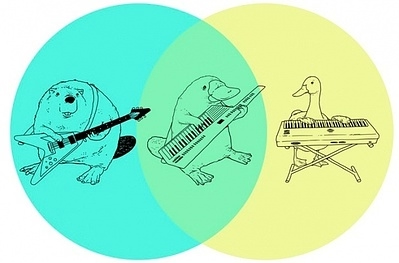
The Venn Diagram might just be the most versatile tool in the meme-maker arsenal. Thanks to these magical overlapping circles, we now know which features mythical creatures have in common, the things that Meatloaf would do for love, and who we should and shouldn’t f*** with.
But what’s lost in all of this fun is the fact that the Venn Diagram is also an incredibly effective visual tool for presenters, providing it’s used correctly. And to better understand how, when, and why to use the mighty Venn Diagram, it helps to go back to the source.
When Venn sat down to write his paper, the idea was to improve on the work of Leonhard Euler, an 18th century Swiss mathematician who documented much of his thinking about math and logic in the 234 personal letters he wrote to German Princess Friederike Charlotte of Brandenburg-Schwedt and her little sister, Louise. (A bit creepy, actually.)
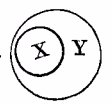
In one of these letters, Euler explored the idea of visualizing logical propositions, and came up with a simple way to draw two common concepts:
“All of X is Y”
“None of X is Y”
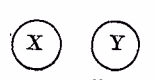
These two diagrams may seem fairly obvious to us now, but it’s safe to assume that Princess Louise was super-impressed. These “Eulerian Circles” were, up to that point, the most sophisticated attempt to visually represent the relationship between two sets.
Venn, however, was underwhelmed.
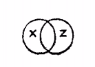
His main argument in 1880 was that these basic diagrams don’t account for a bunch of more common propositions, including: “Some X is Y, and Some of Y is X.” So Venn introduced added a new new diagram to account for this ambiguity (left).
He then went on to show that this same visualization can be applied to three sets, so long as the diagram shows the potential overlap between each pair of sets and all three together. And, with that, the Venn Diagram was born. (John wasn’t brazen enough to name the diagram after himself, but someone else did that for him about 30 years later.)
Today, the Venn Diagram is considered the de facto method for showing the relationship between sets. And, as a result, it’s slowly migrated from academic papers to the PowerPoint SmartArt menu. Which brings us back to presentations.
The Venn Diagram is one of the most common non-bullet slides you’ll find in any given presentation, but it’s also one of the most under-used. And that’s because many people miss the opportunity to use it as John Venn intended.
In most presentations, Venn Diagrams are used to illustrate an "intersection" of two ideas. For example, let’s say your product or service is a perfect combination of art and science. You might be tempted to make that point with the diagram below:
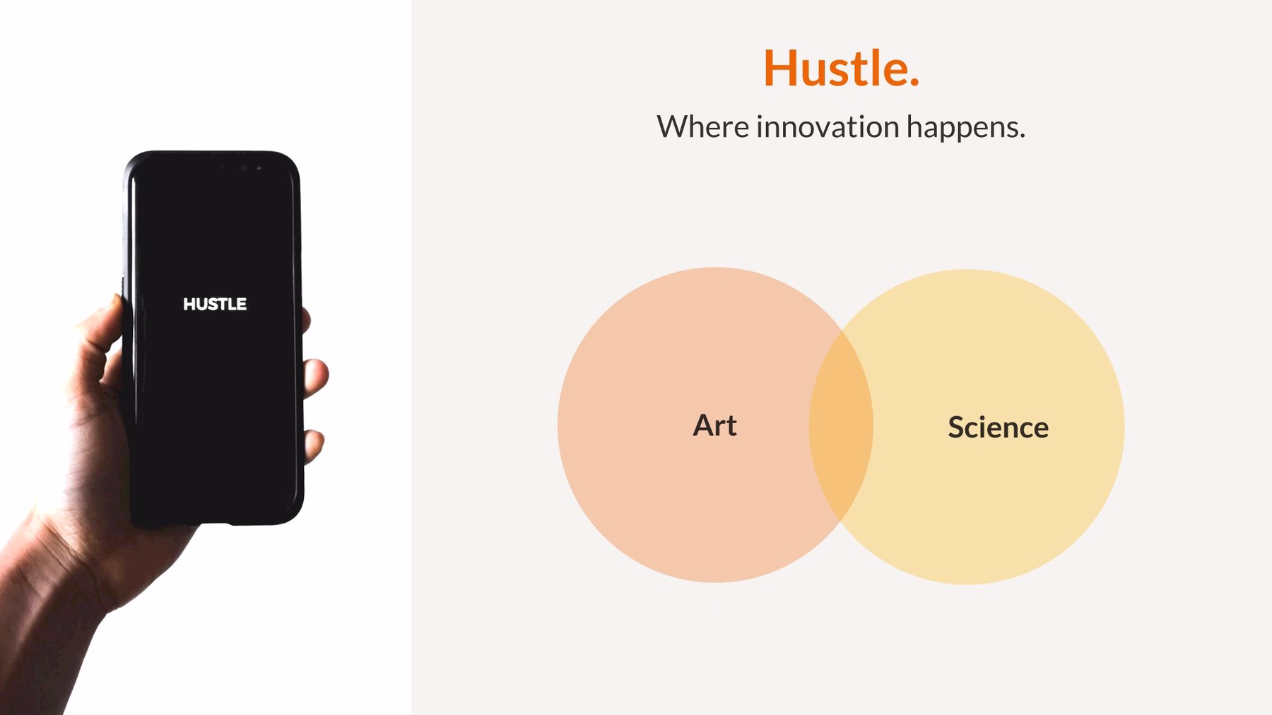
"I couldn't think of a better way to make this point."
There's nothing wrong with this slide, per se. It quickly and clearly communicates that you are bringing together these two disciplines. But, if we're being honest, it's a bit cliché, and it doesn't really take advantage of what makes the Venn Diagram so effective, i.e. the ability to show the specific relationship between sets.
As a general rule of thumb, a Venn Diagram is relevant whenever the key message of your slide is consistent with Venn’s initial rationale for it: “Some of X is Y and some of Y is X.” If this is what you’re trying to communicate, then Venn.
And you're probably making this point more often than you think.
Below are just a few examples how you can use the Venn Diagram in creative and compelling ways. (As always, each of these slides, including the ones above, were created in Beautiful.AI in a minute or less.)
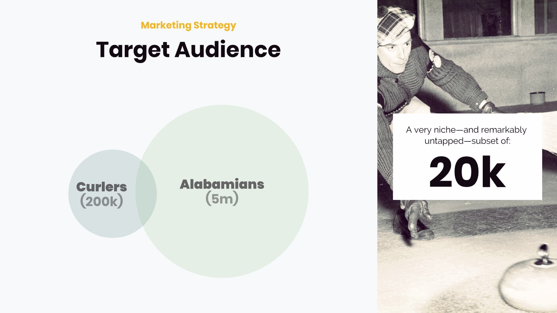
“These sets have more (or less) in common than you might think.”
If the ideal user for your product or service is a curling fan in Alabama, your audience might assume that your product or service is doomed. But if you can demonstrate that there actually is a significant overlap between these two populations, you might just get approval for that extremely targeted advertising campaign you’ve been working on.
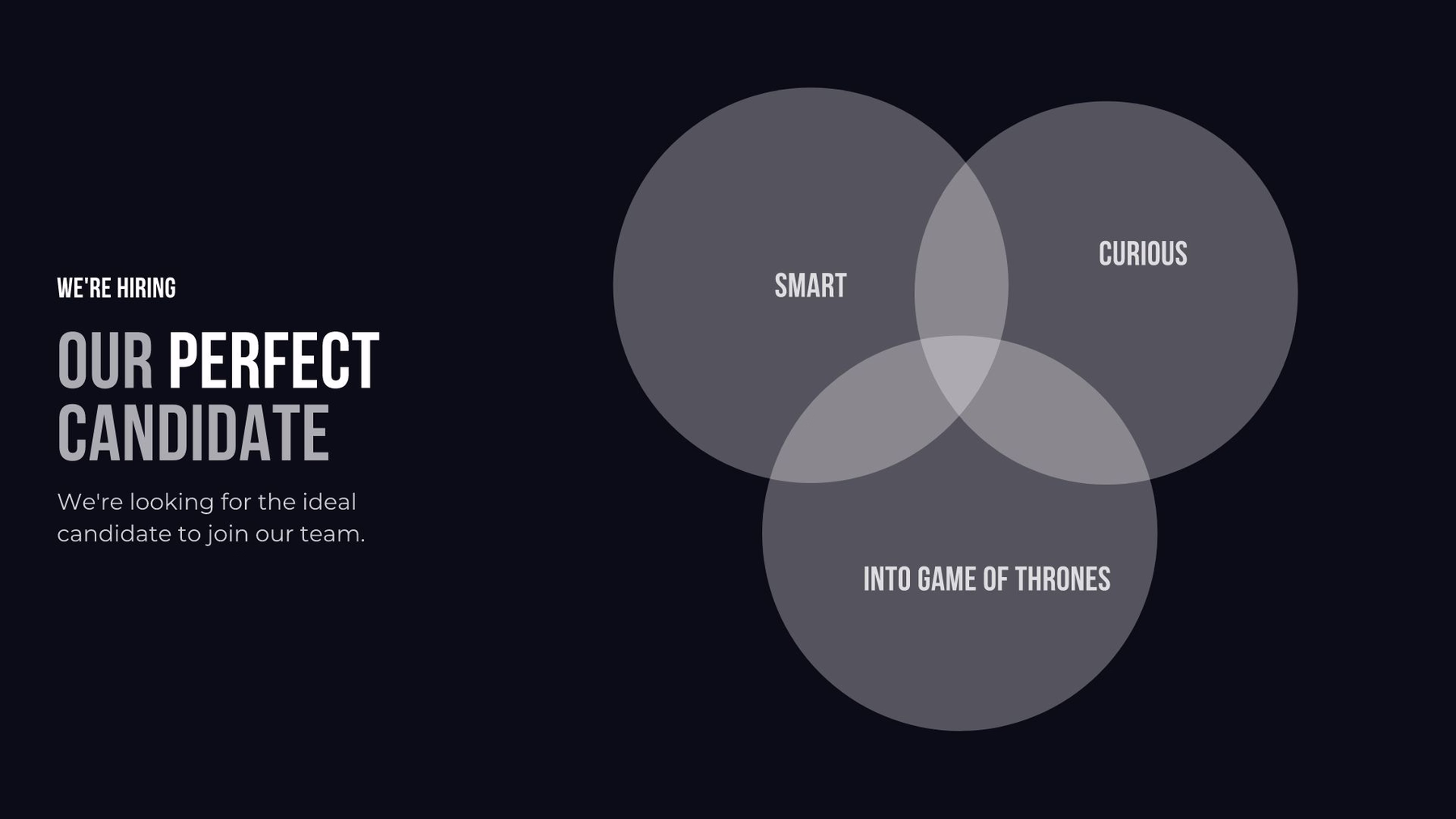
“We're talking about a very specific subset.”
If you’re making a decision about who to hire and you want to get your team on the same page before evaluating applicants, a Venn Diagram is a great way to define the characteristics of the ideal candidate. Your audience will walk away understanding that a future employee must meet all of these criteria to be worthy; and this diagram also reinforces just how small that pool of perfect people is likely to be.
There are obviously plenty of additional use cases for Venn Diagrams, but the important thing to remember here is to start with the message, not the visual. In doing so, we think you’ll find that while you might end up using the Venn Diagram less often, you’ll do so with greater effect.
As we thought about building our own Venn Diagram template, we took a hard look at the SmartArt options available today and realized that there were a few significant holes:
- Placement - sizing and moving circles is way too hard
- Spacing - re-centering diagram as you tweak it requires too much effort
- Text - labeling circles so they don’t encroach one another takes way too long
These may seem like small things, but all together they make it much less cumbersome to create what should be a pretty simple slide.
This is consistent with the way that we think about all of our templates—we want to make it as simple and intuitive as possible as possible, and then take all of the corresponding design work off your plate. We believe that this not only saves you time, but also allows you to stay in the flow of your work and focus on what really matters—your ideas.
Better Venn Diagrams may be just be a small part of helping you tell your story. But, as John Venn proved, every bit of progress goes a long way.


.avif)

