


When you don’t know where to take your presentation, Smart Slide templates are a great starting point. The customizable templates use guardrails to protect the design as you add in your content, and can help you reimagine your story. While there are intentional limitations to maintain design integrity, there are so many different ways to customize each layout beyond the default settings.
In this series, we’re highlighting your favorite slide templates, and challenging you to try something new. For each Smart Slide, we’ll showcase different ways to style and format it to help inspire a new way to tell your story.
Venn Diagram
The Venn diagram is one of the most common non-bullet slides you’ll find in any given presentation. Originally created by John Venn in 1880, Venn diagrams were invented as a way of picturing relationships between different groups of information.
A Venn diagram uses overlapping circles or other shapes to illustrate the logical relationships between two or more sets of items. You may see things in new ways and be able to make observations, choices, arguments or decisions. Often, they serve to graphically organize information, highlighting how the items are similar and different.
Venn Diagram slide design tips
A Venn Diagram is a powerful slide that can be used to showcase complex relationships in a more visual way. Here are five creative ways to make the Venn diagram slide more appealing if you’re feeling stuck.
Use multiple circles
For a more in depth analysis of relationships, the circles or shapes can be separated out onto consecutive slides and then brought together at the end. This method shows the relationship between the compared items in a more dramatic fashion.
Add a tray
To create a more engaging design, you can opt for a tray on either side of your Venn. The tray is fully customizable, and can house video, image(s), text, or a combination of all three. By adding a tray with a supporting visual, you’re encouraging your audience to focus on the slide and retain the information within your chart.
Create callouts for key takeaways
What’s the most important takeaway from the Venn? You can use callouts to bring attention—or add context—to bigger ideas or relationships. They tell the audience exactly what you need them to know, so there’s no guesswork. It also gives you more creative freedom to add custom design elements to the slide.
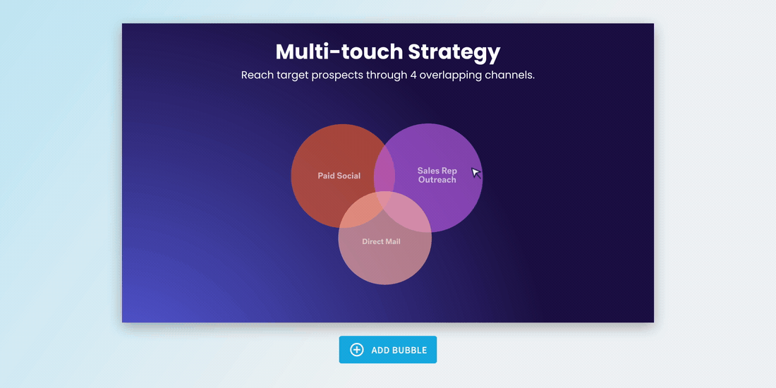
Try a colored or gradient background
An infographic slide—like a Venn—can fall flat if you rely simply on the diagram. To keep your audience engaged, you can take more creative control of the slide background. To add some dimension to the slide, you might try a colored or gradient background. Just make sure you keep legibility in mind so your slide doesn’t go from boring to cluttered.

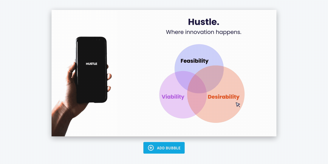
Choose colors to identify relationships
Using color strategically in a Venn diagram can instantly elevate its impact. Thoughtful color choices help audiences quickly differentiate between sets, while blended hues in overlapping areas make shared relationships easier to grasp. Color also enhances clarity in more complex diagrams by organizing information visually and supporting better retention.


.png)

.gif)

