

When you think of a rock-star presentation, what comes to mind? It’s probably a combination of characteristics like good design, strong visuals, and a certain level of professionalism from both the deck and the presenter. A professional presentation can dictate the success of how your pitch, proposal, or report lands with the audience. Most people will form an opinion about you, your presentation, and your topic before you can even make it to the meatball of the deck. Because of that, your presentation needs to be professional right out of the gate to hold their attention.
Sounds simple enough, but for non-designers it’s an uphill battle to create something that will wow the audience. Luckily, you have us (insert wink face here).
In this blog, we share six key elements of a professional presentation.
How to make a professional presentation
Consider these six tips when designing your next presentation to avoid a frankendeck and maintain professionalism like a boss.
Consistent branding
Branding is the essence of your company. Without it, your business would be unrecognizable, unreliable, and unprofessional in the eyes of the consumer. A strong brand presence creates trust and familiarity with your audiences, and this is especially true in presentations. Consistent branding through all sales collateral, marketing materials, and external presentations is an easy win when you’re aiming for a professional-looking deck.
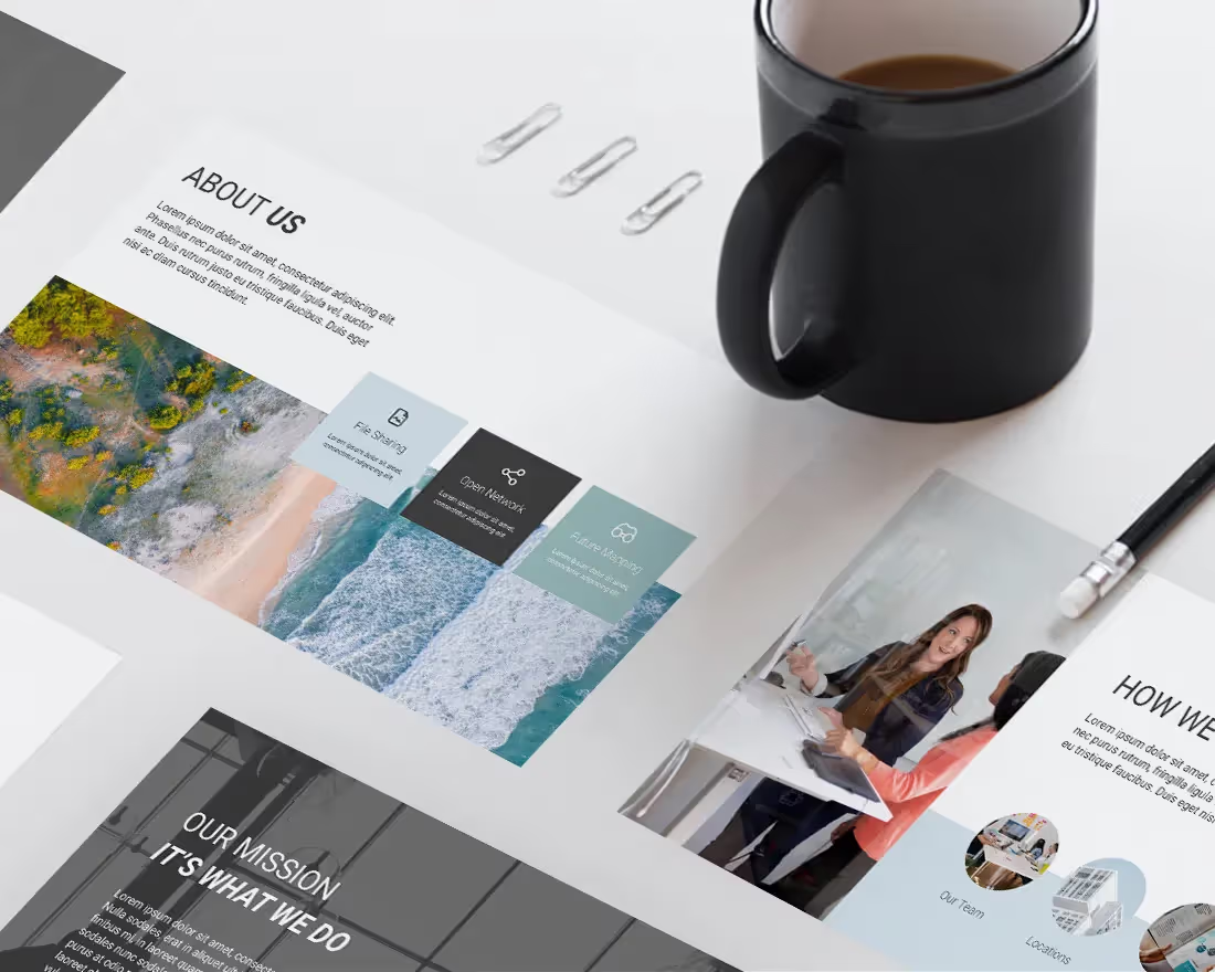
Beautiful.ai makes it easy with our customizable themes. With the presentation theme you’re able to select (or upload) your personal brand colors, fonts, and logos. Just set it and forget it. Once you create a theme, it is automatically applied to each individual slide so your entire presentation is cohesive and professional without any additional work on your end.
Strong data visualization
Numbers don’t lie. In fact, they’re probably the easiest way to gain credibility in your presentation. However, some metrics are more important than others, and knowing the difference is key. To keep your presentation buttoned up and professional, make sure to include only the most meaningful data and the most effective charts or graphs. Data visualization— AKA the use of infographics or charts— makes your otherwise complex numbers more digestible to the audience.
If you don’t know where to start, let our inspiration gallery guide your data. Our pre-built presentation templates can help inform your ideas and encourage you to format your data in new ways. With Smart Slides, data visualization is easy. Simply add your content in and watch the chart or graph adapt in real time with design best practices in mind.
Use text sparingly
Think of the last email you received. Was it a short novel, or was it short, sweet, and to the point? Nobody has time to read obscenely-long paragraphs of text, and if you value your audience you won’t force them to. While you may have a lot to say, use text sparingly. In fact, if you’re able to say more with fewer words, it will make you look more knowledgeable, efficient, and professional.
Instead of using clunky bullet points, try telling your story with the help of images and icons, infographics, or bold statistics. Your audience should be able to look at your slide and understand the key takeaway in three to five seconds. Any information you want them to know beyond that, you can narrate verbally.
Updated content
Make sure you're presenting the most updated information, always. Nothing screams unprofessional like having outdated metrics or information on your slides. Imagine telling your client one thing in a presentation, and another on a follow-up call two weeks later. The inaccuracy can be a huge turn-off for investors or prospective clients and may ultimately cost you.
To avoid this, choose a PowerPoint alternative— like Beautiful.ai— that works in the cloud. With the cloud, you know that you’re always working in the most up-to-date deck at all times. If you’re creating content in tandem with your teammates, any edits made are immediately pushed through to everyone’s deck. Kiss versioning issues goodbye.
High-quality visuals
While your story is the star of the show, beautiful visuals are like your supporting actor or actress. They carry a lot of weight in your presentation, but only if you use them correctly. Any image, icon, or graphic you use should be relevant and appropriate, on-brand, and high-quality (if it’s pixelated, leave it at home).
We understand the importance of a professional-grade visual, so we make it easy. Our free image library is curated with hundreds of thousands of images, icons, and logos so there’s something for every business, every team, and everyone. Simply browse the visual assets right from within the product and add it to your slide with one click— it’s a piece of cake.
Less is more
Less is more should be your cardinal rule when creating a professional presentation. Sure, we already touched on using text sparingly, but this goes for images, data, and graphics, too. Too much of something can take your slide from meaningful to messy in just a few clicks. Just because you like five images, doesn’t mean you have to include all of them on one slide. Be intentional with your slides and the content you’re adding.
Beautiful.ai’s Smart Slide templates have guardrails in place to help you avoid a cluttered mess. Our Smart Slide templates limit how much you can cram on each slide so that the end result is always clean, beautiful and professional. Think of it as your designer in a box that helps you to lay out ideas clearly and tell stories beautifully (you’re welcome).


.avif)
.avif)