

Flashback to early 2005. We were glued to our televisions watching CSI and American Idol. Mario’s “Let Me Love You,” was at the top of the music charts. Nobody had ever heard of “sheltering in place.” People were sharing images on sites like Flickr and Photobucket, but there wasn’t much available in terms of video sharing. That’s right, it was before YouTube (we know, it’s hard to imagine).
Then, three former PayPal employees – Jawed Karim, Steve Chen and Chad Hurley – began work on a dating website they called, “Tune In, Hook Up,” where users could post videos of themselves so others could decide if they were worth a hookup— kind of like Tinder in motion. The concept never really got off the ground, but the trio was happy with the platform’s video-posting technology.
About the same time, Janet Jackson’s infamous “wardrobe malfunction” was the topic at practically every water cooler in the country. Karim, Chen and Hurley noticed, however, that finding a copy of the video footage online was surprisingly difficult. They realized there was a gap in the market that their technology could fill. They repurposed the technology from their failed hookup site, and YouTube was born.
The YouTube.com domain was activated on February 15, 2005, and the first YouTube video— an 18-second clip of Karim standing in front of elephants at the San Diego Zoo— was uploaded to the new site on April 23, 2005.
By the summer of 2006, YouTube hosted more than 65,000 videos, and it was already one of the fastest growing sites on the web. Google bought the site in November of 2006, and today it’s the second-most visited site in the entire world— lagging behind only Google itself— with almost 5 billion videos viewed each day by its 1.3 billion users.
But to get there, the three YouTube founders needed an investment. They received the necessary seed money from Sequoia Capital, which provided them with $3.5 million in November 2005. Sequoia and Artis Capital Management followed up with an additional $8 million in April 2006.
Still, to attract those all-important investors they needed a great pitch deck.
Obviously, YouTube’s original 10-slide deck did the trick. Its information was solid, but the design was kind of a snooze fest featuring a series of monotone PowerPoint-esque slides full of dull text. We have to wonder how much more they could have gotten with a professionally-designed slide deck complete with plenty of eye-catching and attention-holding bells and whistles.
Because we love the challenge of seeing how much better we can make some of the world’s most successful pitch deck presentations— and in honor of the 15th anniversary of the first-ever YouTube video— we decided to try our hand at redesigning that pivotal YouTube presentation.
Not only does Beautiful.ai’s free PowerPoint alternative presentation software incorporate professionally-recommended practices of good design, but it also features all sorts of customizable themes and templates, as well as a library of vivid, public-domain images, fonts, logos and attention-grabbing animations. And, did we mention it supports video upload from (yep, you guessed it) YouTube.
Take a look at our redesigned YouTube pitch deck, and see how we gave it a Beautiful makeover.
Download the free, customizable template here
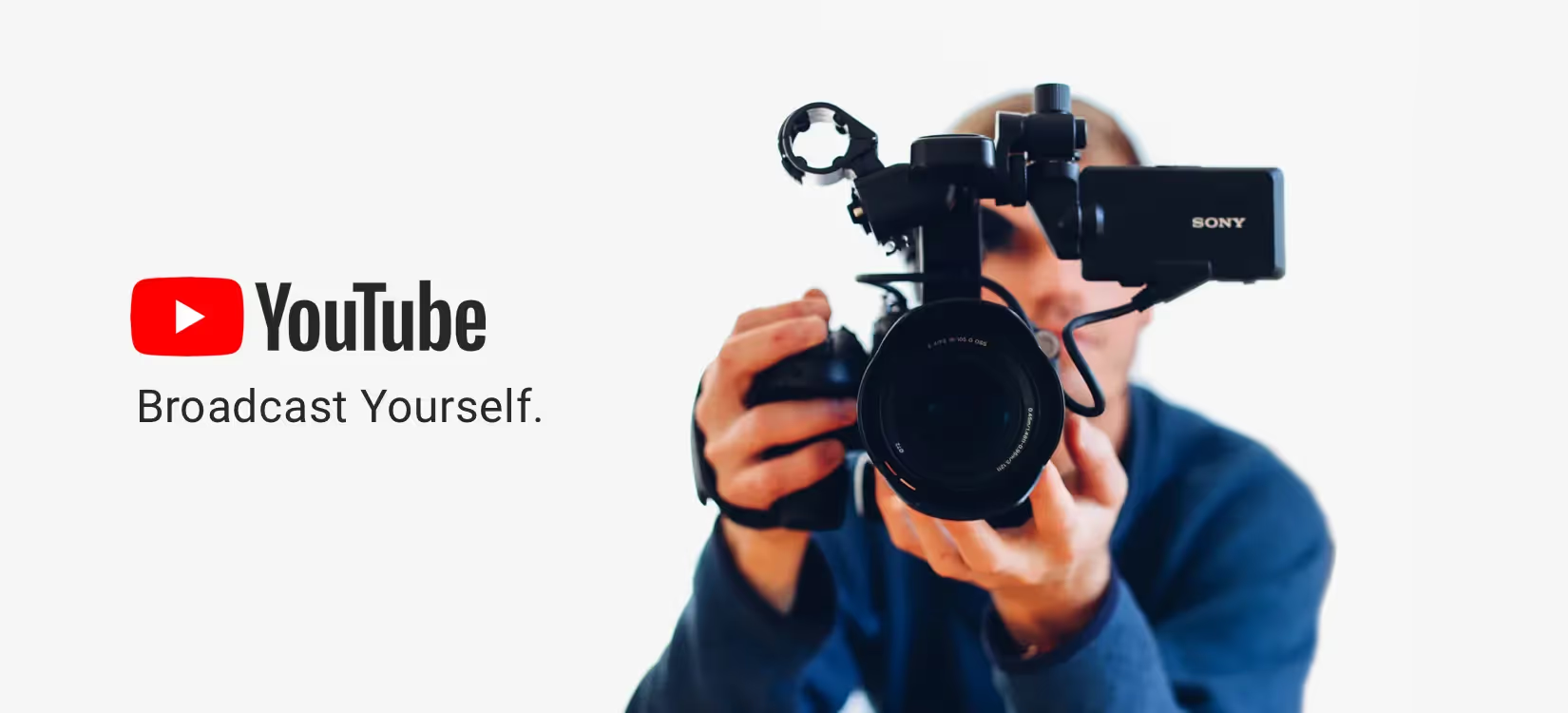
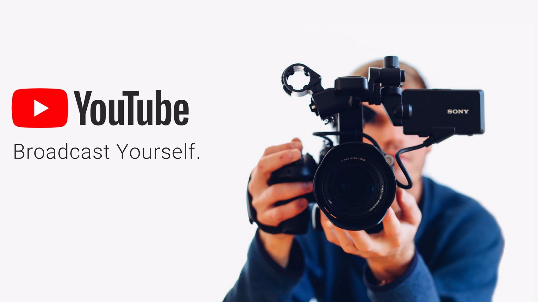
Slide 1: YouTube Title
Every pitch deck needs a title slide, and YouTube’s featured just that. But the monotone logo was just so boring! By simply adding a splash of color and an appealing image it can make all the difference in drawing eyes to the screen from the start. We found just the right photo in our free image library. Plus, Beautiful.ai makes it so simple to incorporate company logos into designs with a search engine for that specific purpose. Just type a company’s name (in this case: YouTube) into the search bar and add it to your slide.
Slide 2: Company Purpose
What is the company’s purpose? It’s great info for a pitch deck, but the original slide in this case was about as dull as you can get, nothing more than plain text. We already set up a theme for our slides with custom colors that align with YouTube’s brand. We used our headline slide and added a corresponding icon from Beautiful.ai’s free icon library. To finish it off, we added a logo into the bottom left corner, which will automatically appear on every slide going forward as a footer.

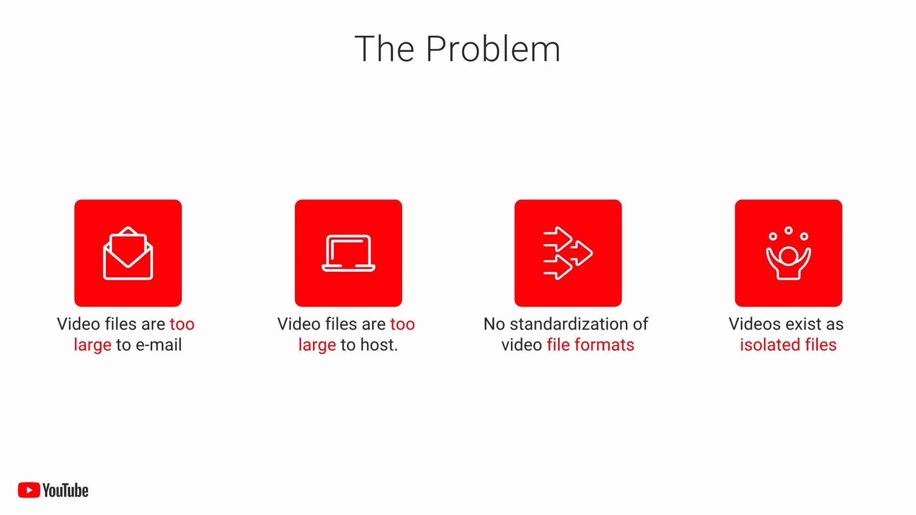
Slide 3: Problem
Any successful company solves some sort of problem, and investors definitely want to know what that is before signing a check. We livened up the slide with our thematic color scheme. Then, instead of including just another run-of-the-mill bulleted list, we included the same four problems from the original YouTube pitch with our icons with text slide in animated sequence.
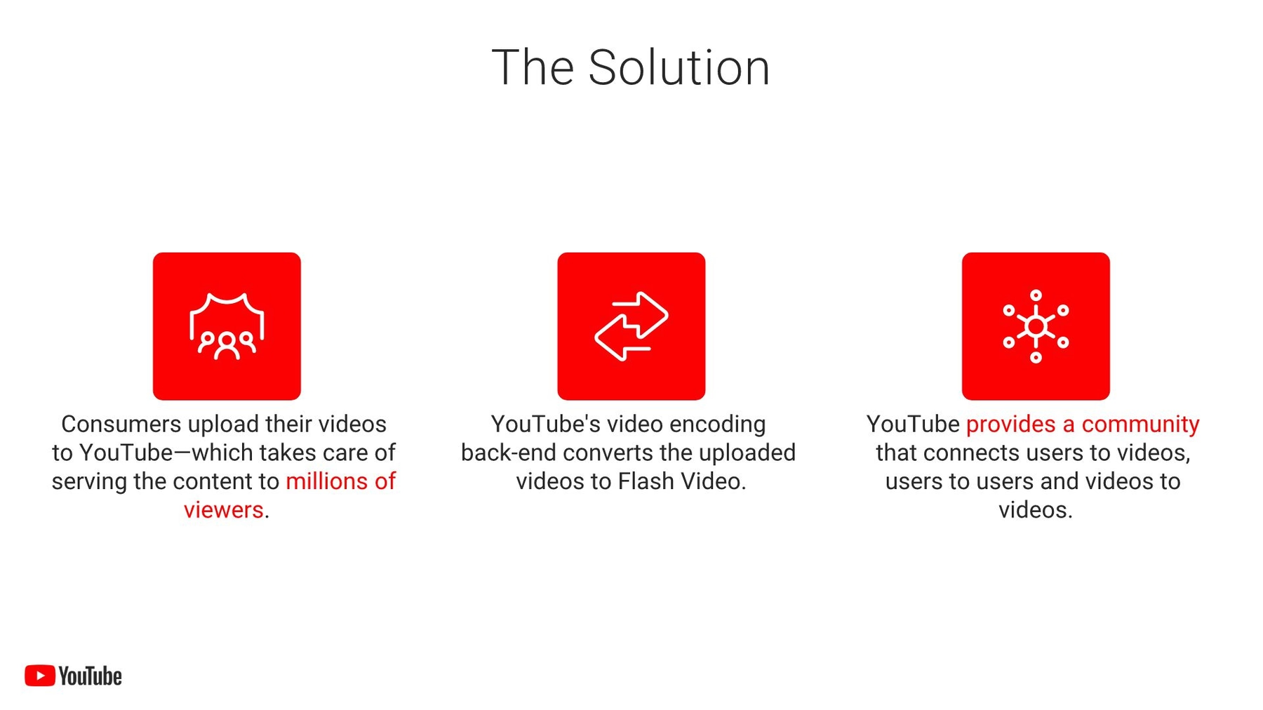
Slide 4: Solution
Once the problem is introduced, a successful pitch deck should tell investors how the company will solve it. Our solution slide uses the same template, color scheme, and animation as the previous slide. Isn’t it far more exciting than a simple black and white list?
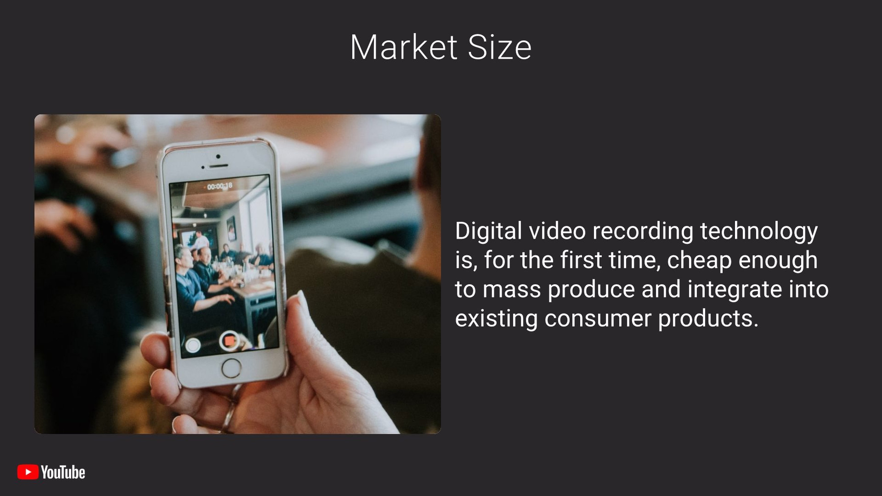
Slide 5: Market Size
We would hate for investors to get bored, so we changed up the next slide with a black background. To detail the potential market for the 2005 YouTube, we chose a carousel slide that allowed us to split the info from the original into two sections, one appearing after the other. How much more interesting is our slide with engaging photos alongside the information?
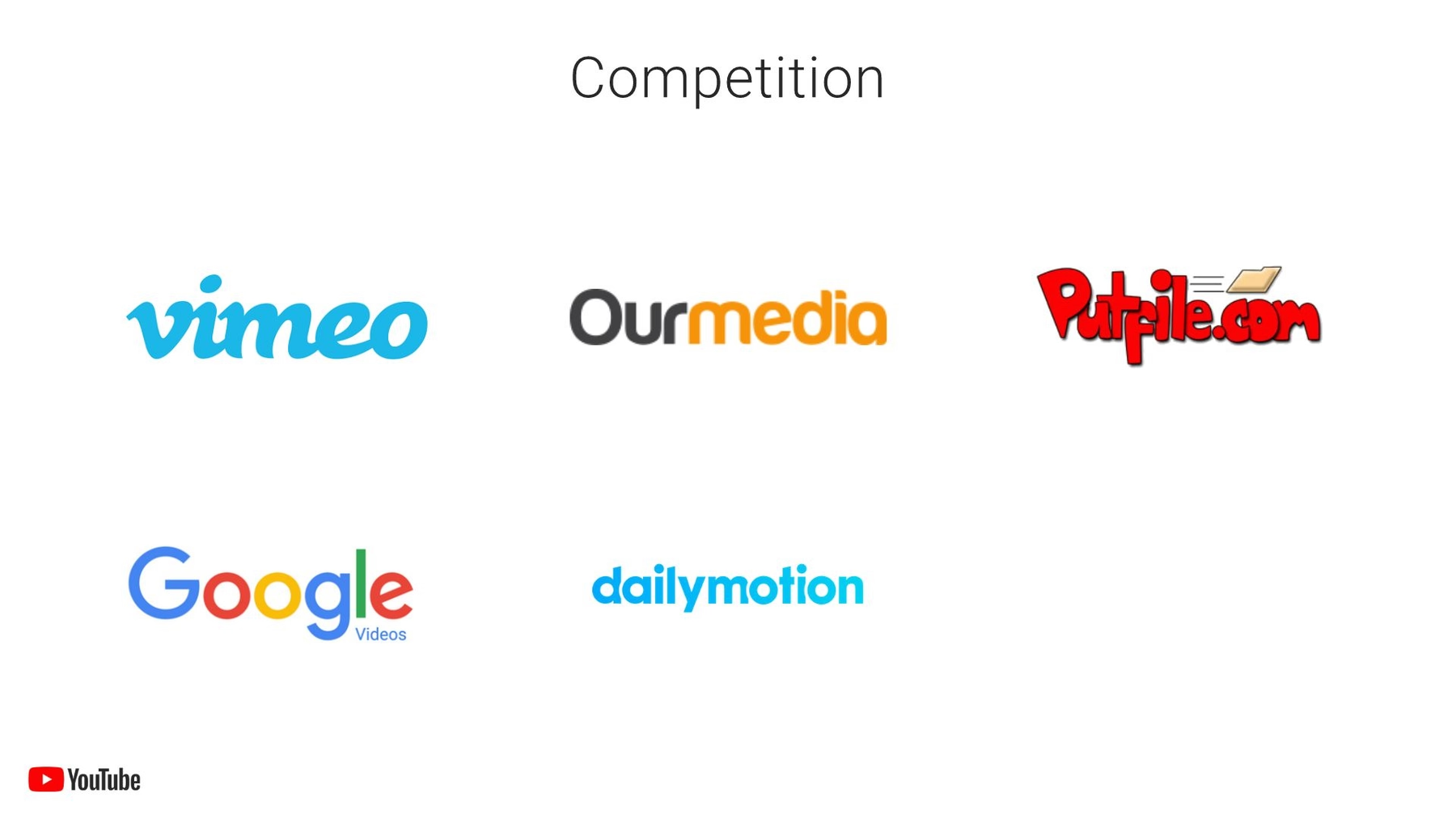
Slide 6: Competition
Even though most of us don’t remember any video-sharing sites before YouTube, it did have some early competition in 2005. YouTube’s original slide was as boring as you can get, just a list of names. However using our logo grid template, we were able to transform the slide with colorful brand logos instead of a typed list of names.
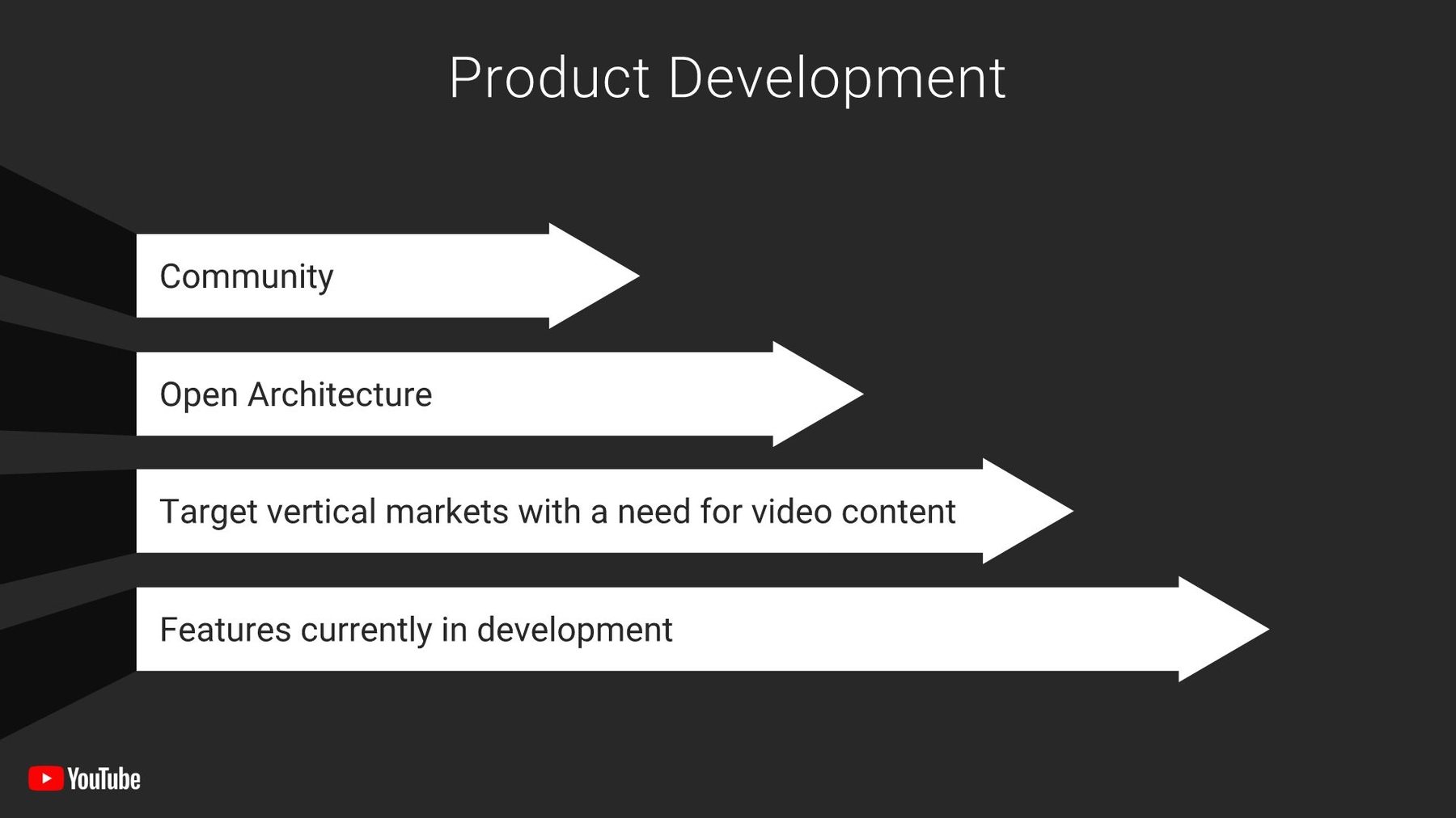
Slide 7: Product Development
To transform another of YouTube’s dull original slides, we took the bulleted list and inserted each item into an arrow bar graph. The slide is not only colorful thanks to the brand-centric theme we already established, but the arrows’ appearance is brought to life through our animation.
Slide 8: Sales and Distribution
We repeated the previous “arrow bars” slide format onto this one, and it was super easy thanks to our custom theme. The animation ensures that audiences don’t miss a single moment of the presentation and keeps them engaged throughout.

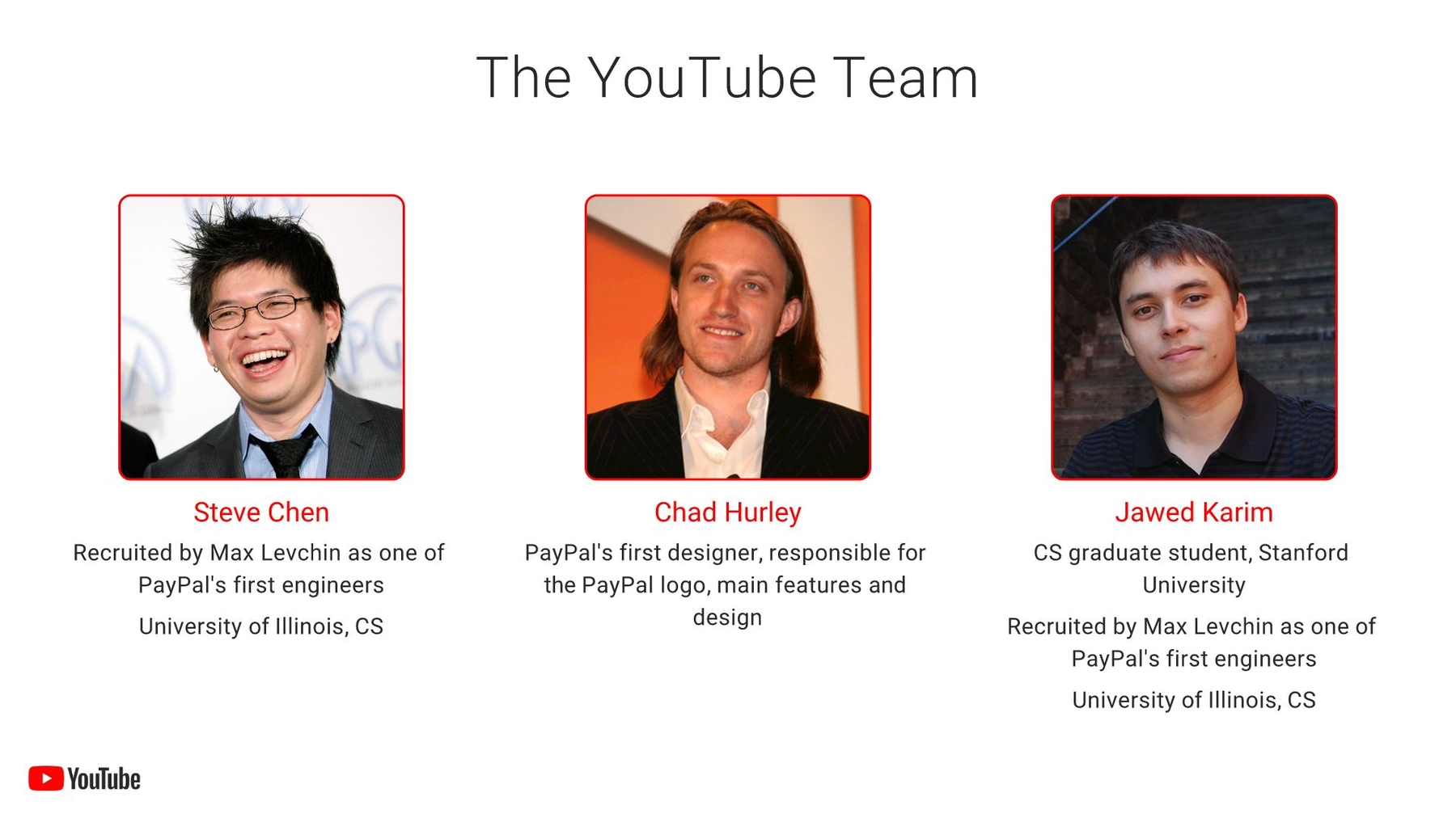
Slide 9: Team
Any effective pitch deck needs to introduce investors to the team behind the product. Sadly, YouTube’s original pitch deck met this requirement with a wall of text. Each of the three founders were listed, along with their professional background. Sure, it was 2005, but shouldn’t someone have known text blocks are a good way to put audiences to sleep? We completely transformed this slide in our redesign with Beautiful.ai’s team members slide template that features images of each stakeholder with their names (in branded coloring) and professional information beneath.
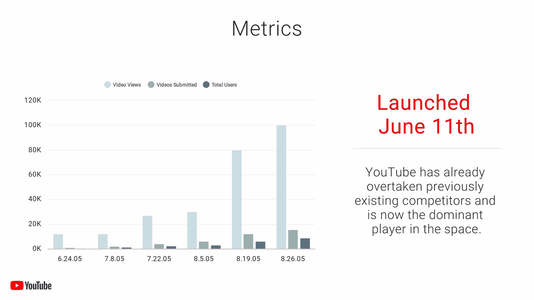
Slide 10: Metrics
YouTube included a slide with the company’s metrics, but it didn’t feature much information – just its date of launch and a statement of its early success. We made sure we included the same statement, but we added some pizzazz with that same YouTube branded color scheme and a corresponding infographic that visually tells the story of success. We found all-important data from YouTube’s early days that illustrates its rise, and we inserted it into Beautiful.ai’s spline chart. Then, we brought the whole thing to life with animation.
Slide 11: Conclusion
The best presenters never just leave their audience hanging after presenting their slides. They leave a lasting impression by closing their presentations with a clincher: a final story, compelling statistic or inspirational quote that acts as the cherry on top of their presentations. We like to finish the pitch deck with a slide placeholder that gives them time for whatever clincher they choose, so we added an image slide to showcase YouTube’s logo to the end of our redesigned presentation.

Would you subscribe to our redesign?


.gif)
.gif)
