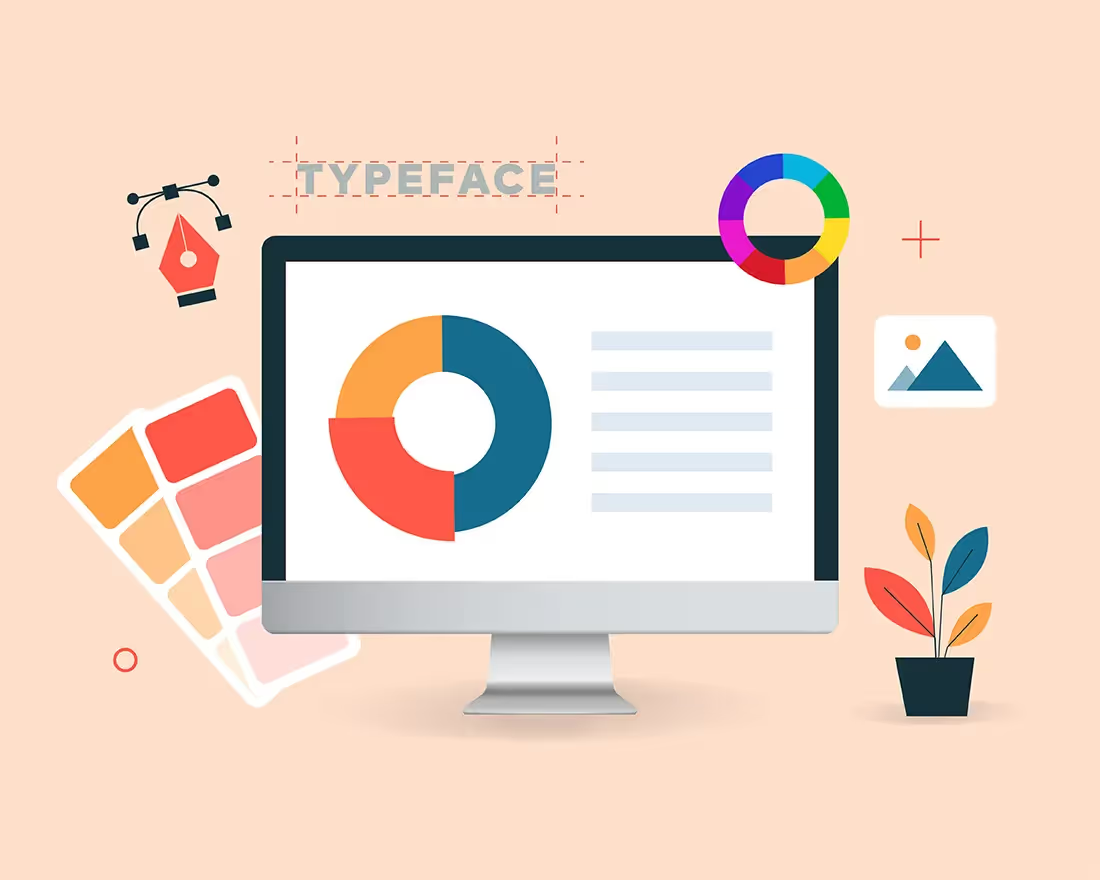

Sometimes people just can’t get presentations right—afterall, we aren’t all designers by trade. When you’re starting from scratch and trying to structure your thoughts it can be overwhelming. What fonts do you choose? How do you make a clean, easily-digestible graph to share your data? And what about aligning text boxes and resizing images? Are you presenting a clean storyline, or is it a hodgepodge of information with no clear structure? These are all questions you may consider when creating a presentation. But even if you can answer the above questions, that doesn’t mean your final product will be a show-stopping deck that will wow the audience. In fact, it might actually look bad.
Insert: a frankendeck.
In honor of Halloween, we’re talking all things frankendecks. What is a frankendeck, what are some relevant examples, and how can you avoid them? There’s a lot to unpack.
What is a frankendeck?
We’ve all seen them. A totally cringe-worthy deck that looks like a junk-drawer of content. The mess can come in many shapes and forms, like lengthy blocks of texts or 6 photos crammed on top of eachother on one single slide. A frankendeck is an out-dated, audience-killing, stale attempt at a presentation. It misses the mark in every aspect. In simpler terms: it’s ugly.
If you’re seeing a frankendeck in the wild, it’s likely because the culprit has little-to-no design background and doesn’t know what they’re doing. They may be first-time presenters, or old school professionals who aren’t tech savvy. Either way, a frankendeck is a disservice to your story. It distracts your audience from the key message and might even turn them off to the call to action at the end of the presentation.
Still unsure what a frankendeck looks like? Here are the 3 best (ugliest) frankendeck slide examples we could wrangle up from the wild web.
The 3 best (worst) frankendeck characteristics
1. Information overload
Our first frankendeck features this slide jam-packed with information about COVID-19. There is so much going on on this slide that there’s not a chance the audience will be able to digest it. So if they’re not going to be able to read it all, what’s the point of including it on the slide? Our suggestion would be to reduce these blocks of texts to short bite-size nuggets that are easier to comprehend. Our image grid slide template would be a great option here to share a mix of statistics, facts, and imagery.

2. Outdated assets
When your deck is the main focus of your presentation, you want it to be visually appealing. That means you don’t want a collage of poorly-cropped images, or pictures that belong in the early 2000s. There are many things wrong with this next slide, so let’s dive in. First, the assets used are extremely outdated. Your images should be relevant, quality, and on-brand— which is why we offer a free image library with hundreds of thousands of free stock images, logos, and icons. Second, the designer here didn’t make the best use of space. You can see the bullet points and the small graphic are all crammed at the top, leaving the second half of the slide blank. Our suggestion here would be to utilize one of our infographic slide templates to display the same information in a more modern, visually appealing way.
3. Lengthy text blocks
In typical PowerPoint form, this next slide is an example of chunky blocks of texts with little-to-no visual appeal. In this frankendeck, you can see that the excessive text boxes aren’t even properly aligned making it look even more messy and unprofessional. All-in-all, this slide is a snoozefest. Of course, we aren’t opposed to sharing bullet points in a presentation. Sometimes you have a handful of key takeaways or data points that need to be listed out. But there’s a wrong and a right way to do it. Our icon slide, bullet list, or number slide templates make your blocks of text look put together and clean so that your audience stays interested and engaged.

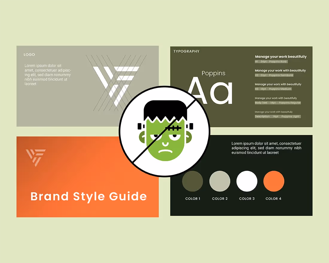
Avoid frankendecks with Beautiful.ai
Do those frankendeck slides make you cringe? Us too. Luckily, Beautiful.ai is your one-stop-shop to ensure you never create a frankendeck again. Our smart technology does the heavy lifting for you and applies design best practices to each slide so that they always look clean, professional, and on-brand. All you need to do is plug and play, and our smart slides will adapt as you add your content. This means your text boxes are always proportional, your images are always aligned and cropped properly, and your words don’t mysteriously disappear off the slide. In Beautiful.ai it’s nearly impossible to create an ugly deck. We set up the guardrails using design principles from the professionals so that you can put an end to frankendecks and create a beautiful presentation instead.