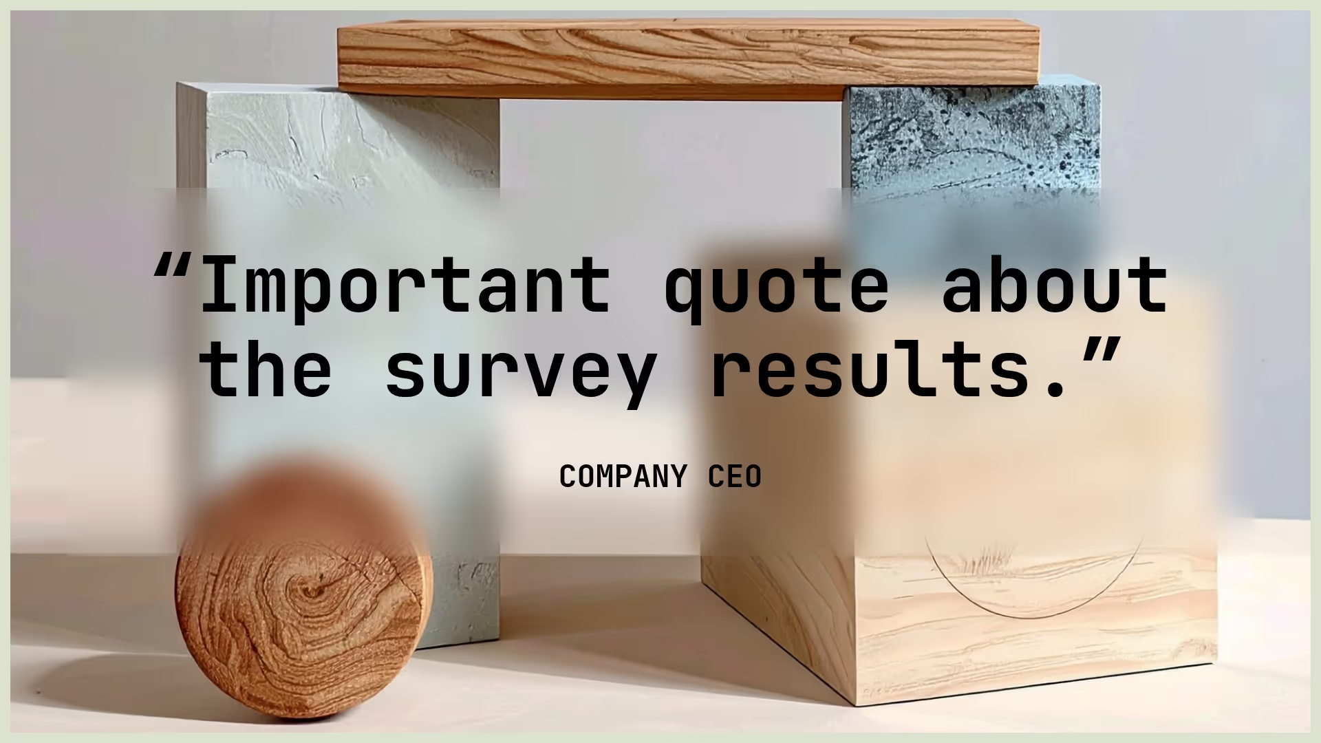
Survey Results Presentation Template

Overview
A survey results presentation is a structured visual summary of the data collected from a survey, often delivered through infographics or interactive dashboards. It highlights key findings, trends, and insights derived from participant responses—using charts, graphs, and concise commentary to make the data easily digestible. This transforms raw data into actionable insights, helping stakeholders make informed decisions, identify areas for improvement, and align strategies with audience needs or market feedback.
Beautiful.ai’s survey results presentation template can give teams the tools they need to respond to feedback and define new opportunities. The customizable template has everything teams need to turn survey data into results that drive action.
Our survey results presentation can also help you:
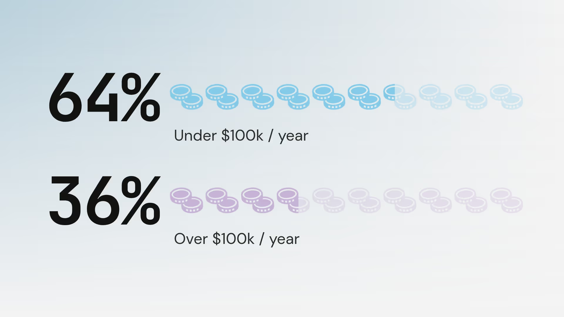
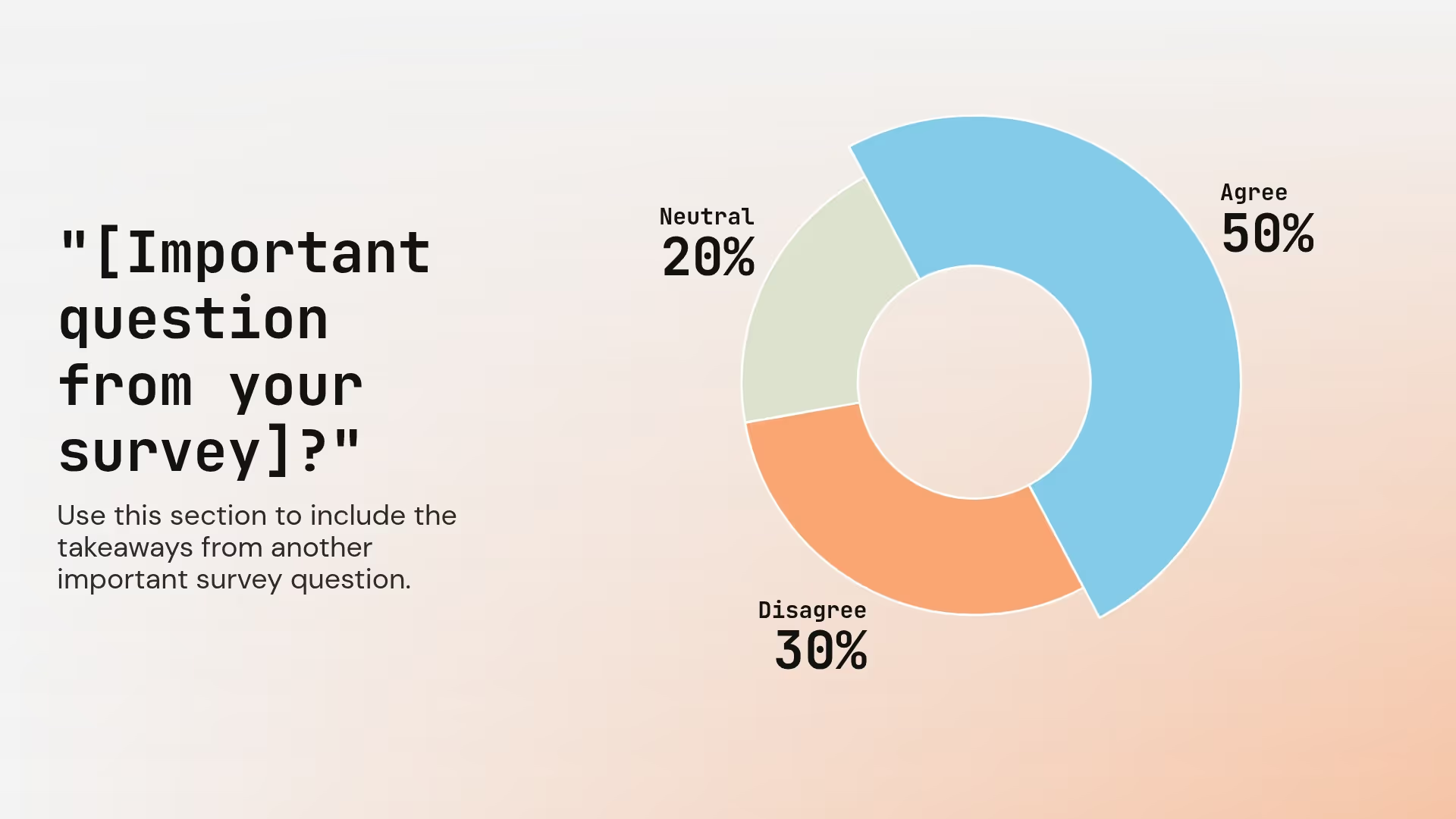
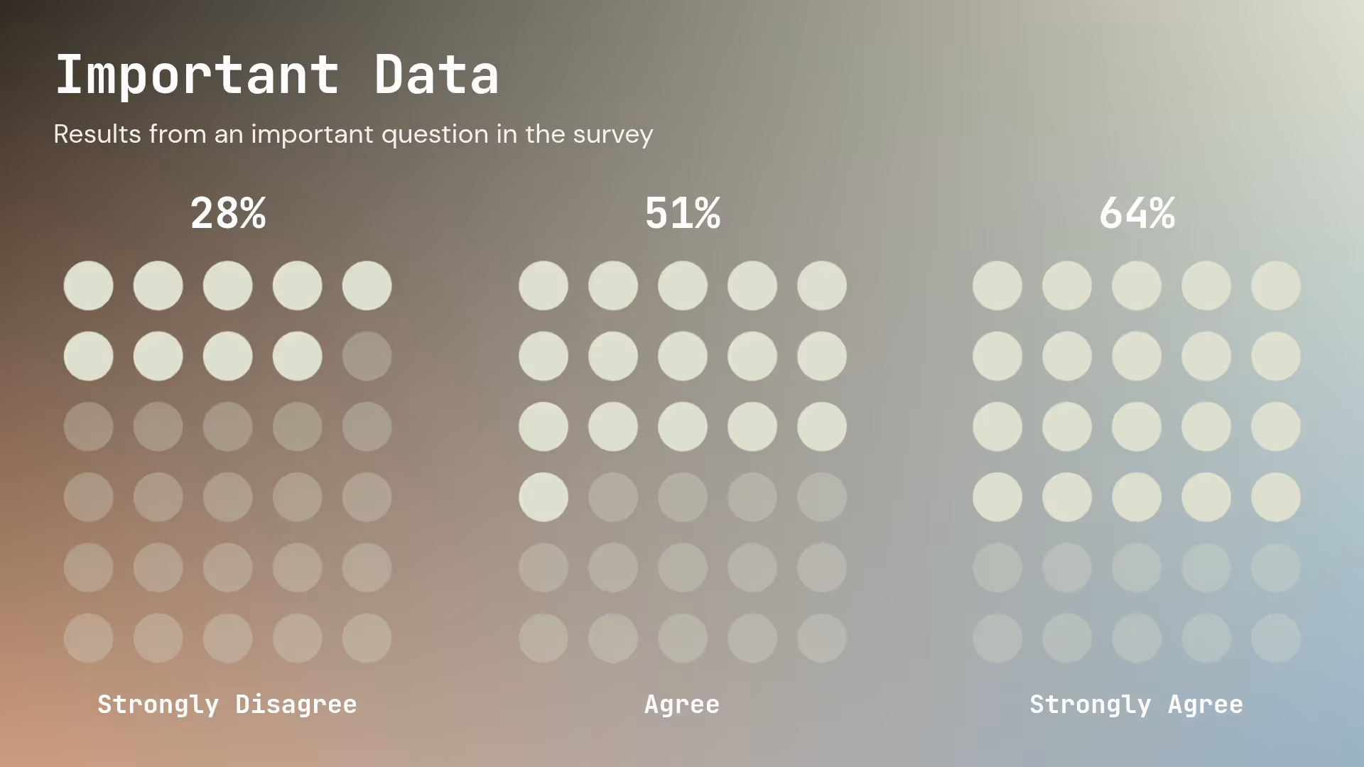
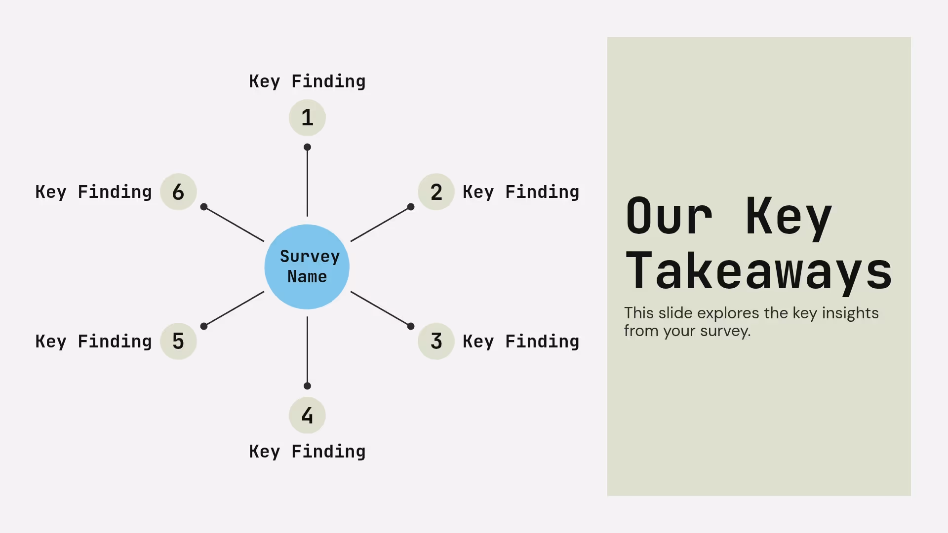
- Organize your survey data in a more digestible way for different audiences
- Identify trends across various data sets
- Support data-driven storytelling in business, research, or organizational settings
Use our template to create an effective survey results presentation


Pro tips for a survey results presentation
Tell an engaging story
Make use of graphics
Use color strategically
Keep it short
Related templates
Economic Advisory Presentation Template
PESTLE Analysis Presentation Template
SEO Competitor Analysis Report Presentation Template
The AI presentation maker for faster impact
With AI that kickstarts your deck and Smart Slides that handle the formatting, you can focus on your story, not the alignment. Go from create, edit, to present with designer-level polish and in a fraction of the time.
Features to ideate, edit, collaborate, and present.
We’re a complete presentation platform. Everything you need is in one place.


Smart Slides
Smart Slides auto-align, resize, and animate your content as you edit, so you focus on the message, not formatting.
Create with AI
Kickstart your ideas with AI. Just enter a prompt, add extra context, and get a beautiful presentation in seconds.
Themes & brand control
Define colors, fonts, logos, icons, and footers once. Save and reuse brand themes across decks and teams.
Data visualization
Instantly create animated charts and graphs. Link any spreadsheet for fast edits and live updates.
Image libraries
Get direct access to an expansive library of free, real-life stock images and videos, no need to leave your slide.
Presentation templates
Discover our gallery of professionally designed presentation templates, multi–slide decks built to give you a head start.
Presentation workflows
Shared slide libraries, real-time collaboration, user permissions, locked themes, and more.
Viewer analytics
Control access, and track engagement so you know what resonates, and when to follow up.
Animation & narration
Add embedded voice or video context to any slide - so your message lands clearly even when async.


“Beautiful.ai helps us quickly create clear and compelling presentations to share our strategy and results. It has been easy to integrate our branding and to pull from the library of materials created by others — building a cohesive and collaborative suite that helps us advance our mission."

"Beautiful.ai increased our efficiency. I mean, 50% sounds crazy, but it's pretty accurate when you consider all of the manual stuff that we used to have to do that Beautiful.ai now does for us."

"What you guys have created is a foolproof way to ensure quality presentations. It's almost just like they have a graphic designer over their shoulder while they're creating their decks."

“For any business owner or entrepreneur where time is of the essence you lose the ability to put those nice touches on presentations, Beautiful.ai does it for you, especially if you aren't creatively gifted!”
Related blog posts
.gif)
Personalized at Scale: Using AI to Tailor Sales Decks for Every Prospect
The 30-Minute Deck: A New Standard for Busy Teams
.gif)
The Art of the Opening Slide: How to Hook Your Audience in 60 Seconds
Try it free for 14 days
Start building Beautiful presentations.

