
It’s hard to believe it’s been just seven years since “swiping” entered our lexicon. Before Tinder introduced the tactic for choosing a date, swiping to most people was nothing more than an action performed by windshield wipers during a rainstorm.
All of that changed when the company originally known as Matchbox took the dating world by storm, forever changing the way singles meet. In 2019 Tinder ranked as the world’s top non-gaming app in terms of total revenue, now exceeding $2.2 billion each year.
Before Tinder, courage was required in making the first move, never knowing for sure if the advance would be welcomed or shunned. Even dating apps at the time required someone to take a risk and contact a potential love interest without the knowledge of whether there was even a mutual attraction.
“In the real world, you're either a hunter or you're being hunted. If you're a hunter, there's constant rejection. And if you're hunted, you're constantly being bombarded,” Tinder co-founder Sean Rad told Inc. shortly after the app was launched.
“On Tinder, you anonymously say if you're interested in somebody, and if that person happens to be interested in you, you can have a conversation,” Rad continued. “If they're not interested, they never know you liked them anyway, so you don't feel embarrassed. And for the person who's being hunted, we take away that overwhelming experience.”
Rad and fellow co-founder Justin Mateen felt that a double opt-in system would provide much-needed comfort and confidence to singles hoping to approach someone to whom they were attracted. After founding Tinder within startup incubator Hatch Labs, a subsidiary of InterActiveCorp, the app was seeded to numerous college campuses where its success quickly led to expansion across additional campuses.
At the time, swiping hadn’t yet been implemented into the program. Instead, users clicked on either a green heart to indicate attraction or a red X to take a pass on the displayed photo. Regardless, Tinder won TechCrunch’s award for 2013’s best new startup.
By 2014, Tinder users were swiping more than one billion times each day, producing about 12 million daily matches. Since then, the swipe functionality has been utilized by multiple other companies.
Still, the swiping all started with Tinder – and Tinder started with a pitch deck.
Tinder’s Original Pitch Deck
In the short and sweet slideshow, Tinder told the story of a single named Matt, who is too shy to approach possible love interests. Tinder – or Matchbox as it was called until it was determined that name too closely resembled competitor Match.com – offered a cure for the fear of public rejection.
The original pitch deck explained how the app connected single people in proximity to one another, but only allowed messaging when both parties mutually liked one another’s profile. The presentation even explained the early plan for monetizing the app, with in-app purchases to access more than the first few free matches.
Was the Tinder pitch deck too simple? Too short? Obviously, it was effective in 2012, but what about in 2020? Today’s entrepreneurs and investors seek more than a bare-bones PowerPoint-style presentation. They want style. They want personality. They want a cohesive visual design.
Tinder’s original pitch was surely a winner, but was the accompanying pitch deck a seller? What might have happened had the Matchbox crew used a professionally designed pitch deck?
To answer that question, the team here at Beautiful.ai redesigned Tinder’s original pitch deck using our special brand of artificial intelligence. Our version is still short and sweet – shorter in fact – but it tells a more cohesive story, and we certainly think it’s a lot sleeker and way more attractive. Plus, we were able to apply a single theme to the full slide deck, so each slide automatically shares common page design, color schemes and fonts.
We think our redesign of Tinder’s pitch deck is more “beautiful,” but what do you think? Let’s take a look at what we did. Would you swipe right on our version?
Download the customizable template here
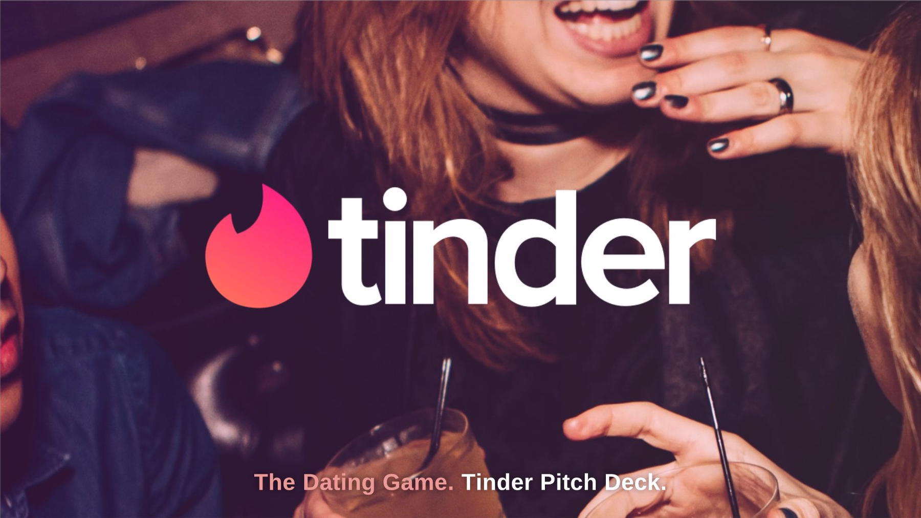
Slide 1: Title
What’s a presentation without a title? For that matter, what’s any type of content without a title? Books have covers. Articles have headlines. Slide presentations have title pages.
Tinder’s original pitch deck had a rather bland title page, just the Matchbox logo on a white background. We made it beautiful by incorporating an image from Beautiful.ai’s free stock image library into the full background. That way, audience members’ eyes are immediately drawn to the screen.
We topped it off with Tinder’s logo – another image that came from a free library within our PowerPoint alternative software. Just type in a company’s name into our search engine, and you’ll instantly see a list of applicable logos. That way, there’s no question what the following pitch will encompass.
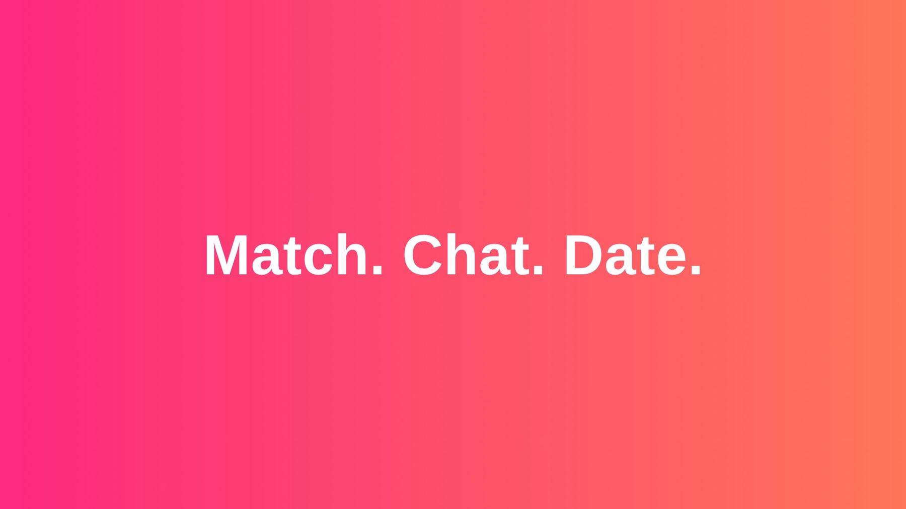
Slide 2: What is Tinder?
A pitch deck is created to attract attention, not to provide the nitty-gritty details about a company. After all, the presenter can communicate plenty more details vocally or in printed addendums. We chose to highlight the gist of Tinder in three words: Match. Chat. Date.
Thanks to the theme we selected for the entire presentation, the font was already selected, and our special brand of artificial intelligence repositions content as it’s added using some of the best principles of professional design.
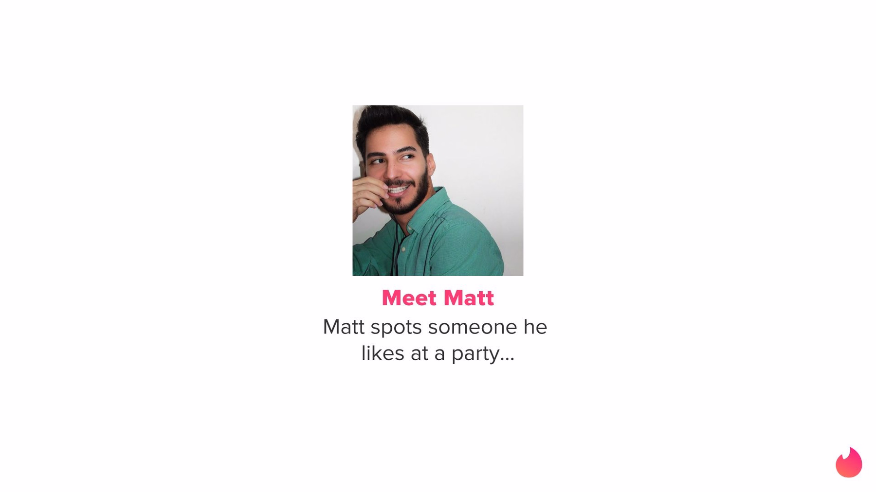
Slide 3: Meet Matt
Just like the original Tinder pitch deck, we introduced audiences to “Matt.” We used our Team Members Smart Slide template so that his image is centered on the slide. Our preset theme automatically added the Tinder logo into the same bottom corner of this and each of the following slides. It was easy to add a short description of Matt’s position using the same font and color scheme selected in our theme.
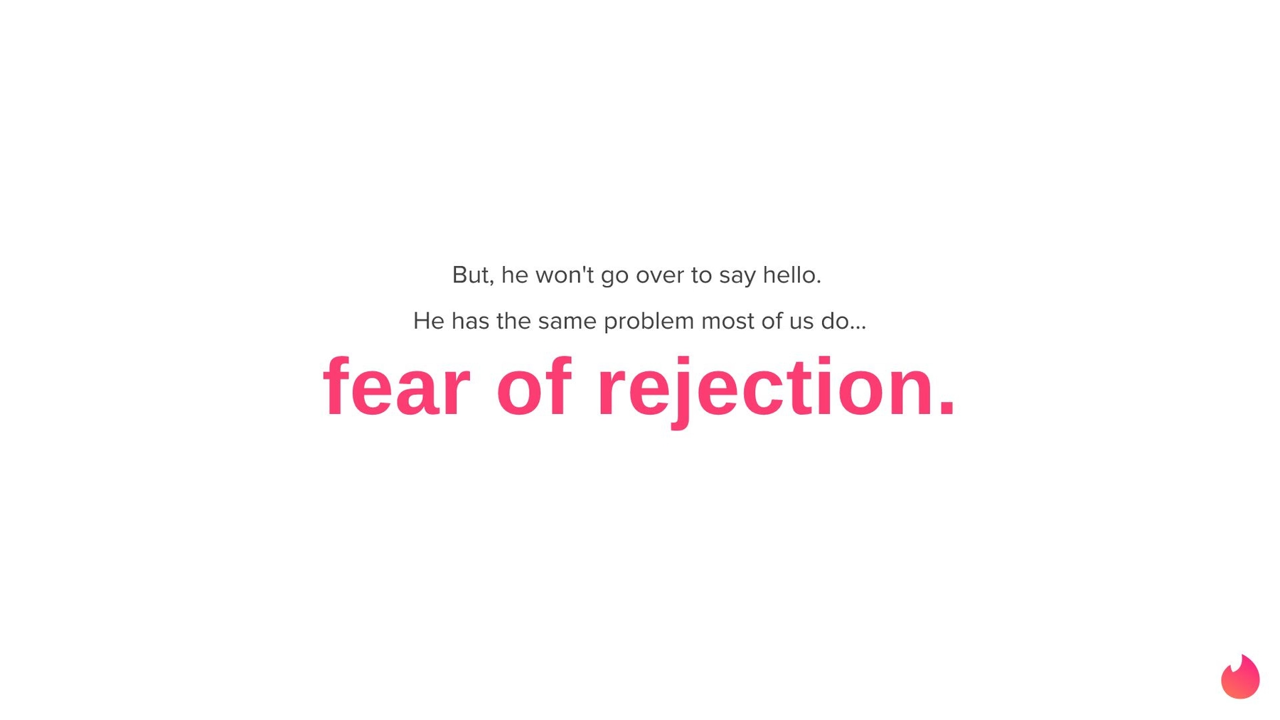
Slide 4: The Problem
Any good pitch will present a problem, then explain how the company will solve it. In Tinder’s pitch, the problem arose when “Matt” was afraid to approach someone he likes at a party. What’s holding him back? The fear of rejection, of course! In its original pitch deck, Tinder found a great way to harness customer empathy – and we agreed with the choice!
We made this short explanation stand out with our Header slide, and a larger, colored font that only appears after the introduction of Matt’s predicament. In doing so, we were able to combine what Tinder originally placed on two separate slides. Once again, our preselected theme made it simple entering the text in the proper font and color.
Slide 5: The Solution
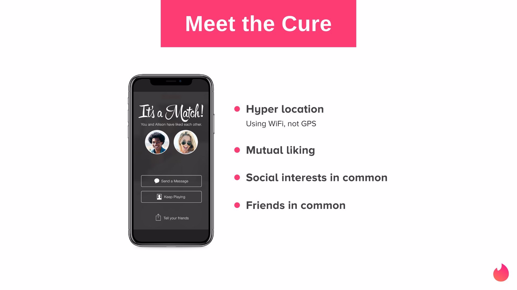
So how will Tinder solve Matt’s dilemma? Our next slide introduces audiences to “the cure.” We’ve used our Mobile Screenshot slide template to feature an image of a smart phone (showcasing Tinder, obviously), then placed a bulleted list alongside it. There, we described the Tinder solution. It solves these dating dilemmas by using hyper location, seeking mutual likes and displaying common social interests and friends. The original Tinder pitch deck had the same information, but presented as a plain bulleted list, aligned to the left on a white background. Boring!
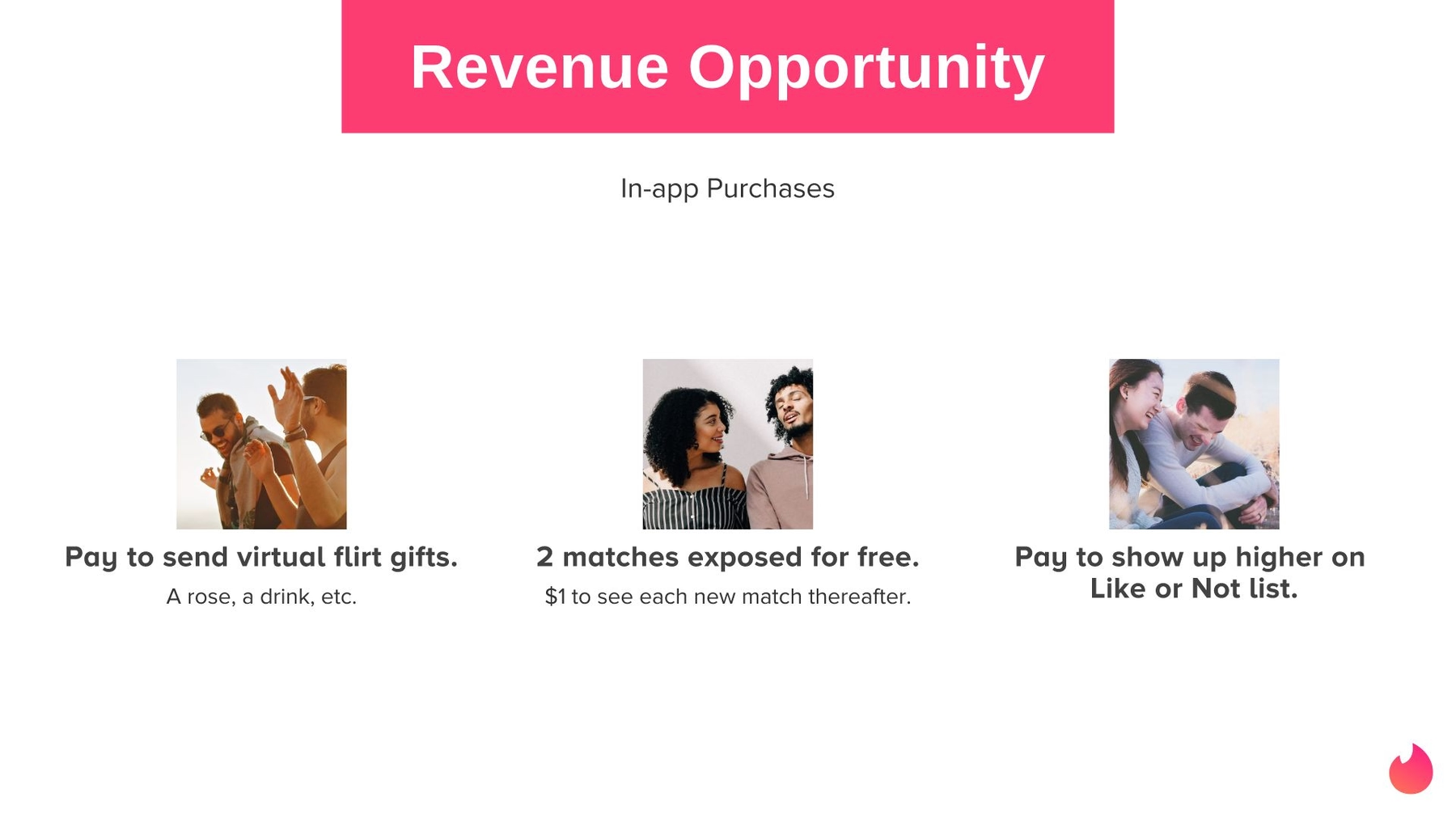
Slide 6: Revenue Opportunities
Much like the original Tinder pitch deck, our made over presentation highlights revenue opportunities. After all, potential investors want to know how they will recoup their capital. In the case of Tinder, revenue would be derived from in-app purchases. But instead of another boring bulleted list, we used our Icons With Text slide to share the same information with corresponding images. Our pre-selected theme matched the same color scheme as the rest of the presentation, and our cloud-based software automatically placed the content in the most eye-catching arrangement.
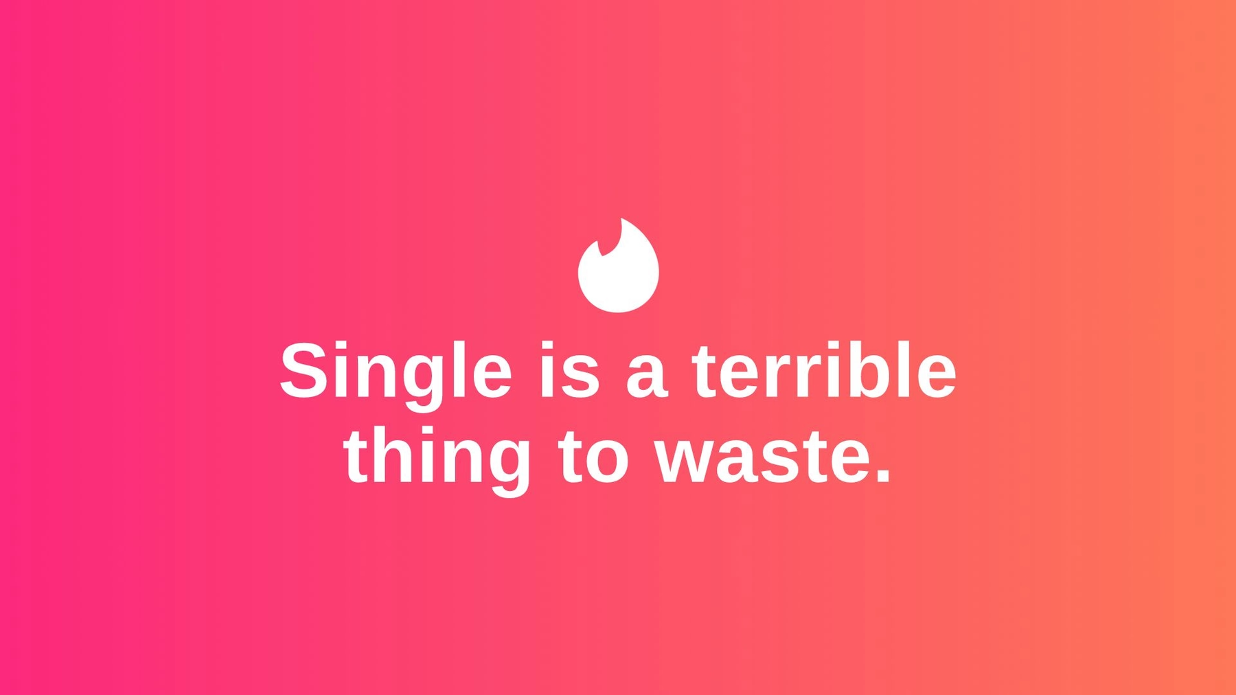
Slide 7: The Point
Tinder’s original pitch deck ended with the revenue opportunities, but that was a little too abrupt for our taste. We wanted to end with a statement, and we accomplished this with a final slide that explains the point of the company: Single is a terrible thing to waste.
We made an impactful slide using the same color scheme from the entire presentation in an Image Smart Slide overlaid with text using the same fonts – all courtesy of Beautiful.ai’s available themes. We also included that famous logo once again. This final slide not only leaves a lasting impression, but it gives the presenter the opportunity to make any final statements while continuing to attract audience members’ eyes to the screen.
So, what do you think of our redesigned Tinder pitch deck? Is it beautiful? Will you swipe right?


.gif)
.png)