

We now live in an Uberized world. It wasn’t much more than a decade ago when Uber founder Garrett Camp and co-founder Travis Kalanick struggled to get a ride on a blustery winter night in Paris.
As they waited, Kalanick recalled a similar struggle he faced while trying to book a car service for New Year’s Eve. There had to be a better—and more affordable—way to get a ride. Why not create a platform that allows multiple people to share the cost of a ride service? Under this premise, Uber was born.
Of course, neither man had any background in the travel industry—Camp made millions from selling StumbleUpon to eBay in 2007, and Kalanick met similar fortune by selling his creation, Red Swoosh an international tech firm—but they didn’t need it. Originally known as UberCab, their company was based upon a smartphone app that allowed users to get a ride with a tap. After a San Francisco traveler first booked a ride with Uber in July 2010, Uber moved to New York City before launching internationally with its December 2011 Paris debut.
By the time it made its Wall Street debut in 2019, Uber had achieved more than $11 billion in revenue, had launched in 100 percent of the top U.S. cities and 30 percent of the world’s nations, and was valued at $82 billion.
Uber’s ridesharing concept was so ingenious that it was soon adopted by a practically endless list of industries. There’s no need to invest in product if you can develop an app that links customers to providers, and it’s more economical for consumers to share the cost of a service.
The sharing economy business model allowed for the creation of businesses such as Lyft, Airbnb, TaskRabbit, Erento, CouchSurfing, etc. In fact, Product Hunt—the encyclopedia of startups—has an entire category of “Uber for X” companies.
Of course, none of this happened without capital, and Uber made the first major step toward its road to success with $1.25 million in seed funding investors including Napster cofounder Shawn Fanning, First Round Capital and others. Uber’s founders made a great case for their company, and as with so many startups, they relied on a pitch deck to present their ideas and data.

Uber’s original pitch deck, which we retrieved from LinkedIn's SlideShare, might have been successful, but we have to admit it leaves plenty to be desired. No offense to Kalanick and Camp, but their pitch deck was kind of a snooze fest. Sure, it had all the necessary elements, but it was designed like a 1990s PowerPoint throwback.
What might the original UberCab have become had it been pitched with a professionally designed presentation? We had to try our hand at creating a pitch deck that presents Uber’s data while really engaging audiences.
Download the free customizable template here.
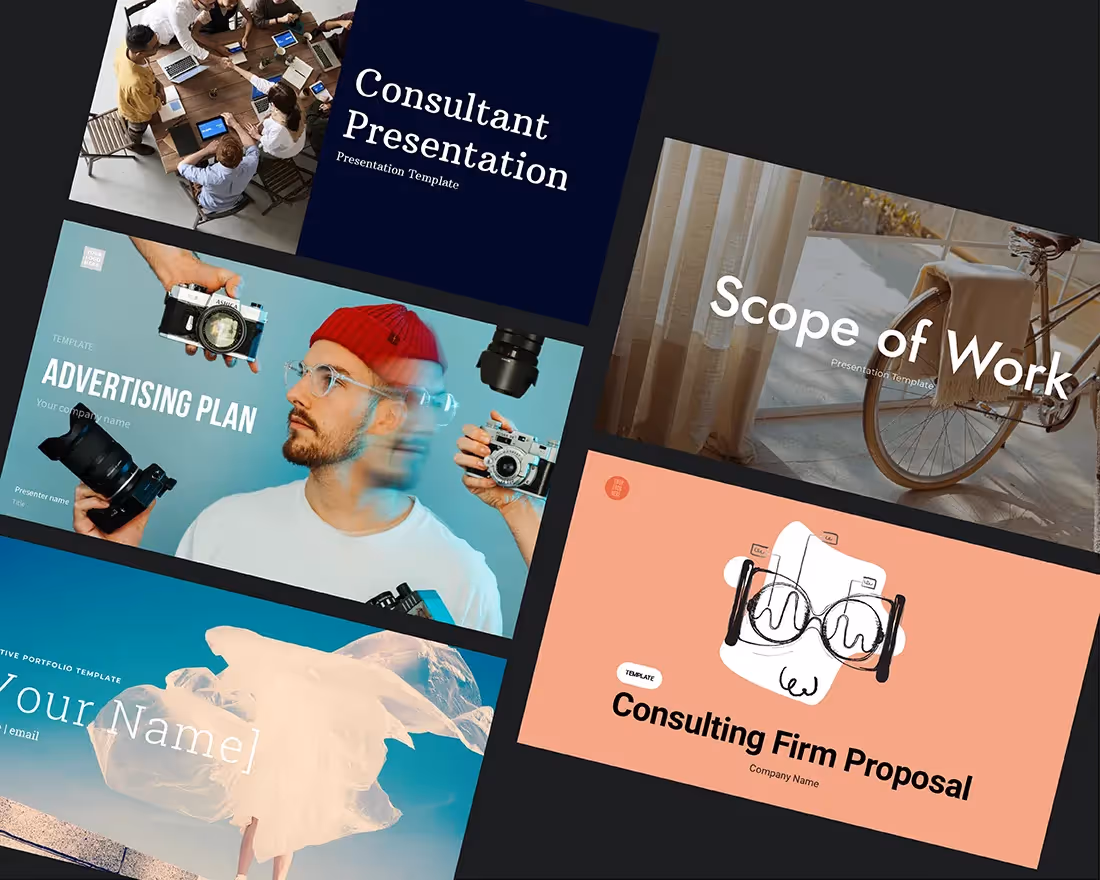
We redesigned the original Uber pitch deck using Beautiful.ai’s PowerPoint alternative presentation software. Our revised pitch deck template incorporates professionally-recommended practices of good design, including a variety of customizable themes and presentation templates for practically any purpose. Plus, Beautiful.ai’s presentation design software features a library of vivid, public-domain images, fonts, logos and attention-grabbing animations.
We added our brand of vivid images, informational graphics and eye-catching animations to the original Uber slide deck. We also condensed Uber’s first pitch deck from 25 to 17 slides.
Is the Uber pitch deck better when it’s “beautiful?” Read on to find out how we did it.
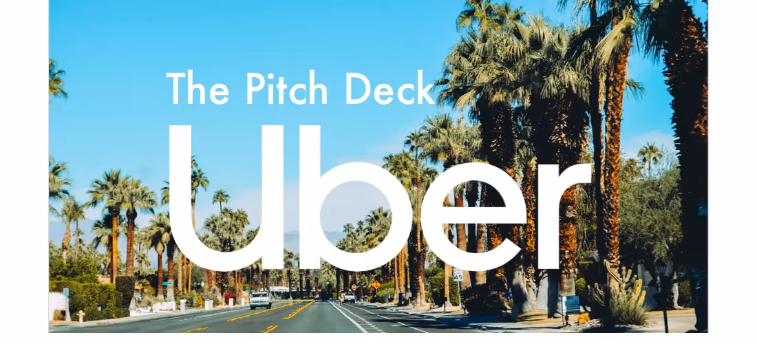
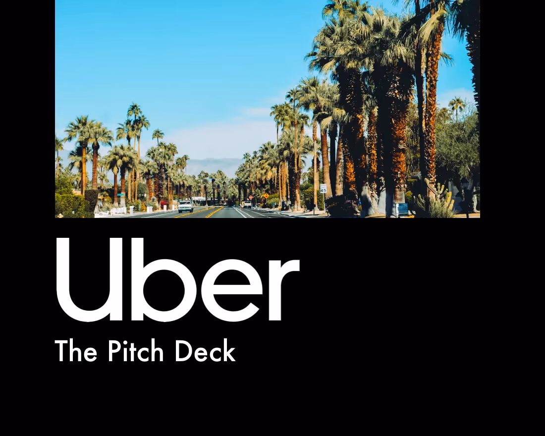
1. Title Page
Every pitch needs a catchy introduction, and the title page of the pitch deck gives the presenter an opportunity to dazzle the audience. Uber’s original title page was OK, but we livened it up with a colorful image from our library. We also selected a theme, so every slide will already be set to add the same fonts, colors and a customized footer.
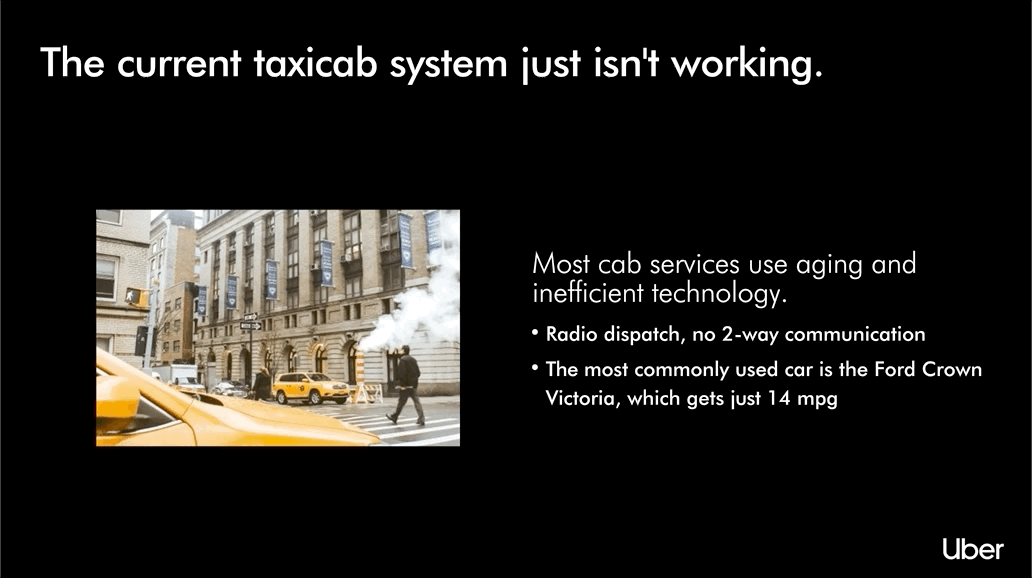
2. The Problem
Any successful brand needs to solve a problem. Uber happens to solve several problems, so our carousel slide feature was perfect to present this important content. We added one heading, then created four variations, each with an image and text boxes highlighting a problem Uber solves.
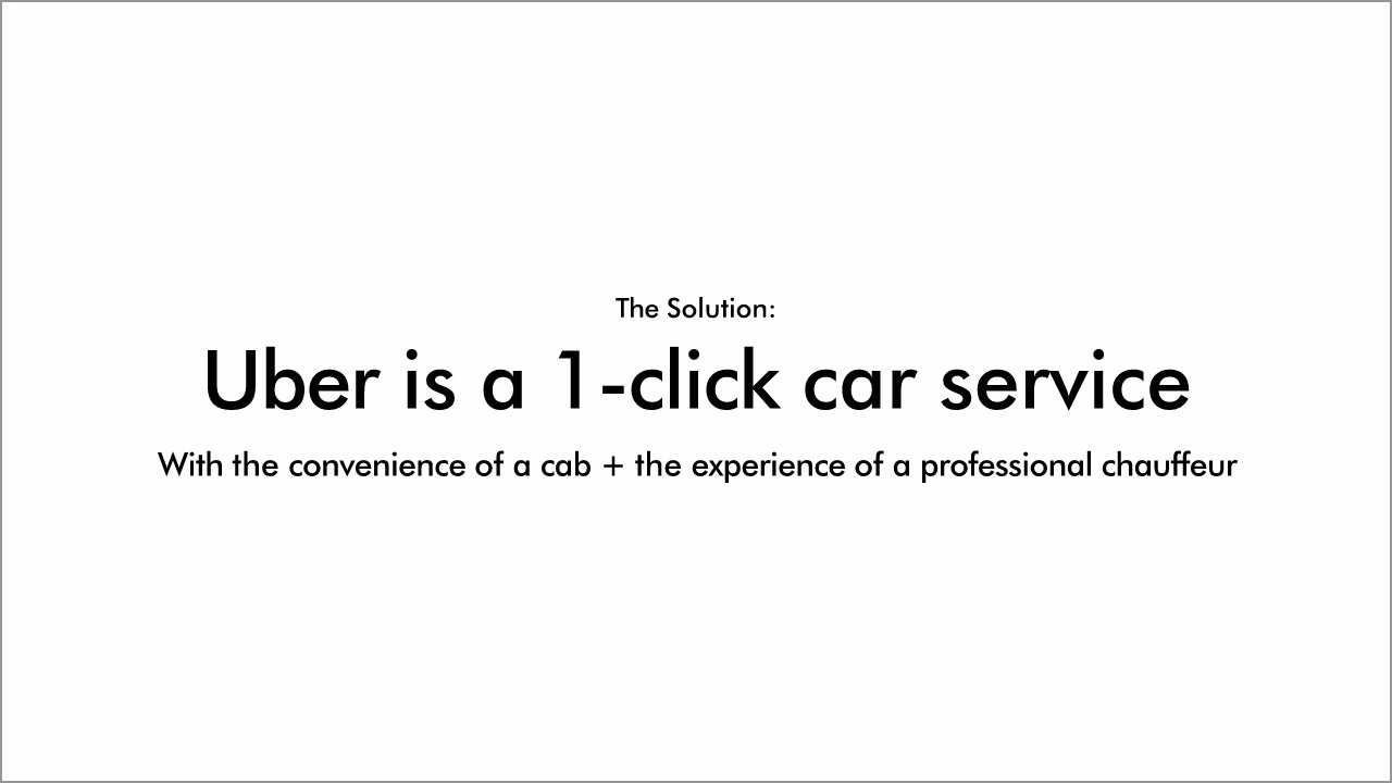
3. The Solution
While there might be multiple problems, Uber provides a single solution to them all. Thanks to our preset theme, we were able to quickly and easily create the next slide, which clearly indicates Uber is the solution. It wasn’t necessary to present a slide full of boring text like the original Uber pitch deck.
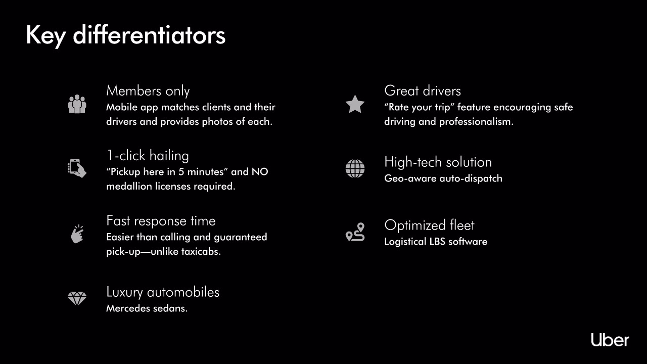
4. Key Differentiators
Uber’s next slide shared important information about then-UberCab, but it was a wall of text…. Boring! We broke up the text by presenting the same information in bulleted text boxes, each bullet replaced with a corresponding icon. We added further excitement to the presentation by animating each point, so they appear concurrently as the presenter speaks.
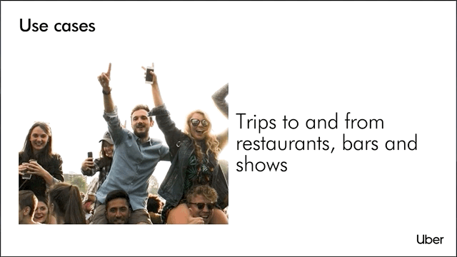
5. Use Cases
The Uber team provided several use cases in its original pitch deck. Again, however, the resulting slide was a boring wall of text. We refreshed the use cases by adding them to another carousel slide, complete with dazzling images from our library.
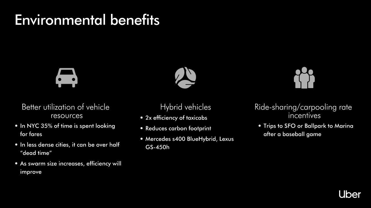
6. Environmental Benefits
One of Uber’s biggest selling points was its friendliness to the environment. But Uber’s presentation of this vital information was enough to put audiences to sleep—just another lengthy block of text without so much as a creative font. We transformed this content with our icon list slide, separating each important fact in its own text box and a corresponding image icon.
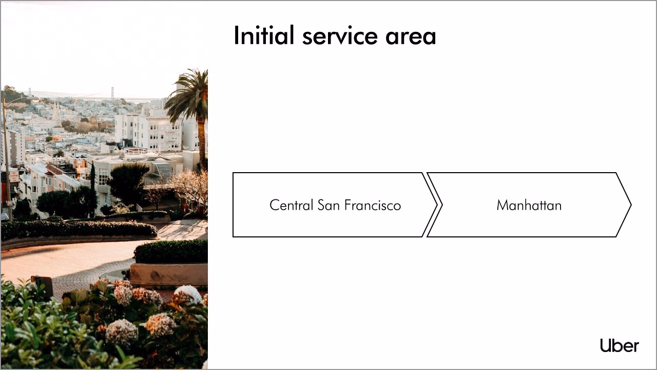
7. Initial Service Area
Uber presented its initial service area with a map of San Francisco – not the most engaging image for a slideshow presentation. We created a slide using our process diagram slide, which presents data in the form of a timeline infographic: San Francisco to Manhattan.
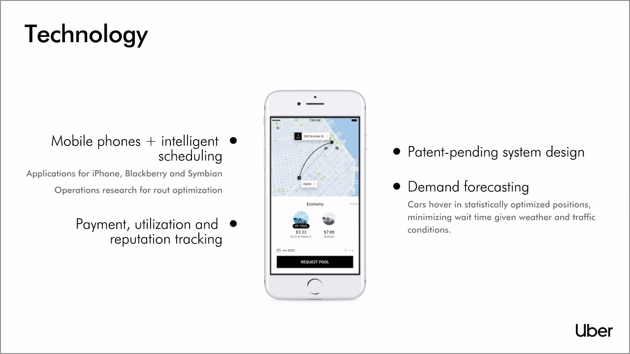
8. Technology
Uber’s technology is the crux of the entire business, and the original slide incorporated a few thumbnail images to liven it up. Unfortunately, the small radial diagrams don’t tell audiences a story. We replaced them, and we broke up the text into digestible bullet points.
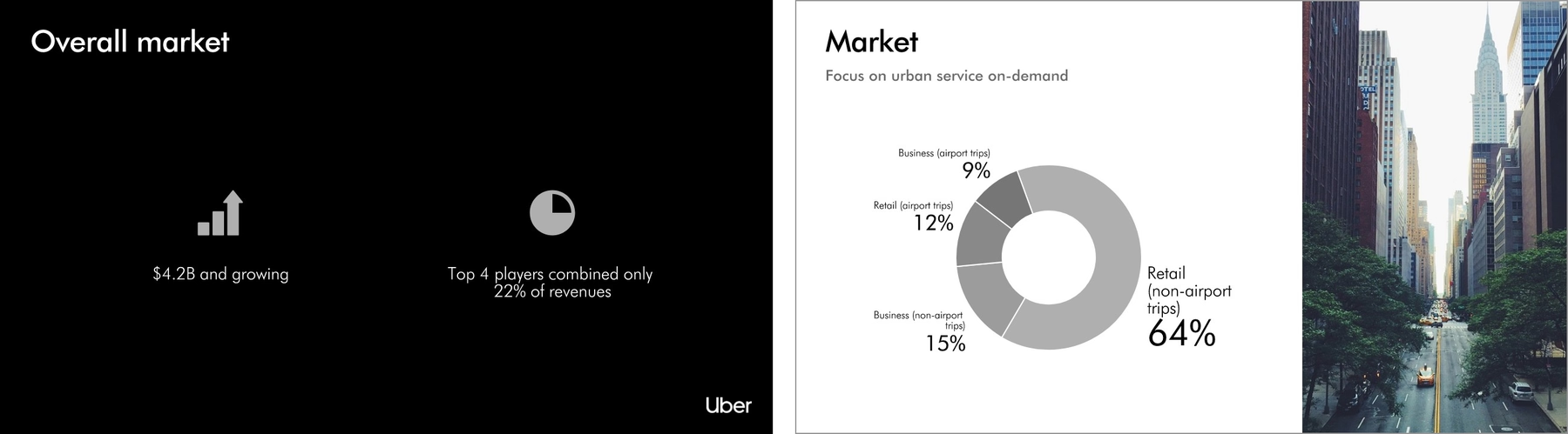
9-10. Market
A successful pitch deck must also address a company’s target market. We created two slides with infographics that tell the story of Uber’s overall and specific market size. For our tenth slide, we selected Beautiful.ai’s customizable donut chart. All we had to do was input the percentages, and the presentation software created the infographic for us.
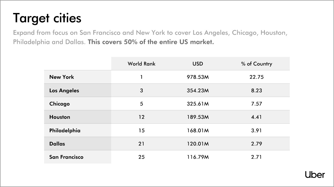
11. Target Cities
When the Uber team presented its original pitch deck, the company had only launched in two cities, but plenty more were already on the agenda. We recreated the original chart and beautified it with our chart builder, which allows users to create charts with customized borders, columns, rows, lines and individual cells.
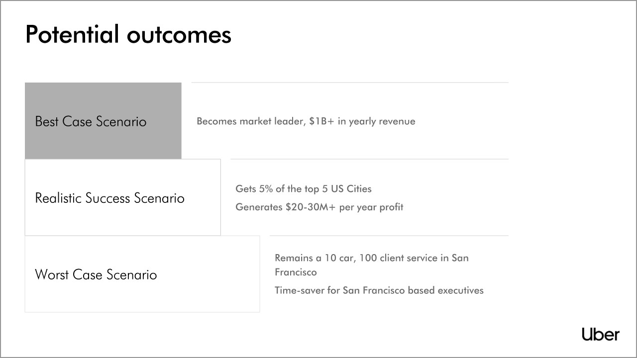
12. Potential Outcomes
Uber’s original PowerPoint slideshow presented the company’s potential outcomes as yet another dull slide full of text. We livened up the content by placing it into Beautiful.ai’s staircase infographic. Then we animated the slide so each section appears 2 seconds after the first.

13. Future Optimizations
Uber listed its future optimizations on a slide with bullet points. We made the same slide beautiful by presenting the same information in our icon list slide. To make sure audiences are still paying attention, we brought the data to life by animating its appearance.

14. Progress to Date
How many of the exact same slide can audiences bear before they completely zone out during a presentation? We took Uber’s original snoozer slide, added a vivid image and animated the bullet points.
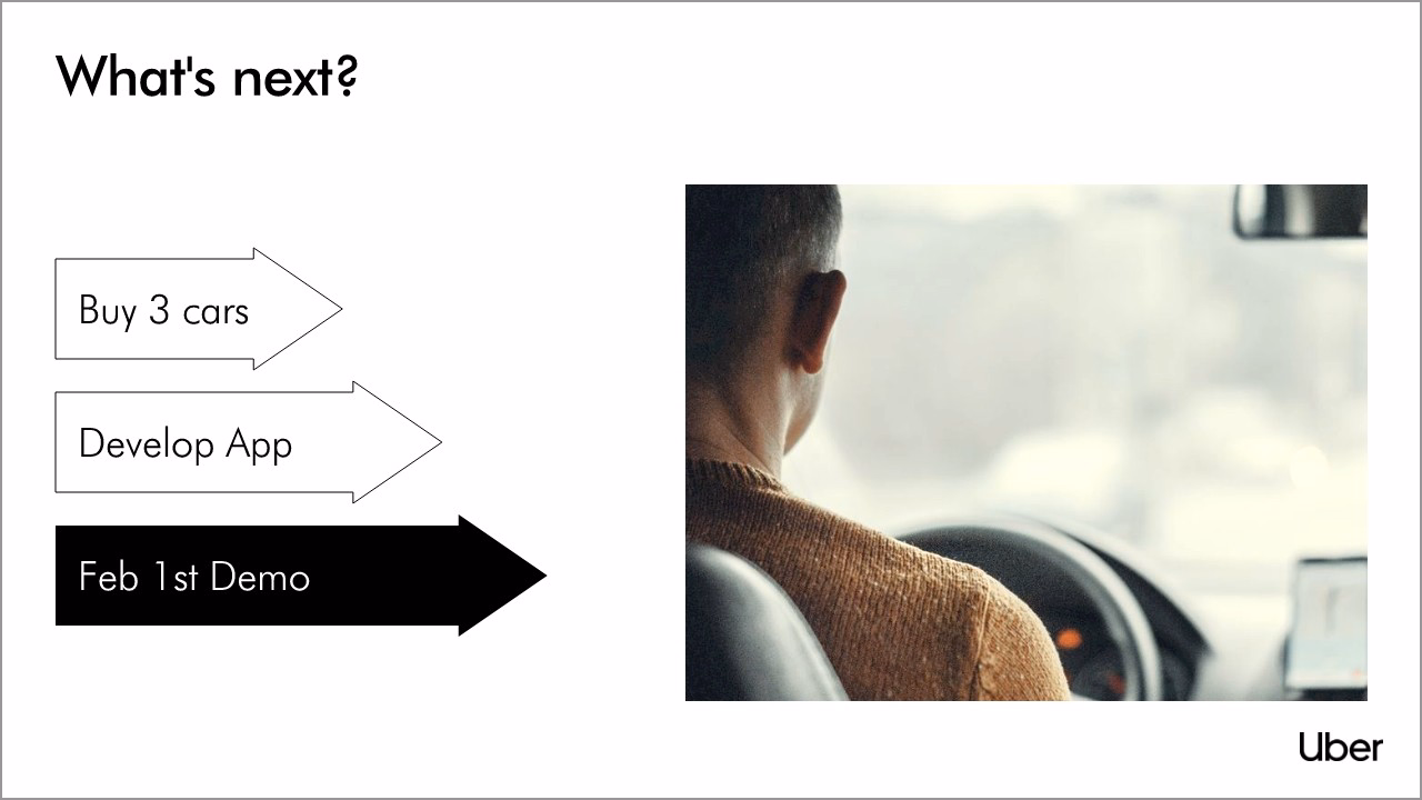
15. What’s Next?
What better way to present a progression than with arrows? Beautiful.ai’s PowerPoint alternative software features customizable arrow infographics. Users can add text and even adjust the length of each arrow.
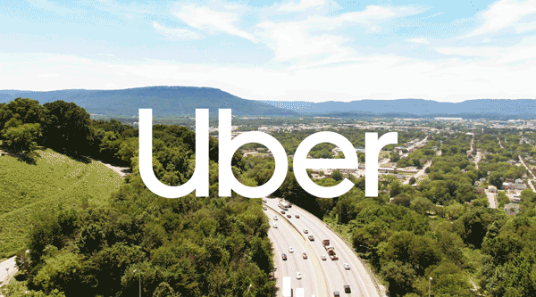
16. Conclusion
Uber ended its first pitch deck rather abruptly, but we prefer a solid conclusion. To engage audiences while the speaker completes the pitch, we created a slide featuring the brand atop a video of cars on the road. Yes, Beautiful’s presentation software even allows the addition of moving images!
Obviously, Uber did well enough with its original pitch deck, as the company’s success will attest. But with a common theme, vivid images and digestible infographics, isn’t ours more engaging and “beautiful?”
How did we do?


.gif)
.gif)
