
.gif)
.gif)

Reports aren’t just a routine task—they’re the backbone of business decision-making. Whether it’s tracking revenue, monitoring campaign performance, or evaluating team productivity, reports provide the evidence leaders need to act with confidence. Done well, reporting transforms raw data into a story: where you’ve been, where you’re headed, and what needs to change. Without regular, reliable reporting, teams risk working in the dark, missing growth opportunities, or making misinformed decisions. That’s why weekly reports are so critical: they keep everyone aligned, accountable, and focused on the right priorities.
Every team needs weekly reporting, but for most teams, reporting is a tedious process. Knowledge workers can get caught up in gathering numbers, formatting slides, wrestling with design consistency week after week, and pulling actionable insights.
The hidden cost of poor reporting consistency
Manual reporting often means starting from scratch every week. Teams spend hours chasing data, updating charts, and formatting presentations. Instead of focusing on insights, they get stuck in copy-paste mode.
Beyond the time sink, manual reports introduce inconsistency. When different team members build reports, design standards are compromised. Inconsistent visuals make reports harder to read—and worse, they bury the important insights or takeaways in cluttered designs. Without a clean, clear way to present reports you’re at risk of losing the plot, which can result in misinformed business decisions.
Tips to automate your weekly reports
The secret to efficient and effective reporting? Automation. If you can automate your weekly reports, and give yourself time back to focus on the story the data is telling, you’re going to have a more engaged audience ready to make data-driven decisions.
1. Start with a template
Select, or create, a presentation template that captures your metrics, layout, and branding. Reuse it weekly to eliminate repetitive setup.
2. Embed live data
Link charts to your data sources so numbers update automatically, in real-time. No more manual refreshes or outdated metrics as you prepare your deck.
3. Pre-build your slides
Decide on the KPIs that matter most and lock them into your deck. Each week, simply swap the numbers instead of starting with a blank slide every time.
4. Use slide duplication for consistency
Need to compare week-over-week results? Duplicate slides and update content. This keeps design consistent and makes trends easier to spot.
5. Leverage AI for summaries
With AI, you can auto-generate narrative takeaways from your data. Instead of struggling to explain the numbers, let AI give you a clear starting point.
Pro Tip: Turn your weekly report into a living deck
Stop exporting and emailing static files. Keep your weekly report cloud-based and share a live link. This makes updates seamless and eliminates the email chain bottleneck. Everyone always has access to the latest version.
How Beautiful.ai makes automated reports more seamless
Beautiful.ai was designed to eliminate presentation design headaches, reporting included. Not a designer? No problem. Not sure how to structure your report? Let Beautiful.ai handle your chart and graph layouts. With automation baked into the platform, teams can create reports that are consistent, fast, and collaboration-friendly.
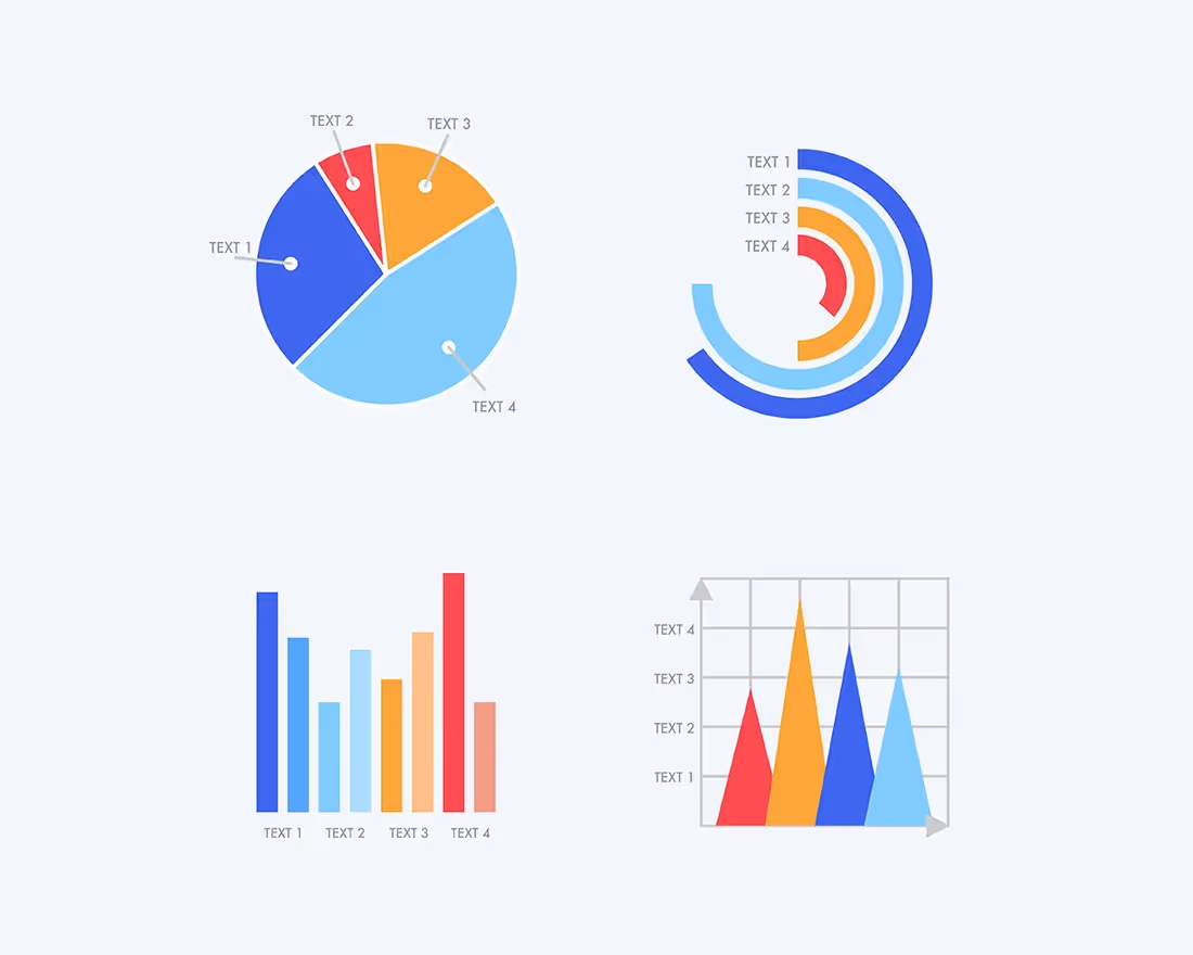
- Smart Slide templates: Charts and graphs automatically adjust as you add in your data, removing the tedious parts of the presentation design process.
- Real-time collaboration: Gather input across teams, and stakeholders, in one shared deck.
- AI-powered automation: Generate content, placeholder slides, and gather insights instantly—no design expertise required.
Reporting should empower decision-making, not drain your team’s time. With Beautiful.ai, you can automate weekly reports, keep them consistent, and free up bandwidth for what really moves the needle: strategy and insights.


.avif)
