We rely on data every day to make decisions large and small. Because most people are of the mindset that numbers rarely lie, they are an effective tool to both inform and persuade all types of audiences. Numbers are also boring. Who wants to spend their time analyzing pages of figures?
Infographics, however, bring numbers to life. They catch audience members’ eyes, add instant meaning to relevant data and tell its story. There are so many types of data visualizations to choose from, but the challenge is knowing the best type of infographic to illustrate specific sets of data. One option is the classic pie chart.
What is a pie chart?
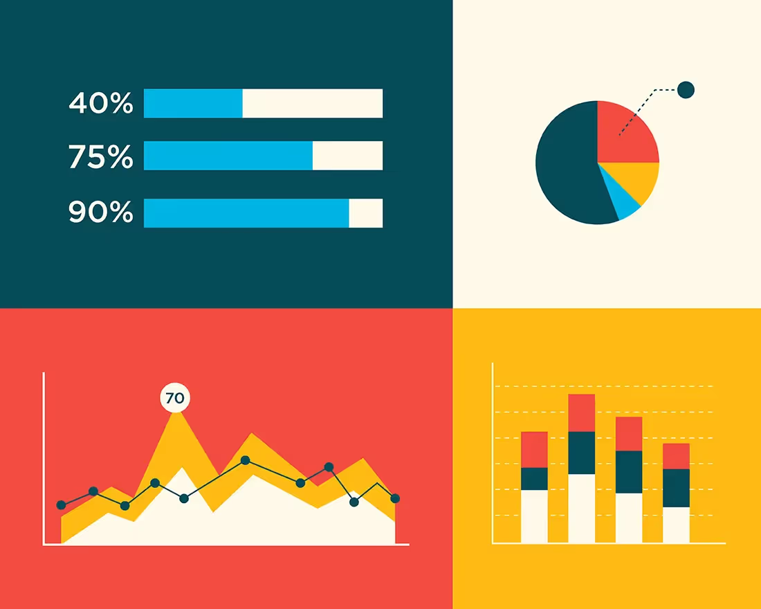
You can’t get much more self-explanatory than a pie chart. It’s a circular graph that compares parts of a whole by slicing the circle into proportionate sections. It’s easy enough for most people to envision half a pie, or a quarter of a pie, or what would amount to more or less of either.
Most people can recall pie charts in school, and they will remember a circle divided into various colored sections. Each section represented a portion of a whole, and the chart provided a visual way to compare the sizes of the different groups. When each section is added together, they should always total the whole, 100%.
For example, a pie chart template can be used to compare pet lovers by shading 40% of a circle purple to illustrate dog lovers, 27% orange to signify cat lovers, 22% green for fish lovers and 11% yellow to illustrate everyone else. A person casually glancing at the chart would immediately recognize that of all animal lovers, most people prefer dogs.
When should you use a pie chart?
A pie chart is commonly used to compare categories, or parts of a whole, such as types of voters or demographics of a city’s total population. In such cases, each slice of the pie represents the size of the category in proportion to the size of the alternative categories, with the total equaling 100%.
Pie charts are most effective for parts-to-whole comparisons between three and six categories and a single set of data. Fewer than three slices makes for an uninsightful presentation, and more than six categories creates a cluttered infographic that takes audiences too much time and visual effort to decipher and accurately interpret.
Of course, a pie chart is a simple data visualization, and while a single pie chart illustrates a single data set, multiple pie charts can be combined to tell a greater story. For example, a single pie chart might illustrate the sales of the top six car manufacturers in 2015, but a series of pie charts can show how those rankings changed each year from 2010-2020.
Why are pie charts important in business?
Pie charts are a common form of infographic in the business world for a variety of reasons. They can be used to illustrate marketing demographics and types of customers, compare sales and portions of profits and even convey budgeting categories.
Pie charts are a valuable tool to communicate relationships of parts of a whole clearly and efficiently, particularly for six or fewer categories. Other business data effectively illustrated in a pie graph includes revenue, market shares, survey results— really anything that can be compared as part of a whole or part of a larger data set.
How do you make a pie chart?
It’s so simple to make a pie chart, almost anyone can create a rough draft with nothing more than pencil and paper. To be your own pie chart maker, just draw a circle and divide it up. But drawing it accurately— and ultimately ending up with an attractive and engaging infographic— is a greater challenge. Some type of pie chart generator software is usually necessary.
Fortunately, Beautiful.ai users don’t have to worry about finding external software or other pie chart makers to design their infographics, they can create them with ease right within their presentation design tool!
To create a pie chart using Beautiful.ai’s cloud-based PowerPoint-alternative software, just choose the type of infographic from the assortment of Smart Slide templates. Once you’ve selected a pie chart template, it’s easy to customize your number of categories and enter the data.
Just label your categories, input the percentages, monetary amounts or other numerical data, and watch as artificial intelligence transforms the number into the perfectly portioned pie chart. If you preselected a theme for your presentation, the custom typography and color palette will automatically apply to the infographic. If you prefer a donut chart, a click of a button will transform your infographic to match.

.gif)
.gif)


.gif)
