
.gif)
.gif)

There’s just no way to overemphasize the importance of data to all types of business. Used strategically, data has unmatched potential to improve business operations.
At the same time, data can be pretty dull and lifeless when presented alone. Nobody wants to spend much time looking at pages of numbers, and without analysis, they don’t mean a whole lot at a glance. Infographics like bar graphs, pie charts and line graphs help audiences understand the data’s story, and they bring the numbers to life in a presentation.
Still, it’s important to choose the right chart to illustrate the right types of data. When is the right time to use a line chart, and how can you create a line graph that engages audiences and tells your data’s story?
What is a line graph?
Often used to illustrate how a data set changes over the course of time, a line graph, also known as a line chart, is a type of infographic that displays data values as points on one or more lines. The values might progress over a chronological scale like a timeline, or the scale could be based on other progressions like populations or monetary values. Most commonly, however, a line chart shows trends over time.
How does a line graph illustrate data? The chart consists of two axes. The vertical axis on a line chart typically identifies an amount of something, such as values in dollars, total sales or number of people. Meanwhile, a line graph’s horizontal axis usually represents the passage of time in hours, days, months or years.
The relationship between two or more data sets is displayed by plotting the values across the chart, then connecting the values with a line. Instead of looking at lists of meaningless numbers, audiences clearly see the relationships between them, which allows for greater insight.
How to create a line graph
Sure, a line graph is a fairly simple infographic that can be created by drawing a horizontal and vertical axis and plotting data points. But it’s 2022, who wants to do anything the old-fashioned way? Instead, we prefer using a line graph generator, software that will create the infographic for us. A variety of line chart creators are available, but we’re partial to Beautiful.ai’s special brand of artificial intelligence.
To create a line graph using Beautiful.ai, start by opening our Line Chart Smart Slide template. The template automatically starts you off with a horizontal and vertical axis, as well as an area for a slide title. When you choose to edit the chart, you can input whatever type of data you are illustrating along each axis.
Based on the numbers you enter, our AI transforms the data into the line chart template. It’s that simple! Want to add another line to the chart and illustrate another data set? Just add a series from within the editing tool.
Best practices for line chart design
While it’s simple to create a basic line chart using Beautiful.ai’s Smart Slide template, you won’t engage many audiences with a couple of basic lines. Be sure and add some pizzazz to your presentation by creating an eye-catching infographic that truly tells your audience a story.
The following best practices will boost your line chart design:
- Prepare your data. To ensure you create your line chart accurately and efficiently, prepare your data ahead of time, and structure it so you can transfer it to your slide template effectively.
- Customize your theme. Instead of editing each individual slide’s fonts, background and colors, Beautiful.ai users can customize a theme with settings that automatically apply to each slide added to the deck. Establish a theme with consistent yet vivid colors and fonts that support your brand’s style guide. Your line graph will automatically be designed to match.
- Keep it simple. While you can illustrate multiple data sets in a single line graph, a chart that displays too much will quickly lose audience understanding and attention. Keep your line graph simple by limiting it to two or three lines. Create additional line charts to illustrate extra relationships, if needed.
- Create a legend. If you’re using multiple lines to compare items in your line chart, be sure to identify your data with varying colors.
- Label your axes. Your line graph won’t be complete without the proper labels. Name each axis with what it represents and don’t forget to identify its numeric values.
- Customize your line chart. Make your line chart stand out by highlighting important data points. Beautiful.ai makes it simple to customize your chart, just point to the data you want to highlight and watch as the AI highlights it for you. You even can create text boxes to highlight important information, then drag them anywhere you want on your slide.
Line graph examples for inspiration
Looking for inspiration when designing your line graph? Beautiful.ai features an entire library of suggested slide designs to give you some ideas, including the following line graph examples:
Marketing traffic line chart
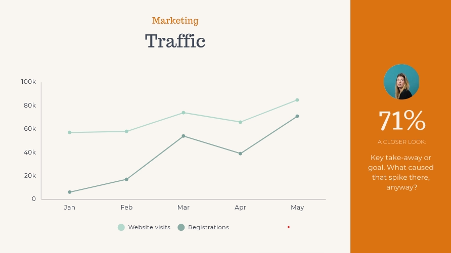
This classic line chart compares the fluctuation of monthly website visitors and registrations over a period of five months. The chart features a legend that clearly labels what each line represents, and a key data point is highlighted in a colorful sidebar.
Performance overview line graph
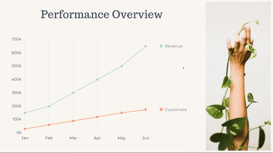
Two colored lines are used to illustrate changing numbers of revenue and customers over a six-month period of time. We added an engaging and eye-catching photo to the right side of the chart to make the slide pop and to keep our audience interested.
Growth projection line chart
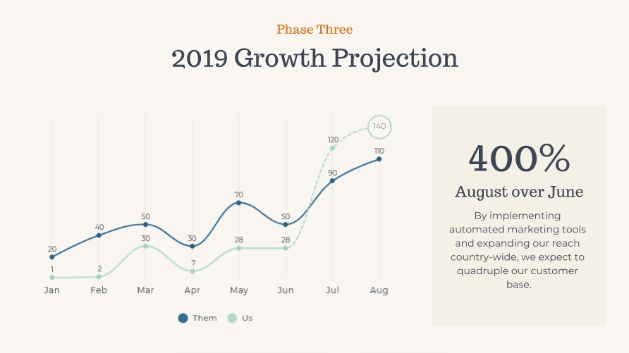
Not every line chart has to look like a carbon copy of the next. In this line graph example, we used curved lines to illustrate growth projections. The small change makes the slide stand out for audiences used to seeing the traditional angled lines. We also highlighted the most important data insight so there’s no question what story this line graph is trying to tell.


.gif)

