

Are you hoping to assemble a year-end report detailing your 2020 client satisfaction, or maybe you’re just interested in compiling customer feedback into an understandable presentation? Ultimately, all the data in the world is meaningless if it’s not in a digestible format. What do the survey results mean? That’s where statistical analysis for survey research comes in.
Of course, even to collect data you’ve got to start with a solid survey. What do you really want to learn about your customers? What types of questions do you need to ask to solicit actionable data that will help your organization?
Still, what do you do after completing a successful client survey? That data isn’t going to analyze and report itself. If you are curious how to analyze and present survey results and reports, you’ve come to the right place.
The following steps will help even amateur surveyors understand how to analyze survey data and how to display survey results like a pro.
Understand levels of measurement
So, you’ve completed the survey, collected all sorts of data, and now you need to analyze those results. What does it all mean? Before you can successfully analyze the data, you should understand the four ways it can be measured. Recognizing the four measurement levels of nominal scales, ordinal scales, interval scales and ratio scales can help you determine what statistical analyses should be performed for each data set.
- Nominal scales classify data without attributing any nominal value to it. For example, a nominal scale could be a label or brand in a survey that asks for a customer’s city, employment type, or favorite brand of cereal. The labels have no numerical significance; they can be used to categorize survey participants and responses or to determine most and least popular answers.
- Ordinal scales explain the order of response values, and therefore carry a quantitative value by ranking possible responses from most to least. For example, an ordinal scale could rank a respondent’s favorite teams or the most common uses of technology, each from most to least.
- Interval scales also convey the order of values, as well as the difference between them. Data measured on an interval scale holds a quantitative value, as each response falls somewhere on the scale. Examples of data measured on interval scales include temperature and IQ score scales, neither of which starts at a true zero point.
- Ratio scales reflect both the order of values and the difference between them. However, they vary from interval scales in that ratio scales begin at a zero-value point. For example, a survey measuring responses based on a ratio scale might ask respondents to select the amount of money they spent on lunch. The answers can vary from one another at equal intervals, but the scale starts at zero.
Evaluate survey results
Now that you know how survey data is measured, you can focus on how to analyze the survey data, including:
- Define Research Queries
You might have determined what questions to ask customers before conducting the survey, but once you have the results it’s time to ask what you want to learn from them. Are you hoping to gain a better understanding of how customers feel about your brand? Or perhaps you want to rank your product offerings from most to least popular. Once you’ve determined your research queries, you can analyze responses from questions that provide the answers you’re seeking.
- Analyze Quantitative Data
The easiest data to analyze is the quantitative variety since researchers can draw logical conclusions based on numerical values. There’s no question when values are ranked or evaluated proportionately to one another. Numbers don’t lie, and quantitative results can later be applied to understanding more subjective customer behaviors.
- Cross-tabulate Results
What happens if your survey respondents don’t represent your target customer? Is it useful to measure answers from people in Thailand when your target customers all live in Texas? Through cross-tabulation, you can categorize survey responses and focus on those most relevant to your brand and goals. Simply ask targeted nominal questions in the survey, then sort overall responses based on those categories.
- Determine Statistical Significance
Is the data generated by your customer survey useful to your organization? How beneficial is understanding the opinions of respondents aged 65 and older when the target customers are teens, for example? To help attract more statistically significant survey respondents, you can evaluate a random sampling of a larger population. The more people who complete the survey, the more random—and accurate— the results.
- Consider Causation Versus Correlation
Drawing conclusions based on survey results can be a tricky task. How do the data groups relate to one another? Failing to understand the difference between causation and correlation can result in a flawed analysis. Just because two sets of data correlate with one another— for example increase at similar rates— doesn’t mean the two groups are at all related or that one caused another. It’s vital to examine in what ways two groups of responses relate to one another before assuming any type of causation.
- Compare Present Data with Historical Data
New or current data can offer a great deal of insight, but comparing it to past data ups the analyzation ante. Is it more useful to know that 25 percent of customers shop online or that 25 percent shop online this year compared to 5 percent last year?
Present survey results
Once you’ve conducted a survey, gathered the data and analyzed the results, you’ll want to share the information with colleagues, stakeholders and customers. Presentation is vital to their understanding, and you might be wondering how to display survey results. The following four mediums might provide your answer:
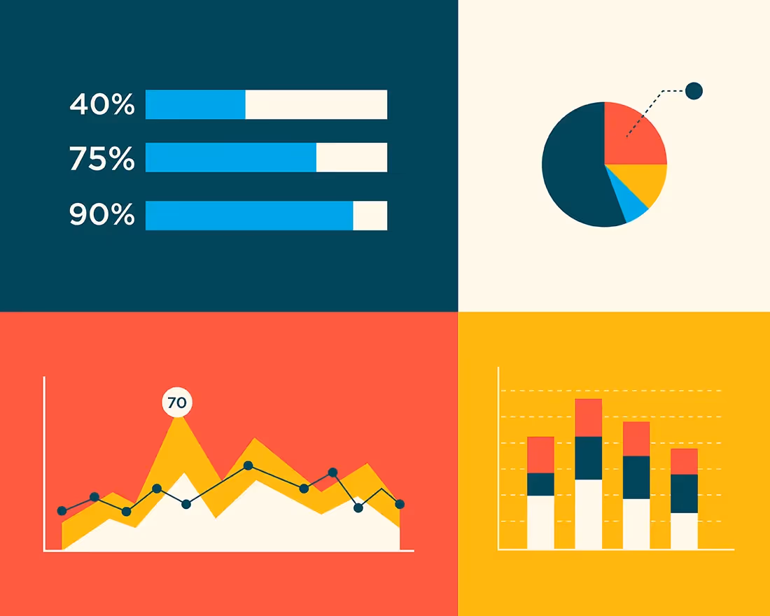
- Graphs and charts like Beautiful.ai’s bar graph or line chart templates offer a way to present data that is visually appealing and easily digestible. Images, colors, and patterns can represent various values, and the combination creates an easy-to-understand presentation.
- Data tables like this Beautiful.ai slide template are another popular way to share numerical data, and they can be created automatically by inputting data into a spreadsheet and relying on the software to tabulate the totals.
- Infographics like Beautiful.ai’s thermometer template or pyramid template are an eye-catching and attractive way to communicate data to an audience. Humans are visual creatures, and infographics are incredibly effective at showcasing analysis through the combination of images, icons, numbers, and text.
- Written reports are useful to report large sets of data with too many details for a chart or a table. Graphs, tables, and infographics can be placed into the report, however, to provide audiences with the benefits of visual presentations with the detail of a written report.
- Visual presentations like those created with Beautiful.ai’s free PowerPoint alternative presentation software can combine all the benefits of graphs, charts, infographics, and written reports into an attractive and consumable format.