


Data visualization is important for showcasing complex metrics and information in a way that makes sense for your audience. Packaging up your data in a more visually appealing way helps break it down in bite-sized chunks for digestibility. This means that your audience will not only understand, but retain, the information you’re trying to tell them. There’s a wide array of charts and graphs that can help you tell your story, one of them being a bar chart.
Horizontal bar chart vs. vertical bar chart
You’ve likely heard of (or seen) a bar chart, but what’s the difference between a horizontal bar chart and a vertical one? Aside from the obvious orientation of the bars, the key difference between a horizontal and vertical bar chart depends on the type of data being presented and the message that needs to be conveyed.
Horizontal bar charts are ideal for comparing data categories with long names or labels. They work well when you have many data categories as they can accommodate a significant amount of text without crowding the chart or taking away from the key metrics. They are also useful when comparing two or more values as their length is easy to compare. You might opt for a horizontal bar chart if you’re including big numbers, too.
Vertical bar charts, on the other hand, are ideal for displaying changes in quantity over a period of time. They are particularly useful for showing trends, making comparisons between different groups of data, and highlighting the differences between different data points. Historically, vertical bar charts are more commonly used than horizontal bar charts, but are only ideal when there are less than 10 categories being shown.
5 Ways to use a horizontal bar chart
Horizontal bar charts are easy to read and allow for longer category labels. They are best for times when the order of categories isn't necessarily sequential, like survey results or demographics.
Here are 5 ways to use a horizontal bar chart in your next presentation.
Comparing data categories with long names or labels
Horizontal bar charts are a great option for metrics with longer labels. For example, data that has a longer product name, company name, or geographic location would be a good candidate for horizontal bars.
Showing the distribution of frequencies within a given category
Are you explaining demographics for your ideal user persona? Or maybe you need to present social media metrics and showcase the number of people in different age groups. A horizontal bar chart would be a good option here.

Demonstrating the size of various data points
Horizontal bars are most commonly used for displaying data points that aren’t sequential. Things like the number of sales made by different salespeople, various product revenue, or the production output of various factories.
Comparing values across different data categories
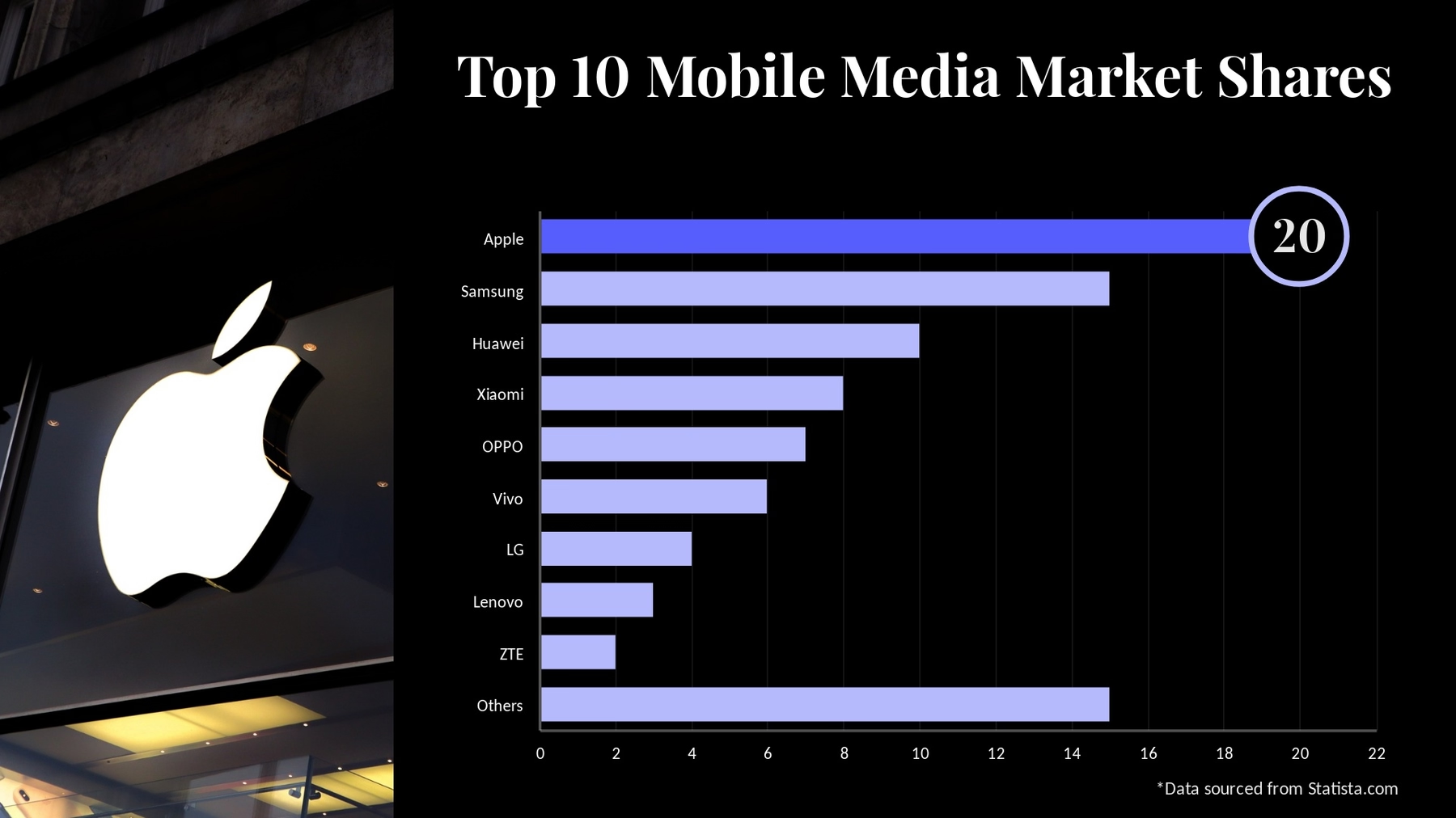
Comparing values across different categories, like the market share of different companies in an industry or the performance of different stocks in a portfolio, can be done in a clear and concise way with a horizontal bar chart.
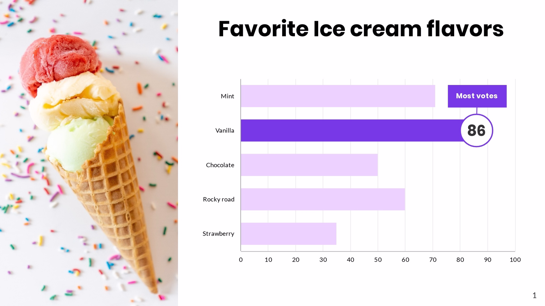
Displaying rankings or orderings
A horizontal bar chart is perfect for showcasing rankings or orderings, similar to our arrow bars template. You can use it to rank the top-performing products for your company, or the most popular tourist destinations in 2023.
Beautiful.ai’s horizontal bar chart
The horizontal bar chart is the new kid on the block, and has been added to Beautiful.ai’s gallery of Smart Slide templates. As with all of our charts, you can easily import data, adjust settings and even switch between chart types to find the best fit for your story. We recommend using color and highlight points to call attention where it's needed—or add a text tray to your slide to summarize the takeaways for your audience. We've also added the option to adjust bar width and spacing for this and our column chart.


.gif)

.webp)
.avif)
