


There’s good reason why the field of business information has become known as Big Data. Once relegated to science and industry, big data is now used in every sector and touches almost every aspect of our everyday lives.
The sheer amount of details available within any business, let alone an entire market, is astronomical. In fact, it’s estimated that the global datasphere will reach 175 zettabytes by 2025. For most of us who have no clue what a zettabyte even is… that’s 175 trillion gigabytes. Even more unbelievable is the daily amount of data generated across all industries: 2,000,000,000,000,000,000 bytes!
What can companies do with all that data? What does it mean? While computers might be able to decipher the information and make some sense of all the numbers, how does a human tell its story? Is it any wonder that 88% of companies’ data remains unanalyzed?
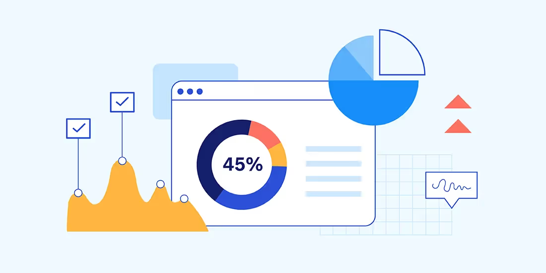
Data can tell its own story when transformed into engaging data visualizations like infographics, maps, charts, pictograms and presentations. As businesses rely more heavily on data with each passing day, data visualizations only become more useful in 2022. The following are four data visualization trends to watch for in 2022 and beyond:
AI-powered data visualizations
Gone are the days when you need to have professional design skill or be a PowerPoint superuser to create data visualizations. In fact, many of today’s complex data visualizations would be practically impossible to craft without the assistance of artificial intelligence. Long used for the automation of information collection, analysis and dissemination, AI and machine learning are now being utilized to create dazzling infographics and other illustrations.
Plus, automated systems are able to construct interactive UI dashboards that are customized for users. Beautiful.ai incorporates artificial intelligence to help design professional-quality visual presentations. Each time content is added to a slide, the AI automatically adjusts the design based on principles of good design. Plus, users need only enter their raw data and watch as the AI crafts engaging and informative infographics like pie charts, scattergraphs and flow charts.
Advanced Infographics
There was a time when a business could effectively tell the story of its data with simple infographics like pie charts, bar graphs and maps. In the time of Big Data, those simple data visualizations are no longer adequate on their own. A variety of complex diagrams and other data visualizations, including options like sunburst charts and violin plots, are needed to efficiently communicate the meaning of modern business information.
These advanced infographics don’t have to be a challenge, Beautiful.ai features a host of infographics among its Smart Slide templates. Choices like Gantt charts, waterfall charts and quadrant slides help present data and transform raw numbers into an engaging story. Users need only input their data and watch as AI uses it to create a beautiful infographic design.
Interactive dashboards
Data visualizations are so prevalent in 2022 they now often take the form of a dashboard, in which a series of interactive infographics, illustrations and reports are presented in a concise format so decision makers can analyze the metrics. A dashboard might present operational data, measuring routine operations and business functions, which can be used to track business processes and measure success toward goals and objectives. Or, the dashboard could present strategic data used to track the status of performance indicators.
A dashboard might even be used to analyze large volumes of data when examining trends and predicting results. Beautiful.ai users can create interactive dashboards in the form of slide decks full of a variety of infographics and other data visualizations. Save time when presenting data to decision makers by letting AI design the charts, graphs and pictograms for you.
Software Tools
Users rely on Beautiful.ai to help them create engaging and interactive data visualizations, saving time and effort with the help of artificial intelligence. But a variety of other software tools are available to assist in the design of infographics and other data visualizations in 2022.
Thanks to data visualization software, even the most amateur designers can create visually-appealing representations of even large data sets. By using software to create visualizations of data sets including thousands or even millions of points, the data is given meaning and it can truly tell a story.


.gif)
.gif)

.gif)
