.avif)
.avif)

There’s nothing worse than spending hours on a presentation and the end result being mediocre (at best). Regardless of what you’re presenting, your story is important and you don’t want to lose your audience to a Frankendeck. Whether you’re presenting a class project, an internal report, or a new business pitch deck, your presentation matters— and the design should reflect that.
People often joke that 99% of presentations suck. Sadly, they’re not too far off. Surveys show that 79% of people think presentations suck, are poorly designed, or are just plain boring. Luckily, there’s an easy solution. Clean, modern presentation designs can help engage the audience better than an outdated deck would. By putting time and effort into the presentation design, it shows your audience that you care about your story and how it lands with them.
With design trends and best practices always changing, what looked good in 2015 might not look good now. It’s crucial for presentation designers to adopt modern designs and adapt with the changing trends.
In this blog we’ll share why clean, modern presentation designs are important, the key principles associated with it, and how good presentation design helps you stand out from the crowd.
Why go modern?
Like it or not, millennials are taking over the workforce. As generation X starts to retire and move on from their careers, millennials are seamlessly slipping into new roles and moving up the chain. As of this year, 35% of the US workforce are millennials— a number predicted to grow to 75% by 2025. What does this mean for presentations and other company collateral? A new demographic means new, fresh designs. Many millennials value good aesthetics, so presentations in the classroom or workplace should reflect that.
Of course, leaning into a clean and modern style when designing your presentation has many benefits beyond impressing millennials. For starters, with less filler content and fluff it makes it easier to structure your story in a more effective way. Additionally, a clean and intentional presentation design will allow your audience to absorb the information quicker, which will help to keep them engaged throughout the entire deck. It goes without saying, but an engaged audience can be the difference between a successful presentation and one that misses the mark. Lastly, your presentation is an extension of your brand, and a more modern design shows professionalism and builds credibility. By adopting a more modern approach to presentation design, you’re a lot more likely to stand out from the crowd (i.e. competitors) and wow your audience.
Key principles of modern presentation design
Sure, modern presentation design is important. But what are the key principles that define that new, contemporary design style? Here are five things to consider to help you create a more modern presentation.
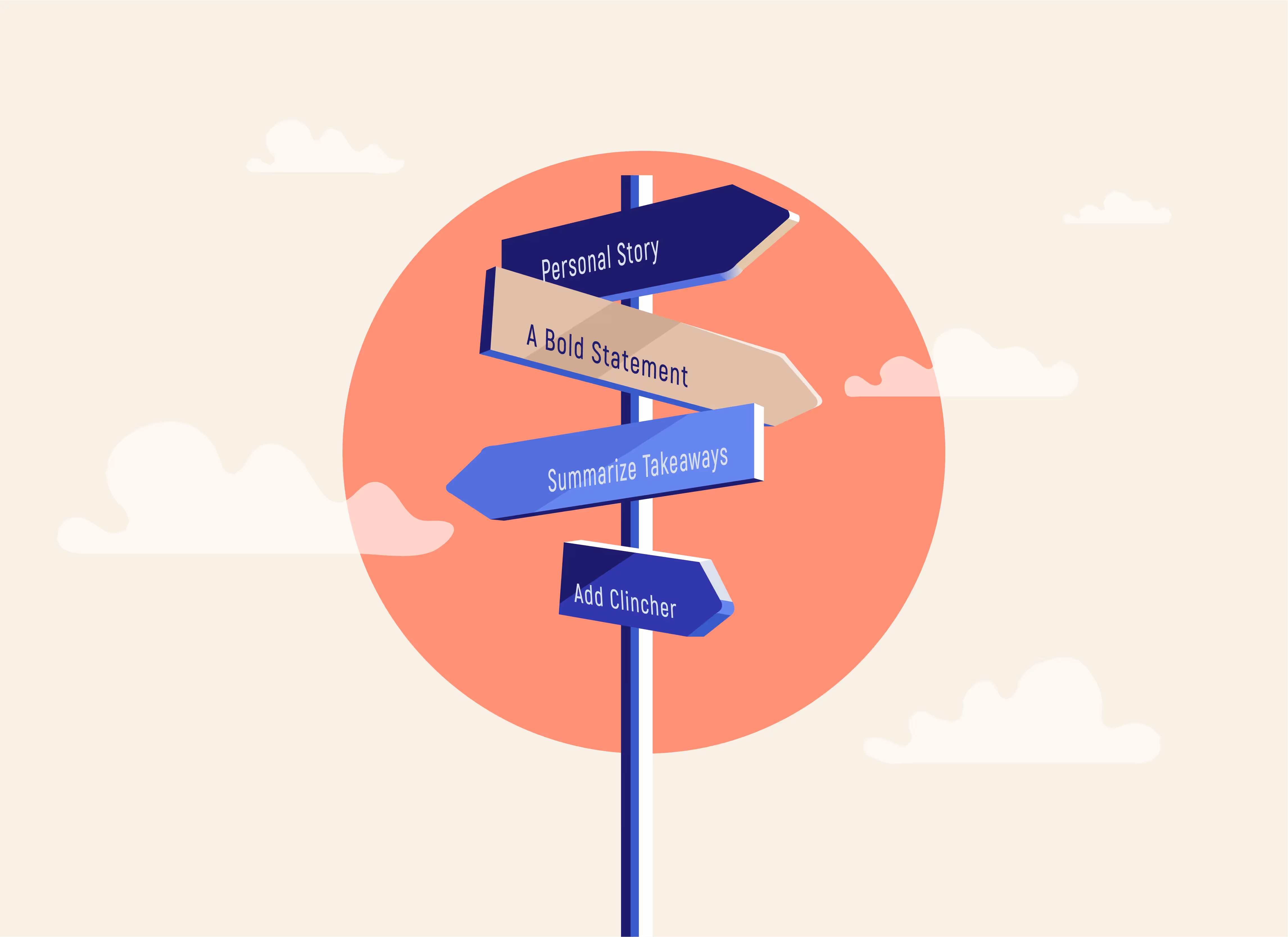
Less is more
In presentation design, less is always more. In fact, experts say that your audience should be able to identify the key takeaway on each slide in three seconds or less. And a cluttered, junk-drawer of a slide doesn’t make it easy to digest information on the receiving end. Instead, ditch the lengthy blocks of text and stick to more wow-worthy headlines. What you can’t fit on your slide, you can narrate as you move through your presentation.
If you don’t know where to start, start with our gallery of pre-built and customizable modern presentation templates. They will help kick-start your creative juices so you can structure your story in a more efficient way, and eliminate the possibility of a Frankendeck.
Visually stunning assets
A picture is worth a thousand words, and videos are quickly replacing photos in the digital world. All that to say, visual assets are your friend here. Between custom icons, high-quality and on-brand imagery, and relevant videos, you can better engage your audience through visually stunning assets. It allows you to say more, with less, all while grabbing their attention and directing it back to your screen. On the same coin, make sure you’re using the most up to date logos on your slides (an easy win that is often overlooked).
Updated fonts
Any marketer or designer will tell you that font matters. Not only does it affect the legibility of your slide, but it affects the design, too. Things like font size, weight, and style can change the whole look and feel of your presentation.
When selecting fonts, opt for more modern and trendy fonts— while keeping your company brand in mind.
Picking a font can feel tedious and overwhelming with so many choices. But, picking the right one can help your presentations look more professional and pop. Some of our top font choices to make any presentation stand out are the following; 1) Poppins can be both understated or have a lot of personality depending on context and font weight, 2) Lato is a classic humanist sans serif font, and a bit more grown up and elegant than poppins, and 3) Jost is a good free alternative to Futura, which is a classic, but trendy font for the digital era. And of course, uploading custom fonts is always an option.
Trending color palettes
You don’t have to be a professional designer to know what colors mesh well. When settling in on your custom presentation theme, you can pick your own hues to match your brand, story topic, or mood. Having your finger on the pulse of what’s trending can help inform your color decisions to be more modern. You might consider looking at the Pantone color of the year and incorporating shades of that color family, or pulling inspiration from the advertising or fashion industries to see what’s popular among other retailers. Whatever you choose, be sure the colors compliment one another to make your text really stand out and make a statement on each slide.
Clean data visualization
Nothing screams 1999 like an outdated chart that is hard to follow. To modernize your deck, it’s critical to use clean data visualization. Don’t worry, you don’t have to be a data scientist to nail data visualization. With our Smart Slide templates, we make graphs and charts easy (and maybe even fun?). Things like infographics, pictographs, and data comparison slides are your friend here. Simply plug and play with your content, toggle between different layouts and colors, and add supporting imagery— and watch your data come to life.
To really give it that modern-edge, you might also consider using dynamic animations for extra effect. It’s 2021, and gone are the days of stale, still slides crammed with numbers. Instead, bring your story to life— millennials and Gen X will be impressed, trust us.