


Over 65% of people are visual learners. It’s no wonder considering images, graphics, or videos make complex information more easily digestible. Presenting content in a more visually appealing way— such as an infographic— makes it resonate better with audiences increasing their chances of retention.
An infographic is exactly what it sounds like, information packaged in a graphic instead of using simple text or numbers. They’re more effective than bulky blocks of text because the combination of graphics and words allow you to say more with less. It takes your key points and makes them more obvious so that your audience knows exactly what you want them to pay attention to. And, of course, they’re easier on the eyes.
In this blog we’re sharing examples of some of the best infographics Smart Slides, and tips to get the most out of them in Beautiful.ai.
Examples of infographics
The following are six great infographic examples that can help you and your team create engaging content that people will want to share.
Arrow bars
Need to dress up a plain list of data? An infographic presentation slide displays your data in an interesting, impactful way. Instead of adding a regular bullet list to a slide, an infographic slide uses arrow bars to organize your data. Arrows can imply relationships or movement between data points, explain steps to achieve a goal, or make any list in your presentation look well-designed.

Percentage with icons
To make sure your presentation is memorable, consider adding a pictograph template. A pictograph template— or percentage with icons— uses repeating rows or a grid of icons to represent data. Also called an icon chart, picture chart, or pictogram, pictographs display data in a simple, compelling way.

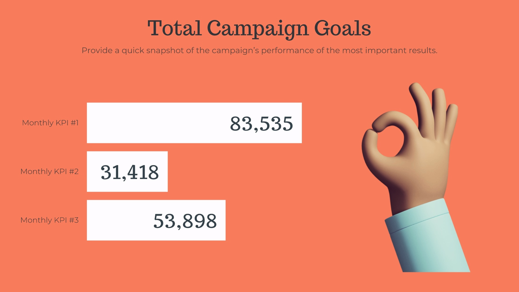
Compare bars
Need to add a little visual interest to your business presentation? A bar graph slide can display your data easily and effectively. Whether you use a vertical bar graph or horizontal bar graph, our bar graph template slides give you options to help simplify and present complex data, ensuring you get your point across.
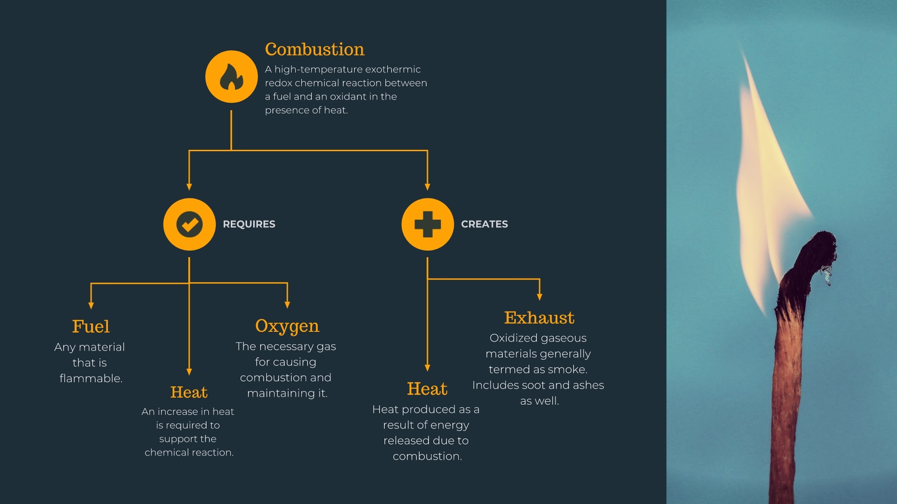
Process diagram
A process diagram is a type of flowchart that illustrates the relationships between major components of a process. It’s used to document, improve, or model a new process. Process diagram templates are a crucial part of every business because they make even the most complex, detailed processes more understandable, clear, and concise — this helps to not overwhelm anyone learning or carrying out a detailed process.

Flowchart
A flowchart is a diagram that shows the sequence of steps and decisions needed to perform a process. Each step in the sequence is noted within a diagram shape. Steps are linked by connecting lines and directional arrows. This allows anyone to easily and logically follow the process from beginning to end.
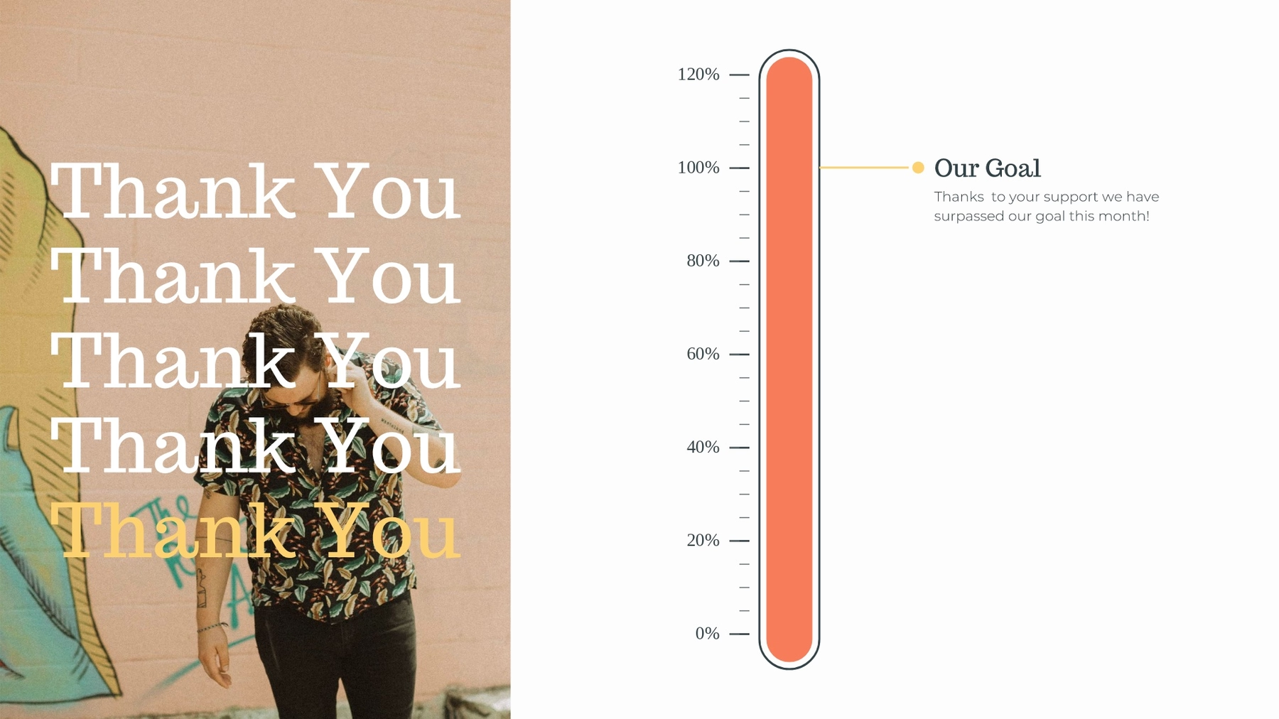
Thermometer
A thermometer slide template uses a thermometer to show the percentage of a value. A thermometer graphic looks like a classic thermometer. Essentially, it’s a vertical graph with numerical values instead of degrees. The “temperature” is the shaded part in the thermometer graphic, which usually represents a defined value.
Pro tips for nailing your infographic
Label your infographic slide appropriately
If you’re explaining steps in a process in your infographic slide, number each arrow. Comparing percentages? Place the percentage in or around each arrow.
Clearly represent your data
A longer arrow bar implies a larger number or percentage. Make sure the size of each bar in your list is proportional to your data.
Get creative
Give each arrow a unique color, add animations or transitions, or play around with fonts and sizing to make your infographic slide template pop.
Use it for more than one data point or idea
One arrow in your infographic slide will look unfinished or like a mistake. Because it’s meant to stylize a list, make sure you have multiple points or steps to display.


.gif)
.gif)
