

No one understands the importance of a pitch deck like a business in the financial industry. Social Finance, Inc was founded in 2011 by Stanford business school students who had intended the company to be a lending model to bridge the gap between recent graduates and alumni. A year later, SoFi became the first company to offer refinancing for both federal and private student loans. Over the course of the last decade, SoFi has also introduced mortgages, personal loans, student loan refinancing for medical professionals, and more.
There’s no doubt that SoFi has seen success since their initial launch in 2011, but it’s not without the backing of investors. In fact, in 2015 SoFi was the first United States company to receive a $1 billion funding round— an impressive accomplishment. With those numbers, we couldn’t help but wonder what their pitch deck looked like. While it covered all the basics, there was room for improvement.
We took the original SoFi pitch deck from 2015 and gave it a Beautiful.ai touch. Check out another one of our famous PowerPoint makeovers.
The theme
A theme— colors, fonts, and logos— sets the tone for the entire presentation. In Beautiful.ai it’s easy for companies to maintain their brand integrity by creating a custom theme and applying it to their presentation. By uploading specific typography, and color palettes unique to your brand, you can ensure that the deck looks cohesive and professional from beginning to end. The beauty about a custom theme is that you can set it and forget it. For this particular pitch deck, we selected SoFi’s brand colors, and logos, and they were automatically applied to each slide within the deck.
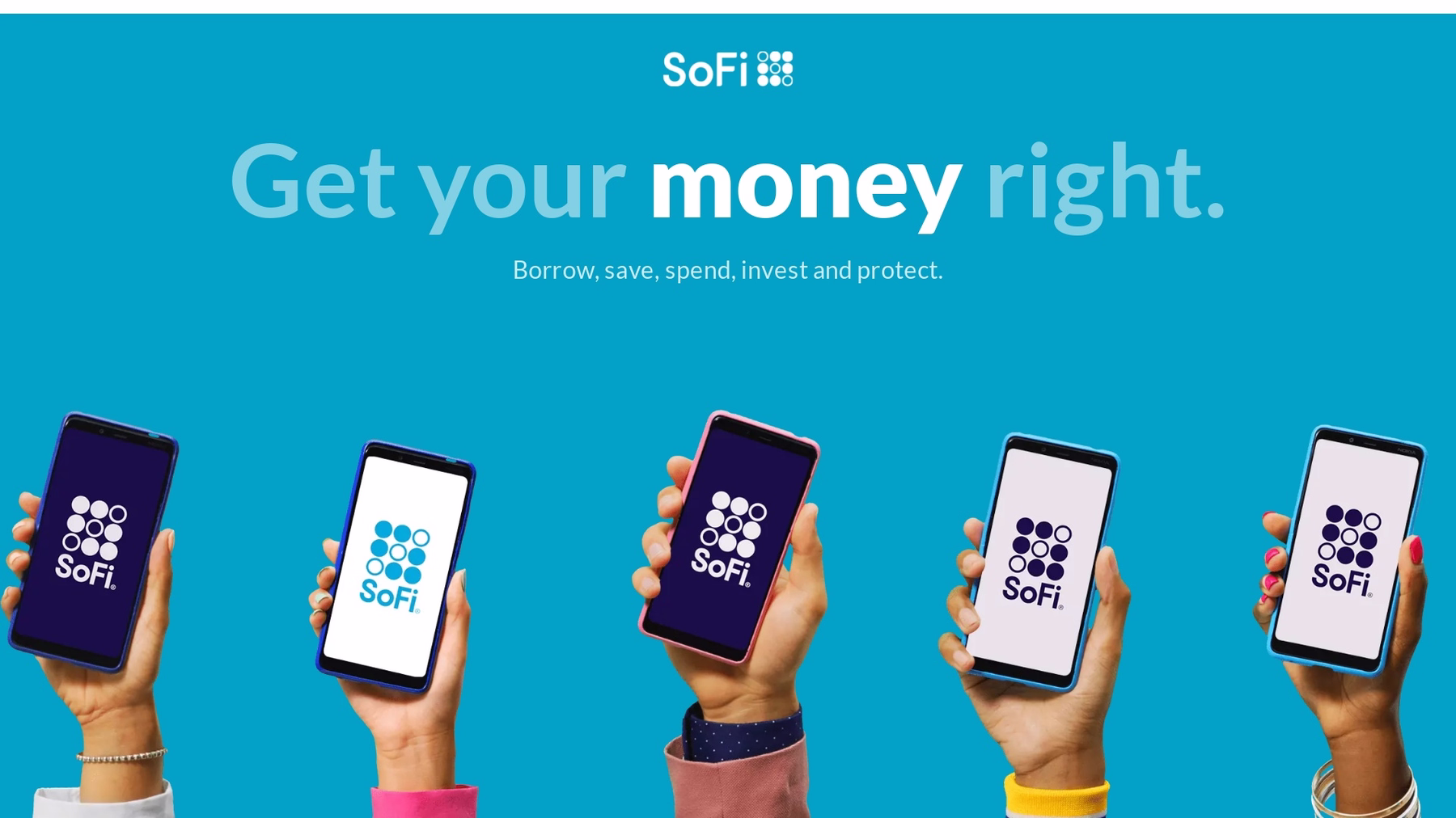
Slide 1: Title slide
In any presentation, the title slide can make or break it. You want to capture the attention of your audience from the second they lay their eyes on your deck, otherwise you run the risk of losing them to boredom. We used a title slide with a vibrant photo, bold headline, and SoFi logo, to grab viewers’ interest before getting into the pitch.
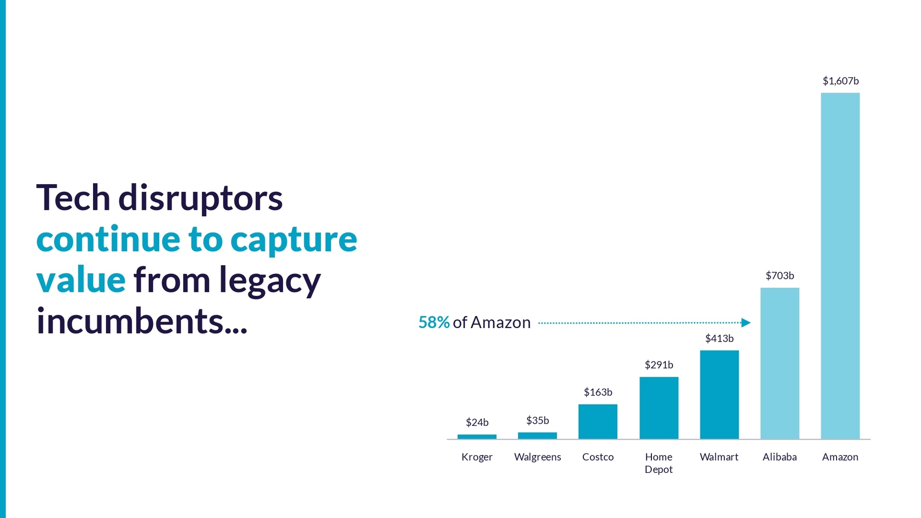
Slide 2: Market share example
SoFi used powerful statistics of household retailers in the e-commerce space to tee up their own trajectory. In the original pitch deck, SoFi crammed two charts on one slide, making it hard to focus on key takeaways. We chose the most meaningful data and used a column chart to compare the data in a clean and digestible way.
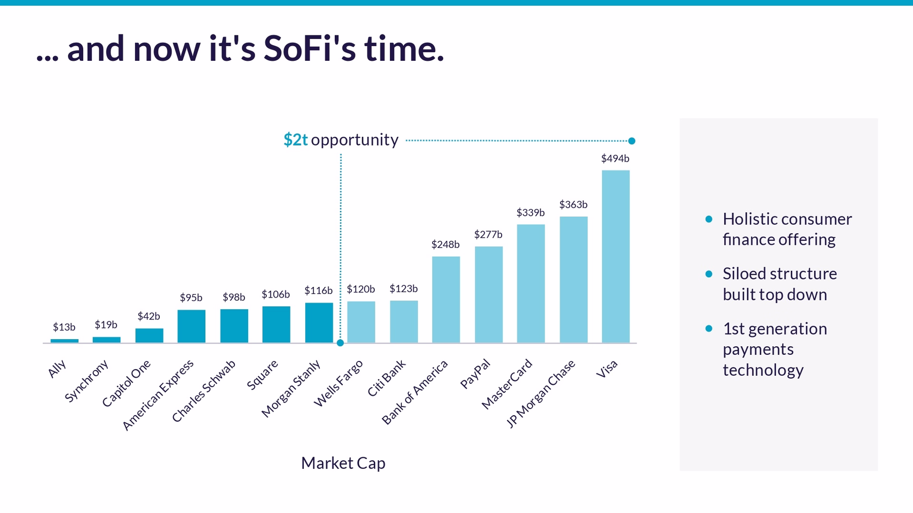
Slide 3-4: Opportunities
After they set the stage with the e-commerce companies, they transitioned to a slide with SoFi’s opportunities in the financial space. The original slide had a bold statement, “...and now it’s SoFi’s turn.” We kept the content, but revisualized the data on another column chart Smart Slide.
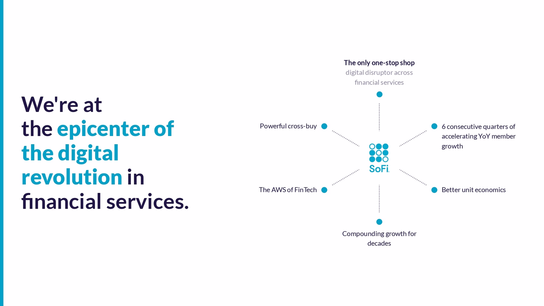
The next slide continues to talk about how the company is at the forefront of a digital revolution in finance, listing out all of their value props. The original deck used boxes with text, but we made it easier to read each key point with a hub and spoke model.
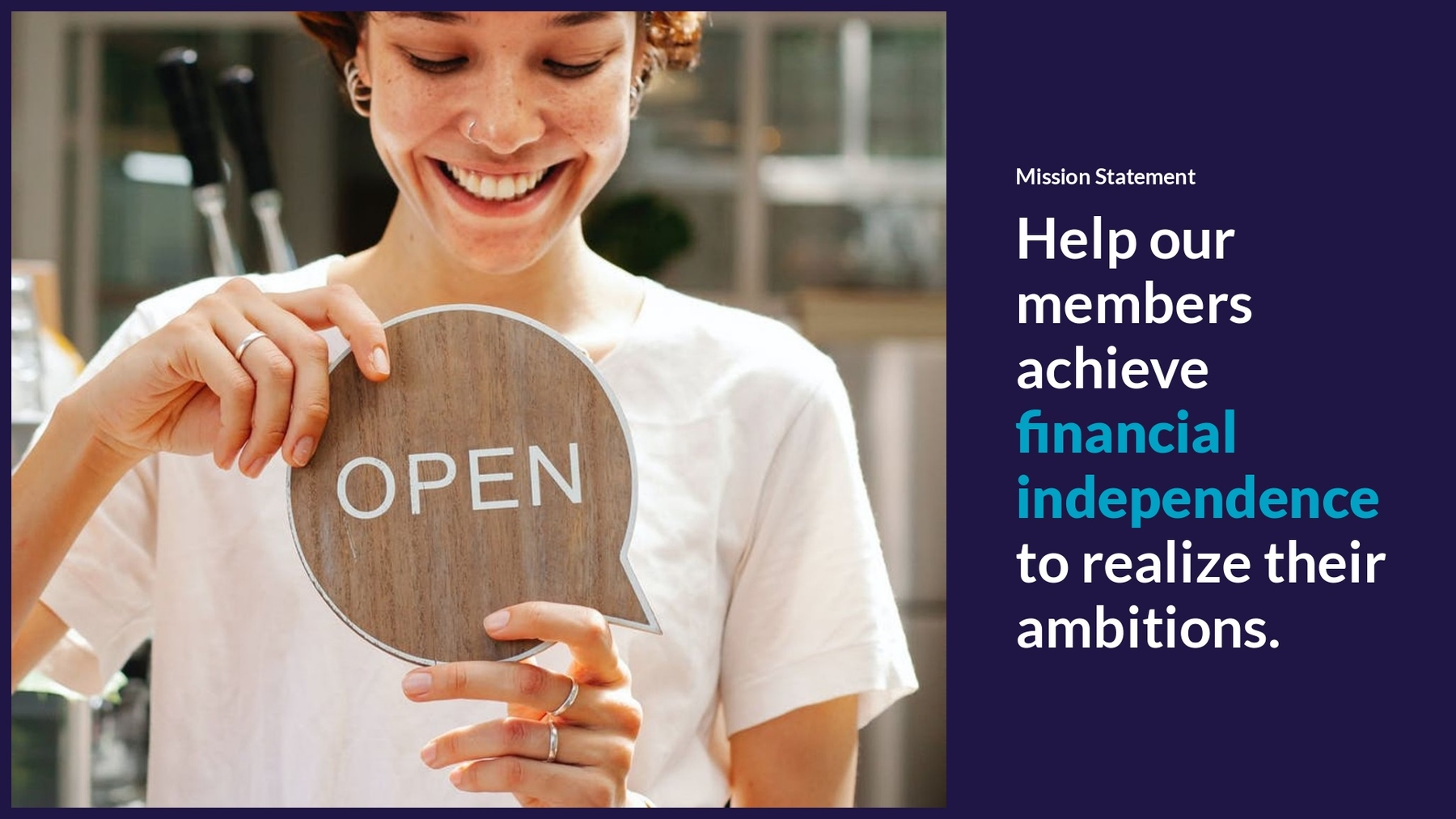
Slide 5: Mission statement
SoFi’s mission statement slide wasn’t terrible. In fact, we like their use of colors and text within the cell phone frame. However, we made it better. We used a headline slide and replaced the cell phone frame with one of our hundreds of thousands of free images from our image library. Adding a lifestyle photo humanized the slide, making it more relatable for audiences.
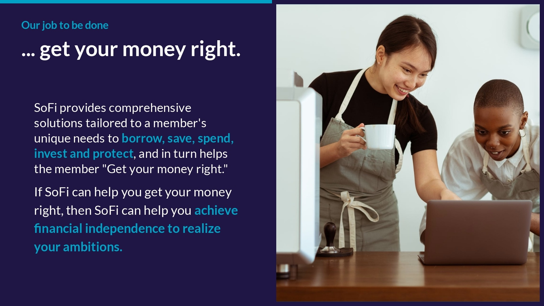
Slide 6: Value proposition
Their value proposition clearly states the benefit they intend to provide for their audience: a solution to their financial needs. But the slide was a mess. We chose a text slide and kept it clean with a nice image and legible block of text.
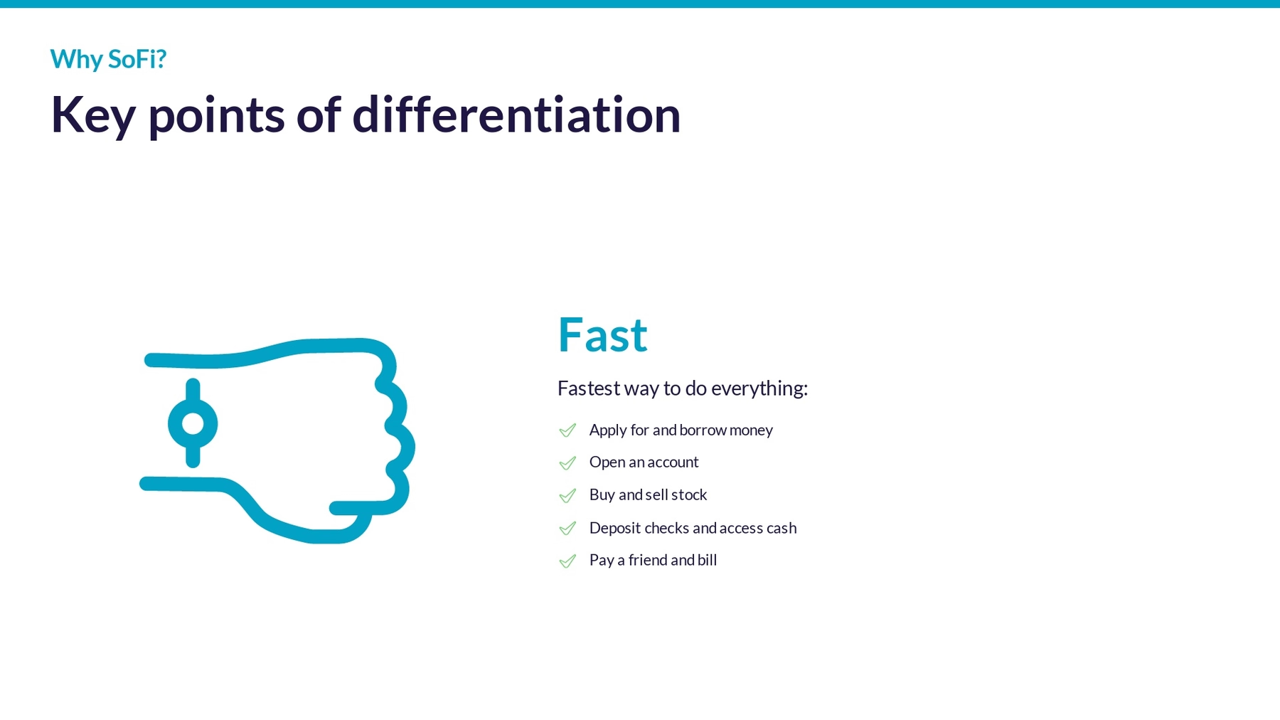
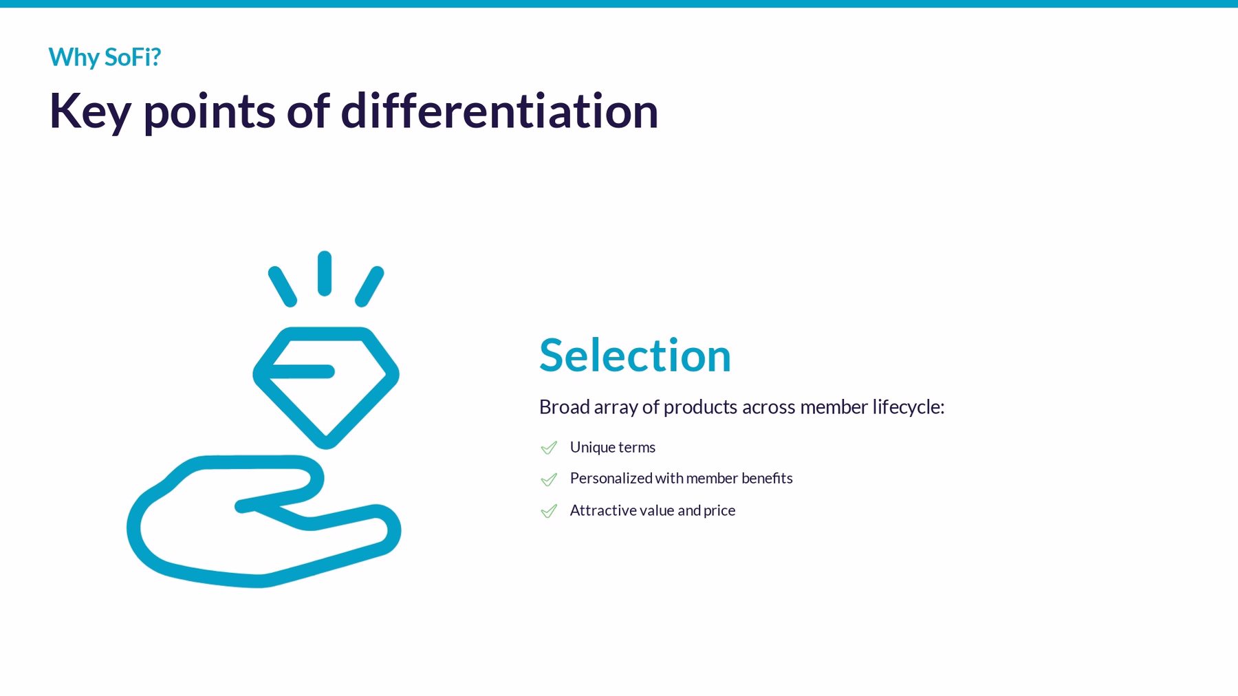
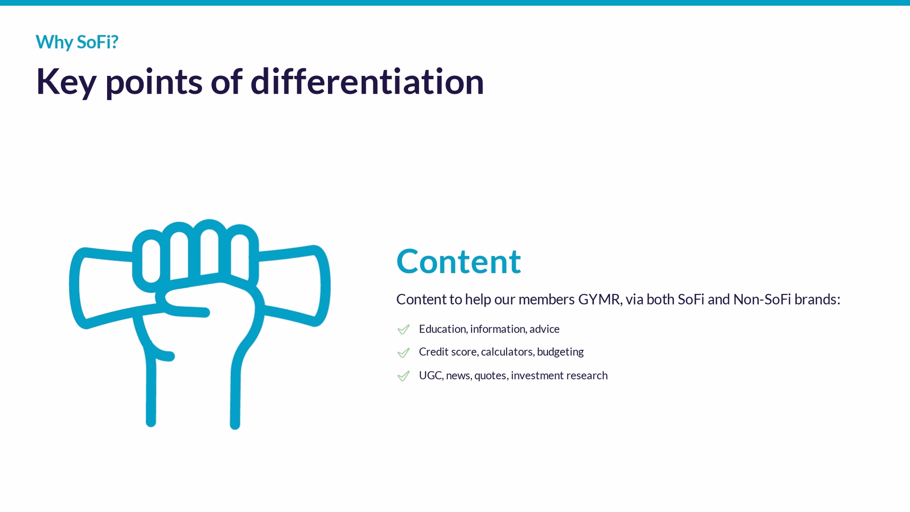
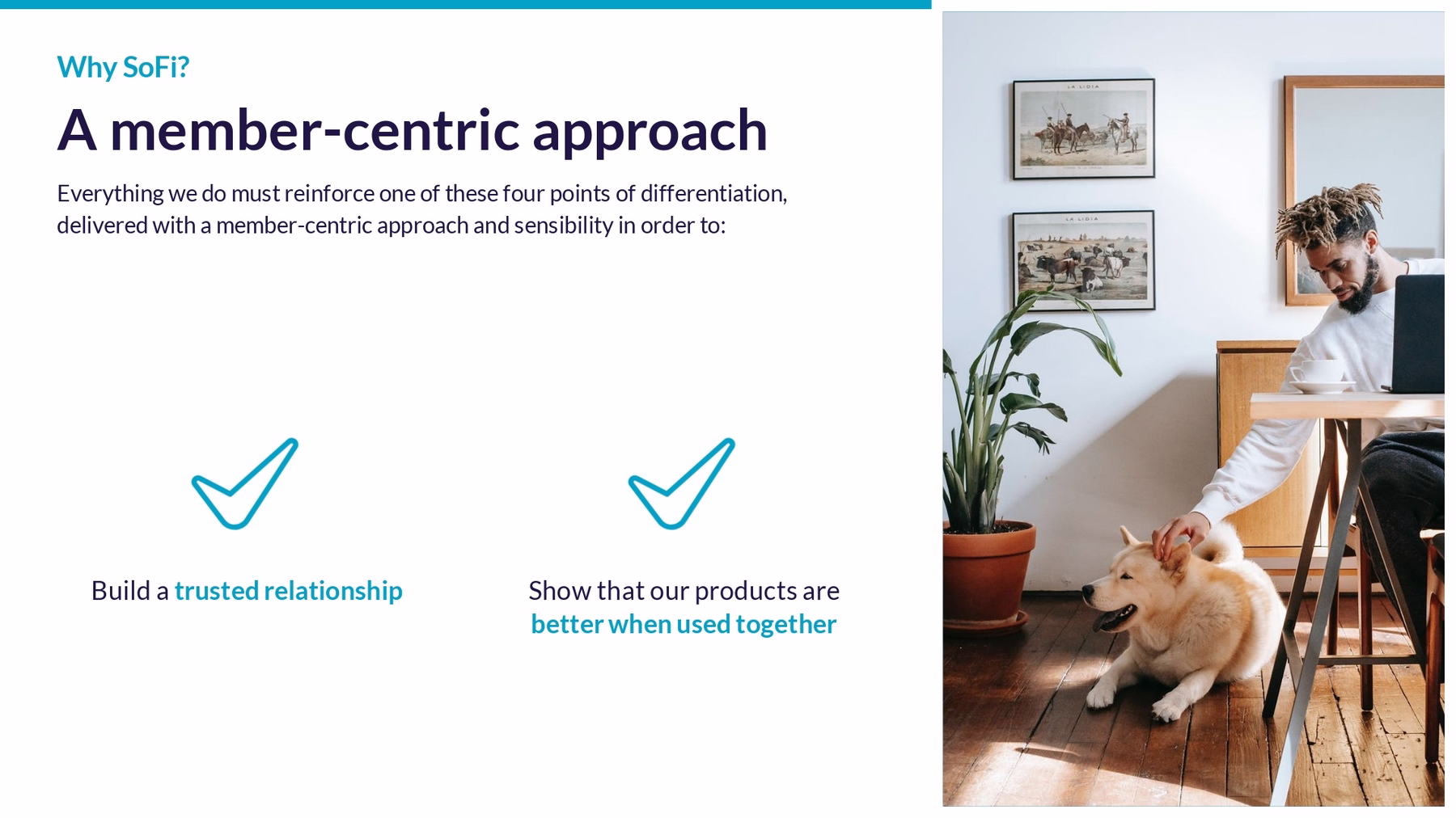
Slide 7-8: Why SoFi?
A good pitch deck will draw a clear line that sets you apart from the competition. The original slide was anything but clear— it had way too much going on. To declutter, we broke the slide out into 2 separate slides. First we shared their key points of differentiation using a carousel to stick to one idea on the screen at a time. Next, we used an icons with text Smart Slide to explain their member-centric approach.

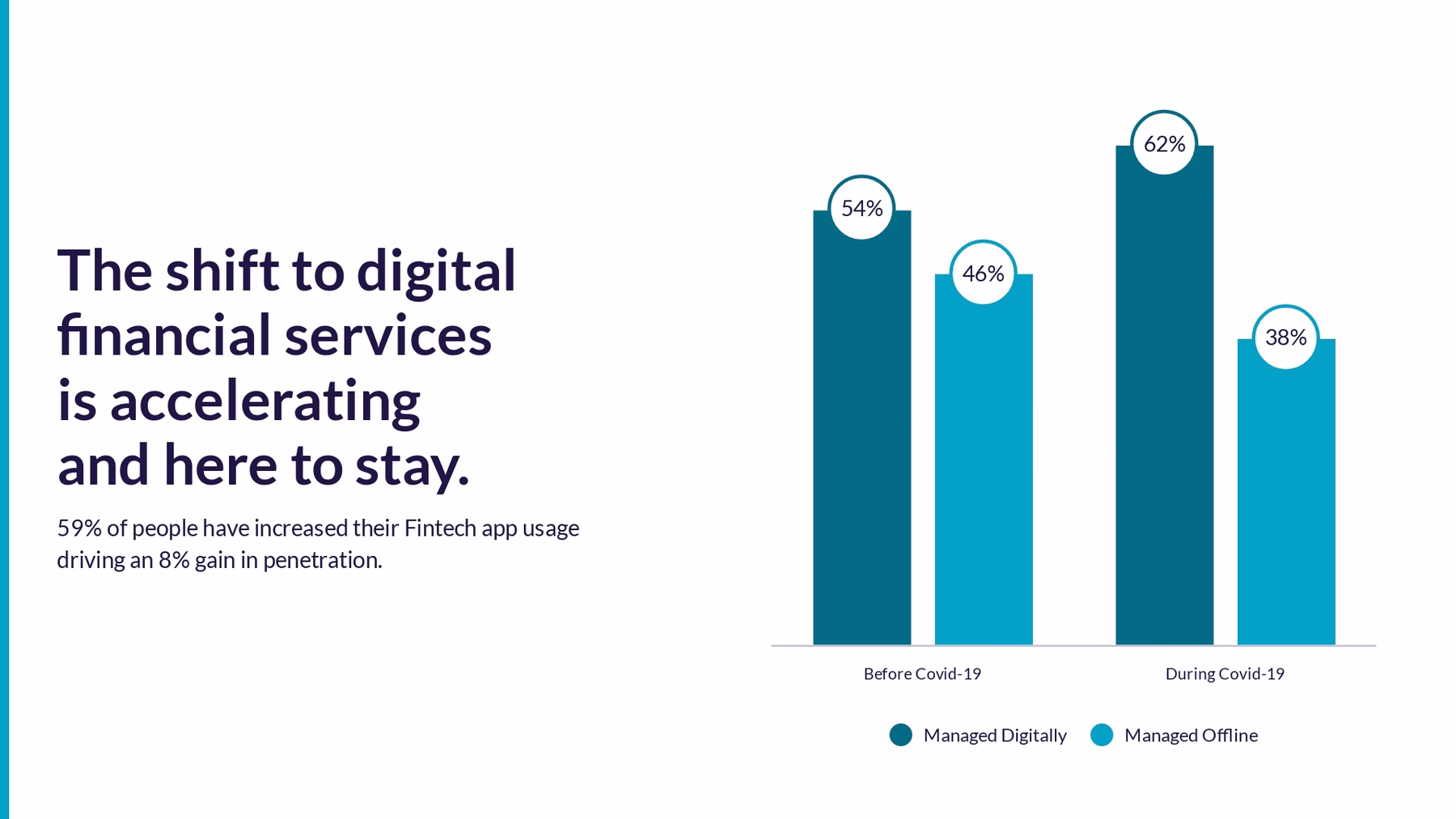
Slide 9: A shift in digital financial services
On this slide, they paint a picture of the need for digital financial services. Their data visualization was simple enough, but we opted for a clean column chart and text to the left to explain what the data represents.
Slide 10: The team
We skipped a couple of the slides with additional SoFi metrics, and introduced the team. The way they presented their management team was cluttered and dated. Instead, we selected our team members slide and gave each key stakeholder a chance to shine without distraction.

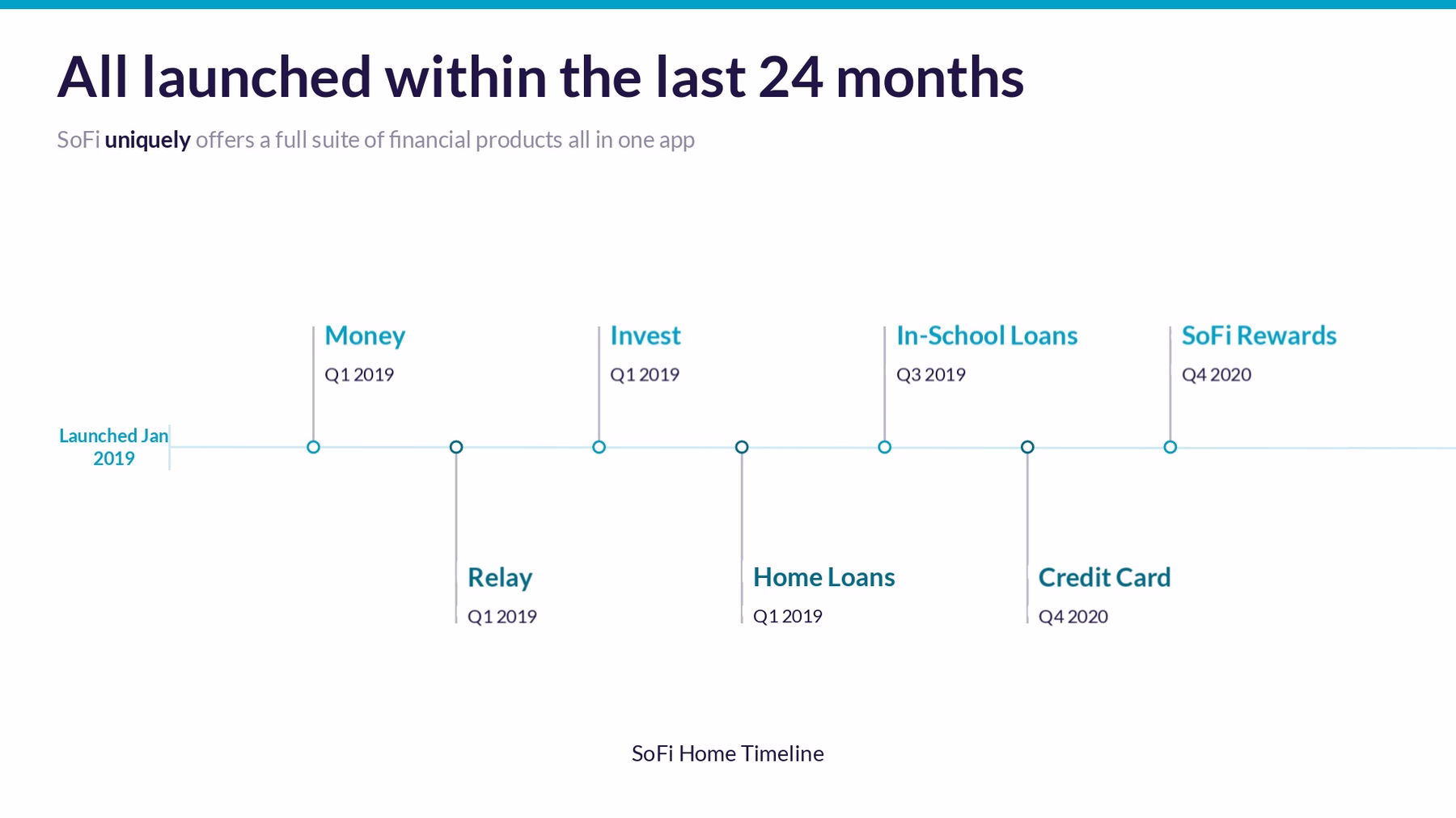
Slide 11: SoFi product launches
Instead of bombarding the audience with confusing charts on the momentum of the industry, we created a clean timeline of relevant SoFi product launches. Not only does this show their own momentum, it helps paint a picture of the need for their product. Our timeline slide was perfect for packaging up this information.
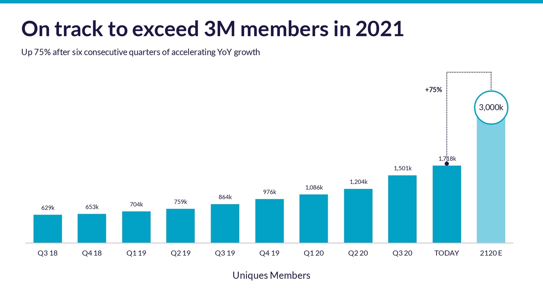
Slide 12-13: Growth
Your potential investors won’t be impressed unless you can quantify your success and prove member growth. We broke this up into two sections, to make it more digestible than what SoFi originally designed. The first slide being a simple headline to transition to the acquisition metrics.

Then we used a column chart to showcase the year over year (YoY growth). It’s important for investors to be able to see a clear upwards trend when it comes to the success of the business, and a column or bar chart is great for that.
Slide 14: Strategy
Investors want to know your goals, but also your strategy. Will you put your money where your mouth is? SoFi’s strategy slide had way too much text paired with a dated diagram. We kept a similar design and sentiment, but used our target slide to share their goals and objectives in a more professional way.

Slide 15-16: Key metrics
In the original pitch deck, SoFi shared a ton of metrics ranging from industry trends to demographics. We picked (what we thought) was the most important and broke it out into two separate slides. The first using a headline for one powerful statistic, and the other using a table chart to share additional relevant metrics.

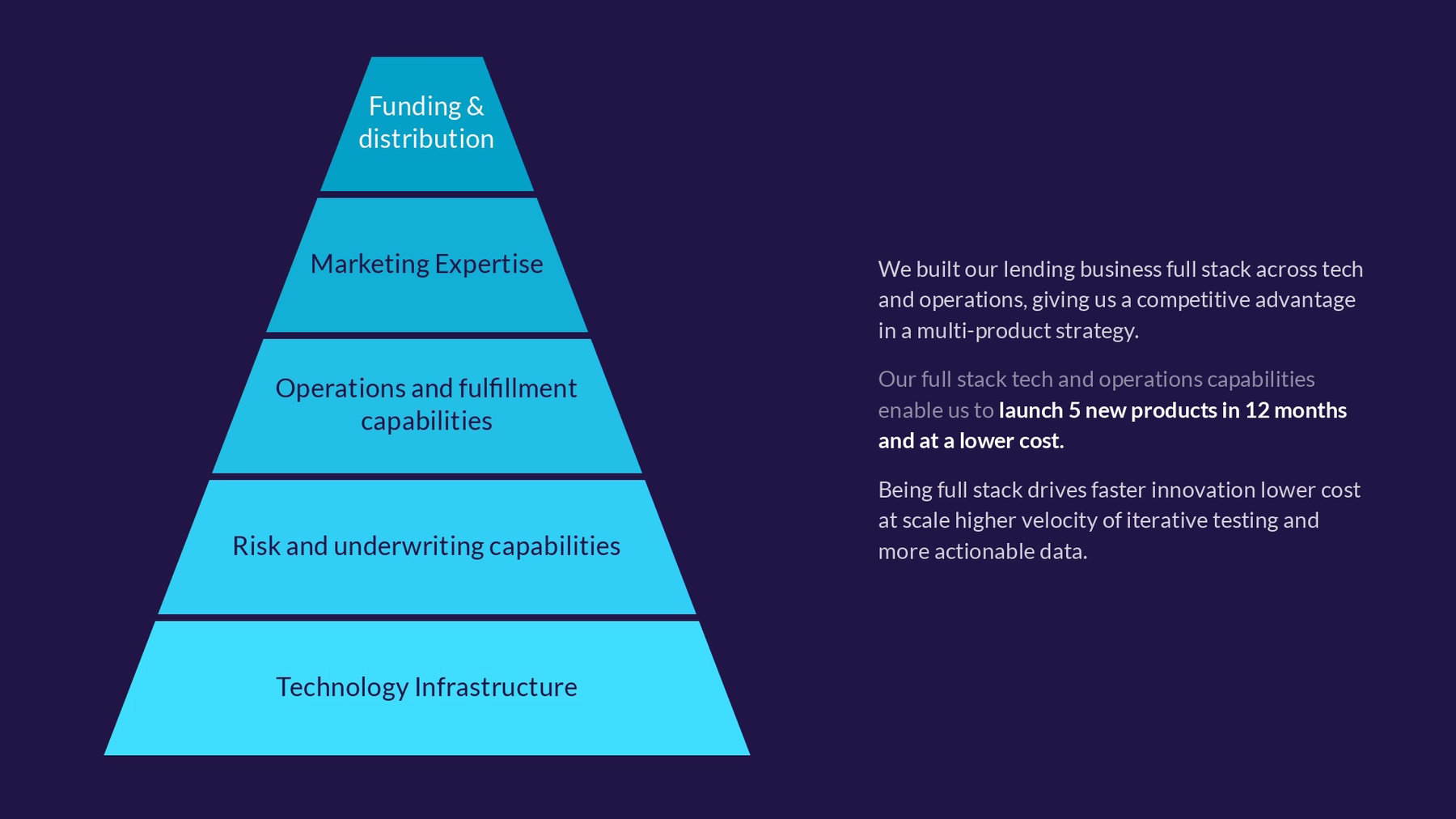
Slide 17-18: Technology and Operations
The next two slides outlined their technology and operations: what their process is and why it’s working. Again, SoFi combined various charts and a lot of text on one single slide making it hard for an audience to retain any information. We used both a pyramid and cycle diagram to visualize their content in a better way.

Slide 19: Opportunity
At one point in the SoFi pitch deck, they shared that the company is in a position to take the “winner takes most” fintech opportunity with supporting points. We used our stack diagram to redesign the content they had in their slide in a more professional and clean format.

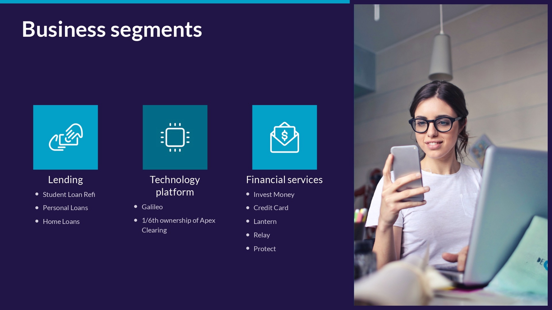
Slide 20: Business segments
SoFi finished their pitch with their financials. And while we didn’t include their revenue and transaction metrics (which was about 7 slides in and of itself), we did think their business segment was important to add. The business segment explains where their revenue comes from— lending, technology platform, and financial services— and how it supports their business model. We used our icons with text Smart Slide to display them in an obvious way.
Slide 21: Closing slide
SoFi’s original deck didn’t have a closing slide, but we believe how you close a presentation is just as important as how you start it. We went with a simple headline slide with their logo on a contrasting background and the text “better together” to really drive their message home.

How did we do? Would you invest in SoFi if they were pitching you with this deck?


