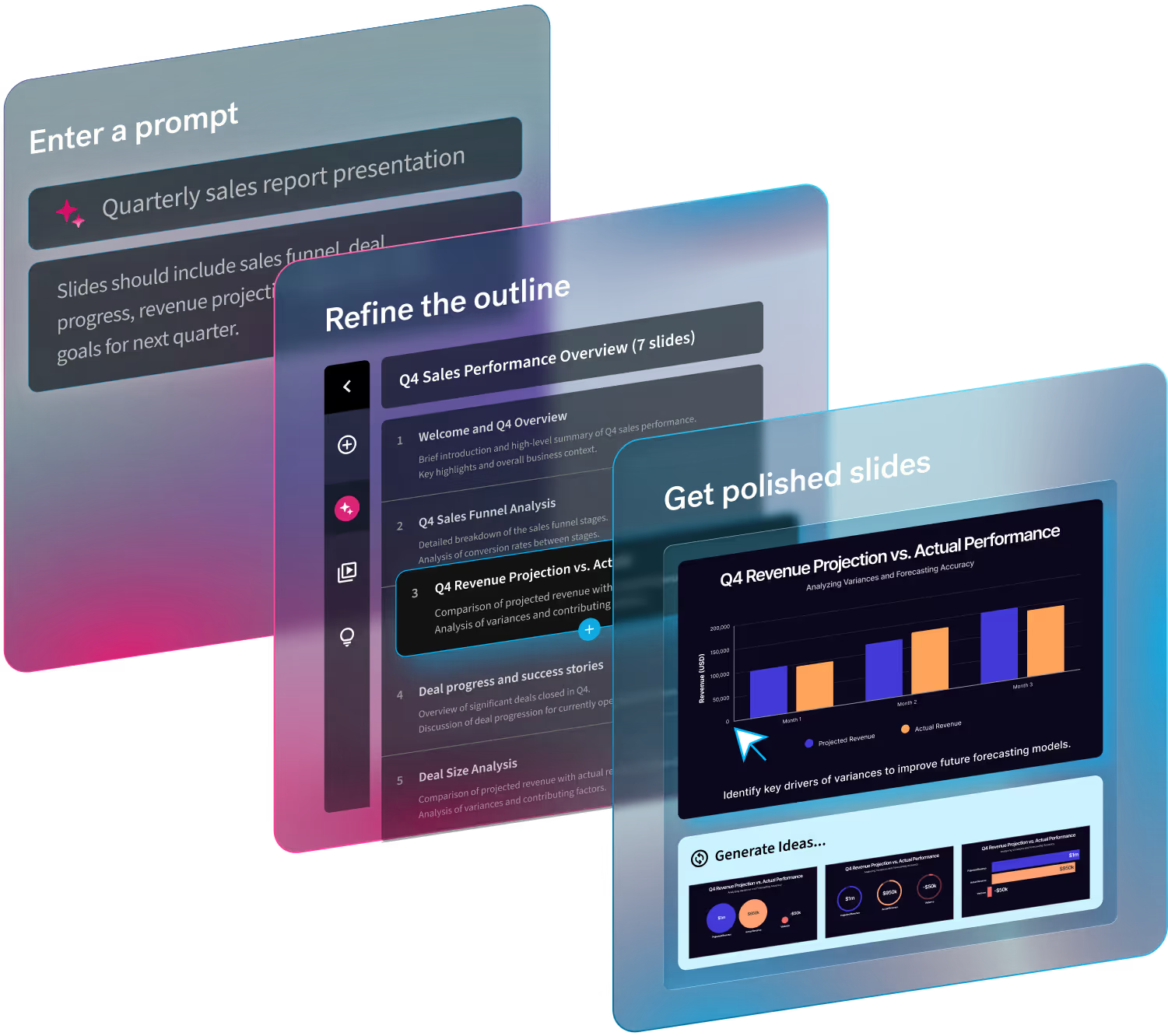
As the final quarter of the year winds down, teams are looking ahead to Q1 to set themselves up for success. Q1 is a critical window for companies to lay the groundwork for the year to come, but you don’t have to wait until January to begin. Planning in advance and building a strong foundation for strategy and goals can remove any unnecessary friction and shorten the ramping period after the holidays.
Presentations can help businesses align on Q1 goals, but only with intentional, actionable slides.
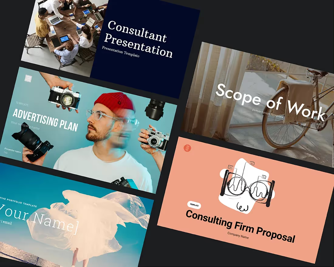
Here are 10 Beautiful.ai Smart Slide templates that teams can use to communicate more effectively heading into the next quarter.
Timeline
A timeline is a visual representation marking all major events over a period of time. Timeline slides have many versatile uses—everything from project plans, to status updates, to “next steps” can be communicated using a timeline. They are most often used for business purposes, but can also be useful for illustrating highly technical processes.
Timeline slides help us keep teams up to speed on project deadlines, and can be a powerful tool for project management in Q1 and beyond.
Gantt
A Gantt chart is a visual view of tasks scheduled over time. Invented by Henry Gantt, an American mechanical engineer, it's a type of bar chart that shows the start and finish dates of several elements of a project that include: what the project tasks are, who is working on each task, how long each task will take, and how tasks group together, overlap, and link with each other.
As we close the gap between Q4 and Q1, Gantt charts are great for project management to track tasks and milestones, or to manage deadlines and deliverables.
Funnel
A funnel chart is an incredibly versatile diagram that illustrates the stages of a process in the workplace. People often use funnel slides in presentations, reports, marketing materials, and dashboards to illustrate the sales or journey of a product or service.
You can use a funnel slide to represent a high-level view of an overall process in Q1 strategy planning.
SWOT
SWOT analysis is an evaluation model used to help identify strengths, weaknesses, opportunities, and threats to a business, project, or opportunity. SWOT itself is an acronym standing for Strengths, Weaknesses, Opportunities, and Threats. A typical SWOT diagram includes both potential internal and external factors and formats them into a single four-quadrant model.
Leveraging a SWOT analysis as you sit down to plan Q1 goals can help you identify low-hanging fruit for the business.
Radial Bar
Need to add a little visual interest to your Q1 business presentation? A radial bar graph slide can display your data easily and effectively. Our radial bar graph template gives you options to help simplify and present complex data, ensuring you get your point across.
A radial bar is a great slide to use to help make data-driven decisions for the new quarter. It is an impactful tool for analyzing what worked in Q4 and what might be an opportunity for improvement in Q1.
Line Chart
A line chart is a concise, visual way to show trends over time. The vertical y-axis on a line chart (also called a line graph) is usually the amount of something, such as dollars, number of sales, or number of customers. The horizontal x-axis typically uses time as a measurement. It could be years, months, weeks, days, or even hours.
A line chart can be used to plot and display any kind of relationship between two values, such as quarter-over-quarter comparisons from Q4 to Q1.
Target Slide
A target is composed of a bullseye at the center, surrounded by concentric circles. Because of its format, a target slide can be used to show how a main idea (positioned in the center) branches off into related ideas or topics (in the surrounding circular areas). A target presentation template can also be broken into sections to display the steps in a process, with the goal as the bullseye.
Use Beautiful.ai’s target slide for more efficient goal setting in Q1 with clear, actionable objectives.
Quotation
Do you have a relevant, meaningful quote to add to your presentation, but you’re not sure where to put it? Give your quote its own slide using our quotation template. Quotes can add credibility, or insights from an expert to back up your presentation. It can also inspire and stir up emotion in your audience.
When used correctly, a quotation template can be used to motivate teams or share feedback heading into the new quarter.
Bar Graph
Do you need to display data in a more digestible way? A bar graph slide can help you share and compare key insights from the previous quarter. The simple, clean data visualization makes it easy to identify results and align on next steps.
When you’re pulling finance reports in Q1, you might use our bar graph template slide to point out patterns or trends in data QoQ or YoY.
Photo Grid
While the information you present in text is one of the most important elements in your presentation, text alone isn’t enough to keep your audience’s attention and get your points across. Mixed-media can make a bigger impact on your audience, ensuring they retain the information.
A photo grid template is a versatile tool for presenting your content in a more visually-appealing way.

.avif)
.avif)


.gif)


