


It’s hard to believe that a media conglomerate the size of BuzzFeed consisted of just five employees huddled in a single NYC Chinatown office only 12 years ago. After all, the company now boasts 14 offices and more than 1,100 employees around the globe, not to mention it garners 1.2 billion pageviews per month. That’s some incredible growth for a publication that started out as a source for viral memes, listicles, quizzes and some of the funniest cat videos.
Just how did an organization now known as the first major media company of the digital era achieve such exceptional growth? According to BuzzFeed cofounder and CEO Jonah Peretti, it was anything but easy. Upon its founding, the original BuzzFeed team had to figure out how to launch a media company without any writers, content creators or journalists.
“Can you make this automatic?” Peretti recalled wondering, according to a 2014 interview. “Could you detect what was trending and then grab stuff from other places and turn it into an article synthetically where the cost of content creation would be zero?”
Apparently, Peretti and team successfully discovered the answer to those questions. BuzzFeed Media Brands was valued at $1.7 billion by 2016. Just how did he and cofounder John Johnson transform a side project designed to track viral media into one of the world’s largest online publications? An initial $3.5 million investment in 2008 sure didn’t hurt.
How did the BuzzFeed founders convince investors the company was a worthwhile gamble? After all, in 2008 the company was little more than an “algorithm to cull stories from around the web that were showing stirs of virality,” Johnson told New York Magazine in 2013. They did it the same way so many other successful startups pave their paths to success: with one heck of a pitch deck.
The original 2008 BuzzFeed pitch deck definitely had its merits. It was informative and detailed with plenty of facts and statistics about the then-fledgling company. It utilized a consistent format and color scheme across the entire slide deck, while its revenue model listed plenty of goals along with courses of action to reach them.
BuzzFeed’s 2008 pitch presentation even utilized original images and screenshots to help tell BuzzFeed’s early story. In fact, we’d almost gander to say it featured too much – the entire pitch deck featured some repetitive visual content on more than 20 slides, when it could have been accomplished with far fewer.

We can’t help but wonder if that initial $3.5 million BuzzFeed raised could have been even more with a professionally designed pitch deck. What if it was created using Beautiful.ai’s PowerPoint alternative presentation software, incorporating professionally-recommended practices of good design?
Since designing visual presentations is what we do best, we thought we’d try our hand at this one. How does our redesigned BuzzFeed pitch deck compare to the original slide presentation used back in 2008? Do you think it’s more effective when it’s beautiful?
Check out our redesigned slides, and judge for yourself how they compare with the original BuzzFeed pitch deck.
Download the customizable template here.
Slide 1: BuzzFeed Title
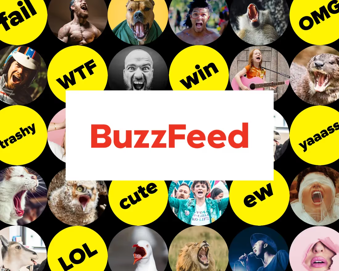
Adding a title slide to the start of a pitch deck might seem obvious, but the content still needs to be effective. Buzzfeed’s original title slide got to the point with the brand named atop a bold orange background, but it was also about as plain as you can get. We transformed the title slide in our redesigned pitch deck with our headline slide: A text box featuring the brand and a subhead against an exciting background of eye-catching images from our free image library.

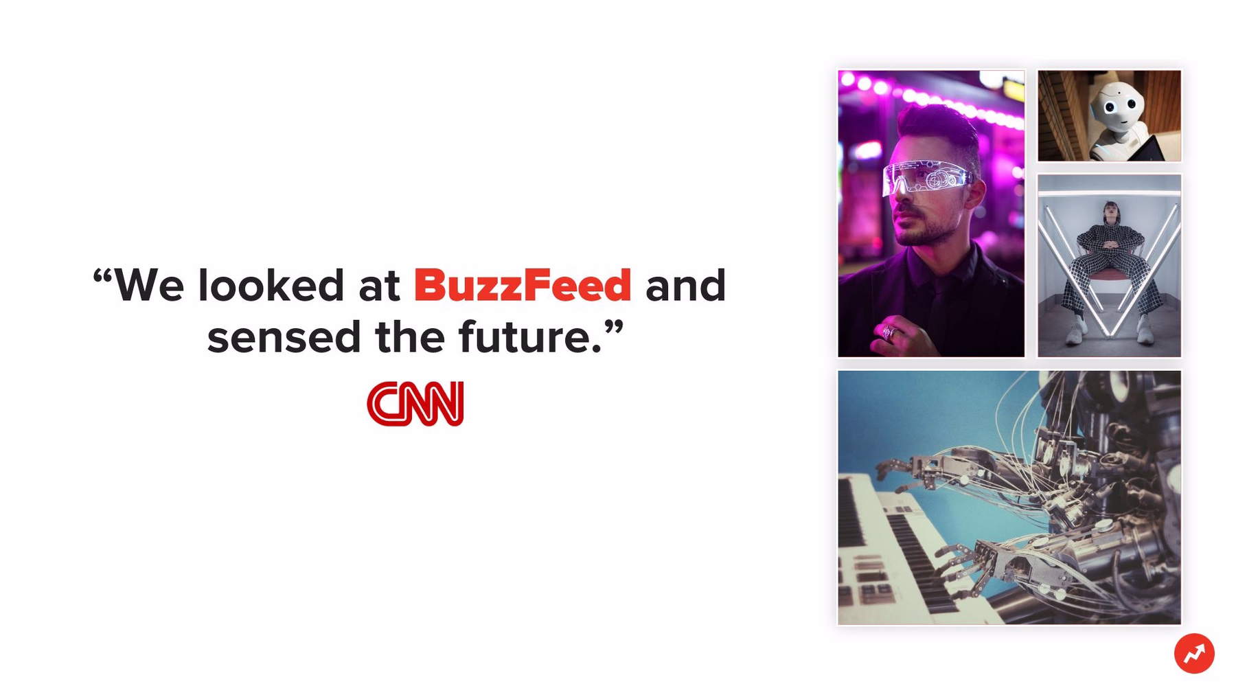
Slide 2: Introduction
Sometimes a presenter needs an extra slide to keep audiences engaged while extra information is conveyed. Incorporating a memorable quotation about the brand is a great way to keep attention focused on the presentation. In this case, we designed another headline slide template with a quote about BuzzFeed from an authoritative source. To the side of the text box, we included a photo grid with a variety of photos from our free image library.
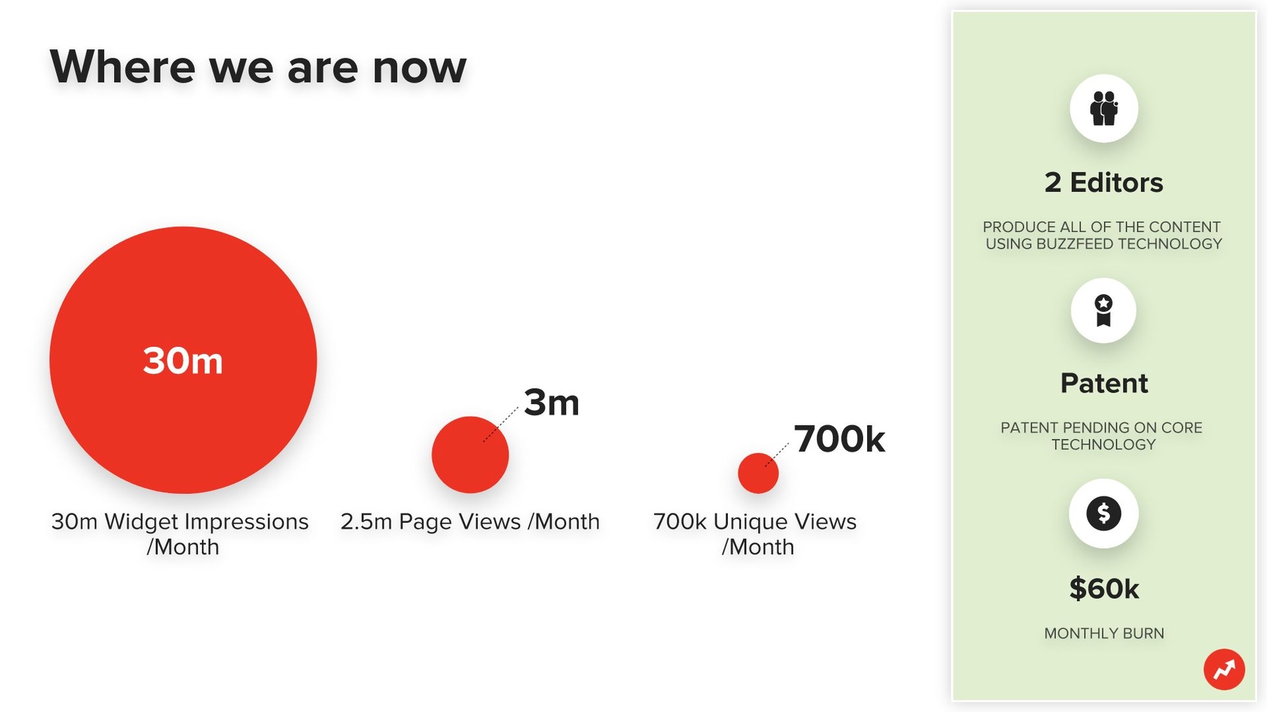
Slide 3: Metrics
Any pitch needs to provide existing data describing a brand. BuzzFeed’s original pitch deck did so by listing its 2008 metrics in bullet points. We incorporated this same information using our compare circles slide template. It’s a smart slide, so the circles automatically adjust in size according to the numerical data entered into them, creating a simple visual comparison. We then included some additional metrics in a sidebar with corresponding icons from our free library.
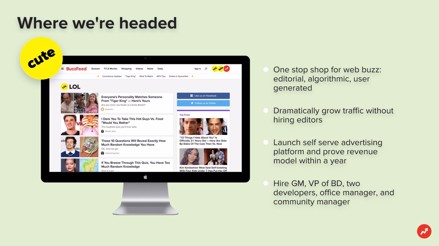
Slide 4: Goals
After learning a company’s current metrics, potential investors want to know where it’s headed. BuzzFeed provided this information in another boring bulleted list. We spiced up our goals by presenting them on our desktop screenshot slide template. We just inserted a screenshot of BuzzFeed’s actual home page into an image of a blank computer monitor, then we added the original bullet points along the side.
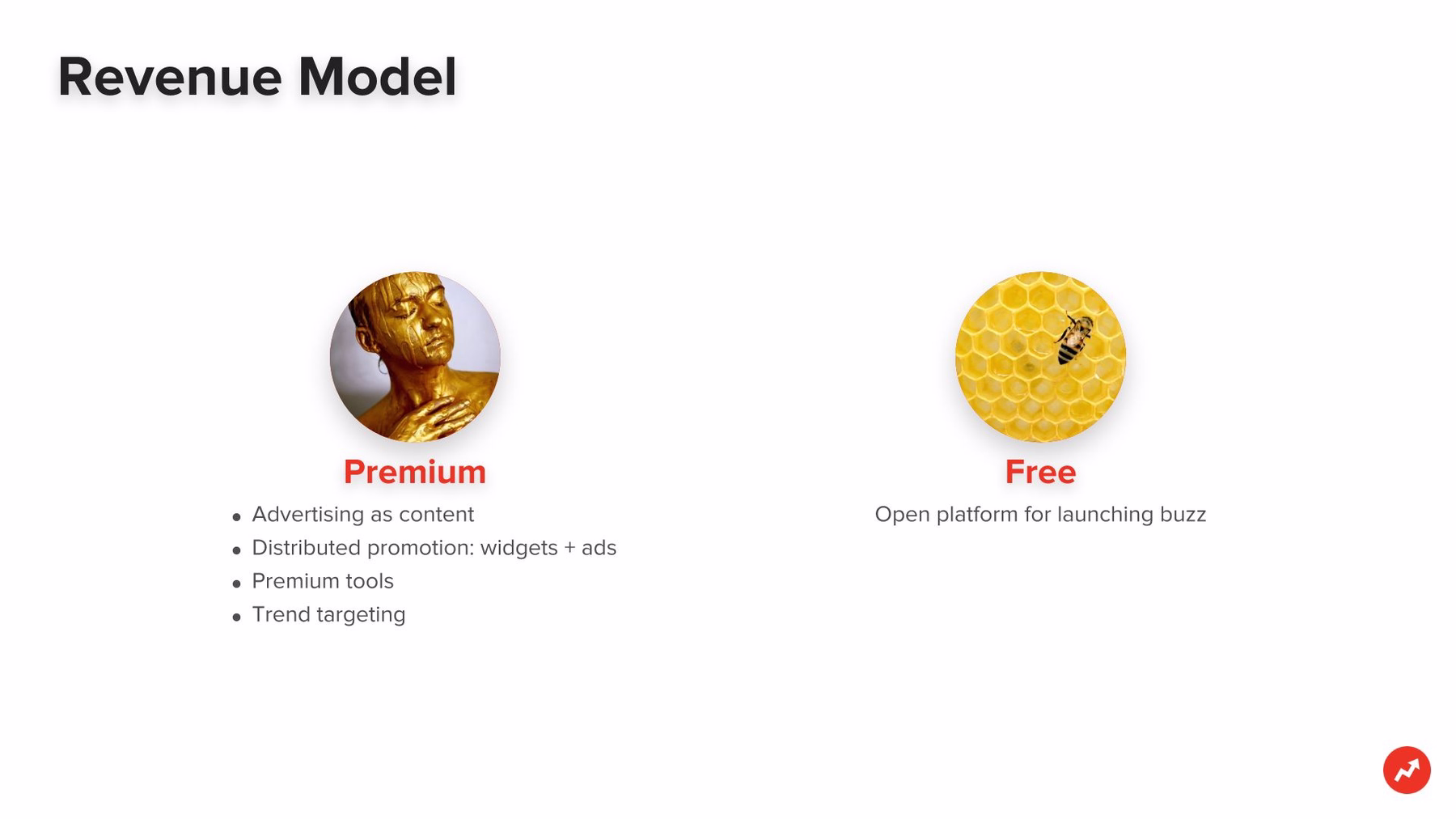
Slide 5: Revenue Model
Any successful pitch deck must include the company’s revenue model. Investors rarely sign checks for businesses that can’t explain how they will turn a profit. BuzzFeed’s original pitch deck featured a revenue model slide, but it followed and preceded a series of somewhat confusing visual slides. Perhaps additional information was offered during this time of the presentation, but it’s hard to say just by looking.
We clearly and simply presented the revenue model information on our icons with text slide: basic bulleted items beneath corresponding image icons found in our free library featuring beautifully colorful photos.
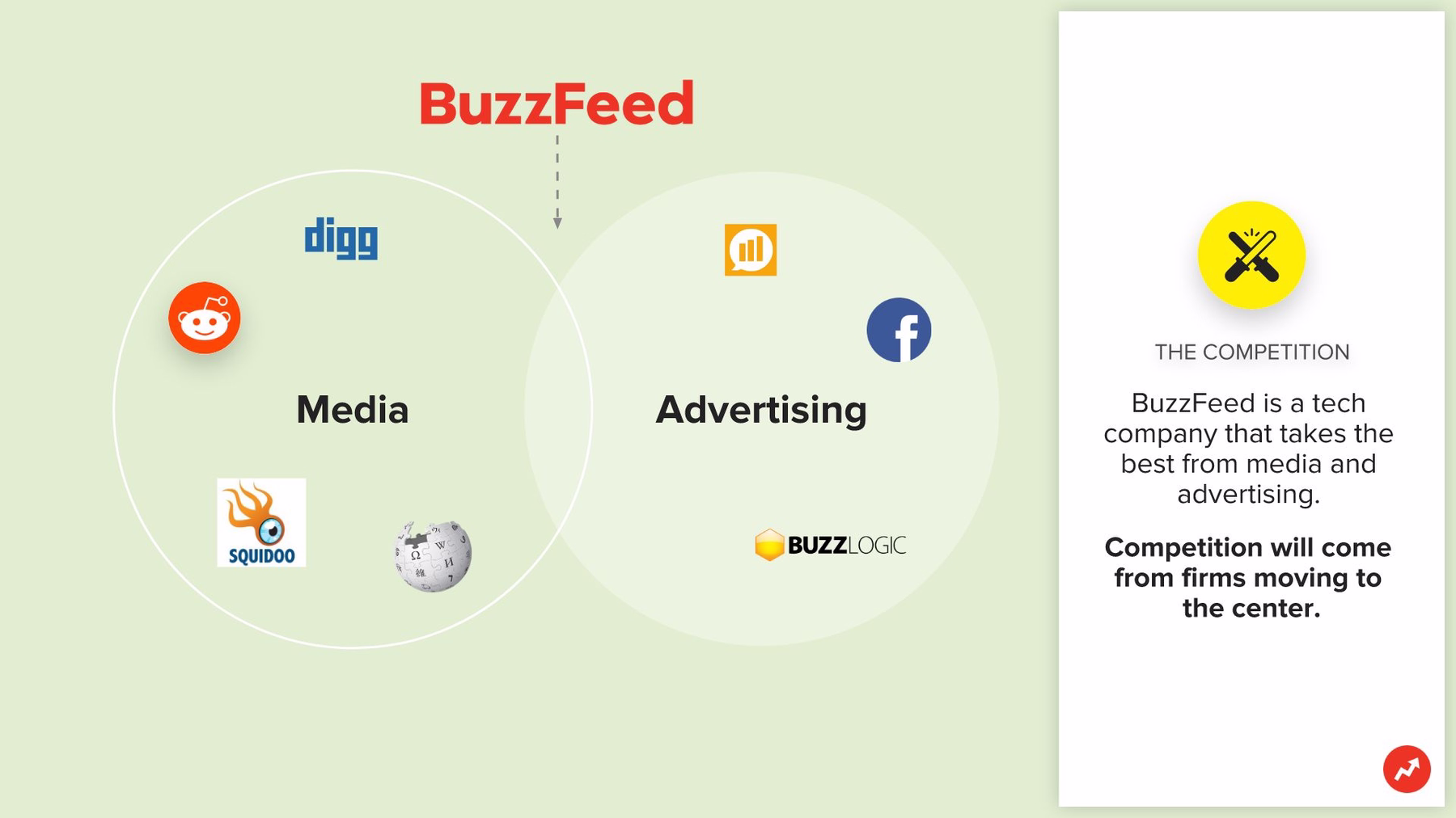
Slide 6: Competition
Potential investors also want to know a company’s competitive landscape. The original BuzzFeed pitch deck accomplished this with a simple Venn diagram, which listed some of BuzzFeed’s early media competitors on one side and its advertising competitors on the other.
We followed suit in our redesign, but you have to admit our slide is so much more visually appealing. Our Venn diagram appears on our flow chart slide, and instead of just naming the competitors, we filled the diagram with visual brands easily found using Beautiful.ai’s search engine devoted entirely to company logos.
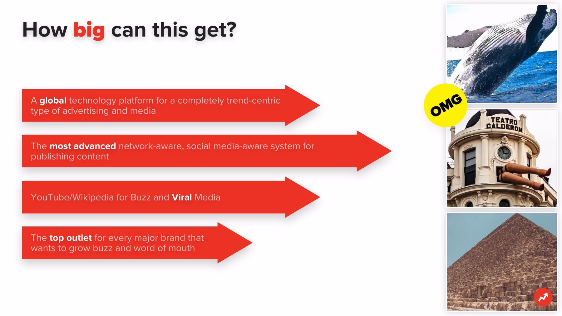
Slide 7: Potential
When potential investors can see a grand future for a brand, they are more likely to ante up that needed seed money. BuzzFeed did a good job of explaining the company’s potential in its original pitch deck, but it did so with yet another boring list of bullets. We completely transformed this slide by using our arrow bars template. Each list item is featured in arrow images of varying lengths. The images can even be animated, appearing in consecutive order to recapture audience attention.
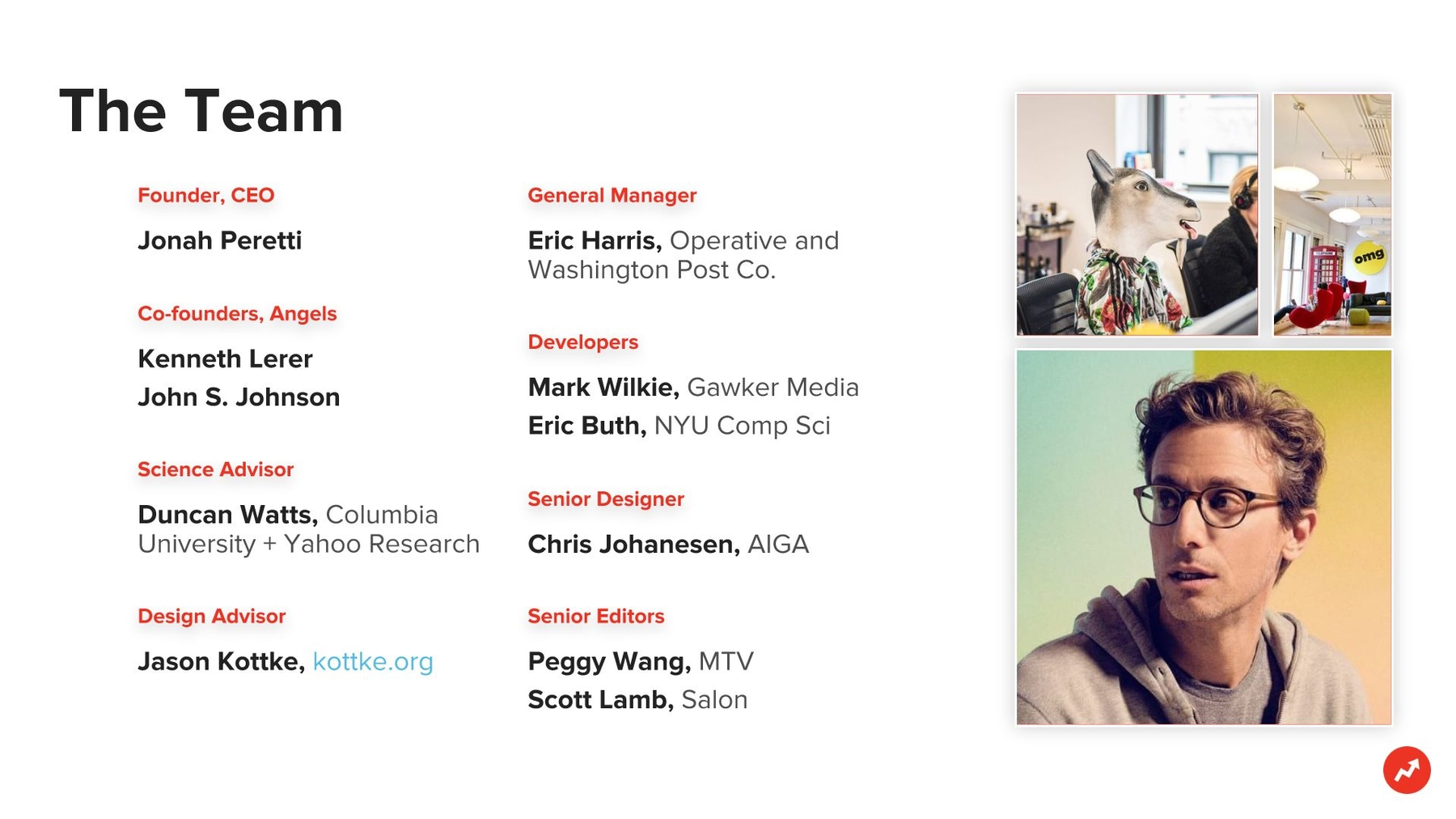
Slide 8: Team
We believe a slide introducing a company’s primary team is a pitch deck necessity, and apparently so did BuzzFeed. We easily recreated this slide with Beautiful.ai’s “about us,” slide template. All of the right design elements are already in place, we just fill in the blanks with names and titles. We spiced up the whole layout with photos in another grid layout.
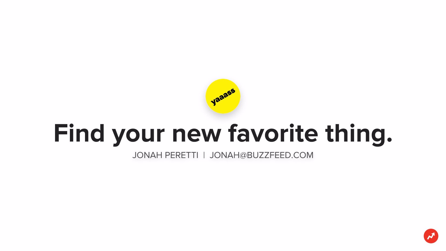
Slide 9: Contact Info
Any effective pitch deck also should communicate how to get in touch. This can be accomplished by listing whichever contact information the company feels is most relevant. Since BuzzFeed didn’t have any type of fancy headquarters in 2008, its contact was simply founder Peretti’s name and email address.
Great in theory, but let’s be honest, the original slide was incredibly dull. In our version, we selected the headline slide template and input the same contact information underneath BuzzFeed’s famous tagline, “Find your new favorite thing.”
How do you think our redesigned slide presentation compares with the original BuzzFeed pitch deck? Do you agree that our version is far more visually appealing? Could BuzzFeed have raised an even greater initial investment with our beautiful redesign?


.avif)
.gif)


