Wedding planning can be incredibly stressful with all the months of attending to hundreds of details and spending thousands of dollars. Just imagine how much more complicated it was before the internet.
Such was the industry landscape in 1996 when four New York University alum, two of whom had recently experienced the terror of organizing their own wedding, saw a business opportunity. They formed a company to offer online content to help couples planning their weddings, and The Knot, Inc.—now known as The Knot Worldwide— was born. After inspiring AOL to invest seed money, TheKnot.com launched in 1997.
The website was such a success the company soon partnered with QVC to launch an online wedding registry and published its first book. It was such a success that by 1999 The Knot, Inc. went public, and it even survived the infamous dot-com bubble bursting. Over the following years, The Knot, Inc., later known as XO Group, continued to dominate the wedding industry, launching its own magazine, a television series and additional lifestyle brands.
As it continued its rise to overwhelming success, XO Group had plenty of good news to share with its investors. What better way to report the company’s progress than with a visual presentation? While it’s not necessarily a pitch deck, XO Group developed a slide deck for its 2014 investor presentation. While the slide presentation was professional and informative, at 27 slides the deck included almost too much content to hold an audience’s attention.
As we often do, we wondered how much better the presentation might have been if its design incorporated the best design practices recommended by professionals. Of course, The Knot Worldwide has continued its path to success in the years since that presentation, but how much more successful might it have been with a presentation designed using Beautiful.ai’s free PowerPoint alternative presentation software?
We redesigned the original 2014 XO Group investor presentation deck, and we’ll let you be the judge of which is better. Is our redesigned slide deck more effective? Is it “beautiful?”
Download the free, customizable template here.
The deck:
We started our redesigned pitch deck by customizing a theme that will be common to each slide. We set a color palette incorporating The Knot’s branded colors. We also customized the typography, and we even set a common footer for each slide using the company’s logo.
Our redesigned slide deck will consolidate some slides from the original presentation, but also omit slides that provide too much data. Those details can be provided to investors in an accompanying information packet, where they can get a better understanding of the details.
Slide 1: The Knot title
Just as every book needs a cover, every visual presentation needs a title slide. We used Beautiful.ai’s headline and Image slide template, and we added The Knot’s logo and an enticing photo, each found searching our vast library of vivid, public-domain images, fonts, icons and logos.

Slide 2: Investment opportunity
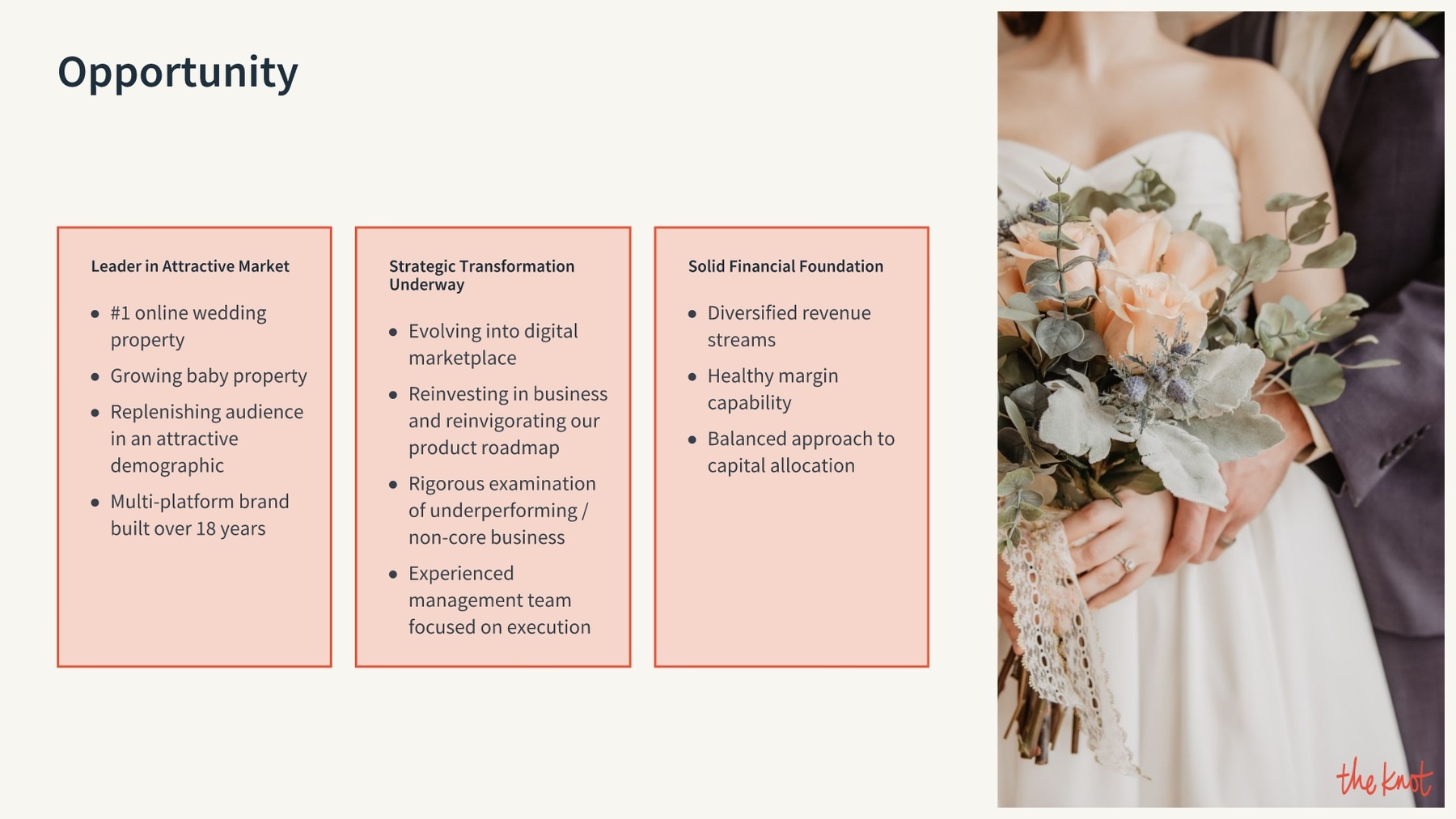
The next slide we redesigned introduces the investment opportunity to the audience. We kept the same content and recreated the slide using Beautiful.ai’s Text Boxes slide template. We were able to separate the lists of opportunities, and we were able to add some pizzazz to the presentation by also including another colorful, wedding-themed image.
Slides 3-4: Company at a glance
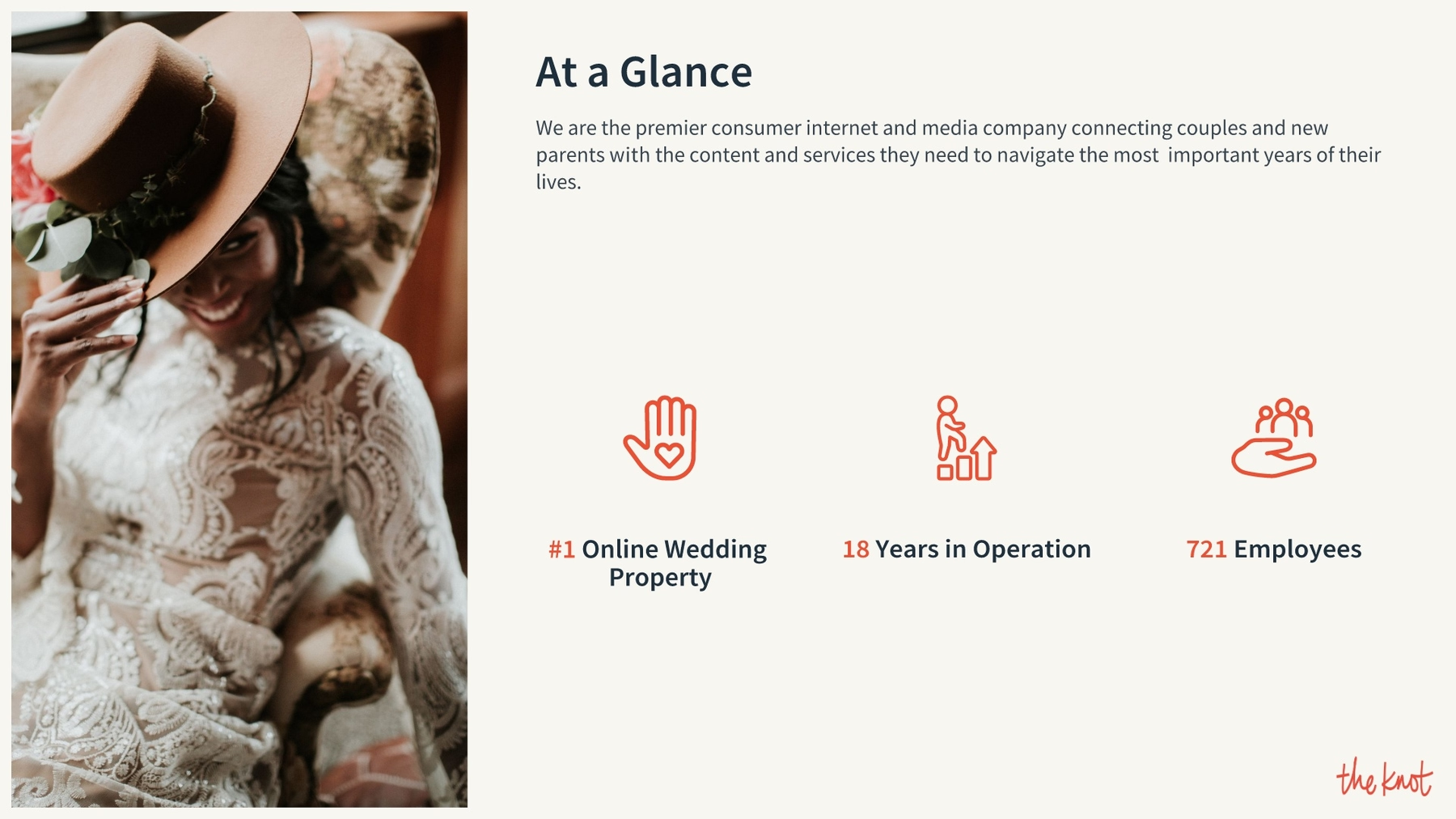
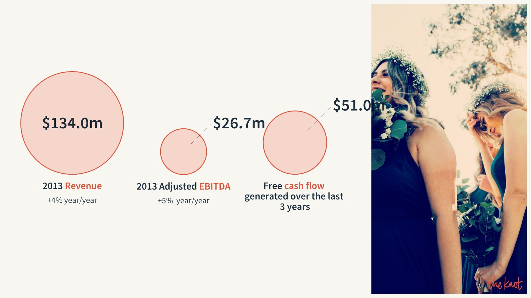
The Knot’s next two slides provided a summary of the company “at a glance.” Both presented data through grids, both provided too much data, and both were overall pretty boring. We kept the most pertinent details and added them first to our icons with text slide template, and then to our compare circles smart slide template. As we entered numerical data, the circles automatically adjusted to proportionate sizes.
Slide 5: Competitive landscape
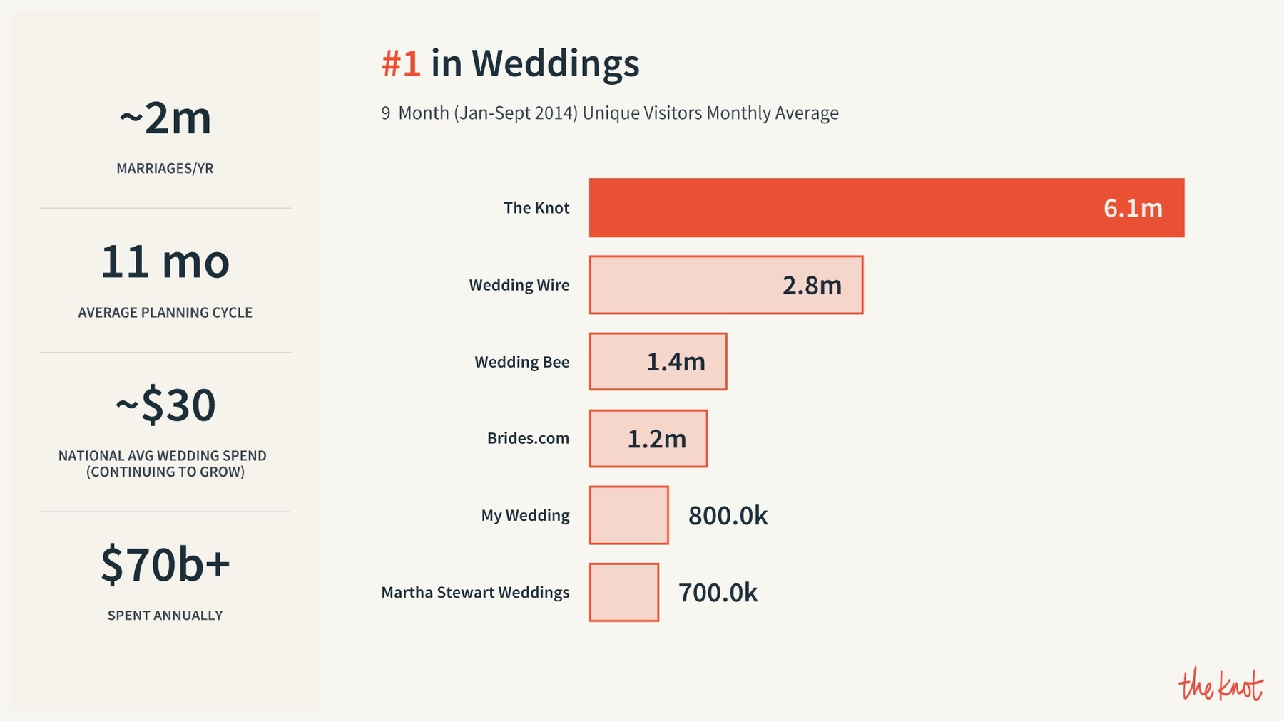
To redesign the next slide in The Knot’s 2014 investor presentation, we chose to recreate the bar graph using Beautiful.ai’s compare bars smart slide template to present the information. We just entered the numerical data, and our special brand of artificial intelligence automatically adjusted the length of the infographic’s bars accordingly.
Slide 6: The market
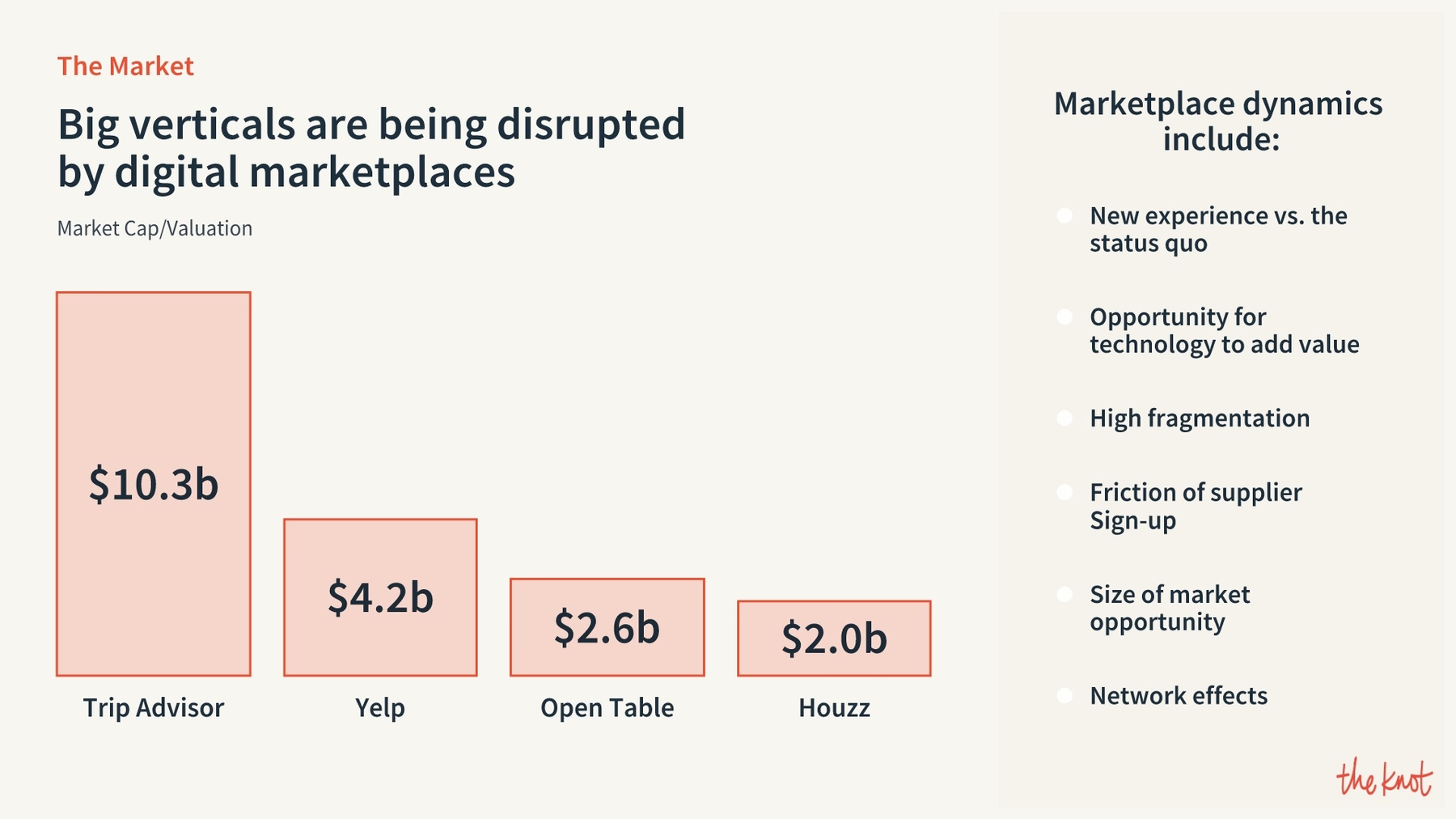
The Knot’s 2014 investor slide deck featured two slides detailing the digital marketplace, and we have to say the first one was a snoozefest. It contained entirely too much data for an audience to consume in a visual presentation format. Using Beautiful.ai’s compare columns smart slide template, we recreated the bar graph on the second slide, and we summarized a few key points on the first into a simple sidebar.
Slide 7: Marketplace opportunity
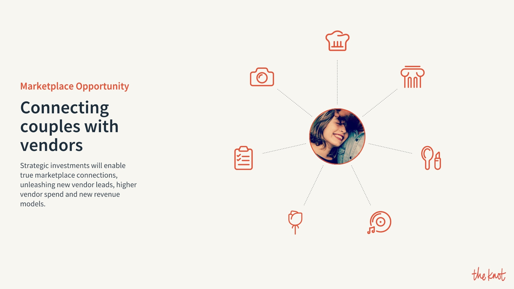
The XO Group repeated the mistake with its next slides, which describe The Knot’s marketplace opportunities. The first of the two slides is crowded and messy with too many details. We summarized the information and presented it using our hub and spoke slide template. The extra data can be presented to the audience in an accompanying addendum.
Slide 8: Company assets
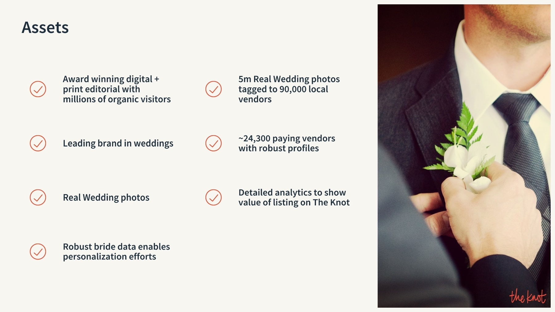
The Knot’s next slide highlighted the company’s 2014 assets, but it presented the information using some plain and boring text boxes. We spiced up the redesigned version of the slide using our icons with text slide template, and we added an accompanying photo to keep the presentation visual and beautiful.
Slide 9-10: Product roadmap
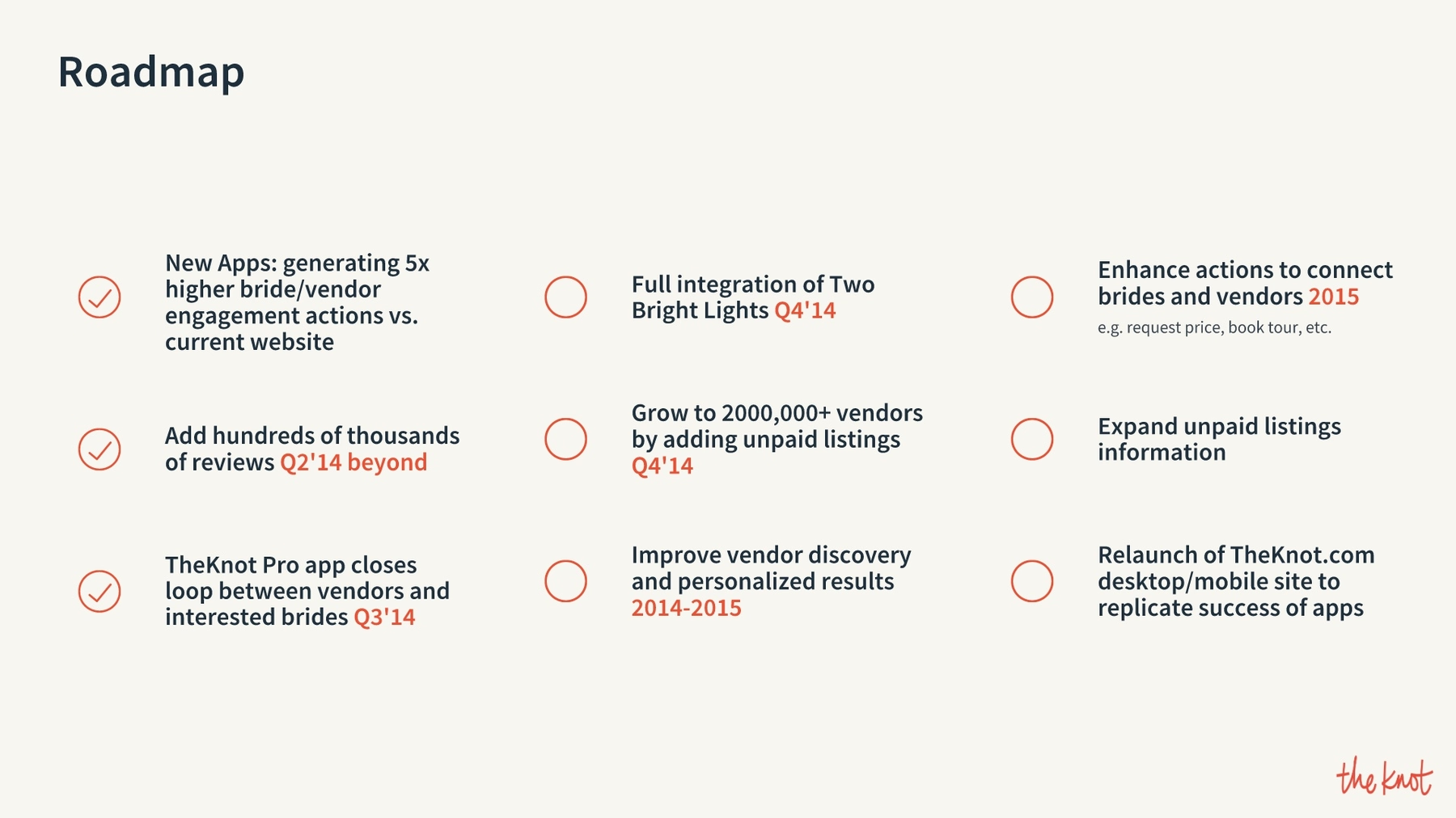
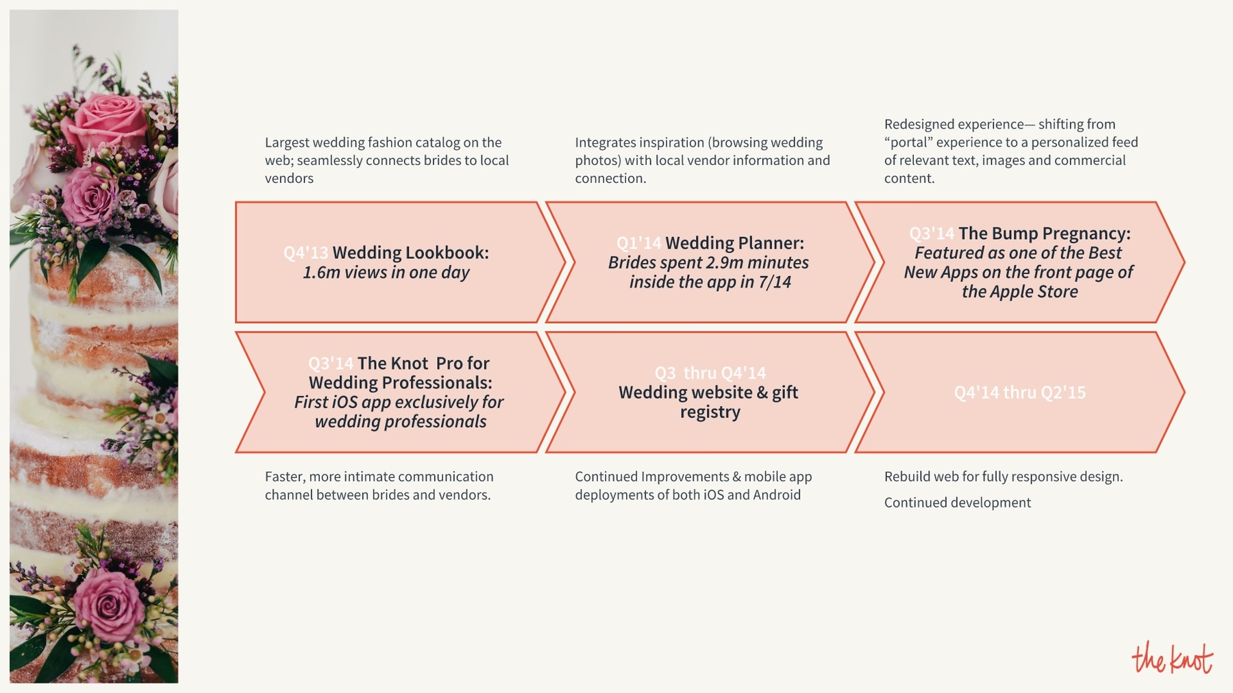
We broke The Knot’s next slide into two, because while details of the company’s future plans were vital to the presentation, it was entirely too much data for a single slide. We summarized the roadmap using our icons with text slide, then we illustrated other details with an infographic using our process diagram slide template.
Slide 11: Investment in business
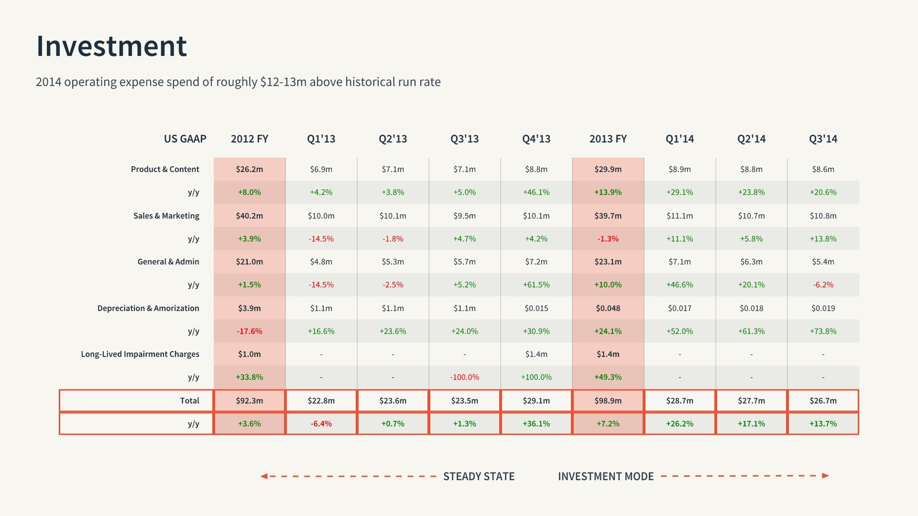
The next two slides in The Knot’s 2014 investor presentation detailed the company’s business investments, and again the company added entirely too much data to each for an effective visual presentation. We consolidated the information into a single slide, and with our table slide template we broke it all down into a single chart, complete with colored columns and outlined rows to emphasize key information.
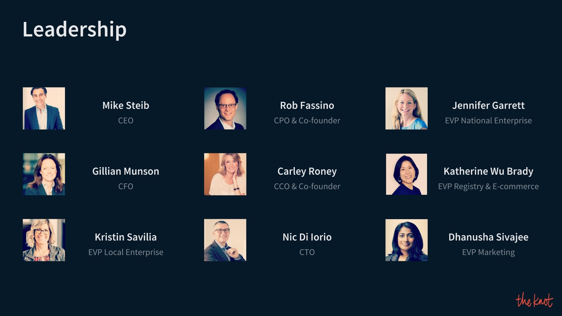
Slide 12: The Knot leadership
Any good pitch deck introduces audiences to principal players in the company, and XO Group’s slide deck was no exception. Still, the original slide once again was a mess with entirely too many details for a visual presentation. We stuck to the basics, including names, job titles and accompanying photos, and we easily presented the information with our team members slide template.
Slide 13: Company successes
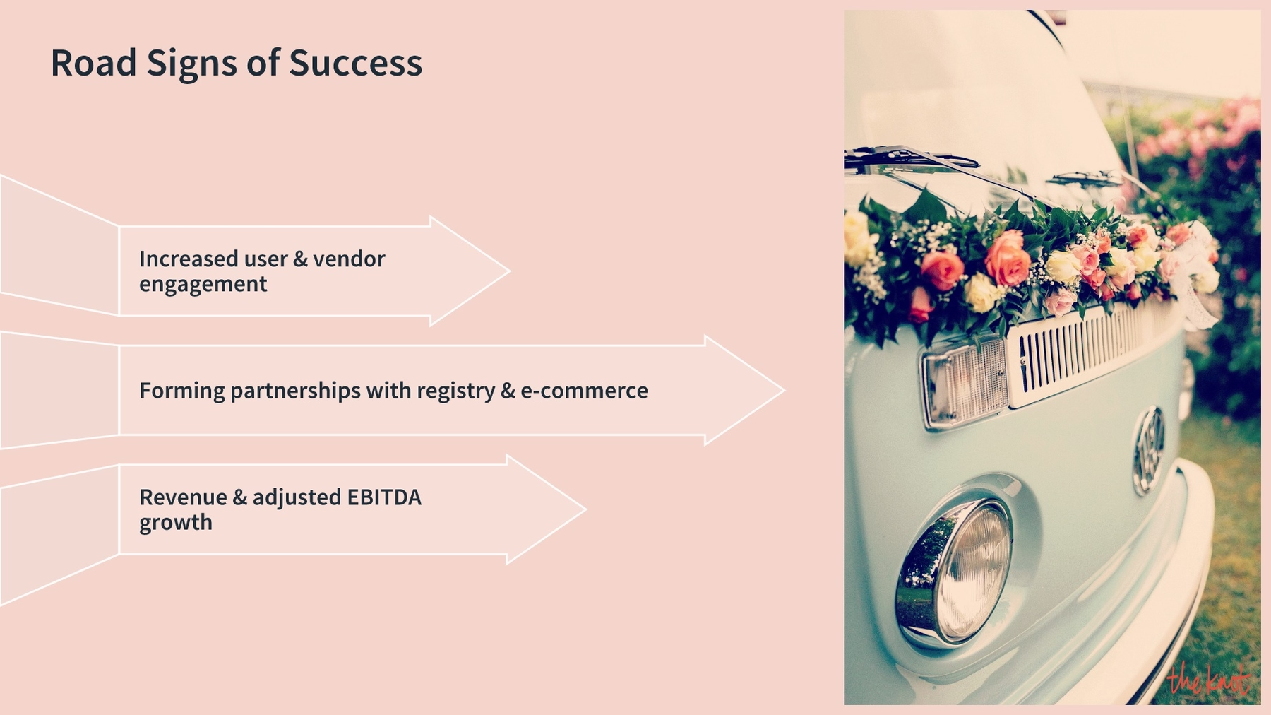
XO Group capped off The Knot’s 2014 investor presentation by describing the signals of the company’s future success. This slide was short and sweet, but it was still really boring. We redesigned the slide using Beuatiful.ai’s arrow bars slide template, which enhanced the visual appeal of the presentation.
Slide 14: Investor questions
We loved that The Knot’s 2014 presentation ended by asking for audience questions, and it did so with a visually appealing slide featuring an eye-catching photo. We recreated the final slide using our headline and image slide template and a fun photo we pulled from Beautiful.ai’s library of free stock images.

What did you think of our redesigned slide presentation? Did you like the way we placed a greater focus on the visual aspects of the deck, and reduced the amount of data on many of the slides? Is our version more effective? Is it “beautiful?"
