

Moz entered the tech realm in 2004 when founders Rand Fishkin and Gillian Muessig founded an online community and blog for experts in the relatively new practice of search engine optimization to share ideas and research solutions.
When the SEOmoz— as it was known at the time— website featured its first Search Ranking Factors study and Beginner’s Guide to SEO, little did Fishkin and Muessig know that within just a few short years their initial effort would grow into a powerful suite of marketing tools that help boost and convert web traffic.
Because SEOmoz launched at a time when SEO was still somewhat of a mystery— most digital marketers at the time knew why search engine optimization was important, but they had no idea how to accomplish SEO goals. They had no technique…not until Moz came along, that is.
After some study of the early demand for SEOmoz, company leaders decided to shift their focus from consulting to software. A first round of funding enabled the development of SEO tools for which Moz is now famous, and it soon launched tools that crawl the web to gather data about any indexed web page and domain. The tools— including options like Link Explorer, Keyword Explorer and the MozBar— then analyze all that data to score sites based on different factors. The higher the score, the higher the page ranking influence.
So, how does Moz score pages? How does it know how a web address will rank in a search? Its software analyzes various factors that can indicate a site’s popularity, relevance, authority and trustworthiness. What are those factors? They fall into two categories.
Off-page factors that impact SEO consist of actions taken outside of an actual website that will impact its search results. These factors include backlinks on other sites that direct back to the one being scored, social media posts about the website, brand mentions in content from other sites and even marketing promotions through influencers and their web presences. Authority scores can vary based on the linking site’s popularity and its own authority, the anchor text used and even the number of other links on the linking page.
While SEO experts learned to use Moz to boost their site’s off-page factors, even more users still turn their focus to on-page ranking factors examined by the Linkscape tool. On-page factors refer to content on a page, both visible to viewers and within the page’s HTML code. On-page ranking factors include everything from the URL structure and overall content hierarchy of the site to source code tags identifying titles, images, descriptions and other content types, or the frequency certain relevant keywords are used throughout a page.
Moz scores even can be influenced by the quality of other sites it links to and how quickly each page loads once accessed in a browser. Moz still provides a free tool to search a website’s page and domain authorities, as well.
Without an online tool that analyzes so many page factors, digital marketing experts might never be able to fully assess a site’s accessibility: the ways a website caters to the differently-abled. Those factors can have a huge impact on user experience. Factors like the size and color of text or the completion of alt-tags read aloud for the visually impaired, for example, can reduce churn and boost page engagement.
Moz is still known for its ability to score page and domain authority, among other metrics, but in 2011 its leaders decided to take the company in a new direction. Like many of the successful companies before it, Moz was ready to grow again by 2011, when company leadership decided to transition to support for marketers across all inbound marketing strategies, not just SEO. But as with any major change in strategy, Moz needed extra capital to forge ahead. Fortunately, it was able to raise more than $18 million from The Foundry Group in series B funding round.
Moz didn’t have any trouble inspiring the Foundry Group to invest in its future. After all, by that point the company had been successfully operating for several years. It wasn’t difficult to impress investors by presenting the Moz business plan, estimated revenues, cost per acquisition and other vital company metrics.
Even though Moz had all the right information to present in that fateful 2011 meeting, it still had to make a pitch— and for that the company needed a pitch deck. We took a look at the original Moz Series B pitch deck, and we think it’s a mixed bag. It’s super informational, but maybe too informational with 36 slides in total. After all, the potential investors already knew about the company.
Still, the Moz series B pitch deck was colorful and detailed, definitely nothing that would turn away an investor. We can’t help but wonder if Moz might have raised even more capital had it used a skillfully designed presentation, created with all the best design principles recommended by pros. To find out, we gave the Moz pitch deck and its tired PowerPoint-esque design a makeover, and we have to admit that the slide deck came out…well…beautiful!
How do you like the consistent theme and extra pizzazz we gave our version? Every slide looks like it was designed by a pro thanks to Beautiful.ai’s special sauce— our AI technology that applies the rules of great design in real time, automatically adjusting the slide’s design each time new content is added. Plus, we condensed the lengthy pitch deck into a presentation half the size of the original— with all the same information.
Does our redesigned pitch deck look more effective to you? Would it inspire you to invest more than the original?
Download the free, customizable template here
Slide 1: Moz Title
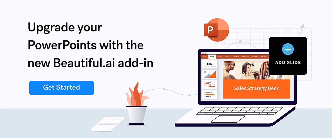
We still believe every visual presentation needs to start with a title slide, and that’s what we created using Beautiful.ai’s title slide template. Our free software makes it simple to customize templates with free stock images found in our library of literally millions of vivid images, logos and icons. Plus, designing all the slides in our redesigned pitch deck will be simple, quick and professionally presented since we were able to customize a common theme for the entire presentation, including a preset color palette, fonts and orientation, among other design features.

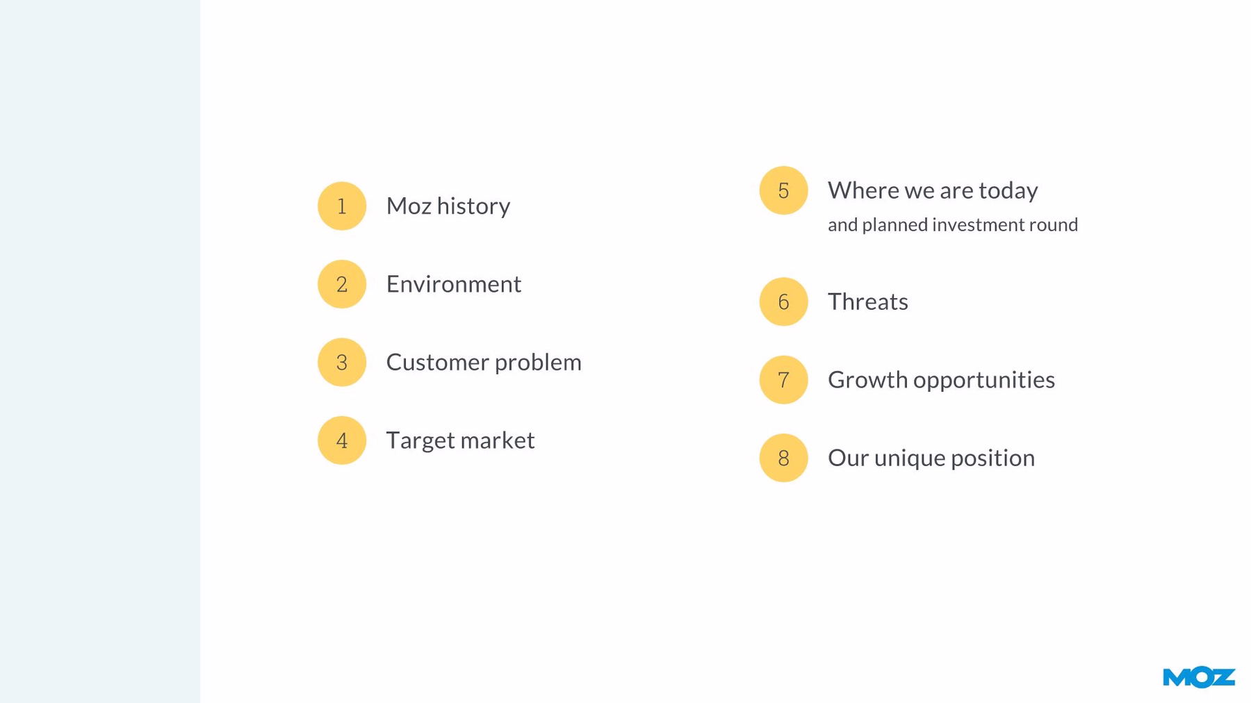
Slide 2: Presentation Contents
Since Moz’s original pitch deck was so lengthy, we added a table of contents to the second slide. That way, audiences can better follow along with the presentation as they track where they are going and where they have been. The slide was so simple to design using Beautiful.ai’s agenda smart slide template. With the colors and fonts already preset, adding the content sections was easy as pie. Our free presentation design software even let us add some animations so content appears one element at a time— an effective way to hold onto audience attention.
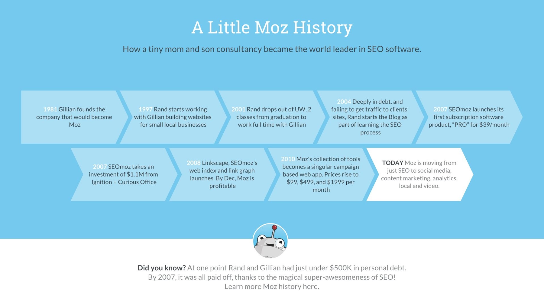
Slide 3: Moz History
A timeline is an effective way to present a company’s history, and the Moz team designed its timeline with a variety of bright colors and simple text boxes. We were fine with recreating the content, so we chose Beautiful.ai’s free process diagram smart infographic slide template. The slide automatically aligned with our color scheme, and we only had to enter event details and our artificial intelligence automatically adjusts the diagram as needed. More animation keeps the presentation visually interesting.
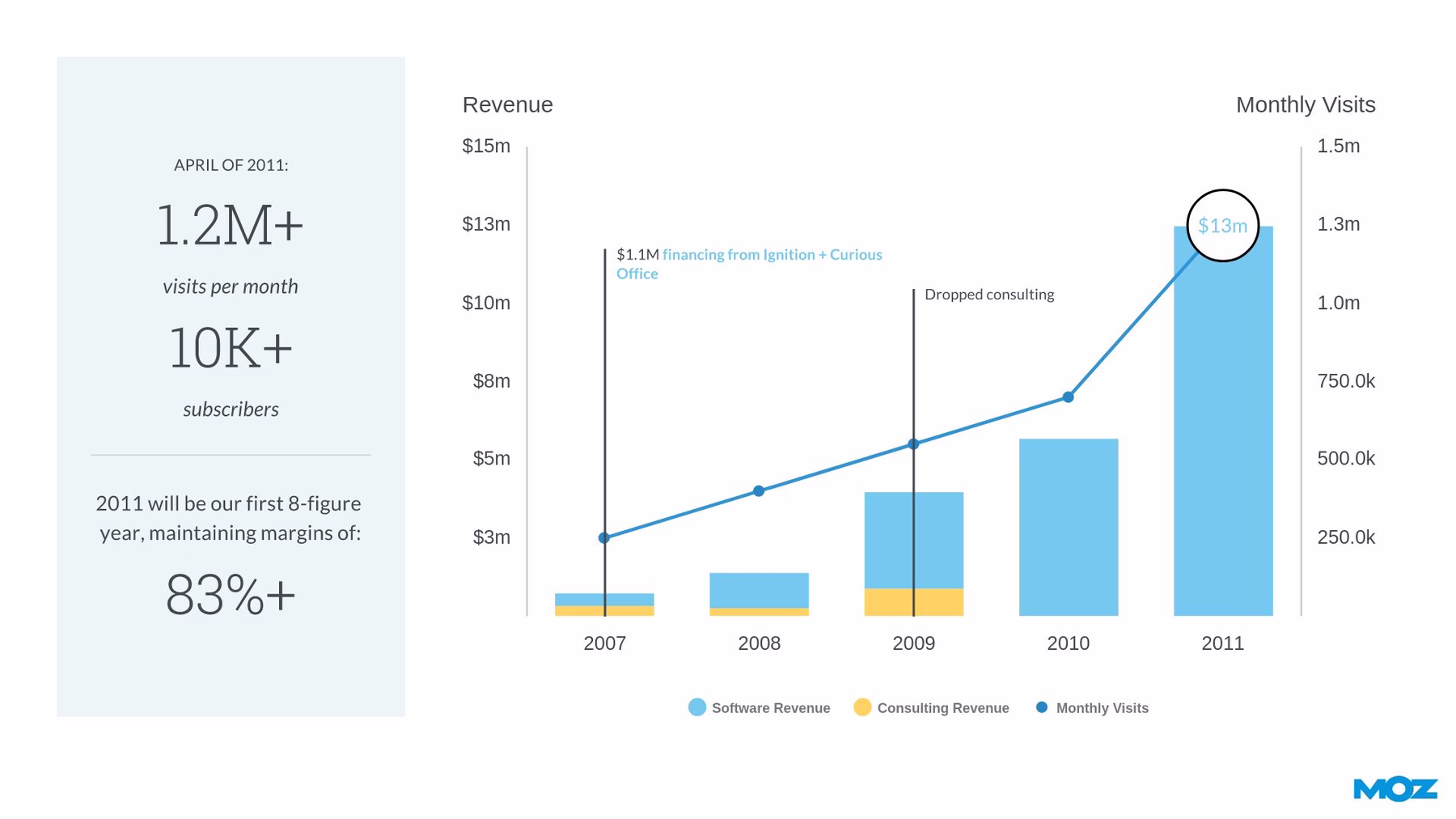
Slide 4: Company Revenue
The next slide in the original Moz series B pitch deck summarized the company’s revenue structure in a fairly complex bar graph. We took that same data and presented it in a simpler format using our column chart smart template. Our free PowerPoint alternative software adjusts the design of the graph as numeric content is added. We then took some of the other information from the original slide and presented it in a sidebar. The overall presentation of the slide is cleaner, and the content is far more digestible.
Slide 5: How Moz Succeeds
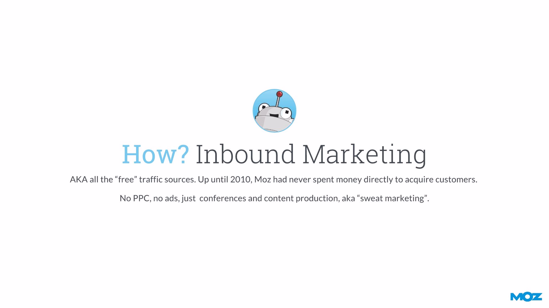
We consolidated the next two slides from Moz’s original presentation into a single page. How had Moz managed its first several years of success? Through inbound marketing, or the “free” web traffic sources. Did that really need to be split between two slides when Beautiful.ai’s headline slide template does the trick? Plus, the design of our made-over slide is more direct and consistent with the rest of the presentation. We added an extra visual element with a Moz logo we found using Beautiful.ai’s free image library.
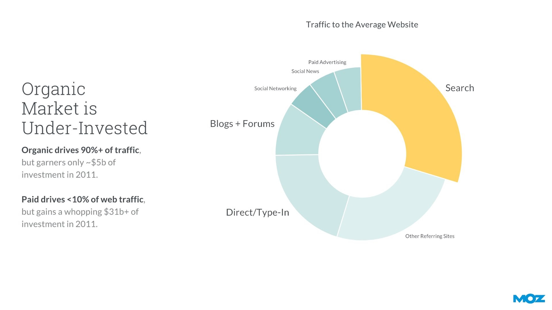
Slide 6: Organic Market
At this point of the presentation, we actually skipped some extra slides from the original pitch deck and moved ahead to illustrate the organic search traffic market. Using Beautiful.ai’s donut chart smart slide template, we recreated Moz’s original pie chart just by adding the category labels and the numerical data to our special infographic design tool. Voila! It’s even in the appropriate color scheme we preselected for our presentation.
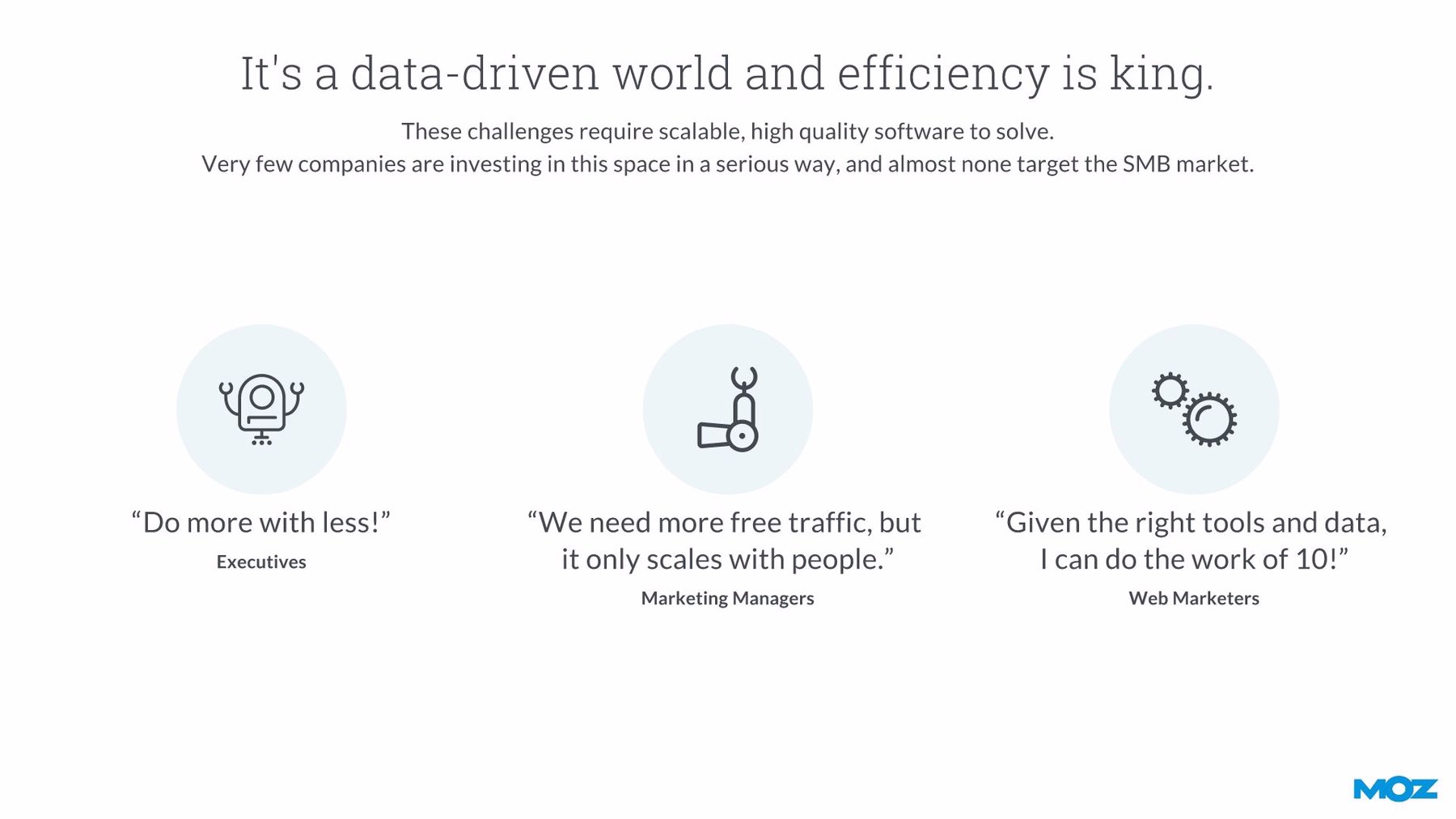
Slide 7: Efficiency Is King
When we redesigned the original Moz series B pitch deck, we transferred the information from the next slide into our Icons with Text smart slide template. All we had to do was choose an icon from the vast Beautifufl.ai library for each entry, then add the associated text as we watch the smart template automatically adjust so it always relies on the principles of good design used in professional settings. We also animated the appearance of each set of content. Doesn’t the consistent color scheme make the slide appear as part of the entire package?
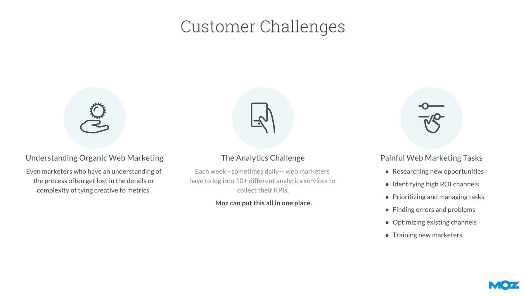
Slide 8: Customer Challenges
We again chose the icons with text smart template to highlight Moz customer challenges circa 2011. Just like with the previous redesigned slide, we simply selected a free icon from our library for each element, then added the textual content. Creating the slide was a cinch since all the appropriate fonts and colors were preselected from our customized presentation theme. Animating content appearance was merely the icing on the cake of the redesigned slide.
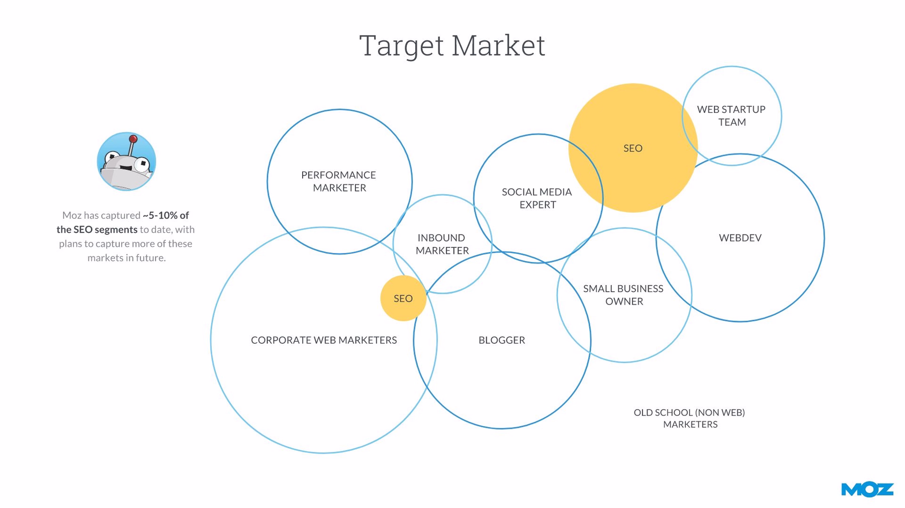
Slides 9-10: Target Market
We again combined two slides from the original Moz slide deck into a single page using Beautiful.ai’s unique floating circles smart slide template. Moz included a floating circles diagram to illustrate its various target marketers, or what types of marketing efforts it will utilize to expand its brand. We recreated this slide with our own floating circles smart slide template, and we placed labeled circles of varying sizes to represent the associated market size. Again, we easily animated the appearance of the circles so the appearance of movement can recapture any audience attention dwindling at this point of the presentation.
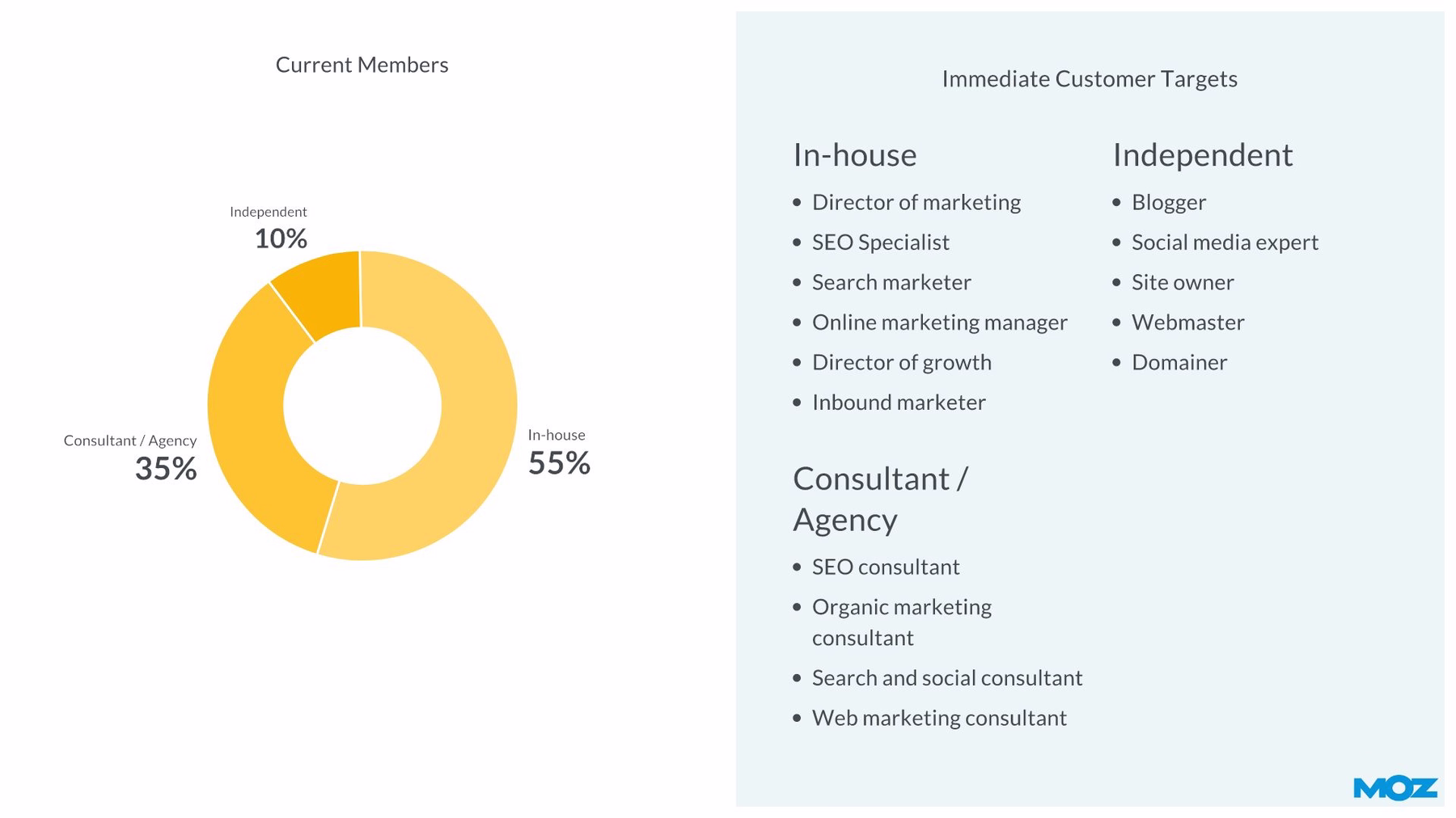
We then created a second slide to display additional information representing various Moz target customers by again customizing the donut chart template— and this time split the slide in half, dedicating one side to bulleted lists detailing the customer types.
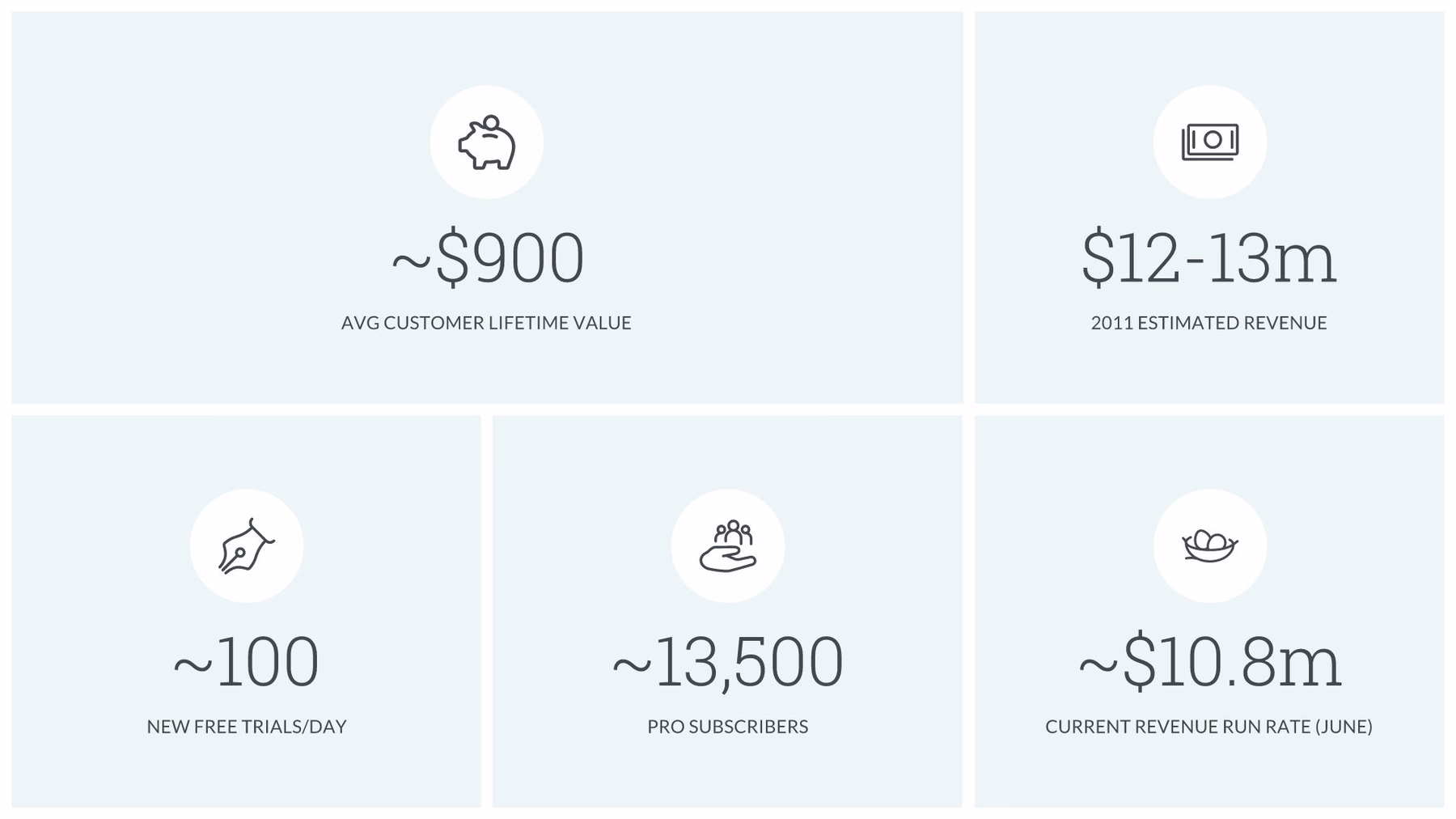
Slide 11: Moz by the Numbers
For our redesigned pitch deck, we combined the data Moz presented across several original slides and presented it all in a single grid using Beautiful.ai’s photo grid slide template. Whereas we usually might search for free stock photos to add to each grid box using our free image search library, this time we sought out icons that correspond with each statistical category, then we just added the numerical data. Creating the clean and concise slide added a simplicity that stands out in the longer presentation.
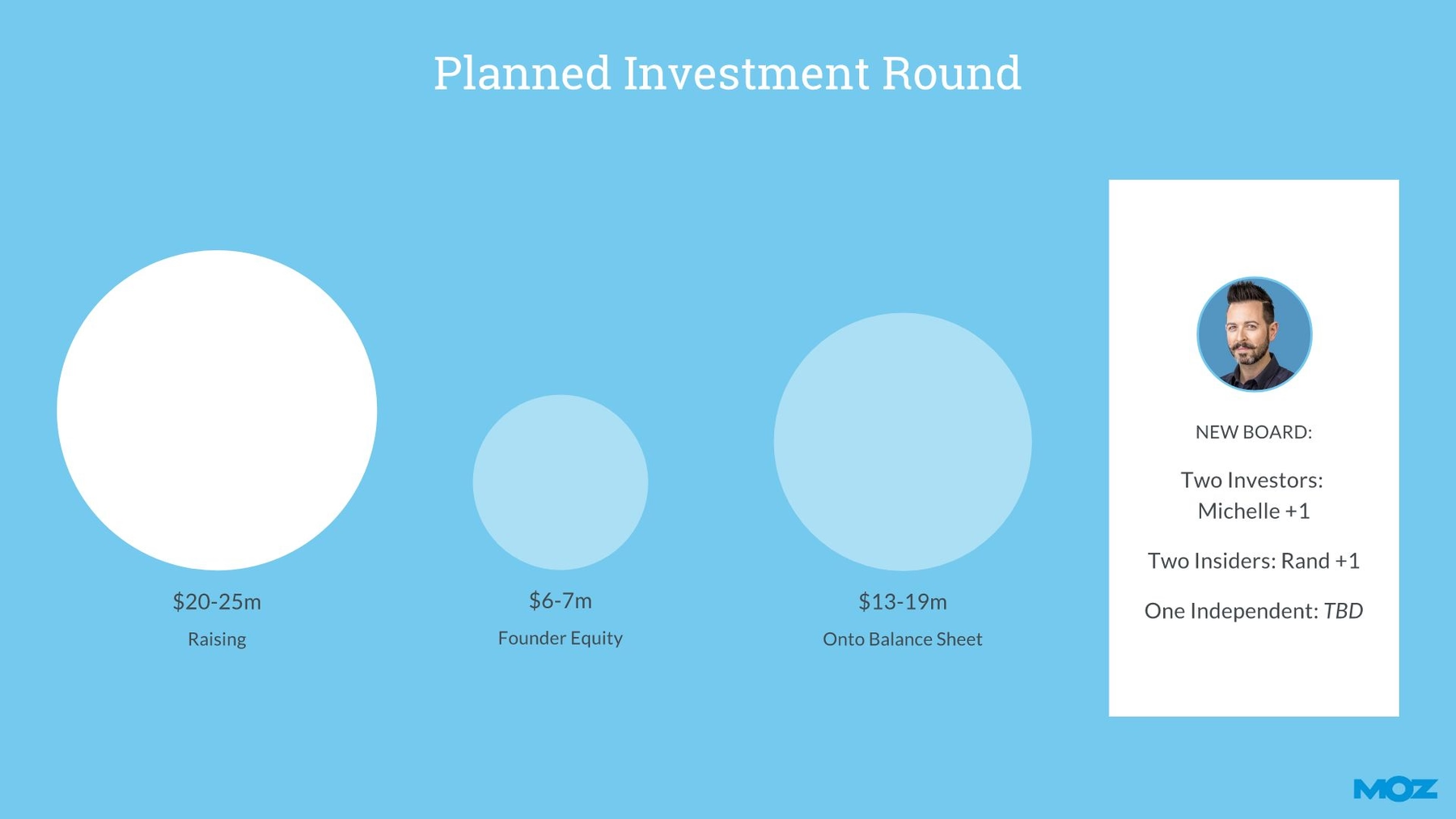
Slide 12: Planned Investment Round
We again combined two original slides into one that highlights Moz’s planned series b investment round. Moz designed a slide that relied on multi-colored text blocks complete with categories and numerical data. We instead chose our compare circles smart slide template. All we had to do was enter each data set, and our AI-powered software automatically adjusted the size of each circle accordingly.
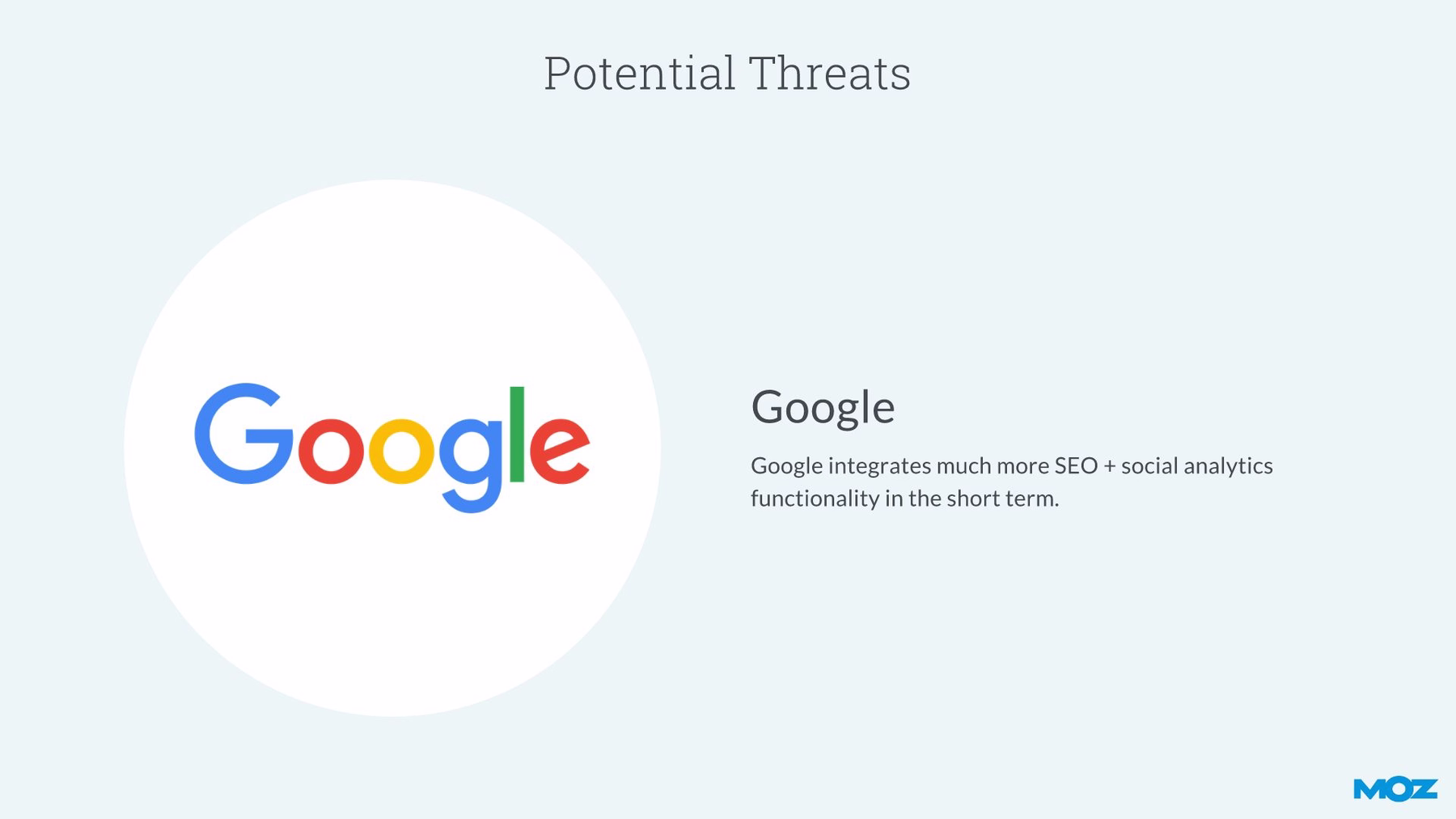
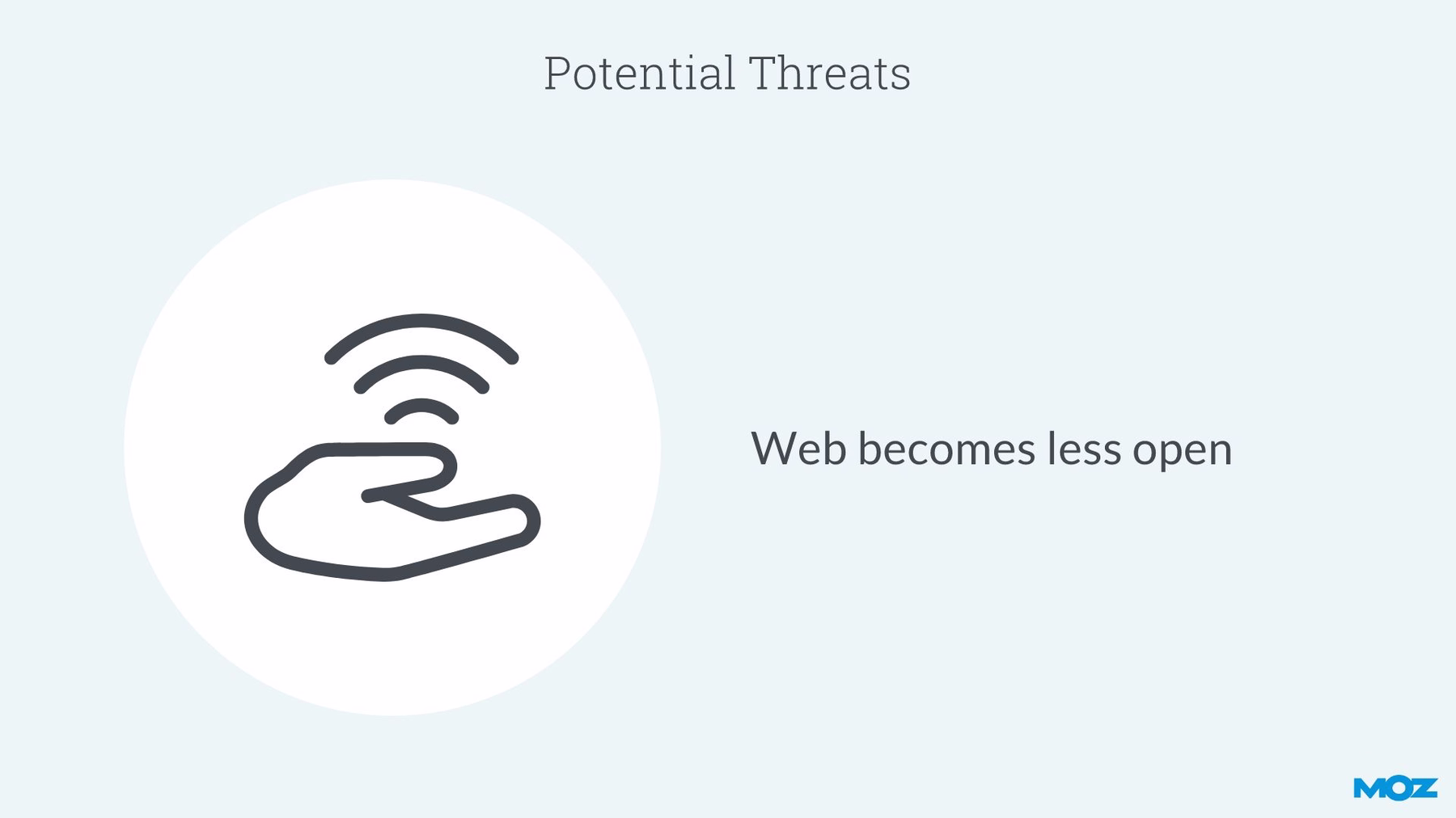
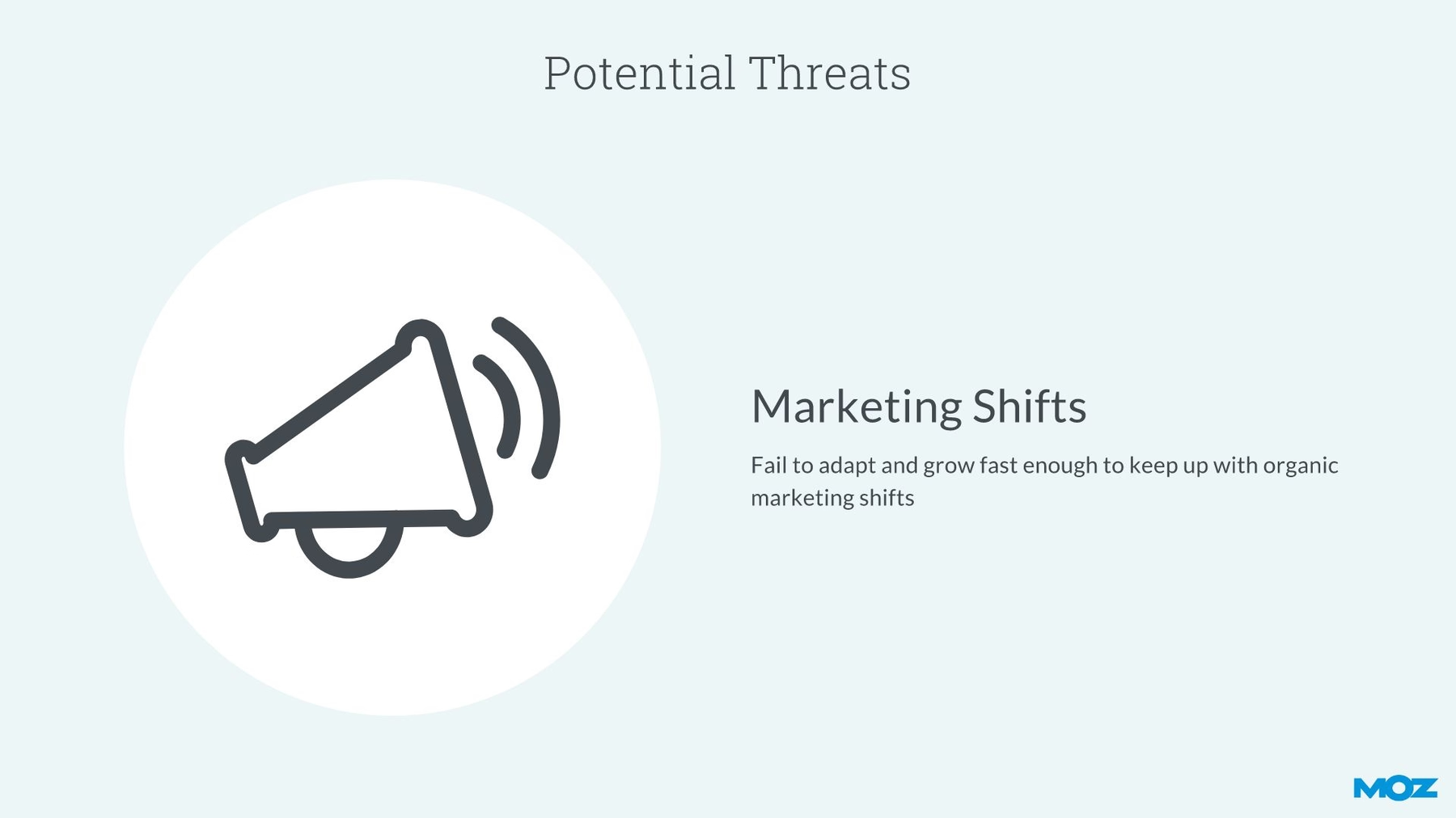
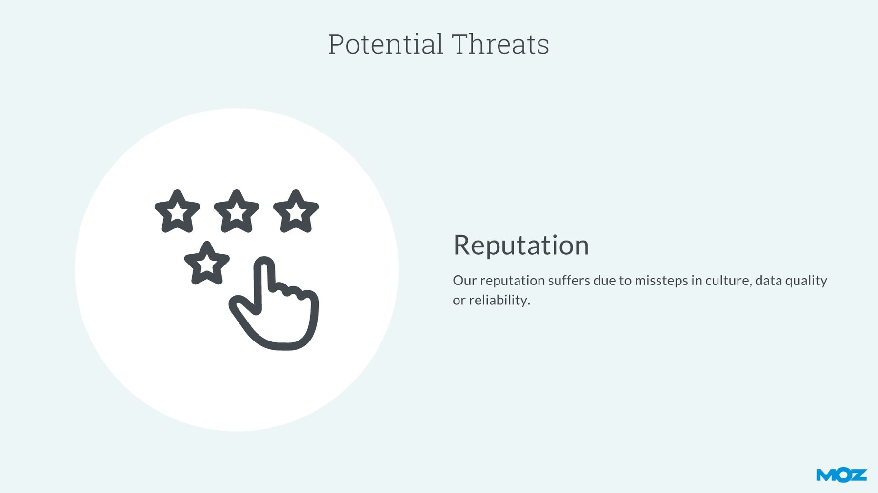
Slide 13: Potential Threats
The next five slides in the original Moz pitch deck highlighted the company’s 2011 business risks. Instead of designing so many separate slides for the same topic, we chose Beautiful.ai’s message carousel smart slide template. We just designed the slide’s overall format, including its title, theme and logo. Then we added each risk in its own carousel window. When the deck is presented, it will appear as four slides instead of a single template with four revolving panels.
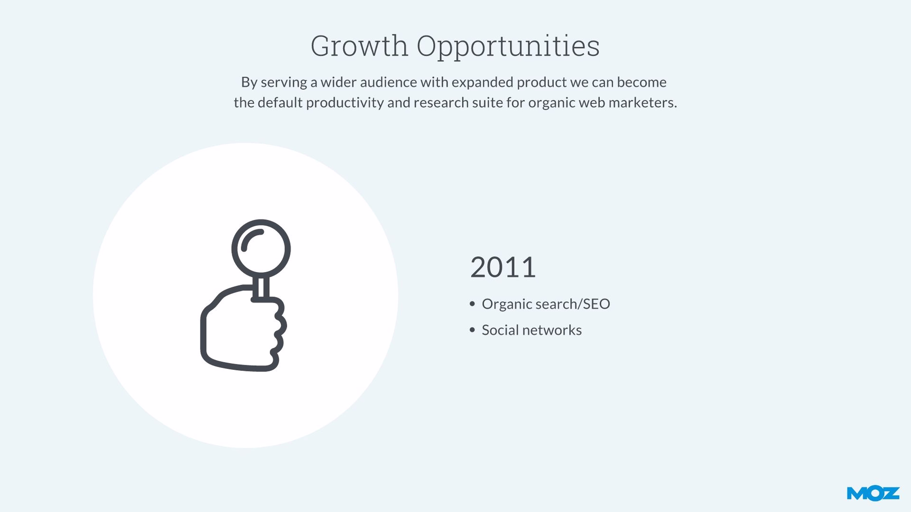
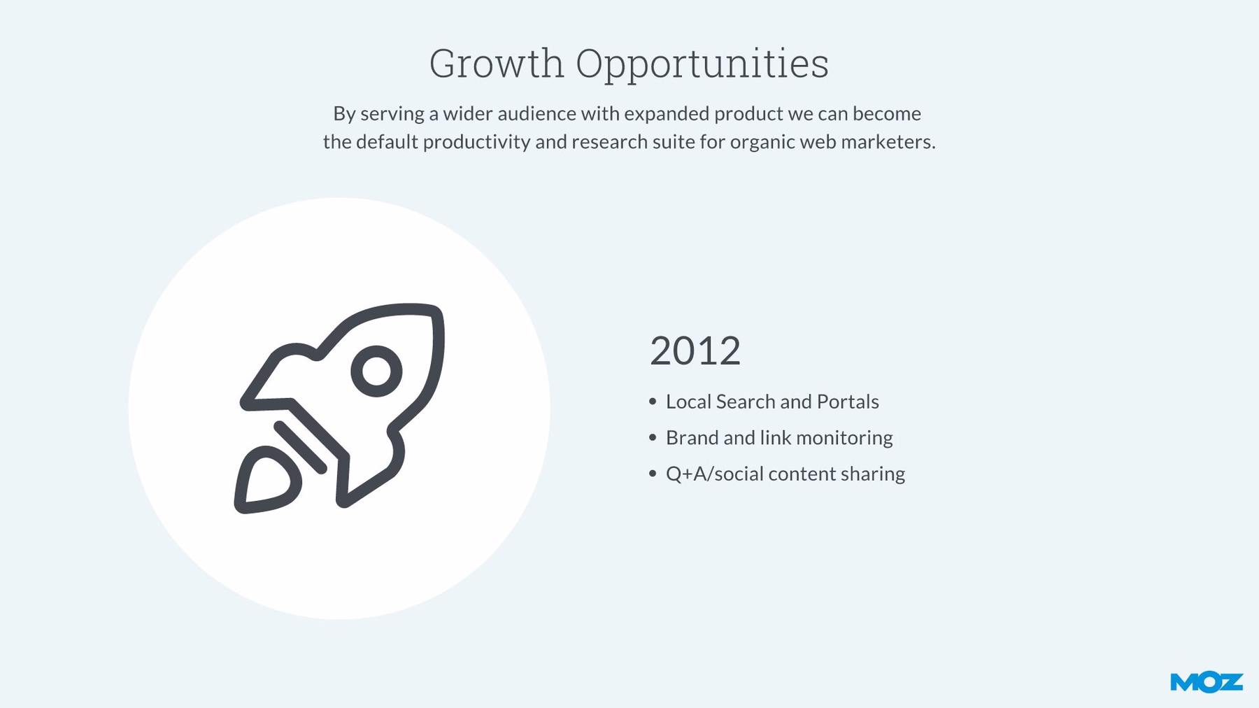
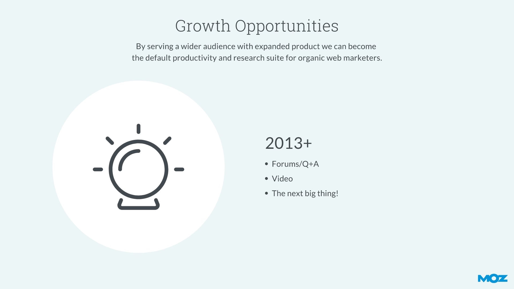
Slide 14: Growth Opportunities
We again chose the message carousel slide template to highlight the company’s growth opportunities. Not only did we only have to design the overall slide once, we were easily able to add images to each revolving slide panel, and they were so simple to locate in Beautiful.ai’s amazing— and enormous— image library.
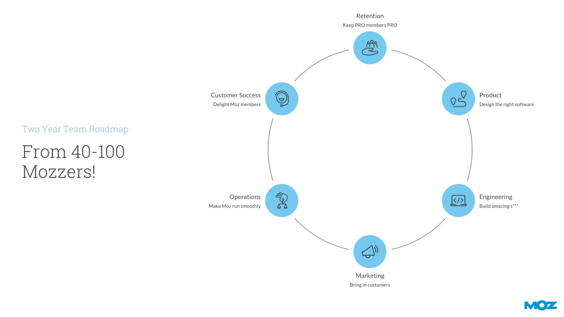
Slide 15: Team Roadmap
Why was Moz uniquely positioned to win the organic traffic market in 2011? We illustrated each concurrent benefit in our cycle smart slide template. Instead of a numbered, chronological list, we were easily able to add each item into a circular element within the cycle infographic, and we were able to choose corresponding icons from our free image library as each automatically took on the appropriate custom color.
Slide 16: Potential Acquisitions
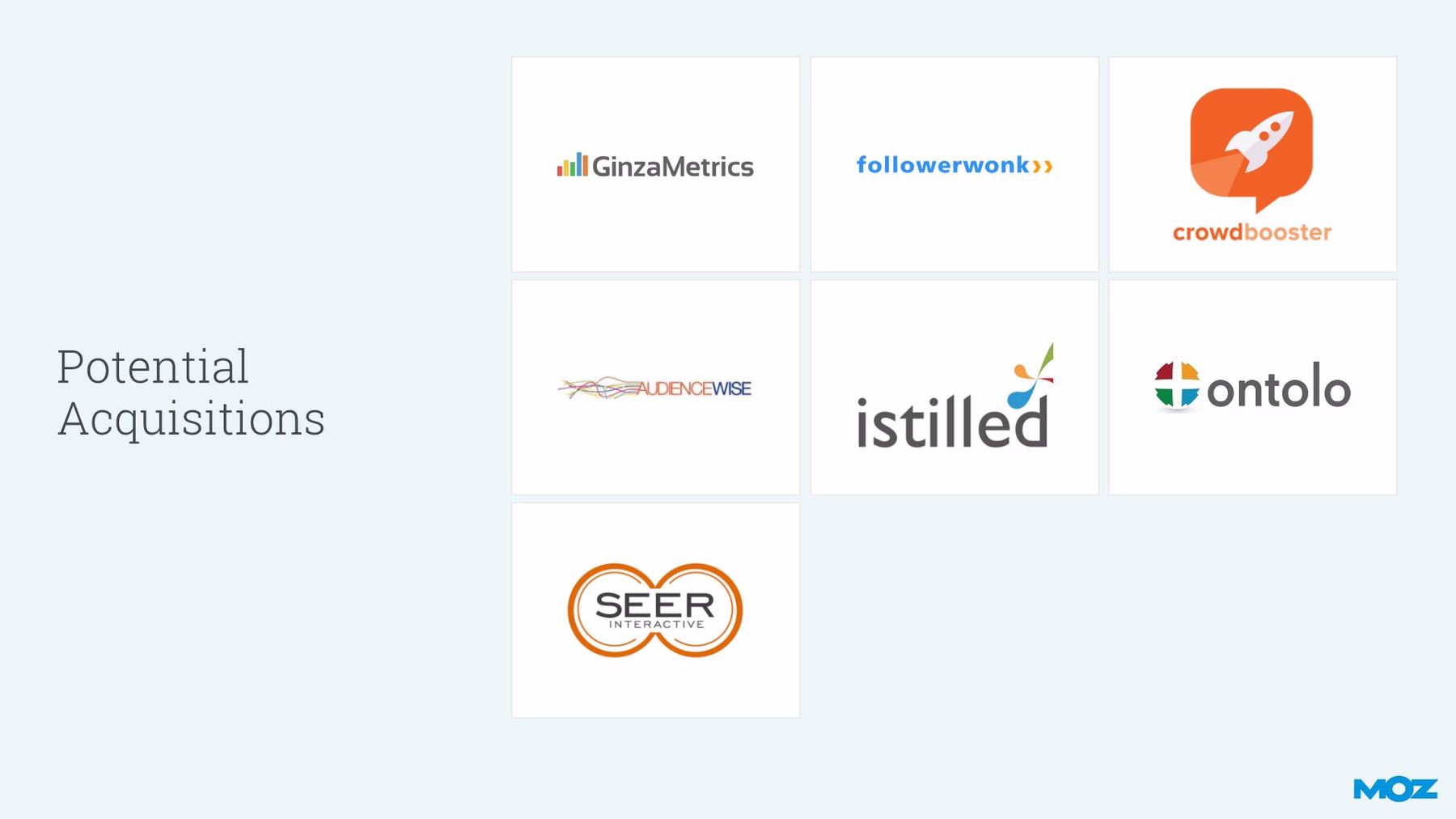
Moz's original slide highlighting the company’s potential acquisitions was informative, yet… busy. Different fonts, different colors, different sizes— absolutely no cohesion in the slide’s design. We corrected that problem with Beautiful.ai’s logo grid slide template. We easily added each item into a square on the grid, using each company’s logo pulled from our vast library. Just enter the name, and our intuitive search tool will find the company’s logo.
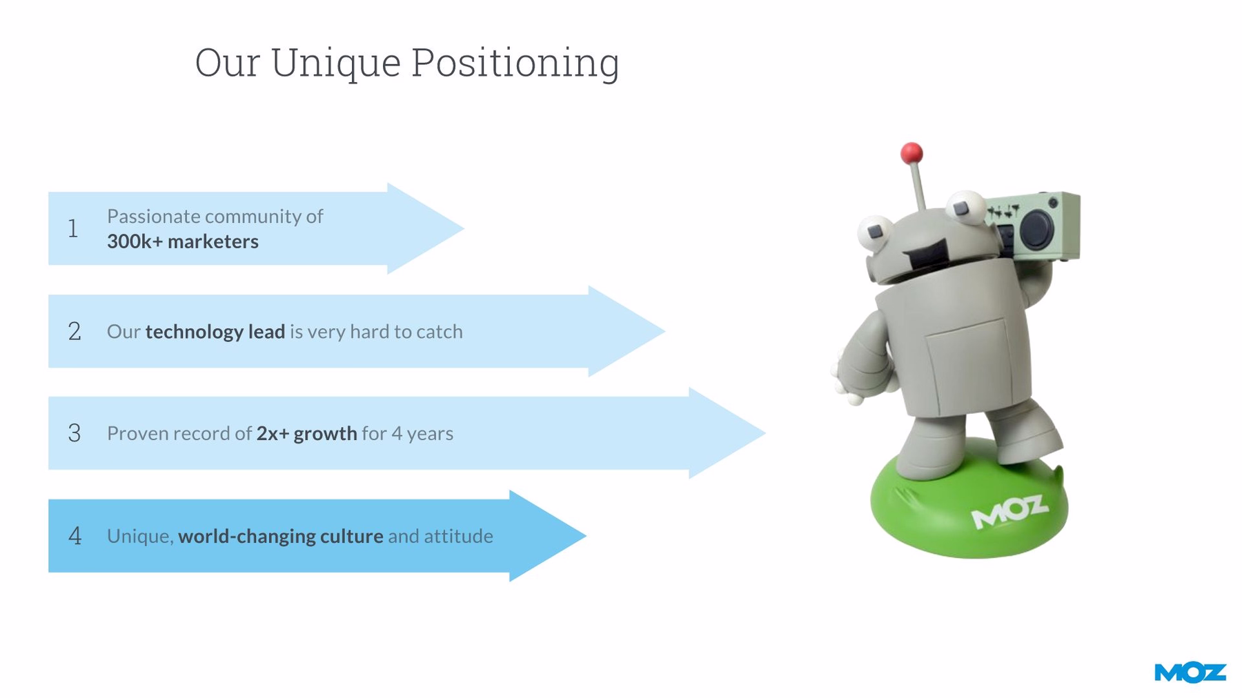
Slide 17: Moz Unique Positioning
For the next slide in our redesigned Moz pitch deck, we chose the arrow bars smart slide template to illustrate the company’s unique positioning in the 2011 market. Our free PowerPoint alternative presentation software lets us easily slide the length of each arrow back and forth, as well as enter corresponding text already preset to the correct size, weight and font. We even pulled an image of the Moz mascot from our image library.
Slide 18: Conclusion
We don’t like to abruptly end a presentation, so we always like to include some sort of concluding slide that marks the end of the pitch. For our Moz makeover, we chose the headline slide template and placed a photo over half of the template, then split the slide and placed some words of wisdom on the other half complete with the Moz logo.

How do you think we did on our Moz Series B pitch deck? Is it more unified and cohesive than the original? Will it effectively captivate audiences? (We think so).